Anyone know a font where they use stick figures or outlines of people to make the letters? I think that'd be pretty spiffy.
Got a tip for us?
Let us know
Become a MacRumors Supporter for $50/year with no ads, ability to filter front page stories, and private forums.
Your most hated font....excluding Comic Sans
- Thread starter dornoforpyros
- Start date
- Sort by reaction score
You are using an out of date browser. It may not display this or other websites correctly.
You should upgrade or use an alternative browser.
You should upgrade or use an alternative browser.
L
Lau
Guest
Oooooh, there's so many good (i.e. bad) ones that have been listed. I will add
 as it is evil and wrong.
as it is evil and wrong. dornoforpyros said:Well aside from everyones well document hatred of Comic Sans I'm wondering what other over used font you see in the every day world that you hate.
For me, it's gotta be Papyrus, I dunno what it is but this turns up on more and more menus & restaurant signs then I care to remember.

Impact. Most overused. Most ugly and the postscript version doesnt match the truetype version... THANK YOU Microsoft! These two versions you're seeing are SUPPOSED to be the same size!
Arial, Helvetica, Univers, Times, Palatino, art directors who think Geneva is a real font, inappropriately used comic book fonts... unless you're doing a "Eat at Joe's" sign, you're using the wrong font!, brush script, bad handwriting fonts, people who dont know what kerning is and anyone who use a script font in caps!!
Attachments

Apple Hobo said:
There are plenty of garbage fonts, but Helvetica is what came to mind first.
I like Helvetica! It is so nice and simple
Sirus The Virus said:I HATE Papyrus with a passion.
ditto, thus why I created this thread
Anything that is "frilly". And Comic Sans MS (which my school over uses-to my utter dismay they use it on absolutley everything. Heck, I've seen it in exams. Exams!).
I adore anything which is simple or modern.
EDIT: I also hate Papyrus with a vengance, along with Snap ICT. Oh, and any varient of Rockwell. And what is the point of dingbats!?
I adore anything which is simple or modern.
EDIT: I also hate Papyrus with a vengance, along with Snap ICT. Oh, and any varient of Rockwell. And what is the point of dingbats!?
ChrisG said:And what is the point of dingbats!?
I don't know, ask MS
lol.Same thing with wingdings
I can't stand Thesis. I can't stand it for one reason: The decender on the upper case Q. It's like they just stuck a tilde down there under an O, and it's so detached it really effects readability.
What about FHWA Series A,B,C,D,E,E(M),F. Road sign fonts are bad. However the new Cleartype font is awesome.
TEG
TEG
Well, pretty much every terrible font in the world has been covered here.
So I'd just like to say: Georgia for ever!
So I'd just like to say: Georgia for ever!

It's not part of the default Mac set (thank God), but I think it comes standard on most PCs. When somebody wants an olde-timey font, they go down the list alphabetically and the first thing they see (and settle on) is Algerian.
It's a beautiful font, but once I almost used it for a logo and then realized it's EVERYWHERE. Now it's kind of my curse in life - noticing that tell-tale capital "A" on business signs, menus - anything trying hard to invoke the look of a class establisment.
L
Lau
Guest
Kong said:
My old school used that on everything, and so brings me out in a cold sweat every time I see it.
Times New Roman! Every PC user uses it because they don't know how to change the font in MS Office (okay, not every one, but tons of them).
What fonts do I hate...where do I begin...
Snowcap has to be one of the worst fonts ever. And the scary part, I think I actually used it once, ouch.

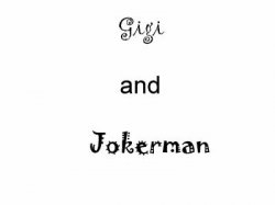
And then there are the obligatory, illegible fonts like Jokerman which are used in every coffee shop. I actually had someone submit an ad to our paper entirely in this font! OUCH!

And my current pet peeve is definitely Papyrus. In the last couple of years that font has become all the rage and is on everything for everyone. It has become the new Brush Script.

Of course the list could go on and on, but these are three that come to mind.
Snowcap has to be one of the worst fonts ever. And the scary part, I think I actually used it once, ouch.
And then there are the obligatory, illegible fonts like Jokerman which are used in every coffee shop. I actually had someone submit an ad to our paper entirely in this font! OUCH!
And my current pet peeve is definitely Papyrus. In the last couple of years that font has become all the rage and is on everything for everyone. It has become the new Brush Script.
Of course the list could go on and on, but these are three that come to mind.
Register on MacRumors! This sidebar will go away, and you'll see fewer ads.