When closing an unsaved document, the "Don't Save" button has been renamed to "Delete." (Which I think makes more sense.)
http://cl.ly/3T2t0m2E0S1S3Q2k271R
Automator has a tweaked icon.
http://cl.ly/3G0h3y2R321Y0w3I0S2q
New build of Safari 5.2. Has some minor UI/icon tweaks. Example:
http://cl.ly/1j0f371t1K0I023F1Q0i
Doesn't look like you can change the Launchpad spacing anymore, at least with pinching on a trackpad.
Nice new Alerts panel in Calendar preferences. You can set default alerts for each calendar account, each event type (all day vs. timed events vs. birthdays), and set whether you want those alert settings only for the Mac you're on or all your devices.
http://cl.ly/2w18110o0B1A1i0F0J1u
Here's one a lot of people will probably enjoy. You can do folders inside folders in iCloud. But subfolders only show in the new list view. Icon view only shows the top level.
http://cl.ly/102w1u2A0G1o1e2Q0U1y
http://cl.ly/381b3J0e2R1T1M2r1S0O
K, I'm not sure if this is new or not, but it being checked by default is definitely new and annoys me quite a bit. Option in General pane of System Preferences to close all windows when apps are quit. Reverses Option-Quit to be "Quit and Keep Windows" instead of "Quit and Close All Windows" like I've been used to now.
http://cl.ly/0r2H271I343I1p260112
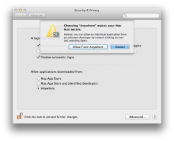
Security pane in System Preferences now has an Advanced button under the General tab where a bunch of stuff has been moved to (nothing new, just moved).
http://cl.ly/2O2l3u0L2W3X2K1d3441
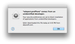
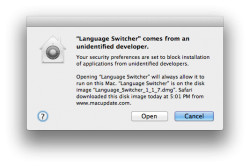
Also, Gatekeeper seems to be working now (I think apps just crashed before). Right-clicking and choosing Open gives a different pop up that allows you to make an exception.
Might be kind of hard to see in this image, but the Notification Center banners have been tweaked a bit. Fonts have slightly different color, size, and shading.
http://cl.ly/352C182W3B0p1Z0r1R1x
New Screen Sharing menu icon, i.e. this is what shows when you're controlling another Mac remotely with normal Screen Sharing not ARD (which has the same icons).
http://cl.ly/0i3o0G2J2c0r0r152W2t
New Contacts access security dialog. No more ugly and uninformative stop sign with a bang. I feel like people will have a greater chance of understanding what's going on with this new icon.
http://cl.ly/2w2S371T3L3f1o2c0f1t


