Become a MacRumors Supporter for $50/year with no ads, ability to filter front page stories, and private forums.

apollo1444

macrumors 65816
Jul 22, 2011
1,329
27
mexico
My S3 has been plenty safe. You read too many negative blogs.

how is safe excuse me? didn't you hear what I said? not all regions have gotten the update for the damn sudden death issue? well I didn't read a blog about safety, It was actually a document issued by f-secure. http://www.f-secure.com/static/doc/labs_global/Research/Mobile Threat Report Q4 2012.pdf
(yeah I know schiller posted that but I did read it, and a friend of mine is still waiting for the damn patch for his S3 surviving with very regular freezes and sudden reboots, I wonder how long it will last)

ps... I already knew android was crap at security.

how in the world would I trust Samsung they never have their phones up to date
 

dontpannic

macrumors 6502
May 16, 2011
460
4
Orpington, Kent, UK
You obviously haven't. If your calling it junk, then your drunk; go home! Did you just watch the s4 keynote.... it was revolutionary.... something you icrap users haven't seen in years....

It was the worst keynote I've seen, too much gimmicky rubbish, poor acting, superfluous information that wasn't required and brought nothing to the show. I felt embarassed for everyone on that stage last night. It lacked order, information, professionalism...

However, with your use of the word "icrap" I can see where this is going. Remind me why you're on MacRumors?

The only thing "revolutionary" about that keynote was that my eyes have been opened to the realisation that no product announcement could be quite that bad in the future.

Watching the keynote, as I really wanted to like the S4, nothing popped out to me to say "wow". The biggest case of "oh wow" was the ability to use it with gloves. Everything else was Samsung borrowing ideas and making up new ideas that I can't see catching on.

The translation utility is just an amalgamation of third party apps - biggest inclusion would be Word Lens which does the same live camera word conversion as S Translation.

S Drive is just Siri + Maps / Google Voice search with Maps

Ability to create and share photo albums? Isn't that just a third party app (or iPhoto?). Ability to beam content to a central hub over the internet... isn't that just iCloud and Apple TV? (Or AirPlay!)

Group speakers?? What? Who's going to buy 5 Galaxy S4's to use as surround speakers? What kind of place will you be where you need to beam music to multiple S4's?

Where are the bits we care about? How about some battery life results - it's all very well telling us how big the battery is but how long does it last? Surely that's a more vital piece of information?

What about better integration with car stereos? Third party accessories?

It's a shame. I really wanted Samsung to out something that would blow my mind and make me want to make the switch to Android... Looks like it will have to wait for another few years.
 

Bahroo

macrumors 68000
Jul 21, 2012
1,860
2
He doesnt have to look into the future, because Android overtook IOS a year again ;)

well last time i checked, iPhone 5 was the most sold smartphone last quarter so thats all that matters to Apple.. Apple could careless about feature phones running Gingerbread.. that is what takes up most of Androids market share
 

TG1

macrumors 6502a
Feb 21, 2011
592
51
I'm not upgrade eligible until October, so it'll between the S4, HTC One, iPhone 5S, Note III, Motorola X phone, Nexus 5, or Droid Razr Maxx 3. Oh, the choices! :)
 

tbayrgs

macrumors 604
Jul 5, 2009
7,467
5,097
I'm gonna swing by the Apple store during lunch to pick it up.

-_-'

It was a little chilly this morning here in Florida, but I didn't think hell had actually frozen over. ;)

In all seriousness though, based on what I've seen from you over the past 6 months, I really don't think you're going to enjoy your time with the iP5--trading one set of problems for an entire different set, though having an option to jailbreak will help. Best of luck though.
 

Zaft

macrumors 601
Jun 16, 2009
4,570
4,049
Brooklyn, NY
I will be getting the S4 from Iphone 5. (I think i wrote that earlier)

One thing that erks me is why do people say "oh its pentile its crap"

Anytime i see a GS3 i love the display. I dont sit there and say "Oh its pentile"

So far every preview of the GS4 has said the display is amazing.:D
 

Kashchei

macrumors 65816
Apr 26, 2002
1,154
5
Meat Space
I listened to the MacWorld podcast with Andy Inhatko explaining why he switched to Android. Ironically, his arguments, while completely logical for him, do not apply to me. Yes, I would dearly love a larger screen, but Inhatko was dissatisfied with the limitations of the iPhone after the first month of intuitive, thought-free use. His solutions to this problem sounded like problems for me, and so I will remain within the Apple ecosystem, silently coveting the large screen of the Samsung S4, but little else about it.
 

onthecouchagain

macrumors 604
Mar 29, 2011
7,382
2
It was a little chilly this morning here in Florida, but I didn't think hell had actually frozen over. ;)

In all seriousness though, based on what I've seen from you over the past 6 months, I really don't think you're going to enjoy your time with the iP5--trading one set of problems for an entire different set, though having an option to jailbreak will help. Best of luck though.


A big part of this decision, admittedly, is Apple's nice 30 day no questions asked return policy.
 

lbros360

macrumors member
Original poster
Jan 3, 2013
59
0
It was the worst keynote I've seen, too much gimmicky rubbish, poor acting, superfluous information that wasn't required and brought nothing to the show. I felt embarassed for everyone on that stage last night. It lacked order, information, professionalism...

However, with your use of the word "icrap" I can see where this is going. Remind me why you're on MacRumors?

The only thing "revolutionary" about that keynote was that my eyes have been opened to the realisation that no product announcement could be quite that bad in the future.

Watching the keynote, as I really wanted to like the S4, nothing popped out to me to say "wow". The biggest case of "oh wow" was the ability to use it with gloves. Everything else was Samsung borrowing ideas and making up new ideas that I can't see catching on.

The translation utility is just an amalgamation of third party apps - biggest inclusion would be Word Lens which does the same live camera word conversion as S Translation.

S Drive is just Siri + Maps / Google Voice search with Maps

Ability to create and share photo albums? Isn't that just a third party app (or iPhoto?). Ability to beam content to a central hub over the internet... isn't that just iCloud and Apple TV? (Or AirPlay!)

Group speakers?? What? Who's going to buy 5 Galaxy S4's to use as surround speakers? What kind of place will you be where you need to beam music to multiple S4's?

Where are the bits we care about? How about some battery life results - it's all very well telling us how big the battery is but how long does it last? Surely that's a more vital piece of information?

What about better integration with car stereos? Third party accessories?

It's a shame. I really wanted Samsung to out something that would blow my mind and make me want to make the switch to Android... Looks like it will have to wait for another few years.
ok....
 

Attachments

  • cool-story-bro-house-Cool-Story-Bro1.jpg
    cool-story-bro-house-Cool-Story-Bro1.jpg
    34.1 KB · Views: 90

onthecouchagain

macrumors 604
Mar 29, 2011
7,382
2
Y'all wanna hear my iPhone 5 impressions?

So far, mostly good. Lots of quirks to adjust to, though. Like no dedicated back button, and no swiping (good lord, the keyboard BEGS for swiping). Typing, while better than it was on my 4S, feels so "manual". That's really the best way to put it. You have to work for everything. Whereas typing on Swiftkey, everything is natural (swiping, long pressing for secondary symbols, word prediction that can sometimes finish sentences for you, etc.).

So... "manual"...

But, seriously, overall...

obama-not-bad-l.png
 
Last edited:

jrswizzle

macrumors 603
Aug 23, 2012
6,107
129
McKinney, TX
Y'all wanna hear my iPhone 5 impressions?

So far, mostly good. Lots of quirks to adjust to, though. Like no dedicated back button, and no swiping (good lord, the keyboard BEGS for swiping). Typing, while better than it was on my 4S, feels so "manual". That's really the best way to put it. You have to work for everything. Whereas typing on Swiftkey, everything is natural (swiping, long pressing for secondary symbols, word prediction that can sometimes finish sentences for you, etc.).

So... "manual"...

But, seriously, overall...

obama-not-bad-l.png

Haha better than I expected....

Anything besides the keyboard giving you trouble?
 

onthecouchagain

macrumors 604
Mar 29, 2011
7,382
2
Haha better than I expected....

Anything besides the keyboard giving you trouble?

Really loathe that safari doesn't let you scroll as fast as you want. Going back to top is instantaneous, sure but every other attempt at moving quickly, up or down, is ridiculous!!

My god. How can anyone stand this? I had to flick so many times to read certain posts!
 

SnowLeopard2008

macrumors 604
Jul 4, 2008
6,772
18
Silicon Valley
Really loathe that safari doesn't let you scroll as fast as you want. Going back to top is instantaneous, sure but every other attempt at moving quickly, up or down, is ridiculous!!

My god. How can anyone stand this? I had to flick so many times to read certain posts!

Scrolling isn't linear on iOS. If you flick with a greater velocity, it actually scrolls more. This isn't much different than any other mobile OS.
 

onthecouchagain

macrumors 604
Mar 29, 2011
7,382
2
Some more thoughts:


-Boy do I miss the dedicated back button. Sure iOS has a button that takes you back but it's not always in the same place. Sometimes it's upper left, sometimes it's lower left (Safari's back button), sometimes it's upper right, and other times it's a "Cancel" button in the lower middle of the screen. You have to search for it, instead of just having muscle memory of tapping back. I post example pictures here: https://forums.macrumors.com/posts/17003123/

-Also miss the dedicated menu button. Goodness gracious, iOS Settings is a mess! It's honestly difficult to find certain things. And I hate how you have to leave an app in order to go to the iOS Settings to get to that app's settings. It's... so counterintuitive. Then, once in a while, you'll have an app like Gmail where there are no settings in the iOS Settings screen. It's actually in the app, so you feel like a fool going to look for it in the iOS Settings screen. Very inconsistent.

-Why does the App Store keep asking me for my password every time I download something? It's so annoying. I already registered the device and signed into iTunes/App Store with my Apple ID. Make it stop.

-Scrolling in Safari is dreadfully slow.

-While the keyboard has been faring okay, it's still no where as easy to use as Swiftkey. Boy, do I miss swiping. The iOS keyboard with its narrow screen BEGS for swiping abilities. Goodness, Apple. Update the keyboard. Everything on this keyboard feels so "manual". That's the best way for me to describe it. You have to really labor to get what you want to type and what symbols you want out. Miss predictions too. Swiftkey used to finish sentences for me. It's such a breeze tapping once to get a full word onto the screen.

-Small thing, but I miss my scrollable wallpaper. iOS looks so static and dead. :( It's really kind of sad.

-All Mail is nice, but it's kind of annoying you can't immediately tell which mailbox the email you're looking at is from. It's annoying that emails are only partially downloaded too. I have to click "download" toward the bottom to get more of it. What the heck is that? It also has to load any old mail or mail in other Labels. With Gmail, your entire mailbox (literally) was available instantaneously.

-BIG MISS: Notification light. I hate having to keep turning the device on just to see if I've got anything waiting for me. This is such a useful feature. To all those people who keep talking about how Apple doesn't implement something until people are ready for it or until they can do it right, here's a perfect example of that philosophy being utter BS. Notification light is majorly useful and it's not hard to get a simple light "wrong."

-I miss not being able to toggle the lock screen on/off. It really sucks having to put in my lock code every single time I access my phone, even if I don't need it, say like when I'm at home. On Android, you can do this, and so when you're at home, you toggle off your lock screen, thus allowing instant access to your phone.

There's a few other small things that bug me about iOS... but other than that, it's not bad. Not as bad as I thought going back to iOS would be. Maybe because my expectations are so... I wouldn't say low... but more like "trained."

EDIT: Another thing I can't stand. Notifications. The little flippy thing that comes down from the top of the screen is so obnoxious. How can anyone accept that this is all Apple could come up with to notify you? It literally blocks any access to the buttons on top. And since the "back" or "cancel" buttons are usually at the top, you have to either wait for it to go away, or swipe it away first. I mean, it's just so unintuitive. I can't believe this is what Apple software developers, after a year, came up with. This is all they could offer? How do iOS users accept this? Really.


----------

30 day challenge.

Day 1 - "Not bad"

lol :D

I'm genuinely trying hard to keep an open mind and appreciate the iPhone for what it is.

But... I don't think I will last. To say that iOS is behind Android is just the biggest understatement of the year (presently). Everything is just so much more laborious on iOS. Everything is just so much more "manual."
 
Last edited:

onthecouchagain

macrumors 604
Mar 29, 2011
7,382
2
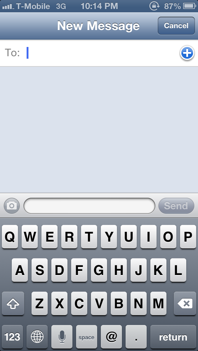
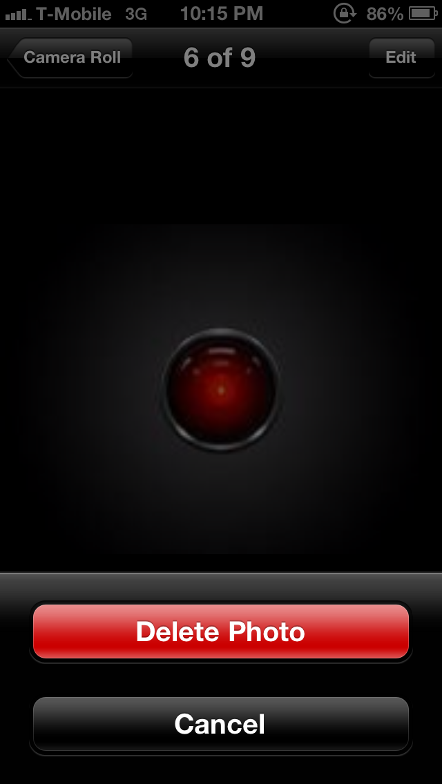
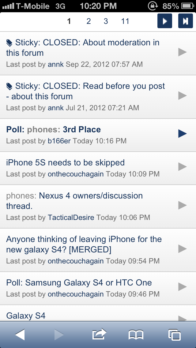
Some examples of what I'm talking about regarding the lack of consistency with going to "back" to the previous screen. Usually it'll be upper left of the screen. But...

Sometimes the only way to go back is the upper right:

srCknzg.png


Other times, it's a cancel button bottom of the screen (you cannot tap elsewhere on the screen to get out of this):

uYbjJch.png


And in Safari, it's lower left to go back a page:

Cvm222I.png
 

unobtainium

macrumors 68030
Mar 27, 2011
2,650
4,086
1400 mAh battery to 2600 mAh ? Are you kidding me? That's a pretty huge leap.

But iPhone is iPhone. I can't really see myself switching.

You can't directly compare battery sizes like that. The S4 will have a larger battery, yes, but it also has a larger screen, bloatier OS, faster processor, etc. Interestingly Samsung didn't talk about battery life, which is the end result that really matters.
 

Grolubao

macrumors 68000
Dec 23, 2008
1,579
583
London, UK
Some more thoughts:


-Boy do I miss the dedicated back button. Sure iOS has a button that takes you back but it's not always in the same place. Sometimes it's upper left, sometimes it's lower left (Safari's back button), sometimes it's upper right, and other times it's a "Cancel" button in the lower middle of the screen. You have to search for it, instead of just having muscle memory of tapping back. I post example pictures here: https://forums.macrumors.com/posts/17003123/

-Also miss the dedicated menu button. Goodness gracious, iOS Settings is a mess! It's honestly difficult to find certain things. And I hate how you have to leave an app in order to go to the iOS Settings to get to that app's settings. It's... so counterintuitive. Then, once in a while, you'll have an app like Gmail where there are no settings in the iOS Settings screen. It's actually in the app, so you feel like a fool going to look for it in the iOS Settings screen. Very inconsistent.

-Why does the App Store keep asking me for my password every time I download something? It's so annoying. I already registered the device and signed into iTunes/App Store with my Apple ID. Make it stop.

-Scrolling in Safari is dreadfully slow.

-While the keyboard has been faring okay, it's still no where as easy to use as Swiftkey. Boy, do I miss swiping. The iOS keyboard with its narrow screen BEGS for swiping abilities. Goodness, Apple. Update the keyboard. Everything on this keyboard feels so "manual". That's the best way for me to describe it. You have to really labor to get what you want to type and what symbols you want out. Miss predictions too. Swiftkey used to finish sentences for me. It's such a breeze tapping once to get a full word onto the screen.

-Small thing, but I miss my scrollable wallpaper. iOS looks so static and dead. :( It's really kind of sad.

-All Mail is nice, but it's kind of annoying you can't immediately tell which mailbox the email you're looking at is from. It's annoying that emails are only partially downloaded too. I have to click "download" toward the bottom to get more of it. What the heck is that? It also has to load any old mail or mail in other Labels. With Gmail, your entire mailbox (literally) was available instantaneously.

-BIG MISS: Notification light. I hate having to keep turning the device on just to see if I've got anything waiting for me. This is such a useful feature. To all those people who keep talking about how Apple doesn't implement something until people are ready for it or until they can do it right, here's a perfect example of that philosophy being utter BS. Notification light is majorly useful and it's not hard to get a simple light "wrong."

-I miss not being able to toggle the lock screen on/off. It really sucks having to put in my lock code every single time I access my phone, even if I don't need it, say like when I'm at home. On Android, you can do this, and so when you're at home, you toggle off your lock screen, thus allowing instant access to your phone.

There's a few other small things that bug me about iOS... but other than that, it's not bad. Not as bad as I thought going back to iOS would be. Maybe because my expectations are so... I wouldn't say low... but more like "trained."

EDIT: Another thing I can't stand. Notifications. The little flippy thing that comes down from the top of the screen is so obnoxious. How can anyone accept that this is all Apple could come up with to notify you? It literally blocks any access to the buttons on top. And since the "back" or "cancel" buttons are usually at the top, you have to either wait for it to go away, or swipe it away first. I mean, it's just so unintuitive. I can't believe this is what Apple software developers, after a year, came up with. This is all they could offer? How do iOS users accept this? Really.


----------


I'm genuinely trying hard to keep an open mind and appreciate the iPhone for what it is.

But... I don't think I will last. To say that iOS is behind Android is just the biggest understatement of the year (presently). Everything is just so much more laborious on iOS. Everything is just so much more "manual."

Seriously man, just Jailbreak and install Swipenav and be gone with the back button
 
Register on MacRumors! This sidebar will go away, and you'll see fewer ads.