For both this reason, as well as the phenomena of developers not even having an iPad app, apple needs to start really cracking down. I say they give developers 1 more year to develop iPad apps (and at the correct ratio), then 3-4 months for ongoing maintenance / updates in the future. Sure, you'll see apps simply disappear, but I'd rather there be fewer, but higher quality apps than a bunch of junk. I buy Apple products because of their (albeit not always perfect) "do it right or don't do it at all" mentality, and I'd like to see them better regulating app developers with this philosophy as well.
Got a tip for us?
Let us know
Become a MacRumors Supporter for $50/year with no ads, ability to filter front page stories, and private forums.
Buyer Beware: 11-inch iPad Pro has a new aspect ratio, and most apps have HUGE black bars
- Thread starter Xeyad
- Start date
- Sort by reaction score
You are using an out of date browser. It may not display this or other websites correctly.
You should upgrade or use an alternative browser.
You should upgrade or use an alternative browser.
Developers need to stop developing for specific screen sizes, and use adaptive layouts. Those that aren't have not kept up with changes in the SDKs and tools that have now been in place for YEARS.
https://developer.apple.com/design/adaptivity/
https://developer.apple.com/library...Experience/Conceptual/AutolayoutPG/index.html
Once an app has an adaptive layout, it's "OK" to then optimize for specific screen sizes. But... ADAPTIVE FIRST, then given sufficient resources you can fret about the perfect layout for e.g. iPhone X.
I write hybrid apps (using WKWebView) and for those, there is absolutely no excuse, because adaptive HTML layout is well established practice. I don't make an "iPhone app" and a separate "iPad app". That is just silly today. But adaptive layout is not limited to apps that use UI/WKWebView, adaptive layout is available for pure native apps as well.
That said, I am a BIG fan of hybrid apps done right. It means that with a bit of effort you can have webpage designers work directly on layout and then test it out themselves. Vs. the horrible practice of a designer making mockups and then "throwing it over the cubicle wall" to a developer, who will then spend valuable developer time trying to reproduce the mockups in proprietary layout tools. Yes, you can teach designers to use the Apple tools. But there are zillions of web designers that already know HTML/CSS inside and out.
[doublepost=1546288435][/doublepost]
That would be short-sighted, something that Apple is not. The problem is lazy developers.
STOP with the fixed layouts.
STOP with bitmap images for UI controls, etc. Use vector artwork for UI controls whenever possible.
https://developer.apple.com/design/adaptivity/
https://developer.apple.com/library...Experience/Conceptual/AutolayoutPG/index.html
Once an app has an adaptive layout, it's "OK" to then optimize for specific screen sizes. But... ADAPTIVE FIRST, then given sufficient resources you can fret about the perfect layout for e.g. iPhone X.
I write hybrid apps (using WKWebView) and for those, there is absolutely no excuse, because adaptive HTML layout is well established practice. I don't make an "iPhone app" and a separate "iPad app". That is just silly today. But adaptive layout is not limited to apps that use UI/WKWebView, adaptive layout is available for pure native apps as well.
That said, I am a BIG fan of hybrid apps done right. It means that with a bit of effort you can have webpage designers work directly on layout and then test it out themselves. Vs. the horrible practice of a designer making mockups and then "throwing it over the cubicle wall" to a developer, who will then spend valuable developer time trying to reproduce the mockups in proprietary layout tools. Yes, you can teach designers to use the Apple tools. But there are zillions of web designers that already know HTML/CSS inside and out.
[doublepost=1546288435][/doublepost]
I don’t know why Apple has to make this such a PITA. Just maintain aspect ratios
That would be short-sighted, something that Apple is not. The problem is lazy developers.
STOP with the fixed layouts.
STOP with bitmap images for UI controls, etc. Use vector artwork for UI controls whenever possible.
Last edited:
To me the biggest issue is with the apps that have a native video player that doesn't match the aspect ratio. This was a huge part of the reason i upgraded - the larger screen for video - and so far its been a real disappointment. I don't know how hard it is to update a native video player, but i don't get the sense that it's just an issue of the app not being responsive.
I don't know how hard it is to update a native video player, but i don't get the sense that it's just an issue of the app not being responsive.
Yet some have been reasonably quick to update (eg. BBC iPlayer), but others (eg. NFL GamePass) have not.
The main issue I see with the 11 vs the 10.5 is the reading view in landscape mode which is the one I use most. The top and bottom bezels being thicker on the 11 you loose at least one line while reading not talking about the bar at the bottom. While side bezels are much slimmer I found that reading is not well optimized.
Anyone else bothered with this?
Anyone else bothered with this?
The main issue I see with the 11 vs the 10.5 is the reading view in landscape mode which is the one I use most.
What do you mean by "the reading view"?
Every app publisher decides on their own layout.
Are you talking about Safari Reader Mode? Some particular app you do "reading" in?
Post a picture, no idea what "bar" you are talking about.
Apple now defines a "safe area":
https://developer.apple.com/design/...ines/ios/visual-design/adaptivity-and-layout/
and UI guidelines dictate content should be shown only in the safe area. Background and decoration/flourishes can/should go outside the safe area, for a seamless appearance. "black bars" will appear on apps that have not been updated. This is imposed by iOS if an app was built for a target version of iOS < 11.
Target version is the HIGHEST version of iOS the app was built for. iOS engages in "adaptive behavior" when running an app on an iOS version > its target version. This is because the developer could not have possibly guessed what Apple will do in the future, and it is desirable for older apps to continue to work on newer versions of iOS with the least-awful side effects.
Frankly, if an app hasn't been updated since iOS 10, you probably should be looking for a replacement app.
For hybrid apps that use a webview, as well as for websites, the safe area is particularly easy to deal with - the webview/browser defines CSS variables for the top/bottom/left/right boundaries.
Notice the pink margin areas in the page I linked above. An older app that has not been updated will probably have a margin to avoid having text get too close to the edges. And so looks fine on an older iOS. But if built for < iOS 11, iOS will add a "black bar" margin. Now you have a nasty black bar, AND still the original margin inside the black bar, and so less space for text.
Developer needs to update the app!
If you are seeing any of this with Safari Reader Mode, then that's on Apple.
Last edited:
What do you mean by "the reading view"?
Every app publisher decides on their own layout.
Are you talking about Safari Reader Mode? Some particular app you do "reading" in?
Post a picture, no idea what "bar" you are talking about.
Apple now defines a "safe area":
https://developer.apple.com/design/...ines/ios/visual-design/adaptivity-and-layout/
and UI guidelines dictate content should be shown only in the safe area. Background and decoration/flourishes can go outside the safe area. "black bars" will appear on apps that have not been updated. This is imposed by iOS if an app was built for a target version of iOS < 11.
Target version is the HIGHEST version of iOS the app was built for. iOS engages in "adaptive behavior" when running an app on an iOS version > its target version. This is because the developer could not have possibly guessed what Apple will do in the future, and it is desirable for older apps to continue to work on newer versions of iOS with the least-awful side effects.
Frankly, if an app hasn't been updated since iOS 10, you probably should be looking for a replacement app.
For hybrid apps that use a webview, as well as for websites, the safe area is particularly easy to deal with - the webview/browser defines CSS variables for the top/bottom/left/right boundaries.
Notice the pink margin areas in the page I linked above. An older app that has not been updated will probably have a margin to avoid having text get too close to the edges. And so looks fine on an older iOS. But if built for < iOS 11, iOS will add a "black bar" margin. Now you have a nasty black bar, AND still the original margin inside the black bar, and so less space for text.
Developer needs to update the app!
If you are seeing any of this with Safari Reader Mode, then that's on Apple.
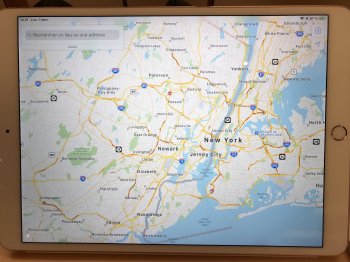
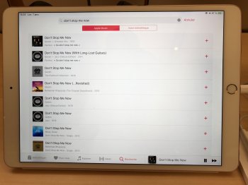
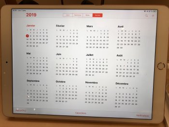
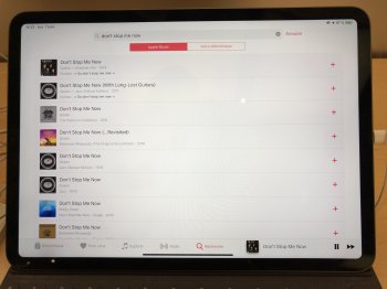
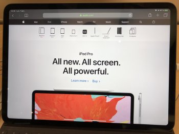
Too bad I did not take a picture when I was at the Apple store. Let me try to rephrase but English is not my native language. I am writing to you from France.
So I placed a 10.5 and 11 side by side (landscape mode) and went to the following websites/app:
-Safari on www.apple.com : I saw more on the 10.5 vs. 11...
-Mail app: the preview pane on the right is larger on the 11 as from left to right the screen is larger with its slimmer bezels but on the reading pane I read again more text (one more line) on the 10.5. They should have kept the preview pane the same size and make the reading pane larger so at the end we would have more to read overall on the 11.
-Apple Books App: again there is more text available on the 10.5 vs. the 11.
Do you see what I mean? Is there anyone having both who could post comparaison pictures?
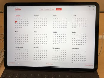
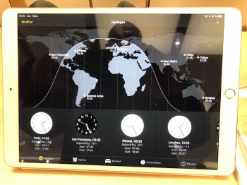
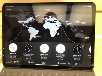
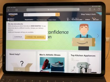
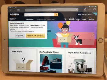
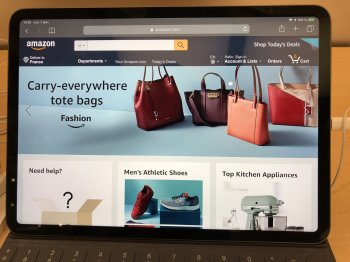
Voila...a few screen comparison b/w 10.5 & 11. Some in favor of the 10.5 some for the 11... I’ll you find out the differences ;-)
Attachments
-
 77893328-6176-4A73-9D15-B0FF2CD69A79.jpeg2 MB · Views: 366
 -
 AE065B13-6A15-447F-A6CA-D462A065487B.jpeg2.3 MB · Views: 334
 -
 E456204D-F763-4BFD-903A-5D5082E0A06C.jpeg1.5 MB · Views: 338
 -
 AA06A6E2-00A8-4647-9BE6-1B2C831DC246.jpeg1.8 MB · Views: 360
 -
 732C1F89-FA7E-49EE-AD14-578BDA043DAB.jpeg1.3 MB · Views: 363
 -
 282EEFA9-AE71-4E8C-A7C0-6744212A9091.jpeg1.5 MB · Views: 358
 -
 9A20E03C-2382-43E9-8C48-47031BB826AB.jpeg1.4 MB · Views: 385
 -
 D21DDE86-184A-45A6-ADFF-0C00DFD24FE0.jpeg1.6 MB · Views: 352
 -
 5765A7C9-9B3B-4598-BDEB-78A988E493F8.jpeg1.6 MB · Views: 326
 -
 5FE93C14-6D82-41BC-928C-A0C6DB9A64B0.jpeg1.6 MB · Views: 343
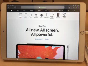
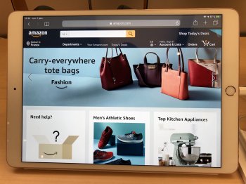
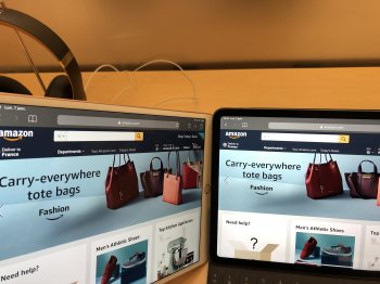
A few more. Check the last one where I put side to side both IPP. While the 11 shows less it seems that “bands” the one with the bag for instance is wider on the 11 vs. the 10.5
Attachments
-
 5C164D19-34BB-444B-8637-C1131BECA87E.jpeg1.4 MB · Views: 384
 -
 56ADFCA2-03AA-4200-B431-3253EAAA520C.jpeg1.4 MB · Views: 348
 -
 256C9F5E-DCC8-4E06-861F-355A652DEC90.jpeg1.4 MB · Views: 406
 -
 43098B42-75C8-444A-B5B6-EDAFF198E060.jpeg1.7 MB · Views: 333
 -
 C51FAE9A-1BF4-4744-8E31-048A522E41C8.jpeg1.6 MB · Views: 350
 -
 FD1DD07D-615D-4056-9B6E-AA01947CA3B5.jpeg1.6 MB · Views: 331
 -
 34D28840-D5D6-4CBC-BA4A-772F112BC739.jpeg1.5 MB · Views: 354
 -
 CF7573AE-51BC-4927-BAB2-D556098A247E.jpeg1.5 MB · Views: 365
 -
 05D844FB-B7C8-4834-912A-47138D974C2F.jpeg1.8 MB · Views: 368
Looking at your pictures, I don't see anything "wrong".
Of course, the newer device has no home button, and so there is the little bar affordance at the bottom instead.
According to the User Interface Guidelines, apps should avoid placing content in that area. And of course Apples own apps - and the browser - will conform to the guidelines.
You give up a little useful space for content at the bottom in exchange for a smaller bezels.
I see Apple "colored outside of the lines" so to speak - and literally - with the Maps app. (Assuming that is Apple Maps? Or is it something else?) To be within the guidelines, Apple should have at least blurred/faded the content near the bottom of the screen on the map.
Everybody is going to interpret the rules a bit differently, according to their own design senses. And it will take some time for common practice dealing with the rounded corners, "home button" affordance, and notch (on devices with notch) to sort themselves out. Some will inevitably decide to increase/decrease font size to make it look nice/functional ACCORDING TO THEIR OWN WHIMS.
Third party apps, of course, you will still find many that have not updated, and will face the wrath of the Black Bar.
That disclaimer on Apple.com says it all “When measured as a standard rectangular shape, the screen is 12.9 inches or 11 inches diagonally (actual viewable area is less).”
So while I love my 11” it actually total BS or marketing...call it as you will.
So while I love my 11” it actually total BS or marketing...call it as you will.
That disclaimer on Apple.com says it all “When measured as a standard rectangular shape, the screen is 12.9 inches or 11 inches diagonally (actual viewable area is less).”
So while I love my 11” it actually total BS or marketing...call it as you will.
I measure mine with my eyes and don't really care if it's 11" or not. It's the size it looks like it is and that's fine with me. To suddenly hate this thing I enjoy so much because I've suddenly found out it's not a perfect 11" just seems silly. It's not like I'll get less enjoyment today than I did yesterday. So why be overly concerned with its physical dimensions?
I like what I see and don't care beyond that. I'll continue loving mine.
"iOS has better tablet optimized apps" , biggest lie.
Seriously? Of course it does. Because some developers still haven’t updated their apps for latest models, doesn’t mean iPad doesn’t have the largest collection of apps designed specifically for the big screen.
ditching iPad's infamous 4:3.
What exactly makes the 4:3 ratio “infamous” in your view?
[doublepost=1547774864][/doublepost]
This problem exists on every OS, except MacOS because nobody builds software for it.
What????
I am not sure on what planet you live if you think nobody build software for MacOS.
Besides, this is not a problem on MacOS (or Windows for what it matter) because apps are designed to run in resizable windows.
Last edited:
What exactly makes the 4:3 ratio “infamous” in your view?
Not to answer for OP, but it's "infamous" in that it was the format for silent films! (1.333:1 = 4:3)
When talkies came along, it got tweaked a bit, to 1.375:1. ("Academy Ratio")
Then TV came along, and we were back to 4:3. I guess nobody thought they would be showing movies on TV, or else that nobody would mind losing the edges.
And then came the ADM-3 terminal, and behold, it was 4:3! (Because commonly available TV tubes were 4:3).
Then came personal computers, and we were still using tube displays, and IBM decided, 4:3 it is! IBMs motto was THINK, not Think Different!
Of course, that was before HD.
I'm not sure that 4:3 for a tablet really ever made much sense. The ratio has at least one foot in the distant past.
But the aspect ratio is not only about what makes sense for video - there are other uses of a tablet. For reading in portrait mode 4:3 or nearby makes perfect sense.
But the aspect ratio is not only about what makes sense for video - there are other uses of a tablet. For reading in portrait mode 4:3 or nearby makes perfect sense.
I would agree and that is one reason why I prefer iPads over Android tablets. The change in ratio is minimal though and still fits well for both uses imho.
You are crazyA revenue cut should be imposed on devs who refuse to optimize their apps. Laziness deserves punishment
I have a pretty hard rule on these things. If the app looks like it wasn't set up properly to work and look right, I don't use it. I've only run into the problem a time or two at this point, but I'm also not very married to anything iPad wise.
I had to delete the YouTube app and download it again as it did not automatically update. Now the info at the top does not appear when watching videos.
Last edited:
I think with a little bit of time as more people complain bugs get ironed out
[doublepost=1547995605][/doublepost]
Generally most are pretty fast although some are slow and lagging.
[doublepost=1547995605][/doublepost]
The problem is many developers take FOREVER to update their ipad apps. Facebook is a multi billion dollar company that still hasn't updated for the larger retina iPads from the last 2 years.
So yes, we can blame apple partly for not partnering with companies to update their software. The iPad is still not taken seriously by many developers (took adobe till 2018) while apple is trying to push this as a laptop replacement. Its comical.
[doublepost=1541433185][/doublepost]
Or never....loads of apps are just blown up 9.7 in versions that look terrible on the 10.5 and 12.9 iPad Pro.
Generally most are pretty fast although some are slow and lagging.
Why are some big app developers just so ****? I give you
Facebook
LinkedIn
Nest
BBC News
Skype For Business
Google
All still not setup correctly for the new iPad screen ratio, the iPad 11 has been out for MONTHS. We get updates by these developers but they don’t addresss the screen aspect ratio, why not?
Well done the small add developers you seem to be able to address this in the first few weeks
Nest
BBC News
Skype For Business
All still not setup correctly for the new iPad screen ratio, the iPad 11 has been out for MONTHS. We get updates by these developers but they don’t addresss the screen aspect ratio, why not?
Well done the small add developers you seem to be able to address this in the first few weeks
Register on MacRumors! This sidebar will go away, and you'll see fewer ads.

