Become a MacRumors Supporter for $50/year with no ads, ability to filter front page stories, and private forums.
Status
Not open for further replies.
Thanks again.

You know how you could really thank everyone who has contributed? Give each and every submission your honest opinion as if you were a client and you went to their office and they submitted this as an idea for a logo. That would complete the real world experience.

Be as blunt as you would be in real life. But do remember the usual way to submit logo ideas when the client has been as vague as you have been is to submit something, anything to try and get a feel of how the client is thinking.

For example if you give no indication then no one is going to want to follow up. If, I respectfully suggest, you just say 'thanks and goodbye' then you have wasted everyones time, the thanks become hollow. So tell us how crap they really are, we're all big boys and girls.
 
Good advice....

You know how you could really thank everyone who has contributed? Give each and every submission your honest opinion as if you were a client and you went to their office and they submitted this as an idea for a logo. That would complete the real world experience.

Be as blunt as you would be in real life. But do remember the usual way to submit logo ideas when the client has been as vague as you have been is to submit something, anything to try and get a feel of how the client is thinking.

For example if you give no indication then no one is going to want to follow up. If, I respectfully suggest, you just say 'thanks and goodbye' then you have wasted everyones time, the thanks become hollow. So tell us how crap they really are, we're all big boys and girls.

I am in the process of going through all of the submissions so far and will respond to each submission with my feedback. This will take sometime as I am considering every aspect of each submission and will not just dismiss one on a first glance.

Thanks again :)
 
620534571_475afbc27a_o.jpg


and I'd also like to apply for a job on the hardware section, "hardcore" for short :p :)
 
OK I'll have a go

(P.S. I don't know anything about converting to print format etc, would you be getting someone to do that for you?)

coremd3.jpg
 
My first attempt.

I wanted to capture that Apple vibe of friendliness and appreciation of nice typography and design. The logo that attaches with the type or stands alone resembles a cutaway to reveal the 'core'. Tried to keep it simple as possible - and thought about the obvious printing issues - by keeping away from gradients, intricate details and lines of altering thickness, which often blur or merge at smaller sizes.

Love to have some feedback.

Thanks,

Gareth.
 

Attachments

  • Picture 2.png
    Picture 2.png
    17.8 KB · Views: 98
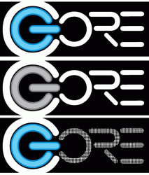
I couldn't agree with dogbone more. As artist we need feedback to make adjustments. I realize there have been a number of ideas thrown your way, but a quick, "I don't like the color, add this or that, we were going more for this direction" would be incredibly helpful.

Anyway, here's a few more to think about. ;)
 

Attachments

  • CORE4.gif
    CORE4.gif
    16.5 KB · Views: 104
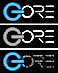
Updates to above...no more gore. :)
I'll play with the logo more to refine it. (just appeasing dogbone). :D

@ doesnotcompute, yes it's good to stay away from gradients because of printing issues. Plus, your logo should be a vector image to allow scalability which would allow for "intricate details and lines of altering thickness." Gradients ("3-D images") are fine for web based businesses, but not for store fronts because of printed materials; i.e. business cards, brochures, give-aways, signs, etc. For one, it's more expensive to reproduce.

As for your "pacman swallowing Gore", as dogbone mentioned, I would refine it. You can add definition without using gradients. Like the idea of simplistic. Look at some of the largest corporation's logos - one to two colors, very simple.
 

Attachments

  • CORE5.gif
    CORE5.gif
    22 KB · Views: 108
My attempt(s). :cool:
one.jpg
two.jpg
three.jpg
four.jpg

Could you please tell us what kind of typeface you would like. :)
 
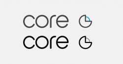
Here is my submission. Both using mainly black and white, as well as using blue as a dominant color.

Even though your store will be a computer store I tried to consciously stay away from very 'techy' fonts and instead went with a softer font that's more indicative of the Apple products as 'lifestyle' products vs. techy computer equipment.

core.jpg
 
ok...here are a few more. The one's on the top i'm actually thinking are the same logo, just using them differently depending on application. in small places use the one on the right, but when it would be printed large enough, use the one on the left. Anyway, that's what i got now.

-JE
 

Attachments

  • core2.jpg
    core2.jpg
    102.2 KB · Views: 103
OK - last one ...
Same logo again, this time used in a business card design (black variation and blue variation)

corebus.jpg


End of my submission :)
 
Andy, you know what would be kind of interesting, is if you were able to narrow it down to a top 5 etc. and list them on Sunday....sort of like making the cut so to speak. Then announce the winner once you have decided. As suggested - feedback on all would also be good.
 
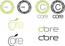
Well in my last post I did say that it would be my last submission ... but I am posting one more proof - this one has my 3 past designs all combined into one image so you can see the entire design concept together.

Now I'm done :)

core-all.jpg
 
Sorry to be a little late to the thread...

But just to make sure, you have verified that the name "Core" isn't already trademarked in the UK, right? You can do a search at the Intellectual Property Office here, although it's down at the moment, so I can't search.

Since you apparently already have the company "Coredelia, Ltd" registered, I assume you have verified that "Coredelia" isn't trademarked, but you want to check for "Core", too, if you're going to be using that name in any fashion. For example, it is entirely possible that Intel already holds the trademark for the use of the word "Core" in any computer-related product or service, so you may have to stick with the full "Coredelia".

A quick Google search turns up CORE (UK) Limited, a seller of IT services and technology, along with CORE, the working name of the Digestive Disorders Foundation. The first one is probably an issue for you.
 
Status
Not open for further replies.
Register on MacRumors! This sidebar will go away, and you'll see fewer ads.