Got a tip for us?
Let us know
Become a MacRumors Supporter for $50/year with no ads, ability to filter front page stories, and private forums.
Competion closed: Need a logo, best wins an ipod video!
- Thread starter AndyClarke
- Start date
- Sort by reaction score
You are using an out of date browser. It may not display this or other websites correctly.
You should upgrade or use an alternative browser.
You should upgrade or use an alternative browser.
- Status
- Not open for further replies.

Sorry to be a little late to the thread...
But just to make sure, you have verified that the name "Core" isn't already trademarked in the UK, right? You can do a search at the Intellectual Property Office here, although it's down at the moment, so I can't search.
Since you apparently already have the company "Coredelia, Ltd" registered, I assume you have verified that "Coredelia" isn't trademarked, but you want to check for "Core", too, if you're going to be using that name in any fashion. For example, it is entirely possible that Intel already holds the trademark for the use of the word "Core" in any computer-related product or service, so you may have to stick with the full "Coredelia".
A quick Google search turns up CORE (UK) Limited, a seller of IT services and technology, along with CORE, the working name of the Digestive Disorders Foundation. The first one is probably an issue for you.
Good point indeed, I hope this has been thought beforehand, would be shame to redo all the cool logos!
okay.. same logo as before.. just now with a leopard feel placed on a black background.
That is my favorite so far!
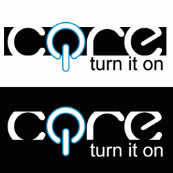
Core Logo Design
Hi there,
I couldn't resist the prospect of a new iPod, so here's my effort
It's pretty similar to one3's concepts, which I've just seen (beforte I did this). Nice work one3 - do you do this sort of thing for a living? If you don't you probably should!
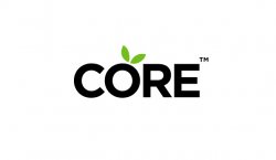
I've gone for simplicity. Very simple bold font (Gotham), all uppercase. Black & white plus one colour - I really like the lime green with the black & white. It's fresh, clean and modern - with also a hint of digital-ness.
The trick with this I think, is to get something to say 'modern lifestyle products, Apple, technology, digital', etc without making it look like a health food store - as anything with an apple reference can very easily do. So I've steered away from having anything too 'organic' looking.
I think this design would translate well across a range of mediums - signage, cards, website, print, etc, because of it's simplicity and boldness.
Would love to get any feedback.
Cheers
Hi there,
I couldn't resist the prospect of a new iPod, so here's my effort
It's pretty similar to one3's concepts, which I've just seen (beforte I did this). Nice work one3 - do you do this sort of thing for a living? If you don't you probably should!
I've gone for simplicity. Very simple bold font (Gotham), all uppercase. Black & white plus one colour - I really like the lime green with the black & white. It's fresh, clean and modern - with also a hint of digital-ness.
The trick with this I think, is to get something to say 'modern lifestyle products, Apple, technology, digital', etc without making it look like a health food store - as anything with an apple reference can very easily do. So I've steered away from having anything too 'organic' looking.
I think this design would translate well across a range of mediums - signage, cards, website, print, etc, because of it's simplicity and boldness.
Would love to get any feedback.
Cheers
Attachments
Hi there,
I couldn't resist the prospect of a new iPod, so here's my effort
It's pretty similar to one3's concepts, which I've just seen (beforte I did this). Nice work one3 - do you do this sort of thing for a living? If you don't you probably should!
I've gone for simplicity. Very simple bold font (Gotham), all uppercase. Black & white plus one colour - I really like the lime green with the black & white. It's fresh, clean and modern - with also a hint of digital-ness.
The trick with this I think, is to get something to say 'modern lifestyle products, Apple, technology, digital', etc without making it look like a health food store - as anything with an apple reference can very easily do. So I've steered away from having anything too 'organic' looking.
I think this design would translate well across a range of mediums - signage, cards, website, print, etc, because of it's simplicity and boldness.
Would love to get any feedback.
Cheers
This one is great. I think one3's is also good but has a bit of that organic feel to it. In my opinion, this one takes it one step further and has more of a digital modern feel to it with the clean, straight lines in the font type. Solid work.
I decided to jump the bandwagon because I loved those logos with the leaf
Here's my newer, cleaner attempt, with a reflection added in just for show.


edit: here's one with a defined o that definitely doesn't look like an orange, even though I didn't think my other ones had that problem:

Here's my newer, cleaner attempt, with a reflection added in just for show.
edit: here's one with a defined o that definitely doesn't look like an orange, even though I didn't think my other ones had that problem:
Simple Design
I thought a lot of the apples in the logos posted looked like oranges... so I made it unmistakably an apple, but far enough from the Apple logo to avoid any *problems*
For some reason it won't show up in this post... but I put the link
http://www.SimpleRepair.com/CORE.jpg
I thought a lot of the apples in the logos posted looked like oranges... so I made it unmistakably an apple, but far enough from the Apple logo to avoid any *problems*
For some reason it won't show up in this post... but I put the link
http://www.SimpleRepair.com/CORE.jpg
Nice work one3 - do you do this sort of thing for a living? If you don't you probably should!
Thanks - like your design too!
Yes, I'm a graphic designer by trade. I do both print and web stuff and of course identity work.
I thought a lot of the apples in the logos posted looked like oranges...
agreed.
Yea I thought about this, the letter O doesn't lend itself very well to an Apple.
Another issue I had with making one letter resemble the Apple logo is the confusion in identity - if you have the cre logo resembling an apple and then the logo on the same page, bag, receipt it might be a bit confusing. Or worse - the customer could think Core is a cheap copy of Apple, trying to make a bit of easy cash using a strong brand.
Just my opinion.
I think i'll give it a go, nothing special, just black and white for the moment. Not going to spend to long on it for nothing. If it needs working/colours give me a shout.

I thought a lot of the apples in the logos posted looked like oranges... so I made it unmistakably an apple, but far enough from the Apple logo to avoid any *problems*
For some reason it won't show up in this post... but I put the link
http://www.SimpleRepair.com/CORE.jpg
Completely agree. I created logo a few days ago that looks very similar and decided not to submit it because it looked like an orange...core.
For example, it is entirely possible that Intel already holds the trademark for the use of the word "Core" in any computer-related product or service, so you may have to stick with the full "Coredelia"
Maybe one3 can adjust his earlier submissions, which in my view well deserve to win this competition, to Coredelia as underlined above.
Great thread this one and congrats to all participating.
I have uploaded all the submitted logo's to Flickr
http://www.flickr.com/photos/andrewclarke/sets/72157600497264321/
I will be adding my comments this afternoon and I hope that others will add comments to help me shortlist the best designs.
Thanks again")
Andrew
http://www.flickr.com/photos/andrewclarke/sets/72157600497264321/
I will be adding my comments this afternoon and I hope that others will add comments to help me shortlist the best designs.
Thanks again
Andrew
well, in my opinion, wouldn't it be nice if it was more reference to Apple and not a straight apple. I think an Orange connotation would be nice. LIke a subtle approach to it. Apples and Oranges so to speak. i don't know...i'm deprived of sleep my self. this probably doesn't even make sense.
-JE
-JE
well, in my opinion, wouldn't it be nice if it was more reference to Apple and not a straight apple. I think an Orange connotation would be nice. LIke a subtle approach to it. Apples and Oranges so to speak. i don't know...i'm deprived of sleep my self. this probably doesn't even make sense.
-JE
good, sleepy call. I think it's difficult to differentiate the two in a simple logo, which is why apple put the bite in theirs... more typically associated with an apple than an orange.
One more use of the logo I designed

Trying a little hard to push the logo, ah?
coredelia
someone above mentioned designing out the logo as 'coredelia'.
I'm not sure if the original poster had asked for this (I don't believe he did) but just in case I've designed it out below, and of course thrown in the obligatory 'reflective' version of the core logo -- I think the whole 'reflective' logo is way, way overused but what the heck - as long as one keeps in mind that the logo should work well on it's own without the reflection.

someone above mentioned designing out the logo as 'coredelia'.
I'm not sure if the original poster had asked for this (I don't believe he did) but just in case I've designed it out below, and of course thrown in the obligatory 'reflective' version of the core logo -- I think the whole 'reflective' logo is way, way overused but what the heck
- as long as one keeps in mind that the logo should work well on it's own without the reflection.
Trying a little hard to push the logo, ah?
Hahaha - you caught me! drat!
Actually I like the way the logo turned out and just wanted to play with some uses for it. But now I'm officially done (well with the exception of the 'coredelia' logo I just posted above).
One more use of the logo I designed
Using Women to meddle with his mind! I call a foul
Oh but it makes the logo look a lot nicer eh?
One more use of the logo I designed
It's a nice logo but will it work on a g string? That is the real test.
It's a nice logo but will it work on a g string? That is the real test.
Yes, see here:
I looked at the Flicker group and noticed there were a few logo ideas I can't see in this thread. Were they submitted via PM? I'm particularly interested in Grégoire Hoin's idea because it looks a lot like the Core Video logo. I believe it should be removed from the competition. As I stated before, try to stay away from another companies logo- it's cheaper that way. It's also not good to copy someone else's logo simply because it's not creative. *stepping down from my soapbox*
Attachments

- Status
- Not open for further replies.
Register on MacRumors! This sidebar will go away, and you'll see fewer ads.