Got a tip for us?
Let us know
Become a MacRumors Supporter for $50/year with no ads, ability to filter front page stories, and private forums.
Competion closed: Need a logo, best wins an ipod video!
- Thread starter AndyClarke
- Start date
- Sort by reaction score
You are using an out of date browser. It may not display this or other websites correctly.
You should upgrade or use an alternative browser.
You should upgrade or use an alternative browser.
- Status
- Not open for further replies.

I looked at the Flicker group and noticed there were a few logo ideas I can't see in this thread. Were they submitted via PM? I'm particularly interested in Grégoire Hoin's idea because it looks a lot like the Core Video logo. I believe it should be removed from the competition. As I stated before, try to stay away from another companies logo- it's cheaper that way. It's also not good to copy someone else's logo simply because it's not creative. *stepping down from my soapbox*
Hi,
I have indeed submitted my logo to Andrew by email. I didn't register on the Macrumors forums until your comment. First of all, and i'm not kidding, i didn't know the Core Video logo, and i must agree it looks damn similar to mine.
But i find your request a bit insulting. Did you ask every person who used an apple in their designs to remove it?
Anyway, i won't take it personnally, so here are a few variations on my design. Although i'm thinking about something else, to avoid the copyright issues, and i might post some alternatives later on.
Any (constructive) feedback will be greatly appreciated!


Any (constructive) feedback will be greatly appreciated!
Looks nice but isn't it a bit pricey to print for a small company? Looks a bit like a cutaway view of a Jaffa.
I agree, good work - this first one is really nice, but perhaps a bit to sophisticated. Printing this logo on merchandise such as T-shirts and Bags would prove difficult and expensive due to the colour variation and gradients. The logo also needs to work in grayscale for faxes, invoices, quotes, etc.
I realized that I might need to post my logo sans color scheme. Color schemes are very subjective thing, and I wouldn't want to lessen the impact because of colors that I happen to like.
So, here are two b/w versions of the logo:

And of course, the obligatory Apple-esque reflected logo shot:

")
So, here are two b/w versions of the logo:
And of course, the obligatory Apple-esque reflected logo shot:
Hi,
I have indeed submitted my logo to Andrew by email. I didn't register on the Macrumors forums until your comment. First of all, and i'm not kidding, i didn't know the Core Video logo, and i must agree it looks damn similar to mine.
But i find your request a bit insulting. Did you ask every person who used an apple in their designs to remove it?
Anyway, i won't take it personnally, so here are a few variations on my design. Although i'm thinking about something else, to avoid the copyright issues, and i might post some alternatives later on.
My comments weren't meant to insulting, only informative. I wasn't implying you intentionally copied an already existing logo or even creatively "borrowed" someone else's idea.
The first thing I do before creating a logo is Google it. I simply Googled (images) "core logo." I knew your logo was very similar because of this search. (The Core Video logo is on the first page - which according to the post was created on April 28, 2005.)
This thread is getting ridiculous. Too many logos floating around, many of which are just bah and a few of which are good (but why are designers hanging around and creating draft after draft for just an iPod?). I'm going to have to echo several earlier posts and say that, oh 2-3 people are selling themselves short.
And the rest are copying logos or styles from Apple, other companies, and OTHER ENTRIES. I love how someone sticks a leaf somewhere and a flood of entries with leaves comes. Whatever.
Gregwhat, your core logo looks like a a hard boiled egg genetically mutated to be perfectly spherical. Just being honest. Egg was the first thing that came to mind.
I really think the OP, AndyClarke needs to close this competition and pick a logo already. Posting them to Flickr (without comments) isn't contributing to anything. People are still designing and drafting. At least narrow it down to 5 (or better yet 3) logos for people to comment about - preferably in a new cleaner thread.
And the rest are copying logos or styles from Apple, other companies, and OTHER ENTRIES.
Agreed with most of what you've said... and this is what I was hinting at when I mentioned disputes to the OP, especially when plagiarism is taken into account. However, a joint decision has been made to keep this thread open, as initially agreed, before it became an issue, and then it will be closed, unless the OP requests it to be locked earlier.
Due to feedback and the work that this thread has created, we have been looking at the entire issue of competitions and no-spec work and will be issuing revised guidelines shortly.
Just for now, please let's keep the thread on topic and let others enjoy it or contribute until it comes to its end.
Thanks.


This thread is getting ridiculous. Too many logos floating around, many of which are just bah and a few of which are good (but why are designers hanging around and creating draft after draft for just an iPod?). I'm going to have to echo several earlier posts and say that, oh 2-3 people are selling themselves short.
I agree with this I suppose. In hindsight, it was a bit silly of me to post the original red logo, I should have posted the black and white one. AndyClarke and BV - I wonder if it would be possible to retract that color one for my latest one? I can clean my original post up myself, but the red logo would have to be deleted form the Flickr group.
....snip.....And the rest are copying logos or styles from Apple, other companies, and OTHER ENTRIES. I love how someone sticks a leaf somewhere and a flood of entries with leaves comes. Whatever.
I really think the OP, AndyClarke needs to close this competition and pick a logo already. Posting them to Flickr (without comments) isn't contributing to anything. People are still designing and drafting. At least narrow it down to 5 (or better yet 3) logos for people to comment about - preferably in a new cleaner thread......snip.....
I agree with this, but maybe a few more than 5?
jng, spot on comments. As an example of why this is working out so badly is that due to no feedback whatsoever it is not possible to refine a design.
For example I tried to get as far away from the concept of an apple core as I could, I imagined core as in a reactor and therefore went for a simple stylised graphic core with a bar and two on either side. Also I went for a font that was quirky but fit my idea.
It was only a rough rough concept, I was hoping for a response like, nah, that doesn't do it for me at all in any way, or I like your idea but not how it came out. I mean without any feedback I'm not going to try to refine it if it's completely wrong to the OP. It's nuts.
Basically the intention of the OP is good, but the execution is bad.
edit: 2Sticky, best so far.

dogbone - please don't think I'm getting snotty here - I genuinely love to talk about design and branding. Your points are all very valid, and I'm not knocking them, I just respectfully disagree.
I understand striving to be different, but does that support the idea behind the company? You have an Apple, Inc. dedicated company, called Core (or Coredelia). To me, abandoning the obvious link between apples and apple cores is a bit dangerous. The connection is so obvious, to abandon it becomes more about designer ego than creating a memorable impression with the viewer.
I'm obviously not saying my design creates any kind of impression. I just went for something very simple and that degrades gracefully. It had to be easy to recreate on apparel (screen printed or embroidered), hold up over crappy faxes, etc etc.
Maybe I was off, but it seemed to me that kind of the OP would choose his favorite, then refinement could be made.
Maybe I'm too naive or whatever, but I thought everybody would have fun with this, and not get too worried about winning. I threw my hat in the ring because it would be fun to design for a contest, something I've never done.
jng, spot on comments. As an example of why this is working out so badly is that due to no feedback whatsoever it is not possible to refine a design.
For example I tried to get as far away from the concept of an apple core as I could, I imagined core as in a reactor and therefore went for a simple stylised graphic core with a bar and two on either side. Also I went for a font that was quirky but fit my idea.
I understand striving to be different, but does that support the idea behind the company? You have an Apple, Inc. dedicated company, called Core (or Coredelia). To me, abandoning the obvious link between apples and apple cores is a bit dangerous. The connection is so obvious, to abandon it becomes more about designer ego than creating a memorable impression with the viewer.
I'm obviously not saying my design creates any kind of impression. I just went for something very simple and that degrades gracefully. It had to be easy to recreate on apparel (screen printed or embroidered), hold up over crappy faxes, etc etc.
It was only a rough rough concept, I was hoping for a response like, nah, that doesn't do it for me at all in any way, or I like your idea but not how it came out. I mean without any feedback I'm not going to try to refine it if it's completely wrong to the OP. It's nuts.
Basically the intention of the OP is good, but the execution is bad.
edit: 2Sticky, best so far.
Maybe I was off, but it seemed to me that kind of the OP would choose his favorite, then refinement could be made.
Maybe I'm too naive or whatever, but I thought everybody would have fun with this, and not get too worried about winning. I threw my hat in the ring because it would be fun to design for a contest, something I've never done.
@Mike Teezie
I think you've missed my point, when I present logo ideas, I always wait for some kind, *any* kind of a clue before I can proceed. The client is always right, even if they're wrong.
I think you've missed my point, when I present logo ideas, I always wait for some kind, *any* kind of a clue before I can proceed. The client is always right, even if they're wrong.
@Mike Teezie
I think you've missed my point, when I present logo ideas, I always wait for some kind, *any* kind of a clue before I can proceed. The client is always right, even if they're wrong.
Generally, sure. But this is a bit different than the process that we are all used to, no?
I hear you though, it's tough working it all out without a platform to jump off of.
majick I don't think one is supposed to use Apple, Inc.'s actual logo.
It would be fun except the OP disappeared. And there are the issues of people selling themselves short. Yay, if one of them wins, but seriously their work is worth more than an iPod.
[edit]
Sorry, just read that post more closely. Perhaps an effort should be made to contact the OP directly to at least narrow down the competition (select x entries for round 2) or to close the competition (by deciding which one wins).
Maybe I was off, but it seemed to me that kind of the OP would choose his favorite, then refinement could be made.
Maybe I'm too naive or whatever, but I thought everybody would have fun with this, and not get too worried about winning. I threw my hat in the ring because it would be fun to design for a contest, something I've never done.
It would be fun except the OP disappeared. And there are the issues of people selling themselves short. Yay, if one of them wins, but seriously their work is worth more than an iPod.
[edit]
However, a joint decision has been made to keep this thread open, as initially agreed, before it became an issue, and then it will be closed, unless the OP requests it to be locked earlier.
Due to feedback and the work that this thread has created, we have been looking at the entire issue of competitions and no-spec work and will be issuing revised guidelines shortly.
Just for now, please let's keep the thread on topic and let others enjoy it or contribute until it comes to its end.
Thanks.
Sorry, just read that post more closely. Perhaps an effort should be made to contact the OP directly to at least narrow down the competition (select x entries for round 2) or to close the competition (by deciding which one wins).
He was logged in only yesterday.It would be fun except the OP disappeared.
AndyClarke has since made some clarifications in the thread's first post. A date, this coming Sunday, is set in there.Perhaps an effort should be made to contact the OP directly to at least narrow down the competition (select x entries for round 2) or to close the competition (by deciding which one wins).
Kind of late to the game but my iPod's battery is dead so i though i might give it a try! Here are some quick mocks, I tried to keep it a bit abstract rather than relate it to an apple's core. Criticism and suggestions are welcome.

Hi all.
I have been amazed at the amount of entries. As you know I have been uploading them to Flickr. I have also been making notes on all the entries and showing them to my business partners. I will upload our feedback on every single entry over the next 24HRS.
On Sunday I will select our a final five logos. How I pick the winner is still undecided. But I would like to somehow involve the Macrumors regulars to help select the final five, this may not be possible but I will look into a way of doing so. I will close the thread at midnight on Sunday.
In the meantime please feel free to view them on Flickr and post any comments or send me a message.
Thanks again,
Andrew

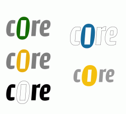
Kind of late to the game but my iPod's battery is dead so i though i might give it a try! Here are some quick mocks, I tried to keep it a bit abstract rather than relate it to an apple's core. Criticism and suggestions are welcome.
hsotnicaM said:Love the top left...and it's something different than everyone else is submitting...finally.
The bottom right, however, looks like a chemical company logo.
It's a copy of the gamecube logo.... that's the immediate thing that came to mind for me. Doesn't qualify I'd say.
- Status
- Not open for further replies.
Register on MacRumors! This sidebar will go away, and you'll see fewer ads.