Got a tip for us?
Let us know
Become a MacRumors Supporter for $50/year with no ads, ability to filter front page stories, and private forums.
Competion closed: Need a logo, best wins an ipod video!
- Thread starter AndyClarke
- Start date
- Sort by reaction score
You are using an out of date browser. It may not display this or other websites correctly.
You should upgrade or use an alternative browser.
You should upgrade or use an alternative browser.
- Status
- Not open for further replies.
It's a copy of the gamecube logo.... that's the immediate thing that came to mind for me. Doesn't qualify I'd say.
Now that you mention it, you are right... they share the same concept. However 'copy' is a dangerous word so be careful where you use it.
What do you imply, that i copied and pasted the gamecube's logo from Nintendos website?
 . 'Similar' and 'identical' are two vastly different things. But we are opening a big subject here which is not for this thread.
 Anyway thank you for your comment, i might do a few more if i find the time.
He was logged in only yesterday.
AndyClarke has since made some clarifications in the thread's first post. A date, this coming Sunday, is set in there.
Well I didn't check if he logged onto MR. Just noticed no feedback on this thread. Didn't see the Sunday thing, sorry.
I will upload our feedback on every single entry over the next 24HRS.
Wow every logo? Rather daunting. But kudos to you for doing it.
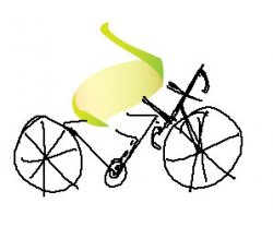
haiggy I like the concept (however very Gamecube-like). Question, why is a chunk out of the bottom 2 missing from the cube?
Now that you mention it, you are right... they share the same concept. However 'copy' is a dangerous word so be careful where you use it.
What do you imply, that i copied and pasted the gamecube's logo from Nintendos website?
Anyway thank you for your comment, i might do a few more if i find the time.
I don't think it is that similar actually. I have a Gamecube (meaning that I see the logo everyday) and the logo didn't remind me of it.
Question, why is a chunk out of the bottom 2 missing from the cube?
The top edge of the 'chunk' defines one edge of the cube, otherwise it would just be a hexagonal cell.

The top edge of the 'chunk' defines one edge of the cube, otherwise it would just be a hexagonal cell.
Looks more like a hexagonal cell to me than a cube actually on 2nd thought. I thought cube only because the ones above were cubes. It'd be interesting to to see what a focus group not exposed to the whole set would think.


I will upload our feedback on every single entry over the next 24HRS.
How's the feedback coming? It's been 24 hours, and I don't see any. I'm anxious to see which ones you liked the best.
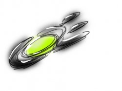

Just wanted to post an updated version of my logo, a more professional one. Hope it's not too late.

The 'O' has been rendered in SolidWorks this time, making it more realistic, and the color on the inside is darker (more green). The focus is more on "core" than on Apple this time. Hope you like it!
The 'O' has been rendered in SolidWorks this time, making it more realistic, and the color on the inside is darker (more green). The focus is more on "core" than on Apple this time. Hope you like it!
Just a reminder:
This thread and competition will be closed in less than 24 hours.
12 midnight BST, 7pm EDT
Thanks.
This thread and competition will be closed in less than 24 hours.
12 midnight BST, 7pm EDT
Thanks.
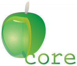
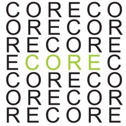
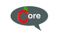
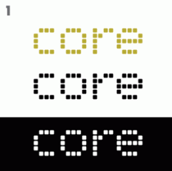
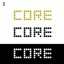
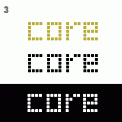
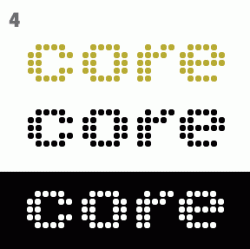
Here is my entry. I was trying to go for a clean, simple, bold logo that combined the imagery of "core" with a hinted apple motif. I think the logo communicates the store's name without being too literal or abstract.

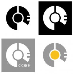
Condensed

Enhanced

[Updated] Silver

Hopefully that isn't too big. I didn't know what format the logo needed to be entered in so I attached both the full logo concept as well as a smaller version.
Of course the colors can be changed, the colors used here were just an idea. I kept the design simple, without extra added effects, to get across what I'm trying to communicate. At it's most basic level a logo should be easily identifiable, which is why in this variation I chose to leave out unnecessary effects. Like I said, all this can be changed later, when choosing a logo it's usually best to have a solid image or recognizable symbol that is identifiable by it's form and meaning rather than by extra effects. I added the enhanced version just to show what could be done with the concept.
Let me know if you have any questions,
Thanks!
Condensed
Enhanced
[Updated] Silver
Hopefully that isn't too big. I didn't know what format the logo needed to be entered in so I attached both the full logo concept as well as a smaller version.
Of course the colors can be changed, the colors used here were just an idea. I kept the design simple, without extra added effects, to get across what I'm trying to communicate. At it's most basic level a logo should be easily identifiable, which is why in this variation I chose to leave out unnecessary effects. Like I said, all this can be changed later, when choosing a logo it's usually best to have a solid image or recognizable symbol that is identifiable by it's form and meaning rather than by extra effects. I added the enhanced version just to show what could be done with the concept.
Let me know if you have any questions,
Thanks!


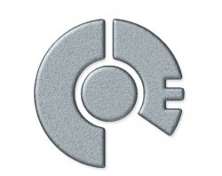
Here is my last attempt on the deadline day (today is the deadline right?)
Yep, about 10 hours or so to go, and then we can put this to bed.
- Status
- Not open for further replies.
Register on MacRumors! This sidebar will go away, and you'll see fewer ads.