Become a MacRumors Supporter for $50/year with no ads, ability to filter front page stories, and private forums.

Are you going to switch?

  • Yes

    Votes: 92 24.8%
  • No, staying with iPhone

    Votes: 175 47.2%
  • No, I'll go with another platform

    Votes: 3 0.8%
  • Considering it

    Votes: 101 27.2%

  • Total voters
    371

spinedoc77

macrumors G4
Jun 11, 2009
11,488
5,413
Maybe I have lower expectations than others but I'm not finding FaceID to be as lackluster as others here. Is it as fast as TouchID on the last 2 gen of iPhone? Nope. But it's not that much slower, not enough where I feel like I'm waiting. I usually swipe up before I even glance at the display so it's opened by the time I'm ready to use it. I've also had pretty good success with using it at angles off from center. I just tapped the screen to wake it while looking at it from probably 30-45 degrees below the display and it opened right up. I tried using it from either side and was successful from roughly the same angles. My Apple Watch is presently re-pairing to it and while it was mounting in a vertical style dock, I woke it in a very dark room from probably 2 feet back and maybe 15-20 degrees off to the right and it opened right up.

Having to swipe every time is admittedly a bit irritating but I have to do more than that (double tap screen or press side wake button, then swipe) to open my Pixel 2 XL every time I don't pick it up and reach around back for the fingerprint sensor while its on smart lock.

Again, these are just my very first impressions while going through the initial setup/updates. We'll see how I feel about it after some more extensive use. I'll check back in later with an update.

Yeah its not terrible, just annoying. Many times when I swipe up face ID is still working on it. I've found I can be 45 or so degrees off to the side and it works, so it works in my car cradle which is in the center of my dash. But anything past 30 degrees or so if the phone is flat in front of me doesn't work, which sucks because it pretty much lives on my desk all day.

I'm getting into the habit of just swiping up first, makes it seem quicker and helps with my muscle memory from using touch ID.
[doublepost=1509768340][/doublepost]
Some next to the Essential.
Not sure on my thoughts just yet.

Nf8f954.jpg


RufoExF.jpg


AXQxRjT.jpg


OEuAiIy.jpg


rUCwCbd.jpg

THIS is what the X should have been, reminds me I have to try and find a semi cheap Essential. Whatever happened to the fast updates though, no Oreo yet.
[doublepost=1509768770][/doublepost]
I'm a few hours in with the X, so here's a few observations:

  • Face ID works really well. The biggest drawback is if it's on a table and you want to glance at something requiring you to open your phone. However, I have encountered the exact same issue with my Pixel XL and Note 8, so that's not really a thing for me. Otherwise my fail rate with Face ID has been at or near zero. Also: the move is swipe up immediately once you raise to wake. It unlocks as your swiping up. It's like your phone isn't locked.
  • Gestures rock. I have no idea why any tech bloggers were suggesting app switching needed some getting used to. They're morons. The move isn't to move up and stop, it's move up midway and swipe right. Boom. Done. And flipping back and forth by swiping the indicator at the bottom is cool.
  • I. Do. Not. Notice. The. Notch. So I'm officially in the camp that it's not a thing. I've watched videos in full screen. It doesn't really register for me.
  • It *is* weird readjusting to a smaller phone after using the Note 8. The software does mostly profile as the smaller iPHone. That might actually be a thing for me, I don't know yet. Typing feels a little cramped, but again I'm so used to the king of the jungle of phones I want to give myself a bit before coming to a firm conclusion.
  • Animojis are cute and I'm already over them. I don't think they're going to be a big deal, but I do think they serve as a kind of proof of concept for developers to think about what they can do with the camera system.

That's about it for now. It's still an iPhone, still uses iOS 11. Downloaded 11.1, so we'll see if it's more stable than the initial release. No idea about battery. It seems worse than the Pixel XL, but I've been using it a ton so dunno yet.

wow, great tip on the app switcher, MUCH easier to swipe up and right. My only gripe is to force close an app you have to long press then slide up, just an extra step.

I notice the notch a LOT, mostly when in landscape mode. But having the sides colored in just looks terrible. I thought I could get used to it, but it's hard. It's really bad with apps where it blocks your view such as safari.
[doublepost=1509769263][/doublepost]
iOS is too confining for the type of screen they're going for. If an app isn't optimized for the ratio, you're stuck with a box. Case in point: Amazon Prime Video isn't optimized. So it runs in both letter and Piller box. Thus there is zero advantage to the screen size. And I can't stand the regular iPhone size software.

SO...not for me. Maybe next year when they produce a plus size. Pixel XL 2 wins my daily driver sweepstakes.

Which pretty much means most non apple apps. I've only found a few that work, and the devs mostly just stretched up the titlebar into the notch area so they are still iPhone 8 sized apps. I have a feeling that laziness will be pervasive in the dev community. Google doesn't have squat optimized for the X, but I guess that doesn't surprise me. Microsoft optimized their apps though, so they look a bit better.
 

Radon87000

macrumors 604
Nov 29, 2013
7,777
6,255
I'm a few hours in with the X, so here's a few observations:

  • Face ID works really well. The biggest drawback is if it's on a table and you want to glance at something requiring you to open your phone. However, I have encountered the exact same issue with my Pixel XL and Note 8, so that's not really a thing for me. Otherwise my fail rate with Face ID has been at or near zero. Also: the move is swipe up immediately once you raise to wake. It unlocks as your swiping up. It's like your phone isn't locked.
  • Gestures rock. I have no idea why any tech bloggers were suggesting app switching needed some getting used to. They're morons. The move isn't to move up and stop, it's move up midway and swipe right. Boom. Done. And flipping back and forth by swiping the indicator at the bottom is cool.
  • I. Do. Not. Notice. The. Notch. So I'm officially in the camp that it's not a thing. I've watched videos in full screen. It doesn't really register for me.
  • It *is* weird readjusting to a smaller phone after using the Note 8. The software does mostly profile as the smaller iPHone. That might actually be a thing for me, I don't know yet. Typing feels a little cramped, but again I'm so used to the king of the jungle of phones I want to give myself a bit before coming to a firm conclusion.
  • Animojis are cute and I'm already over them. I don't think they're going to be a big deal, but I do think they serve as a kind of proof of concept for developers to think about what they can do with the camera system.

That's about it for now. It's still an iPhone, still uses iOS 11. Downloaded 11.1, so we'll see if it's more stable than the initial release. No idea about battery. It seems worse than the Pixel XL, but I've been using it a ton so dunno yet.
Compared to the iPhone 8 how much better was the display? Is it just a slightly more saturated iPhone 8?
 

epicrayban

macrumors 604
Nov 7, 2014
6,517
5,353
I notice the notch a LOT, mostly when in landscape mode. But having the sides colored in just looks terrible. I thought I could get used to it, but it's hard. It's really bad with apps where it blocks your view such as safari.

I’m not fond of the thick-ish borders around the iPhone either, but it’s not bad. The notch though is definitely not something you can ignore. You only can get used to it.
 
  • Like
Reactions: jamezr

mellofello

macrumors 65816
Feb 1, 2011
1,258
556
I got in my x today. I really wanted to love it. It would make my life much easier moving to iOS for compatibility with work stuff. However it is going right back.

How did no one mention how tiny it is? Coming from a note 8 this is ridiculously small. I need a IPhone X+. If it had the s8+ 6.2 inch screen with this form factor I would be in heaven. My work leads me to reviewing technical documents on my phone in the field. This size won’t do for me.

I was pumped, and after playing with it I am totally blasé. Perhaps I am just used to the Samsung colors, but I really don’t care for the temperature of the display. Far too warm IMO.

Also so far very unimpressed with the lowlight photos. Tons of grain, and bad handling of available light.

This isn’t a $1000 phone IMO
 
  • Like
Reactions: Demo Kit and jamezr

widgeteer

Suspended
Jun 12, 2016
1,565
4,610
Compared to the iPhone 8 how much better was the display? Is it just a slightly more saturated iPhone 8?

Slightly more saturated. Nothing Earth shaking. Perhaps I'm the wrong guy to ask though cause I always liked Apple's LCD's. Plus, if you use Tru Tone it narrows the gap that much more.
[doublepost=1509788896][/doublepost]
I got in my x today. I really wanted to love it. It would make my life much easier moving to iOS for compatibility with work stuff. However it is going right back.

How did no one mention how tiny it is? Coming from a note 8 this is ridiculously small. I need a IPhone X+. If it had the s8+ 6.2 inch screen with this form factor I would be in heaven. My work leads me to reviewing technical documents on my phone in the field. This size won’t do for me.

I was pumped, and after playing with it I am totally blasé. Perhaps I am just used to the Samsung colors, but I really don’t care for the temperature of the display. Far too warm IMO.

Also so far very unimpressed with the lowlight photos. Tons of grain, and bad handling of available light.

This isn’t a $1000 phone IMO

Hahaha totally get this. I've been using a Note 8 for two months now and it felt like I was going to a Palm Pre. I think I could have gotten used to it all things being equal.
[doublepost=1509789568][/doublepost]BTW, this is odd but true for me: this is a physically unpleasant phone to hold. You can feel the ridges of the steel band, and the camera lens bump is a little ridiculous.
 
  • Like
Reactions: jamezr

Aneres11

macrumors 601
Oct 2, 2011
4,353
9,551
BTW, this is odd but true for me: this is a physically unpleasant phone to hold. You can feel the ridges of the steel band, and the camera lens bump is a little ridiculous.

I don't agree with this, personally.
Sure, the camera bump is ugly as sin, and I hate the new layout of it - preferred the way they did it with 7/8 Plus. But it's a lovely phone to hold in the hand. For me anyway.

Compared to the Essential, it's much easier due to the rounded corners ad curved sides. I'm finding it very pleasing to use currently.
 
  • Like
Reactions: jamezr

The Game 161

macrumors Nehalem
Dec 15, 2010
30,987
20,171
UK
Photos are stunning on the x like with most flagships these days

Would I buy the bigger version? Yes I would but for now the size is fine

Face ID is great and I don’t miss Touch ID at all

If I wanted to do things that require a bigger device? That’s what my MacBook Pro and iPad Pro is for
 

Radon87000

macrumors 604
Nov 29, 2013
7,777
6,255
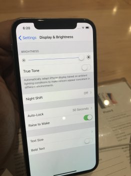
Went to take a look at the X at the store. Screen looked exactly like my 7 Plus except with True Tone. Didn’t really notice a difference. Max brightness also looked same. I thought I had mentally prepared myself for the smaller screen but in hand it felt way too small. Really don’t think it’s worth the almost 1k Plus price Apple is charging.

Oh and that off axis blue tint which people were scorning the Pixel for is there on the X just less severe. A small shift and it kicks in. I could tolerate it for $950 but at $1200 I shouldn’t.

I attached a pic of the tint.
 

Attachments

  • 0328015A-D80D-4B8D-900F-28825E166EC4.jpeg
    0328015A-D80D-4B8D-900F-28825E166EC4.jpeg
    1.5 MB · Views: 160

epicrayban

macrumors 604
Nov 7, 2014
6,517
5,353
The Verge’s final review calls out Apple on iOS and how it’s really time to give us default apps, more dynamic home screen, better notifications, and more. He also says he leans toward the Pixel 2 camera a little more than the X.

I agree. Apple has caught up on hardware, now it’s time for iOS to grow up, too. That’s the next step.

Despite the notch, the iPhone screen experience is a real joy. Even just a day or so with it has already improved the entire iPhone experience for me.

Best iPhone indeed.

 
  • Like
Reactions: jamezr

widgeteer

Suspended
Jun 12, 2016
1,565
4,610
Went to take a look at the X at the store. Screen looked exactly like my 7 Plus except with True Tone. Didn’t really notice a difference. Max brightness also looked same. I thought I had mentally prepared myself for the smaller screen but in hand it felt way too small. Really don’t think it’s worth the almost 1k Plus price Apple is charging.

Oh and that off axis blue tint which people were scorning the Pixel for is there on the X just less severe. A small shift and it kicks in. I could tolerate it for $950 but at $1200 I shouldn’t.

I attached a pic of the tint.

The off axis blue tint on my X is about the same as my Note 8. Which is to say there but not really a big deal.
 

epicrayban

macrumors 604
Nov 7, 2014
6,517
5,353
BTW, this is odd but true for me: this is a physically unpleasant phone to hold. You can feel the ridges of the steel band, and the camera lens bump is a little ridiculous.


Yes, if you feel and look closely, there is a break in the design when the frame meets the back glass panel. It's surprisingly rough there. It's not as sleek and smooth as the s8 that feels entirely seamless.

And agree with you about the camera bump. It's ugly and it's rather large. There is some serious wobbling when you set the device down flat. Again, not true with the s8.

The s8 is simply a better and more balanced design.
 
  • Like
Reactions: koigirl

widgeteer

Suspended
Jun 12, 2016
1,565
4,610
After 48 hours with the X, it is absolutely not going to work for me. There is a lot to recommend the device but for me too many design choices that are obnoxious. The indicator bar at the bottom is atrocious, in example. Sometimes it sticks out during videos if the app isn’t optimized. The notch doesn’t bother me. Inconsistent behavior from apps reacting to the notch bothers me. As a user, I have no idea how or why certain video apps respond in different ways to the screen. It’s a mess.

I’m hoping in a year Apple releases a Plus version and has these issues worked out. I do like Face ID a lot. I love app switching.
 
  • Like
Reactions: epicrayban

AustinIllini

macrumors G5
Oct 20, 2011
12,699
10,567
Austin, TX
After 48 hours with the X, it is absolutely not going to work for me. There is a lot to recommend the device but for me too many design choices that are obnoxious. The indicator bar at the bottom is atrocious, in example. Sometimes it sticks out during videos if the app isn’t optimized. The notch doesn’t bother me. Inconsistent behavior from apps reacting to the notch bothers me. As a user, I have no idea how or why certain video apps respond in different ways to the screen. It’s a mess.

I’m hoping in a year Apple releases a Plus version and has these issues worked out. I do like Face ID a lot. I love app switching.
It's a shame (although not incredibly surprising) that so many of the issues people have with the iPhone X revolve around software. Apple could have addressed that in numerous ways and appears to have chosen not to do anything about it.
 

widgeteer

Suspended
Jun 12, 2016
1,565
4,610
It's a shame (although not incredibly surprising) that so many of the issues people have with the iPhone X revolve around software. Apple could have addressed that in numerous ways and appears to have chosen not to do anything about it.

That’s the sense I got too. I just have too many, better, options than to put up with it hoping for an update.
 

mikef07

Suspended
Aug 8, 2007
305
273
It's a shame (although not incredibly surprising) that so many of the issues people have with the iPhone X revolve around software. Apple could have addressed that in numerous ways and appears to have chosen not to do anything about it.

Not one software issue for me at all. Exponentially better than the S7 Edge so far.
 

widgeteer

Suspended
Jun 12, 2016
1,565
4,610
It's saying a lot that the best looking piece of Apple software remains macOS, which as been based on the same design for about 17 years.

The more I've thought about it, the more the notch annoys me. Not from a visual standpoint, the idea behind it. It is there solely so people know you're using an iPhone. It serves no purpose to the user whatsoever. Which means the company put marketing ahead of its own customers.
 

Zaft

macrumors 601
Jun 16, 2009
4,570
4,049
Brooklyn, NY
It's a shame (although not incredibly surprising) that so many of the issues people have with the iPhone X revolve around software. Apple could have addressed that in numerous ways and appears to have chosen not to do anything about it.
You can’t force developers to optimize their apps right away. Same issue when the iPhone 5 came out with a different aspect ratio.

That being said, my X comes tomorrow. I’ll see if the screen is big enough for me since I have the 7 Pus. I have a feeling I will wait for the Plus version next year.
 

Puddled

macrumors 6502a
Jun 9, 2017
548
602
The more I've thought about it, the more the notch annoys me. Not from a visual standpoint, the idea behind it. It is there solely so people know you're using an iPhone. It serves no purpose to the user whatsoever. Which means the company put marketing ahead of its own customers.
Which is why the likes of Chris Pirillo are so upset over it.

And rightly so
 

convergent

macrumors 68040
May 6, 2008
3,034
3,083
It's a shame (although not incredibly surprising) that so many of the issues people have with the iPhone X revolve around software. Apple could have addressed that in numerous ways and appears to have chosen not to do anything about it.
So basically, you can tell this was intended to be next year's phone and they rushed it ahead because they realized that many were not going to be happy with the 6sss. Makes perfect sense.
 

widgeteer

Suspended
Jun 12, 2016
1,565
4,610
Which is why the likes of Chris Pirillo are so upset over it.

And rightly so

I like Pirillo's insights. Often agree with him. But dear God is his delivery obnoxious.

I'm not upset over it. It's a shame. There's so much right and heading in the right direction with the X. But Apple software is so disjointed now. Gestures are brilliant. Face ID is going to be industry standard in another generation or two. But the execution and design on virtually everything else is a disaster.
 

convergent

macrumors 68040
May 6, 2008
3,034
3,083
Apple admitted it was supposed to be next year. Competition pushed them.
And it shows in all these unpolished software things. If they had to rush this to not quite catch up to the competition (no plus size), and they had gone since the 6 without a design change, what does that say for the pace of Apple's development? They continue to have big gaps in their lines vs the competition. I would guess the X will be a 4-5year design... and it's just catching up.
 
Register on MacRumors! This sidebar will go away, and you'll see fewer ads.