Become a MacRumors Supporter for $50/year with no ads, ability to filter front page stories, and private forums.
Here's a test.

Find someone new to OS X and tell them to: 1) Change the Finder view from list to icons 2) Create a new tab in Safari. No prizes for guessing which of the above two screenshots makes that easiest do to.
 
Those screenshots really show how much wasted space there is in Big Sur.


As predicted I'm actually growing to not mind the overall design aesthetic; in a month I think I won't notice it all. But I'm never going to not notice the massive head on Safari/Finder/Activity Monitor. It's ugly and pointless. Stands out as much as the iMac's chin does in 2020.
 
@JonBOY26 , I think your screenshot sums up the two major problems with Big Sur regardless of whether you like the design 1) Loss of information density - you simply can't fit the same amount of things on the screen as before 2) Smaller font size even where it doesn't need to be

Some might argue this same debate happens with every new Mac OS version, but I simply don't remember the same problems with Catalina vs Mojave, Mojave vs High Sierra etc.

I agree. In fact I'll go as far as to say that this is the worst MacOS "upgrade" I have ever undergone.

bsbar.jpg


finder.jpg


bstools.jpg


In Finder, my window header is even taller than yours because I have a tab bar. How did you get rid of that?
 
I made no mention of my personal health, but since you're so interested in it, I have this really nasty hemorrhoid I need you to pop for me.
You said you could not make out the buttons / text , yet in the screenshots you posted they look perfectly fine and quite legible.
 
First impressions so far (from a mid-2014 13" MBP that didn't get bricked :D) :

- love the white ! For me middle grey UI elements have always looked like an heritage of the 90s. The combination of white everywhere and increased spacing visually de-clutter the UI for me and makes everything more legible. That being said there are plenty of areas where it seems that the UI team didn't seem quite sure which way to go and reverted to light grey gradients to provide UI separation (example : preference panes various "areas") instead of sticking to being unapologetically white and thoroughly change the UI to conform to that principle. Besides there are still way too many legacy design aspects IMO (again, for example the sharing preferences pane, which looks completely off next to the control centre preferences pane).
- I really like the new menu bar control centre menus overall. As an example they provide a faster access to controlling my AirPods. But there are also plenty of small niggles to work out.
- I love Apple's newer B&W menu icons language, but some can sometimes be confused between each others.
- I'm one of those who would have much, much preferred if Apple simply had copy / pasted iOS icons instead of redesigning ones with very questionable embossing. Frankly I find the coloured apps and preferences panes icons over-thought and over-designed compared to the rest of the UI.
- Maybe stable, but very buggy. There are plenty of small UI bugs everywhere (such as the improperly centered accentuation box below). The worst bug for me so far is that my AirPods Pro just won't ever auto-switch from my iPhone to my Mac (but is that because it's an older model ?) and when selecting them manually, only the audio output gets switched (I have to manually switch the input as well).

Let's just say that I think that Apple's teams will be busy in the next few months to address these bugs and continue to coalesce the leftover UI elements towards this new language.

View attachment 1668289
Glad you like the new interface, so do i! But it is weird that I don't have that UI bug you showed.

Screen Shot 2020-11-16 at 1.30.18 PM.png
 
You said you could not make out the buttons / text , yet in the screenshots you posted they look perfectly fine and quite legible.

Obviously, the buttons / text are discernable - any of us can make them out. I think the point was that the contrast is far poorer than in Catalina, which seems to be a regression in terms of ease of use.
 
You said you could not make out the buttons / text , yet in the screenshots you posted they look perfectly fine and quite legible.

Well I disagree. I think that it's really far from "perfectly fine" and clearly I'm not the only one who thinks it looks washed out. I'm happy for your xray vision.

I suggest you state your opinions without being a complete douche by making health judgments on people. You're not my doctor.
 
  • Like
Reactions: w1z
Light mode


Catalina

maillightcat.png


BS


maillightbs.png


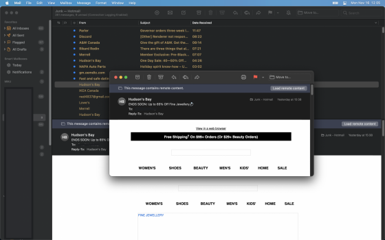
By the way the message titles are light yellow because it's the junkmail folder. Normal mail is dark grey (but not black) on white so it's fine.
 

Attachments

  • maildarkbs.png
    maildarkbs.png
    1 MB · Views: 94
  • Like
Reactions: Michaelgtrusa
I think I just discovered a bug as I was editing those images. Look how garbled the graphics are.

(screenshot of editing a screenshot in Preview)

Screen Shot 2020-11-16 at 12.20.24.png
 
Thanks for that, it is very helpful.

When you customise the toolbar in mail, is there an option to have text and icon like in Catalina, or is it icon only.
 
Yup. Image rendering gets garbled when I click the "Show Markup Toolbar" button in Preview

Screen Shot 2020-11-16 at 12.47.07.png


Screen Shot 2020-11-16 at 12.58.42.png
 
Last edited:
As I have said - I'm sure I'll get more used to it but somehow creating something that seems to many to be harder to see details is a step in the wrong direction. Also, there are things such as some of the mail options that came from IOS where IOS could have used some from MacOS

At least no one can say there are no changes in this OS.

I have found several apps that work more slowly or took several tries to get to work. For instance Malwarebytes - first time I ran I got error has occurred - try restarting or uninstall and re-install. So I ended up uninstalling and reinstalling - first run did basically nothing 10 minutes 1 file. Second run did the files but never ended. The third run and from then on it seems to work fine. May have something to do with some new security but strange.
 
Register on MacRumors! This sidebar will go away, and you'll see fewer ads.