Become a MacRumors Supporter for $50/year with no ads, ability to filter front page stories, and private forums.
I'm using it for an hour or two now and I'm not impressed with performance on 2019 16" MacBook Pro with 5300M. A lot of system animations that were smooth, no longer are. For example: quick look (space on document) and genie effect are slide shows. System monitor tab switching takes longer, Safari tab switching takes longer. Not much, but perceptible. In general system seems sluggish compared to Catalina.

Usability was hit as well. Spotlight lost right-pane document preview which honestly sucks big time. I relied on it A LOT. Tabbed views (about this Mac, system monitor) are less legible because active tab is just a tiniest touch darker than the rest - it could really use accent color. Is it really still Aqua? I also don't like how condensed top bar is in apps like System Monitor or Mail, for the sake of what? Left-hand scroll bars stretching to the top?

It's Yosemite all over again. Unpolished UI, bad performance. Next release will improve it hopefully.
 
First impression is good. I like the UI quite a lot! Finally got around to deleting those last 32bit applications, as I upgraded from Mojave.

Second impression is that it runs well on my '16 Macbook. It is still indexing Spotlight, so that does take some CPU power away, which is severely lacking on this machine.

Other caveats:
It lacks contrast for text. I keep thinking Safari is in the background, with the grey text on a grey background.
Not too fond of the new delete file sound. Sounds like a ball of wet paper being thrown at a wall.
Some text is too small.

Is it normal that the menu bar is still white in dark mode?
Funny, mine is stuck with a black menu bar in light mode!

Why the fudge is this even up there in the first place???? See attached image.

I know what it is. But why is it there??
It is normal for Apple to activate new features, so people know they are there. Just like adding new apps to the Dock. Takes a second to remove, but now I know it is there.
I'm using it for an hour or two now and I'm not impressed with performance on 2019 16" MacBook Pro with 5300M.
Make sure it isn't still indexing Spotlight, or doing something in the background. Let it run for a few hours, then restart it.
 
  • Like
Reactions: decypher44
Ugly interface.

Too much white-on-white.

Too much white space. Illegible text. Too much space between menu items.

Mac Mail looks clunky, hard to find options like 'sort by date'.

Again, too much white space, and light grey on even lighter grey.

And no options to revet back to a more legible interface. Bad for productivity.
Agree on all counts.
 
  • Like
Reactions: AAPLGeek
Continued.. Wow! :oops: Mail notifications lost instant delete button. Now you have to click 'Actions' and then 'Delete'. Usability is getting better and better. I used it a lot, another great addition.

EDIT: Good news is, Mail no longer seems to open by itself. However I'd give it yet more time.
 
two other points:

1. I don't have individual volume controls for my speakers inside iTunes/Music.app any more. I generally use the app to control what's playing from my HomePod, which also AirPlays to different speakers around the house. I used to be able to control the volume of each speaker from inside the app; now I just have one overall volume control. This is silly.

2. Bookmark folders in Safari now just show as folders on the homepage, so I can't see what's in them at a glance. They used to show the same way that folders in iOS do, so you can see the mini favicons for each one. This means I have to look each time at the name of the folder and try to remember how I've sorted them to access the bookmark I want.
 
I'm using it for an hour or two now and I'm not impressed with performance on 2019 16" MacBook Pro with 5300M. A lot of system animations that were smooth, no longer are. For example: quick look (space on document) and genie effect are slide shows. System monitor tab switching takes longer, Safari tab switching takes longer. Not much, but perceptible. In general system seems sluggish compared to Catalina.

Usability was hit as well. Spotlight lost right-pane document preview which honestly sucks big time. I relied on it A LOT. Tabbed views (about this Mac, system monitor) are less legible because active tab is just a tiniest touch darker than the rest - it could really use accent color. Is it really still Aqua? I also don't like how condensed top bar is in apps like System Monitor or Mail, for the sake of what? Left-hand scroll bars stretching to the top?

It's Yosemite all over again. Unpolished UI, bad performance. Next release will improve it hopefully.

Same, just tried the quick look looks like it‘s lagging poorly. And the new UI, who designed this??
 
I didn't have any problems with Catalina so I don't see anything much different.
I have a problem with the look of it and it's ongoing with the Apple look over a while both on IOS and MacOS
As they simplify things, strip them out and make everything more pastel, those of use getting older increasingly have problems with their diminishing button sizes.
Tiny little xs slashes or dots that melt into the background and are almost invisible.
Yes, you can use accessibility to increase contrast and it helps but it also makes a lot of colours really garish and ugly.
Yes, you can scale the display but isn't it sad that the only way you can increase the size of a bit of text is to abandon your retina display resolution (and cause yourself problems at the same time because it actually has to redraw everything constantly when you rescale so uses graphics processing power). All that money on a display quality you don't use then.
What would be great would be something really innovative like the ability to change the size of all the text and icons on headers, menus etc. individually, you know like we could do in WinXP 20 years ago.
I also think they've changed something in Dark mode because some text seems to be almost invisible and I swear it was possible to customise it before and that's gone.
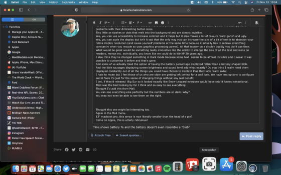
And some of us actually liked the option of having the battery percentage displayed rather than a battery shaped blob.
And the little sausages displaying screen brightness and sound level add what exactly? Do you think I really need them displayed constantly out of all the things you could have chosen to display? Plus they look really awful.
I hate to moan but I feel those of us who are older are getting left behind for a cool look. We have less options to configure and it feels it's just for the sense of changing things without any real benefit.
I bet, if they'd released Big Sur so it looked exactly like Snow Leopard everyone would have said it looked sensational.
That was the best looking by far I think and so easy to see everything.
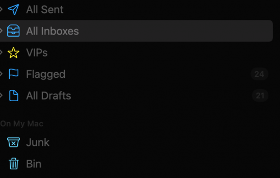
Thought I'd add this from Mail.
You can see everything else perfectly but the numbers are so dark. Why?
You may not even be able to see them on the right.


Thought this one might be interesting too.
Again in the Mail menu.
13" macbook pro, this arrow is now literally smaller than the head of a pin?
Come on Apple, this is utterly ridiculous!
 

Attachments

  • IMG_5033.jpeg
    IMG_5033.jpeg
    77.2 KB · Views: 113
  • Screenshot 1.png
    Screenshot 1.png
    43.8 KB · Views: 122
Last edited:
  • Like
Reactions: cfdlab
Ui needs some adjustments. We need more options to move and adjust elements not less. I'm not crazy about sidebar widgets and control center seems redundant unless it was made for a tablet. ;)
Music apple is a battery hog. Didn't notice it using so much on Catalina.
 
I'm using it for an hour or two now and I'm not impressed with performance on 2019 16" MacBook Pro with 5300M. A lot of system animations that were smooth, no longer are. For example: quick look (space on document) and genie effect are slide shows. System monitor tab switching takes longer, Safari tab switching takes longer. Not much, but perceptible. In general system seems sluggish compared to Catalina.

Usability was hit as well. Spotlight lost right-pane document preview which honestly sucks big time. I relied on it A LOT. Tabbed views (about this Mac, system monitor) are less legible because active tab is just a tiniest touch darker than the rest - it could really use accent color. Is it really still Aqua? I also don't like how condensed top bar is in apps like System Monitor or Mail, for the sake of what? Left-hand scroll bars stretching to the top?

It's Yosemite all over again. Unpolished UI, bad performance. Next release will improve it hopefully.

you can’t lose performance as described with one OS update. The benchmarks for every bit of hardware are identical in Big Sur compared to Catalina.

If there’s something bringing down your performance then it’s your system indexing and temp folders full of junk that needs to be cleaned up.

Steps:

1 If your system is indexing let it finish

2 When it is finished delete all the legacy stuff Catalina created in the following folders:

User/Library/Caches
User/Library/Application Saved State

3 Clear all the logs in the Console app

4 Reset the PRAM and NVRAM

5 Ensure all your apps are updated to latest versions, especially if they are updated for Big Sur. if you’re using some age old software that hasn’t been updated then nobody can help that.
It's not indexing anymore. I might try all those steps later but right now I have to get back to work. I am sceptical though clearing caches will help with quick look. With small files it's still fast. However try using it with let's say a photo and it is slide show. It's nuisance, but in Catalina it was buttery smooth.
 
  • Like
Reactions: decypher44
Surprised people are shocked by the UI. Is it much different than the hundreds of screenshots which have been visible for months ?

It's kinda hard to tell how something actually looks until you see it in action and in motion. I thought it looked pretty in screenshots; in "the flesh" I think it looks a bit cheap. It will probably grow on me in time but all this blank space and light grey-on-white feels a bit FisherPriceOS.
 
Reading through these comments I'm amazed that so many people are installing it despite the known Uglyness!

Catalina is a perfectly balanced User Interface for those of us doing serious work, and so far I can't spot any features that Big Sur has that most people would urgently need to use.

Interested to know people's motivation for installing it, besides having 'latest and greatest'?
 
Will probably forget in a week how bad it looks, but yes. It IS ugly. I hate the transparent menu bar. I was already used to the dark version. In clocks widget I select my city but in only shows Cupertino. 🤔

System preferences - Accessibility - Display - Reduce transparency
 
Reading through these comments I'm amazed that so many people are installing it despite the known Uglyness!

Catalina is a perfectly balanced User Interface for those of us doing serious work, and so far I can't spot any features that Big Sur has that most people would urgently need to use.

Interested to know people's motivation for installing it, besides having 'latest and greatest'?
But you seem to be deciding for everyone else what they should and shouldn't like. I have NO problems with the new look. Then again, I had no problems when Apple switched to their flat look with Yosemite. I do like the new layout such as clicking on the date and time on the menu bar and bringing up the widgets slide over window. Safari has some nice and improved privacy features and the translate feature is beyond welcomed. It's nice going to a website in a different language and having Safari translate the words for you.

This is all pretty much rinse and repeat. This version of macOS xx.xx is the worst and buggiest followed by singing its praises a year later when we get the next edition. So you may not like the look but I can guarantee there are many who do, I know I do.
 
Last edited:
Well its going to come down to, how long can people stay on Mojave or go to Big Sur!
 
I didn't have any problems with Catalina so I don't see anything much different.
I have a problem with the look of it and it's ongoing with the Apple look over a while both on IOS and MacOS
As they simplify things, strip them out and make everything more pastel, those of use getting older increasingly have problems with their diminishing button sizes.
Tiny little xs slashes or dots that melt into the background and are almost invisible.
Yes, you can use accessibility to increase contrast and it helps but it also makes a lot of colours really garish and ugly.
Yes, you can scale the display but isn't it sad that the only way you can increase the size of a bit of text is to abandon your retina display resolution (and cause yourself problems at the same time because it actually has to redraw everything constantly when you rescale so uses graphics processing power). All that money on a display quality you don't use then.
What would be great would be something really innovative like the ability to change the size of all the text and icons on headers, menus etc. individually, you know like we could do in WinXP 20 years ago.
I also think they've changed something in Dark mode because some text seems to be almost invisible and I swear it was possible to customise it before and that's gone.
And some of us actually liked the option of having the battery percentage displayed rather than a battery shaped blob.
And the little sausages displaying screen brightness and sound level add what exactly? Do you think I really need them displayed constantly out of all the things you could have chosen to display? Plus they look really awful.
I hate to moan but I feel those of us who are older are getting left behind for a cool look. We have less options to configure and it feels it's just for the sense of changing things without any real benefit.
I bet, if they'd released Big Sur so it looked exactly like Snow Leopard everyone would have said it looked sensational.
That was the best looking by far I think and so easy to see everything.
Thought I'd add this from Mail.
You can see everything else perfectly but the numbers are so dark. Why?
You may not even be able to see them on the right.


Thought this one might be interesting too.
Again in the Mail menu.
13" macbook pro, this arrow is now literally smaller than the head of a pin?
Come on Apple, this is utterly ridiculous!
mine shows battery % and the battery doesn't even resemble a "blob"
 

Attachments

  • Screen Shot 2020-11-13 at 10.54.52.png
    Screen Shot 2020-11-13 at 10.54.52.png
    1.3 MB · Views: 119
Performance and speed are way down on lower powered/older devices. On my high end MacBook Pro I don't notice any issues but on both my MacBook airs 2018 and 2013 they took a noticeable hit. I left them powered on all last night to index and "finish" but they are still noticeable slower today.
 
Register on MacRumors! This sidebar will go away, and you'll see fewer ads.