Become a MacRumors Supporter for $50/year with no ads, ability to filter front page stories, and private forums.
Despite it being an absolute pain in the backside to get installed, now it is up and running, I really like it. It's a cleaner look, the new menu bar/control centre and widgets features feel more natural to use (as a heavy user of iOS).

No noticeable bugs for me, but I'm going to spend the day playing around with my MBA, will see if anything comes up.
 
  • Like
Reactions: pshufd
I’m not seeing any performance loss and every benchmark for every hardware component and app are the same as Catalina.

I see this often, do clean installs and maintain a clean system and clean disk. I am aware most people don’t know how to do this, but they just need to ask.
I do a clean install with every new major version of macOS. I still have worse performance than with Catalina.
 
  • Like
Reactions: INoctilux
After sleep, video may just instantly skip to the end. Solution: kill coreaudid.

It is absolutely amazing how they can REINTRODUCE old bugs…
 
I don't mind the new look, I think it'll take some getting used to but I can appreciate what they were going for ...EXCEPT for the new app icons. I really hate them, they're very unprofessional for such a major OS.

Yes it's very cute-sy just like all the other iOS style cartoon icons. I guess they're trying to appeal their products towards children.

big turd.jpg


I love the aesthetics but it does not feel very fluid. I am on a 2020 MBA intel

Well of course it doesn't, they want you to buy the new M1 MBA for that.
 
This morning the in place upgrade went smoothly (I joined macos ecosystem at high sierra, since then I always upgraded, and one time transfered from mb 15 to mb 16. This experience is surreal compared to windows word.)

Big sur seems faster than Cataline, and I didn't experience any temporary slows done for house keeping etc.
I like it, but the UI...

...is not perfect.
For me it is too bright, everything rounded just silly. (I found a dialog in preferences with two adjacent touching buttons with rounded corners...)
The transparent menu is bad idea. I have multiple desktops with different background, so in one desktop I have white text in menu, on another one black text, this just hurts the eye. I know it can be "disabled" in accesibility, but this should be a separate option just for the menu.
The toolbars are too large, the right aligned toolbar in finder is stupid. And the toolbars are not unified for apps. For example: finder/safari has new style toolbar, but preview/text editor has old style toolbar, strange.

First bug I found: cannot change weather location on the widget.
 
To be honest looks aren't that big of a deal. I'm rolling back to Catalina when I find spare time because I just can't work with crippled Spotlight (without right pane preview). Could I get Alfred? Yes. However I don't feel I should need to, especially since such feature was present for a long, long time. Couple more releases and we're going to need replacement for every system tool.
 
Having used Big Sur for a day or two - I find the new interface looks 'ok' on a 13" laptop screen, but is awful on a big external monitor.

It's as if they didn't bother testing it on this scenario.

The chunky tool bars / white space / gaps between icons are such a waste of space. And Finder feels a bit janky / like it's somehow off or been rebuilt by a different team of developers and doesn't feel right.

A strange release, really. It feels like a pirated knock off of macOS.
this is horrifying...............

do you think theres going to be enough complaints to steer apple back on course? ive rolled with the punches over many years with apple and always get used to what they're throwing down, but this is the first time ive ever not upgraded... how you described it as a pirated knock off is a perfect explanation. It looks like (from screenshots anyway) we all got jail-broken devices and are installing OSX themes from cydia on it.

I'm using it on 25 and 27 inch monitors and it looks fine. I haven't tried it on a laptop yet.
 
Performance wise seems good on my '18 Mini and '17 Air. The interface is OK nothing too shocking. Hate to say it but here in my office I will still choose my Win 10 box for productivity.
 
I'm a fan of Big Sur. I'm using it on a 2015 MacBook Pro and everything is as fast / faster than Catalina (other than panning around in the new maps app which seems a little jerky).

I am really enjoying the new look, it feels a lot cleaner and more modern compared to Catalina.
 
I’m on Mojave on iMac. Catalina on 16 mbp. And soon to be Big Sur on m1 mini.

No desire to upgrade iMac. Will update rest.
 
My first impression is that it's snappier. And Parallels Desktop 16 is way faster: they might have completely rewritten how graphics are rendered, and it's the major improvement for me.

Still no working Voice Control/custom vocabulary for other languages than the US, British and Indian English, but I expected that, so no surprises. A short test also showed that even in US English the Voice Control is worse than Siri (the Keyboard Dictation). And none of them compares to Dragon.

The UI feels unpolished. Some examples: uneven distances between the menulets, misleading greyed out shortcuts in the menu, floating dock, it's now impossible to change the volume with the mouse wheel, some fonts are too small, etc. Not critical.

The iMac is still straining for the eyes, but differently than before. I'll have to spend more time working to see how it is in the long run.
 
After day and 1/2 - runs fine, speed seems fine, haven't found any apps that don't work yet. However, I see no really benefit to the design changes. Some of the apps that I run look really strange now. Some of the changes I don't understand for instance: I do screen mirroring to my TV. So I go into new "control panel and select and then the device - works fine. However, when I want to stop mirroring it used to be right on the control to stop - now I found I have to select screen mirroring again and then select the device from next screen and then I can select stop - so extra steps and a bit hidden. Also, as I mentioned on another thread the mail app when you select mailboxes you have all the inboxes, all sent, all drafts but no longer all trash - why.
So it is OK but some things I think strange - time will tell
 
  • Like
Reactions: jackoverfull
After day and 1/2 - runs fine, speed seems fine, haven't found any apps that don't work yet. However, I see no really benefit to the design changes. Some of the apps that I run look really strange now. Some of the changes I don't understand for instance: I do screen mirroring to my TV. So I go into new "control panel and select and then the device - works fine. However, when I want to stop mirroring it used to be right on the control to stop - now I found I have to select screen mirroring again and then select the device from next screen and then I can select stop - so extra steps and a bit hidden. Also, as I mentioned on another thread the mail app when you select mailboxes you have all the inboxes, all sent, all drafts but no longer all trash - why.
So it is OK but some things I think strange - time will tell
Hover your mouse up by the favorites line, click in the + sign in the circle, will give you the option to add mailboxes.
 
Love it, but my biggest gripe is it's incompatible with my Late 2013 iMac, so I'll never be able to install it lol
 
  • Sad
Reactions: joelovesapple
After day and 1/2 - runs fine, speed seems fine, haven't found any apps that don't work yet. However, I see no really benefit to the design changes. Some of the apps that I run look really strange now. Some of the changes I don't understand for instance: I do screen mirroring to my TV. So I go into new "control panel and select and then the device - works fine. However, when I want to stop mirroring it used to be right on the control to stop - now I found I have to select screen mirroring again and then select the device from next screen and then I can select stop - so extra steps and a bit hidden. Also, as I mentioned on another thread the mail app when you select mailboxes you have all the inboxes, all sent, all drafts but no longer all trash - why.
So it is OK but some things I think strange - time will tell

mirroring is available right from the Control Centre. 2 clicks.
 
However, I see no really benefit to the design changes.
Really? I see why Apple is going in this direction. They want a unified platform of devices whether it's iPadOS, iOS, macOS. They are looking to achieve consistency regardless of the device you are using. They are also bringing iOS apps to macOS. Another reason to ditch Intel and use their own Arm chips.

I even foresee them treating macOS updates in the future like they do with iOS and iPadOS so downgrading might be impossible when they stop signing a particular version of macOS. So yeah from Apple's perspective there's a lot of benefits in their design changes.

Whether you like or approve of them is a different matter.
 
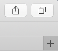
My first impressions are they changed things just for the sake of changing things. One example is the location of the new tab (+) button in Safari. They say it was done to increase the available space in the tab bar, but it is now physically disconnected from the thing it controls, and the space saved is so trivial. Does anyone know how to make it go back to its rightful place?
 

Attachments

  • Screen Shot 2020-11-14 at 1.45.03 PM.png
    Screen Shot 2020-11-14 at 1.45.03 PM.png
    9.3 KB · Views: 116
  • Screen Shot 2020-11-14 at 1.45.13 PM.png
    Screen Shot 2020-11-14 at 1.45.13 PM.png
    21 KB · Views: 125
One thing I don't like is the location of the new tab (+) button in Safari. They say it was done to increase the available space in the tab bar, but it is now physically disconnected from the thing it controls, and the space saved is so trivial. Does anyone know how to make it go back to its rightful place?

You can move it to the far right by right clicking and arranging the toolbar but not into the tab bar.
 
I honestly love it.

Feels snappy as hell when doing any kind of multitasking on a 2014 mini with only 4gb/SSD which was really struggling with Catalina.

Just feels ........ very optimised for lower spec machines.

The interface, IMHO a real breath of fresh air over any 10.x version ... familiar but different
 
  • Like
Reactions: mcdawg
Register on MacRumors! This sidebar will go away, and you'll see fewer ads.