Become a MacRumors Supporter for $50/year with no ads, ability to filter front page stories, and private forums.
Fortnightly Challenge - Sept 11 thru Sept 24
- Thread starter JohnMC
- Start date
- Sort by reaction score
You are using an out of date browser. It may not display this or other websites correctly.
You should upgrade or use an alternative browser.
You should upgrade or use an alternative browser.

Rules in anything visual are meant as starting points. Once you learn them, then you break them more successfully. I could dig out a book and list things, but that is no fun. I will comment on things as I see them in this thread and propose some of the formal design rules as topics for future challenge topics.
Probably made things clear as mud...
Dale
Now it gets even more interesting...! That would be great for you to propose some challenge topics with your persepective on art and design. I'm really looking forward to these exercises now. It's both fun, and educational.
This is an example of what I meant by "make it look intentional" in an earlier post. The out of focus areas at the top and right of the original distract from the image. If I had left the white stone at the left, it would have intruded into the image as well. Cropping removed these elements. If something is very close to the edge of a frame or running off it, leave it in or take it out depending on what you want, but make it look intentional and not an afterthought of something you overlooked.
Working with a Point and Shoot forces me to do this in post.
Dale
Working with a Point and Shoot forces me to do this in post.
Dale
Attachments
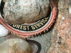
This is an example of what I meant by "make it look intentional" in an earlier post. The out of focus areas at the top and right of the original distract from the image. If I had left the white stone at the left, it would have intruded into the image as well. Cropping removed these elements. If something is very close to the edge of a frame or running off it, leave it in or take it out depending on what you want, but make it look intentional and not an afterthought of something you overlooked.
Working with a Point and Shoot forces me to do this in post.
Dale
You make an interesting point. The crop version here really works, and seeing the original, and what elements you intentionally left out illustrates what you're getting at. Sometimes I work at framing a shot trying to "see" what elements on the edges add to the image, and which ones should be subtracted - but lots of times I don't see it until later, and maybe it can be fixed (like yours) or maybe it's better to go back and rethink the shot.
Your photo of the jacket patch at the memorial is a poignant reminder of the lost firefighters.
Probably made things clear as mud...
Thanks, Dale. We played in mud when we were kids. Why not as adults?

Maxxamillian -- I like the image of the cycle as an abstract piece. It took a long time and a lot of struggle for me to figure out what it was. My problem was that it is so dark that I just could not make it out. Perhaps if you lightened it a bit.........
Bruce
This is an example of what I meant by "make it look intentional" in an earlier post.
This really resonates with me. With very few exceptions, I have found that if I work to set up a shot I end up with a failure. Most of my stuff is what I call "flash and dash". I take a picture of something that catches my eye in some way. After I get it into my computer, then I can start looking for what I saw but didn't know I was seeing.
Thanks, Dale. We played in mud when we were kids. Why not as adults?
Maxxamillian -- I like the image of the cycle as an abstract piece. It took a long time and a lot of struggle for me to figure out what it was. My problem was that it is so dark that I just could not make it out. Perhaps if you lightened it a bit.........
Bruce
I do like my darks
I worry about how my pics show on other's monitors. You take some great pics...which leads me to believe you are viewing on a calibrated monitor...can you give me an idea of what you are using? I trend towards dark on most of my pics and worry that I overdo it...
I do like my darks
I worry about how my pics show on other's monitors. You take some great pics...which leads me to believe you are viewing on a calibrated monitor...can you give me an idea of what you are using? I trend towards dark on most of my pics and worry that I overdo it...
I shoot with a Nikon D50 with the Nikon 28-200 VR lens. My machine is a 17" MBP with Leopard. No external monitor. I use Photoshop Elements 6 and (rarely) iPhoto. Other than cropping, I do minimal PP, and then usually to fix the blemishes. Sometimes I will adjust lighting. While I might convert to sepia or B&W, I never mess with the colors themselves. The only PP I ever do on my mineral images is cropping.
I would suggest that if you think you might be "overdoing it" then go with your gut. Art is very subjective. I think it works better when we allow it to tell us what to do. (That is my Zen thought for the day.)
The only thing about any of your images that has ever not worked for me is lighting. You compositions are truly outstanding.
20mm wide angle on 35mm b/w didn't do it near enough justice.
What's that???????????
One of my design teachers told us to make elements look intentional. The interpretation here would be to give more breathing room and let the orange flow freely.
Dale
I had that same design teacher!
Seriously, I had the great fortune to study with Michael Manwaring for a while (he was a very famous Bay Area designer--eventually made it into many of the design history books before giving it all up and absconding to Oregon, where he now spends his retirement doing painting and sculpture). Anyway, he made a big deal about the elements of a design/image looking intentional. He used to say that you know you've got it right when you wouldn't want to add anything or take anything away to make it any better. He also talked a lot about giving elements "breathing room." Your mention of those two ideas immediately made me think of my old mentor. I now apply his advice to my photography, and I think it's just as valid there as it was with design.
As others have mentioned, this took me by surprise. I loved the colors and kept looking until I realized it was a motorcycle. Great use of an unusual perspective to turn an object into art. You are really good at this. The Painting with Light entry in the last photo contest was stunning. At least to me. I don't judge... It looked like a winner to me.
Dale
Originally Posted by pdxflint;
20mm wide angle on 35mm b/w (film) didn't do it near enough justice.
What's that???????????
Okay... ha, ha!
Maxxamillian, I've really liked your 'darker' tones. They display well on my MBP 15" matte screen. Just one or two of the portrait shots have been maybe a tad darkish, but mostly they have seemed very warm, and full of interesting tones, very artistic and creative. The cycle shots have been right on for me. I recognized this last one immediately - maybe because I've been a rider in the past and my eye instantly picks up certain details like the rear tire, frame tubing, wire wheels and footpegs... which draw me into the rest of the shot for some closer examination. If anything, I want more sharpness in this one, whereas your style seems to scream "smoothness".
I shoot with a Nikon D50 with the Nikon 28-200 VR lens. My machine is a 17" MBP with Leopard. No external monitor. I use Photoshop Elements 6 and (rarely) iPhoto. Other than cropping, I do minimal PP, and then usually to fix the blemishes. Sometimes I will adjust lighting. While I might convert to sepia or B&W, I never mess with the colors themselves. The only PP I ever do on my mineral images is cropping.
I would suggest that if you think you might be "overdoing it" then go with your gut. Art is very subjective. I think it works better when we allow it to tell us what to do. (That is my Zen thought for the day.)
The only thing about any of your images that has ever not worked for me is lighting. You compositions are truly outstanding.
I can happily spend hours post processing a single picture. This is from my days as an artist sloshing away at canvas and board with charcoals, paints, and such. I think your Zen thought is very appropriate. So far you are the only person to identify the picture as being too dark...could it be your monitor settings? If not then it IS my monitor calibration that needs re-doing...
As others have mentioned, this took me by surprise. I loved the colors and kept looking until I realized it was a motorcycle. Great use of an unusual perspective to turn an object into art. You are really good at this. The Painting with Light entry in the last photo contest was stunning. At least to me. I don't judge... It looked like a winner to me.
Dale
Thanks Dale--I really appreciate the feedback and observation, especially from someone with your background. As for the contest...if there is one thing I've learned: Photography is SO subjective. How many times have you seen a picture that others have just raved about and you're just not seeing it yourself?
Okay... ha, ha!
Maxxamillian, I've really liked your 'darker' tones. They display well on my MBP 15" matte screen. Just one or two of the portrait shots have been maybe a tad darkish, but mostly they have seemed very warm, and full of interesting tones, very artistic and creative. The cycle shots have been right on for me. I recognized this last one immediately - maybe because I've been a rider in the past and my eye instantly picks up certain details like the rear tire, frame tubing, wire wheels and footpegs... which draw me into the rest of the shot for some closer examination. If anything, I want more sharpness in this one, whereas your style seems to scream "smoothness".
There is an object familiarity component to this picture...that is for sure. I'm curious to see how much sharpness I can tease out of the picture before adding too much noise. On a different note--your recent harbor series have been captivating....I really enjoy seeing your work
Thanks for the feedback.There is a good chance that this is the only wildlife photo I've taken. Chalk it up to a lack of patience on my part for this kind of thing. I was really waiting for a bear, a moose, and a mountain lion to come into this clearing and put on a spectacular (National Geographic award winning) fight. Instead, during the whole 20 minutes I waited, I got this little guy...

There is a good chance that this is the only wildlife photo I've taken. Chalk it up to a lack of patience on my part for this kind of thing. I was really waiting for a bear, a moose, and a mountain lion to come into this clearing and put on a spectacular (National Geographic award winning) fight. Instead, during the whole 20 minutes I waited, I got this little guy...
Its a bit light
Sorry I couldn't resist
Maxxamillian -- I don't think there is a problem with either monitor. My pictures display and print virtually identically. I think there is just a difference in style and taste.
I hate chipmunks, but your picture is beautiful. It was worth the wait. Regardless of what Chappers says, I think the lighting is just right.
===================
Here is my next entry.
I hate chipmunks, but your picture is beautiful. It was worth the wait. Regardless of what Chappers says, I think the lighting is just right.
===================
Here is my next entry.
Attachments
Its a bit light
Sorry I couldn't resist
You DO realize you could have prompted an entire weekend of calibration that would have whipsawed between being "too light" and "too dark" and ended with me, straight-jacketed, riding the paddy wagon to the nearest facility right?
Think they'll let me take my camera with me?
Maxxamillian -- I don't think there is a problem with either monitor. My pictures display and print virtually identically. I think there is just a difference in style and taste.
I hate chipmunks, but your picture is beautiful. It was worth the wait. Regardless of what Chappers says, I think the lighting is just right.
You've got a keeper of a monitor then...getting WISYWIG from monitor to print has been a challenge for me. As for chipmunks...I don't mind them as long as they are not singing in obnoxiously high voices.
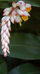
The flower photo you just posted --excellent IMO. Nice composition with complimentary colors and simplicity. Well done
On a different note--your recent harbor series have been captivating....I really enjoy seeing your work
Thanks - I was wondering if fishing boats was getting boring, or overdone...
I've got quite a few others I'd like to share, but it's not that easy picking out something fresh, that doesn't have a lot of similar elements - other than perspectives, perhaps... anyway, thanks again for the nice words.I hate chipmunks, but your picture is beautiful. It was worth the wait. Regardless of what Chappers says, I think the lighting is just right.
How on earth can someone hate a chipmunk??
Unless you grew up hearing them singing...Here's a different try at edge... edge of frame this time. I was in the greenhouse today picking peppers, and the mint (which has gotten completely out of hand...
) was attracting lots of flying critters, but nothing photogenic at all. I did notice this little guy (very small, actually) and had my nifty-fifty 1.8 on the camera, so I took a few shots in manual focus. Kind of a weakish attempt at some kind of macro-ish image... Don't look at it in that light... just think "edges"... BTW... this was cropped somewhat.
Camera: NIKON
Model: D50
ISO: 200
Exposure: 1/2000 sec
Aperture: 1.8
Focal Length: 50mm
How on earth can someone hate a chipmunk??
Had 3 in my basement about 5 years ago. Enough said.
The butterfly is pretty good given the circumstances. My eye keeps getting pulled to the lower right. That one stalk is very distracting to me. I think the image would work much better if you got rid of that.
Put up some of your other boats. Sometimes others see things we don't.
The butterfly is pretty good given the circumstances. My eye keeps getting pulled to the lower right. That one stalk is very distracting to me. I think the image would work much better if you got rid of that.
Put up some of your other boats. Sometimes others see things we don't.
Well, the key is "under the circumstances." And I agree, I just thought it might be fun just to play around with this just to see if I might like a macro lens (which I would...love.) I think I'm more interested in slightly backed-off macro perspectives so I can get a bigger picture of what's going on, rather than close-ups of a bug's eye... but it could be fun to explore the little world going on in and around plants.
I did a different crop to elimintate the flower 'bud' but I'm thinking it's not going to really do the topic much justice.

Think I'll stick to boats...
===================
Here is my next entry.
I really like the use of color and motion in this shot. The flower stands out nicely against the background and your plane of focus enhances this. The sweep of the flower pulls my eye down and through the image. The space on the left is tight, but not too much so. The green in that area flows down into the bottom of the photo and adds to the feel of motion. Nice work.
Dale
I really like the use of color and motion in this shot. .... Nice work.
Dale
Dale -- Thank you. I had some struggles deciding how close to crop this. Perhaps I have some hidden sense of design?
Bruce
=======================
Maxxamillian -- I'm Bruce's son, Jacob. I really like your photo of the motorcycle. I think that the pictures flows very nicely. The dark against the bright red works very nicely. I looked at the photographs on your web site, and I also thought they are all unique and interesting.
Jake
Jacob,
You are very kind and equally gracious. It is easy to see that the apple does not fall far from the tree here. Thanks for the words of encouragement and for the feedback
Warmest Regards.
My humble contribution.

No need to be humble here - lovely shot - I would love to see it minus any people - I'm don't do landscapes but love it when scale is caught well.
Register on MacRumors! This sidebar will go away, and you'll see fewer ads.