Got a tip for us?
Let us know
Become a MacRumors Supporter for $50/year with no ads, ability to filter front page stories, and private forums.
Identify this font
- Thread starter Doctor Q
- Start date
-
- Tags
- discussions fonts
- Sort by reaction score
You are using an out of date browser. It may not display this or other websites correctly.
You should upgrade or use an alternative browser.
You should upgrade or use an alternative browser.
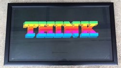
Does anyone know what font is used in this Apple poster? I don't think its one of the usual ones
The base font looks like Rockwell ExtraBold with the colour bands and 3D 'telescope' added by the designer.
Cheers
Jim
The base font looks like Rockwell ExtraBold with the colour bands and 3D 'telescope' added by the designer.
Cheers
Jim
Thanks so much!
I imagine that was created with a fat marker pen and scanned. Not a font.
The second one is http://www.myfonts.com/fonts/linotype/insignia/
And the first is here (it has a thin line that runs between the diamonds and the characters, but this is it):
http://www.dafont.com/xxii-arabian-onenightstand.font?text=Pranamar
Can anyone help me?
I got an old 80's tourist book from Hungary and the used font is really weird.
It looks like a mixture of Erato and American Garamond
Here is a sample from a page.
Note the number 4 which is below the baseline as in the Erato.
But also note the lowercase y and r which are not like in the Erato, but the same as in American Garamond.
So what is it? For me it looks like a mixture of both.
Also, the Erato font was released in 2011 so it can't be.
(And they haven't used a different font for page numbers. Where numbers are in the text, the font is the same)
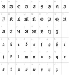
I have already identified the font Deutsche Zierschrift, I'm looking to see if anybody can locate anybody using it.
I have already identified the font Deutsche Zierschrift, I'm looking to see if anybody can locate anybody using it.
..any particular reason why?
..any particular reason why?
Yes! Should have mentioned... I'm using it for a logo for my personal company. Unfortunately the company doesn't make any money, but it's mine, all mine!!!
Really, I'll probably use it more for social media and the like. The logo is mostly done, just a few tweaks to work out. It's based on my last name and a manipulation of one of the fonts letters.
Yes! Should have mentioned... I'm using it for a logo for my personal company. Unfortunately the company doesn't make any money, but it's mine, all mine!!!
Really, I'll probably use it more for social media and the like. The logo is mostly done, just a few tweaks to work out. It's based on my last name and a manipulation of one of the fonts letters.
OK, cool. I'll look forward to seeing your final logo then.
As far as anyone else using this font is concerned, I'd imagine there isn't much usage out there than the odd possible German newspaper masthead. (I've checked and can't find any)
Have you fully considered legibility of your logo in an online environment?
Take a look and tell me what you think. Not the final, but close. The logo is actually the first letter duplicated in a square. I call it a box 4K.
https://www.dropbox.com/s/vu9j4krcvb4ybsg/Deutsche Zierschrift.pdf
Can anyone help me?
I got an old 80's tourist book from Hungary and the used font is really weird.
It looks like a mixture of Erato and American Garamond
Here is a sample from a page.
Note the number 4 which is below the baseline as in the Erato.
But also note the lowercase y and r which are not like in the Erato, but the same as in American Garamond.
So what is it? For me it looks like a mixture of both.
Also, the Erato font was released in 2011 so it can't be.
(And they haven't used a different font for page numbers. Where numbers are in the text, the font is the same)
Unfortunately the bowl of the capital "P" in American Garamond is closed, whereas your example is not.
The closest I can find is Monotype Garamond Roman. This is close, but no cigar...
http://www.fontshop.com/fonts/singles/monotype/monotype_garamond_roman/
But even that does not have oldstyle or expert numerals. It is of course entirely possible that the folios were set in a different font.
Have you checked the colophon at the front of the book to see if the fonts in question are listed?
I'm pretty certain it's a member of the Garamond Family. (Is it not Erato).
Check the uppercase "P" and "K" (leg length), and the lowercase "a" and "g" (link length and ear position) for identification... good luck
----------
Take a look and tell me what you think. Not the final, but close. The logo is actually the first letter duplicated in a square. I call it a box 4K.
https://www.dropbox.com/s/vu9j4krcvb4ybsg/Deutsche Zierschrift.pdf
I must admit I'm pleasantly surprised.
Nice work.
I must admit I'm pleasantly surprised.I like it.
Nice work.
Thanks! Yeah, came out better than I could've hoped. Owe a lot of credit to my friend who found that particular font.
I ran into this such a beautiful programming font today, could anyone tell me the name? thanks guys :-*

PS : they are from a theme collection for Sublime Text 2 https://github.com/imagentleman/ublime

PS : they are from a theme collection for Sublime Text 2 https://github.com/imagentleman/ublime
Looks like custom art
I'm betting that's either hand drawn or seriously tweaked - not an off the shelf font.
I'm betting that's either hand drawn or seriously tweaked - not an off the shelf font.
I've been after The Economist font for a long time. I actually e-mailed them once, asking where it could be purchased however they weren't very accommodating. Can anyone suggest some free alternatives as close to the font as possible?
Hey, do any of the font experts in here know what font this might be that is being used after each logo?
Image
Thanks a lot!!!
Looks like VAG Rounded Light to me.
http://www.linotype.com/47966/VAGRoundedStdLight-product.html
Hi Guys, trust you type gurus to help me identify these... I'm doing some work for a guy who had his logo commissioned, but they didn't tell him the name of the fonts...
STEPHEN HART is in Futura Light
http://www.linotype.com/45058/FuturaStdLight-product.html
DIRECTOR OF PHOTOGRAPHY is in Neue Helvetica 33 Thin Extended, but the spur of the G has been customised by the looks of it.
http://www.linotype.com/45578/NeueHelvetica33ThinExtended-product.html
Register on MacRumors! This sidebar will go away, and you'll see fewer ads.


