Become a MacRumors Supporter for $50/year with no ads, ability to filter front page stories, and private forums.

GreyOS

macrumors 68040
Apr 12, 2012
3,358
1,694
Some great suggestions, here are a few more

Maps
- allow for multi-destination routes
Clock
- more alarm options: volume, fade, snooze length
Bluetooth
- allow aliasing of devices
Wifi
- allow viewing/managing all remembered networks. for viewing passwords, ordering preference of connection etc.
DND
- weekly or custom schedules
- exclusions for messages (inc third party)
Safari
- improved text selection so it stops jumping to select whole paragraphs
General
- big reduction of CC / NC swipe rejection in full screen scenarios where it's not needed (e.g. watching video)
 
  • Like
Reactions: Mudodonbond

DaPizzaMan

macrumors 6502a
Jun 14, 2016
549
1,186
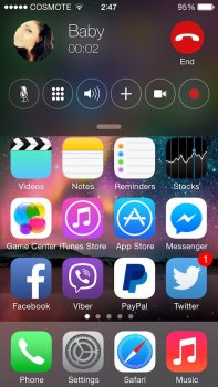
I agree with 90% of what the OP mentioned. I would like to add one thing off the top of my head: fix the volume interface so that it doesn't disturb you from the middle of the screen for the few seconds that it appears every time the volume changes.
 
  • Like
Reactions: Devyn89

Type4O

macrumors 6502
Aug 23, 2011
346
121
Toronto, Canada
I agree with 90% of what the OP mentioned. I would like to add one thing off the top of my head: fix the volume interface so that it doesn't disturb you from the middle of the screen for the few seconds that it appears every time the volume changes.

I concur; it really isn't necessary for it to be so obtrusive.
 

EM2013

macrumors 68020
Sep 2, 2013
2,490
2,326
A big part of it is likely since these devices are essentially phones first/primarily (despite how people might ultimately use them) the whole taking calls and placing calls part essentially takes precedence.

That said, you can press the lock/sleep button twice when a call comes in to dismiss it and get back to what you were doing (or use the decline button on the screen if the call is coming in while you are using the phone and it's unlocked).

It's just so obtrusive. Something like this jailbreak tweak is so much better.
[doublepost=1483583077][/doublepost]

I agree with 90% of what the OP mentioned. I would like to add one thing off the top of my head: fix the volume interface so that it doesn't disturb you from the middle of the screen for the few seconds that it appears every time the volume changes.
How did I forget this! Definitely agree
 

Attachments

  • IMG_2699.JPG
    IMG_2699.JPG
    124.1 KB · Views: 412
  • Like
Reactions: ISRMafia

Stalyn

macrumors 6502
Jul 7, 2012
269
79
It's just so obtrusive. Something like this jailbreak tweak is so much better.
[doublepost=1483583077][/doublepost]


How did I forget this! Definitely agree

Link to that wall paper please.
 

rijc99

macrumors 6502a
Apr 27, 2015
854
645
I'd like the CLEAR notification button at the bottom of the list. I hate having to scroll back to the top of the notification list to hit that X after scanning through a long list.
 

Dave245

macrumors G3
Sep 15, 2013
9,843
8,075
I think more features for the Apple Pencil would be nice, there are rumours that they are adding features such as being able to annotate in Safari and apps like Mail, Messages and so on. I'm not sure if I'd like the Apple Pencil to be compatible with the iPhone Plus model, not the normal sized one that would be too small, but it may work with the 5.5" Plus, I'm not sure tho.

Steve Jobs had a very good saying "people don't know what they want until we show it to them" and I think that's right, people didn't know they wanted the iPad until Apple showed it to us, the same with the iPhone.
 

rijc99

macrumors 6502a
Apr 27, 2015
854
645
I think more features for the Apple Pencil would be nice, there are rumours that they are adding features such as being able to annotate in Safari and apps like Mail, Messages and so on. I'm not sure if I'd like the Apple Pencil to be compatible with the iPhone Plus model, not the normal sized one that would be too small, but it may work with the 5.5" Plus, I'm not sure tho.

Steve Jobs had a very good saying "people don't know what they want until we show it to them" and I think that's right, people didn't know they wanted the iPad until Apple showed it to us, the same with the iPhone

Yeah, it would work fine. People have been using styluses on smart phones for a while now. From the Note series going all the way back to the Windows Phone days. Samsung is showing there is somewhat of a demand for stylus. Apple has followed on their tablets already. If they see enough demand, they'll put it on their phones too.

Re Steve Jobs, remember when he said, "Who wants a stylus? Yuck, nobody wants a stylus" and "You can't get your hand around it, no one's going to buy that." Apparently he didn't know what people wanted either. Companies just look to each other to see where the sales are and follow. IE. Apple showed there was a preference of capacitive over resistive screens so other smartphone makers followed. Android phone makers shown there was a demand for large phones so Apple followed.
 
Last edited:

C DM

macrumors Sandy Bridge
Oct 17, 2011
51,392
19,461
I'd like the CLEAR notification button at the bottom of the list. I hate having to scroll back to the top of the notification list to hit that X after scanning through a long list.
Couldn't you just tap on the status bar at the top, like pretty much on any other screen, and that would quickly scroll you to the very top right away?
 

mtcowdog

macrumors regular
Jul 17, 2010
239
176
In today's tech world, it is hard to stand out. Everyone is iterating on a basic theme and core. But in my dream list, Apple can stand above. For me the next step is changing how we interact with our devices. A little this, a little that is fun, but everyone is on that train. Apple has the capacity to change at least one significant aspect of mobile devices. In the iOS world, I think that can be how we interact with our phones. Currently we type and swipe and press. And we have some basic voice interaction that isn't terribly useful. Can Apple change an interaction and make our devices more useful? I think yes. Of course, I'm not smart enough to guess what that might be. Siri, biometrics, a new interface, ... Guess away.

And let's say I am wrong. So we get some this and that just like everyone else. See ya next year. iOS is still good enough. But when does that end? Hello Crystal Ball.
 
  • Like
Reactions: GreyOS

CMoore515

macrumors 6502a
Sep 27, 2015
763
884
Des Moines, IA
Wow! Very good and lengthy list indeed!
My wish is that iOS would run as smoothly as iOS 6 did on i5 and i4S at least on the latest devices.
I mean ios10 it is not horrible right now on the iPhone 7 nor was iOS9 on i6s but it was better in ios 6 times.
I have a more-sensible-than-average eyes for stutters Btw.

This.
 

rijc99

macrumors 6502a
Apr 27, 2015
854
645
Couldn't you just tap on the status bar at the top, like pretty much on any other screen, and that would quickly scroll you to the very top right away?

Sometimes I keep multiple days of notifications and only want to delete a specific day or the oldest day. I know... its odd but I have a specific use scenario that my stuff requires.
 

C DM

macrumors Sandy Bridge
Oct 17, 2011
51,392
19,461
Sometimes I keep multiple days of notifications and only want to delete a specific day or the oldest day. I know... its odd but I have a specific use scenario that my stuff requires.
Well, that's a bit different than just scrolling to the top to dismiss it all then.
 

Shirasaki

macrumors P6
May 16, 2015
16,249
11,745
Bring back Forstall's skeuomorphic design. No like flat. Even Microsoft deemphasized Metro.
Microsoft does not deemphasize metro. Windows 10 is all flat, so does windows server 2016. Microsoft just transforms the start screen to a sort of mixture of old start menu and new metro style start menu.
 
  • Like
Reactions: jpn

dekomori

macrumors newbie
Jan 25, 2017
19
3
Bring back offline music toggle, slide to unlock to non-touch id users,

Music app revamp (it's like designed by a group of high school students)
[doublepost=1485949464][/doublepost]
Was iOS 3 -> 4 really a major redesign? In addition, I don't think iOS 10 was THAT different from iOS 9. Yes, some design changes, but every iOS version change has seem some design changes in a different facet.

I would say iOS 6 -> iOS 7 was the most major redesign of iOS we've seen thus far.

Apple isn't required to stick to a certain design language for any certain period of time, but I wouldn't be surprised if we saw an overhaul of iOS for the iPhone's 10th anniversary next year, with the heavily redesigned iPhone too.
I remember it was the dock being glass and some icons have that stripes design
 
  • Like
Reactions: Feyl

Math889

macrumors 65816
Jan 7, 2016
1,052
422
After iOS 10.3 beta app warning , it is clearly that Apple will drop support for 32 bit apps and consequently 32 bit devices soon. Finally, iOS 11 will be the first to support 64 bit devices and 64 bit apps only !!!!

Since the iPhone 5S was released, we all knew at some point in the future Apple would drop 32 bit support.
 

C DM

macrumors Sandy Bridge
Oct 17, 2011
51,392
19,461
After iOS 10.3 beta app warning , it is clearly that Apple will drop support for 32 bit apps and consequently 32 bit devices soon. Finally, iOS 11 will be the first to support 64 bit devices and 64 bit apps only !!!!

Since the iPhone 5S was released, we all knew at some point in the future Apple would drop 32 bit support.
It certainly seems like they are planning on doing that. We'll have to see if they go through with it with iOS 11.
 
  • Like
Reactions: Math889

Shirasaki

macrumors P6
May 16, 2015
16,249
11,745
Music app revamp (it's like designed by a group of high school students)
I am afraid that next revamp could just make it look worse than what it is now.
"Designed by a group of elementary school children". (Joking)
 
  • Like
Reactions: jpn

d5aqoëp

macrumors 68000
Feb 9, 2016
1,796
3,149
Better Siri with more features.
Who uses Siri?

BTW I am using iOS 10.2.1 on iPhone 7 Plus. The touch accuracy has gone down the toilet. I mean it's down to Android Gingerbread levels.

Try using the track seek button in the new Music app and half of the time the iPhone doesn't register our touches. The iPad Pro 12.9" keyboard is another prime example. Typing on it gives a feeling that the keyboard is trying it's best to resist our keyboard taps.

iPhone apologists will claim it's a non issue (For them there is zero issue in iPhone anyway) but Apple Siriously (pun intended) needs to tackle this input lag and touch accuracy issue. It just takes away from the entire iOS experience.
 
Last edited:

dekomori

macrumors newbie
Jan 25, 2017
19
3
Who uses Siri?

BTW I am using iOS 10.2.1 on iPhone 7 Plus. The touch accuracy has gone down the toilet. I mean it's down to Android Gingerbread levels.

Try using the track seek button in the new Music app and half of the time the iPhone doesn't register our touches. The iPad Pro 12.9" keyboard is another prime example. Typing on it gives a feeling that the keyboard is trying it's best to resist our keyboard taps.

iPhone apologists will claim it's a non issue (For them there is zero issue in iPhone anyway) but Apple Siriously (pun intended) needs to tackle this input lag and touch accuracy issue. It just takes away from the entire iOS experience.
I use siri a lot, making quick timers, calling someone and making appointments.
 

Cakefish

macrumors 6502a
Oct 14, 2015
512
308
Sort out the absolute total and complete disaster that are notifications on iOS.

They should be grouped together the way Android does it. Easily my biggest bugbear with iOS as of now. It feels so archaic. The notification centre gets cluttered so darn quickly even though I've disabled notifications from many apps simply because every single email or every single message or every reply gets its very own independent notification.

What makes it worse is that Apple provides no way of quickly clearing these notifications on iPads. You have to clear them day by day. So I'm sitting there and pressing the clear button 20 times over because I'm not religiously tapping on notifications as they come through because many of them I read on my Android phone. So easy to rectify.
 

RedGT

macrumors 6502
Apr 14, 2014
300
325
London innit
An EQ for the podcasts app....it's ridiculous you can't set up you own preferences for the sounds that enter your ears.
 
  • Like
Reactions: Altis
Register on MacRumors! This sidebar will go away, and you'll see fewer ads.