Become a MacRumors Supporter for $50/year with no ads, ability to filter front page stories, and private forums.
Well, as a developer, it's totally a weight off my shoulders to finally understand that I just don't understand how development works. Now I just need to get some time scheduled with Apple to get me that design for my next app.

You're welcome to reply. That's not for me to deny you that. But please don't expect any further feedback on my part.

In all sincerity, can you share sites or pages or mobile apps or programs you've had a direct hand in developing? This is a sincere request. I've always wanted to see an example for which a developer can share how much of certain features/content he had direct control in choosing vs. which elements they maybe would have liked to do different but felt forced to follow a certain recipe/format/aesthetic/limitations from iOS programming options. Without pointing to distinct examples like that and/or being able to show how I'd do something vs. how a certain item was developed, it can be hard to have discussions like this. Perhaps you've created something within the iOS7-11 UI/architecture that's quite pleasing and intuitive and not a blatant lemming-off of the uber-minimalist style that I have critiqued endlessly, and you'd certainly deserve to be lauded for that.
[doublepost=1505323202][/doublepost]
Lets take one of the low points (among many) of iOS 6 interface design. The contacts app.

View attachment 706505

There we go. Colorful, pretty, real world. All the things you love. Makes perfect sense, right?

I'm replying to an old post but - now and even when I jumped into this thread, no, seeing a book & pages is not what I'd prefer. I would prefer that iOS7-11 had retained using black font instead of light grey, that ios7-11 still used boxes/buttons to outline actionable items instead of text...that ios7-11 used borders/frames/zones for individual groupings of addresses that were actual rectangles and not light grey lines extending from right to left screen edges which tend to allow me to lose context of various regions....that ios7 kept using blue font to show something highlighted amongst the black or other-colored font, instead of using light blue to often show what's pressable. I wish ios7-11 retained an actual search window where one press lets you start typing vs. the many ios7-11 apps for which the search function is shown by just a magnifying glass icon where you have to press it once to open the search window and then a second time to start typing in the search window... I wish ios7-11 still used dark colors and larger fonts instead of white & grey thin wispy fonts all over which are impossible to read in the sun and without glasses at times.

Please realize that I and many aren't looking for the return of green felt, leather books, and thick stitching. Just bring back UI elements that aren't grey/white/borderless tributes to uber-minimalization and instead use time-tested intuitive UI cues that make the user experience more "it just works" and are much more friendly for those of us with 4" iPhone 5s's and who try to use an iPhone in the sun/outdoors often.
 
Last edited:
  • Like
Reactions: Beeplance
It's ridiculous to expect an IOS redesign, for quite a while.

2013, not 2012, was the last overhaul; and it's been pumped up with features ever since.

No, Apple is not going to pull the rug out again, for quite awhile. Get used to that.
 
That's the problem with all your (others too of course) talking. UIs are meant to present the user information. The iOS 1-6 UI was cluttered with unnecessary elements to "explain" users what what is. We are over this point now everybody knows touch screens and how to manipulate them and what a smartphone is. With real AR and VR applications coming the UI will get even more simpler and non-existent (hello AI and speech output). And that's also why skeuomorphic UIs will probably never come back.

Did you not even read this? Like… at all? Think about it this way. Take a piece of paper and color it a matte red color. What do you have? You may think it's a flat design, but it simply isn't because of the way that light works, how the world works. Something that appears flat in the real world will always be 3D no matter what. You can't make 2D figures in this world. This makes skeuomorphic design even more relevant with things like AR kit and what not, a UI that matches the way the world works. It's a perfect union between artificial and real. The reasoning behind this flat design trend, none of it has yet to give me a relevant explanation of why its better for the future. One of the things that I'd like to move on with is the fact that design can be taken many ways, but with flat ones, it's extremely limited. This is just why I think the idea of flat UIs is ignorant. Do they make the display of a product look impressive? No, real photographs make it impressive, and skeuomorphic designs back this up and make displays look impressive, even if it is a subpar display. The details matter, they really do, but today's standards, the details are simply lost.


iOS 6 inspires me a lot, in fact I recently came back to a notification concept that I deferred a while back. The beauty of the UI in 6 is just how flexible it really is. Everything is so open, it's like an open concept house, it feels free and can be manipulated to do many things. Unfortunately the design never stuck around to show just what it could do and how far it could be taken. Were some things of the skeuomorphic style overdone? Yes, were they understandable? Yes. Since the design in some areas were taken to the max, it could easily be tuned down to a more subtle approach, but not limit the beauty and functionality of it. This is the point where the creativity of your mind must fly and shine through.
Creativity... creativity... where did it go?


Something else I want to point out is popular influence. Skeuomorphic UIs are marked as old and supposedly "look outdated", because they don't match what OTHER people are doing. That's a key point. Why do something similar to the other people, when you can make something unique and interesting that will make your product more interesting.
It all comes to wether you want to be the creative one, or the one that follows suit with everyone else…
 
In all sincerity, can you share sites or pages or mobile apps or programs you've had a direct hand in developing? This is a sincere request.

No, not professionally, and that's a sincere answer. I'm a web / SharePoint developer and work for a health insurance company. Anything I could share (which wouldn't be a lot), wouldn't really give you the answers you're looking for. Also, I'm not a web designer. Anything I've done which looks super nice would have had the UI developed by someone with those skills.

As for iOS apps, I've fooled around and learned some stuff, but certainly don't have anything in the app store. I am getting ready to start my own project to replace a 32-bit app I don't want to loose (st@sh). But I've been lazy all summer and keep putting it off. I started something back in June, then got distracted with other projects. Now that iOS 11 is out, I plan to jump back in. But I probably won't go so far as to put it in the app store. If it was a money maker, the original developer wouldn't have killed it. But it's useful to me, so I'm going to create my own version.

The closest thing I would have to show-off would be a plug-in for a DVD database I use (DVDProfiler). If you're honestly curious, I could post screenshots of that. But again, I don't think it would be useful to you. I deliberately designed my plug-in to match the look and feel of the program I use. And it's 9 years old at this point, so not really a modern design.

And once again, I'm not making any claims, good or bad, about Apple's design. I think there were elements pre-iOS 7 that were good. I think there are elements post-iOS 7 that are good. But I do have problems with logic. Like using a design Apple had no part in to prove that Apple has poor UI design. If you want to slam Apple, I'm happy to stand back and watch. Just make it a fair fight.
 
And once again, I'm not making any claims, good or bad, about Apple's design. I think there were elements pre-iOS 7 that were good. I think there are elements post-iOS 7 that are good. But I do have problems with logic. Like using a design Apple had no part in to prove that Apple has poor UI design. If you want to slam Apple, I'm happy to stand back and watch. Just make it a fair fight.

Great reply, above.

Fair enough, ha - later I'll post some pre & post-ios7 apps that will hopefully better demonstrate what I'm talking about. There unarguably a general theme of making things more monochromatic, more flat, and more "space-wasting" after ios7 such that certain once-great apps are now tedious, to state it simply, where the app developers stuck to a theme of "large white circles taking up the entire screen instead of using space more wisely so more info could be shown on one screen like before."

Where a developer created quite the useful app before, why after 2013 do they seem to only be able to create something that's less efficient? More followups later. :)
 
Did you not even read this? Like… at all? Think about it this way. Take a piece of paper and color it a matte red color. What do you have? You may think it's a flat design, but it simply isn't because of the way that light works, how the world works. Something that appears flat in the real world will always be 3D no matter what. You can't make 2D figures in this world. This makes skeuomorphic design even more relevant with things like AR kit and what not, a UI that matches the way the world works. It's a perfect union between artificial and real. The reasoning behind this flat design trend, none of it has yet to give me a relevant explanation of why its better for the future. One of the things that I'd like to move on with is the fact that design can be taken many ways, but with flat ones, it's extremely limited. This is just why I think the idea of flat UIs is ignorant. Do they make the display of a product look impressive? No, real photographs make it impressive, and skeuomorphic designs back this up and make displays look impressive, even if it is a subpar display. The details matter, they really do, but today's standards, the details are simply lost.

It does not. You didn't understand what I said. In AR and VR there is NO need for any real interface because it's just all about the information. Why do you want to mimic real world objects as part of the UI? Thats redundant and not useful at all. I am tired to debate about it - you will see it will never come back. Also because in 50 years from now on nobody will know what these old objects were.
 
The only thing I dislike about the UI of iOS 11 is the app store. I personally would prefer a condensed list. Other than that, I think iOS 7 and iOS 11 are the best design changes ever made in iOS.
 
It does not. You didn't understand what I said. In AR and VR there is NO need for any real interface because it's just all about the information. Why do you want to mimic real world objects as part of the UI? Thats redundant and not useful at all. I am tired to debate about it - you will see it will never come back. Also because in 50 years from now on nobody will know what these old objects were.
So basically to sum up what you just said, you mean to tell me that in order to get rid of the UI it must be flat? Seems illogical to me. Keep in mind that skeuomorphism isn’t limited to mimicking real world objects. This applies to makeing solid elements that appear 3D, but reflect nothing of the real world making your statement even more irrelevant than before. We’re still living in the lives of displays, so to say that flat design is one step closer to VR and AR, that’s just silly. Design isn’t about only having what’s necessary, it’s about being creative and making something appealing and worthwhile, yet having what you need as well. Right now, the flat UI trend hasn’t accomplished any of that and frankly most of the time they look thrown together and often act like it too, kinda like iOS 11 does.
 
So basically to sum up what you just said, you mean to tell me that in order to get rid of the UI it must be flat? Seems illogical to me. Keep in mind that skeuomorphism isn’t limited to mimicking real world objects. This applies to makeing solid elements that appear 3D, but reflect nothing of the real world making your statement even more irrelevant than before. We’re still living in the lives of displays, so to say that flat design is one step closer to VR and AR, that’s just silly. Design isn’t about only having what’s necessary, it’s about being creative and making something appealing and worthwhile, yet having what you need as well. Right now, the flat UI trend hasn’t accomplished any of that and frankly most of the time they look thrown together and often act like it too, kinda like iOS 11 does.

Skeuomorph
A skeuomorph is a derivative object that retains ornamental design cues from structures that were necessary in the original. Examples include pottery embellished with imitation rivets reminiscent of similar pots made of metal and a software calendar that imitates the appearance of binding on a paper desk calendar.
------
3D Design would be realism, not Skeuomorphism. though both are similar.
 
  • Like
Reactions: marvz
So basically to sum up what you just said, you mean to tell me that in order to get rid of the UI it must be flat? Seems illogical to me. Keep in mind that skeuomorphism isn’t limited to mimicking real world objects. This applies to makeing solid elements that appear 3D, but reflect nothing of the real world making your statement even more irrelevant than before. We’re still living in the lives of displays, so to say that flat design is one step closer to VR and AR, that’s just silly. Design isn’t about only having what’s necessary, it’s about being creative and making something appealing and worthwhile, yet having what you need as well. Right now, the flat UI trend hasn’t accomplished any of that and frankly most of the time they look thrown together and often act like it too, kinda like iOS 11 does.
Seriously? I'm not talking about flat or material (Google) design or whatever design. Im telling you that the UI of software itself will vanish over time and will be replaced almost completely by the information and data we want to see/use/manipulate/etc. There is simply no need for an over complex UI aka skeuomorphism.
 
Skeuomorph
A skeuomorph is a derivative object that retains ornamental design cues from structures that were necessary in the original. Examples include pottery embellished with imitation rivets reminiscent of similar pots made of metal and a software calendar that imitates the appearance of binding on a paper desk calendar.
What does this mean for artificial UIs? Well anything, you can band it very far in a digital realm. Another term is abstract, where they have realistic characteristics, like light and shadows, yet don't have any obvious relation to a real world object. I like to use skeuomorphic as the term because with UIs it can redone in different ways. iOS 6 was classified as a Skeuomorphic design, but a lot of things in it were abstract and not relative to real things.

Once again, bringing up the point of creativity. Skeuomorphic design is the limit, and it can be manipulated into something less in your face per say. You don't have this type of freedom with flat design.

Screen Shot 2017-09-13 at 5.56.51 PM.png

[doublepost=1505343964][/doublepost]
Seriously? I'm not talking about flat or material (Google) design or whatever design. Im telling you that the UI of software itself will vanish over time and will be replaced almost completely by the information and data we want to see/use/manipulate/etc. There is simply no need for an over complex UI aka skeuomorphism.

"Design isn’t about only having what’s necessary, it’s about being creative and making something appealing and worthwhile, yet having what you need as well."
 
Guys, stop fighting over a term that even Apple didn't know. I certainly heard it first when iOS 7 was introduced. Here's a quote from Scott Forstall on that:

"I never heard the term skeuomorphism, even years after we built iPhone.

I mean, that’s a horrible word. It sounds unnatural, it just sounds terrible. When I look at good design—when I look for good design—I look for something which is easy to use.

Approachable and friendly that you can use without a manual.

If you look at the designs we did at Apple, we talked about photo-illustrative, metaphorical designs. And those were infused into the design sense of Apple by Steve Jobs since the original Mac if not earlier. The original Mac had a desktop and folders that looked very much like the desktop on which that Mac sat.

And so we used these design philosophies. It doesn’t mean that we loved every single part of it. It doesn’t mean I loved every single part of it. There’s definitely things that I was less a fan of than others. But we built these designs that worked. And how do we know they worked? You just had to watch people use it."
That says a lot and honestly roasts Apple's current design team pretty hard. Wow.
 
Did you not even read this? Like… at all? Think about it this way. Take a piece of paper and color it a matte red color. What do you have? You may think it's a flat design, but it simply isn't because of the way that light works, how the world works. Something that appears flat in the real world will always be 3D no matter what. You can't make 2D figures in this world. This makes skeuomorphic design even more relevant with things like AR kit and what not, a UI that matches the way the world works. It's a perfect union between artificial and real. The reasoning behind this flat design trend, none of it has yet to give me a relevant explanation of why its better for the future. One of the things that I'd like to move on with is the fact that design can be taken many ways, but with flat ones, it's extremely limited. This is just why I think the idea of flat UIs is ignorant. Do they make the display of a product look impressive? No, real photographs make it impressive, and skeuomorphic designs back this up and make displays look impressive, even if it is a subpar display. The details matter, they really do, but today's standards, the details are simply lost.

Something else I want to point out is popular influence. Skeuomorphic UIs are marked as old and supposedly "look outdated", because they don't match what OTHER people are doing. That's a key point. Why do something similar to the other people, when you can make something unique and interesting that will make your product more interesting.
It all comes to wether you want to be the creative one, or the one that follows suit with everyone else…

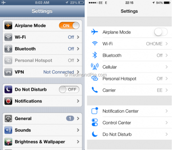
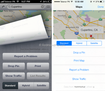
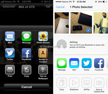
This is one of the most well-written explanations of how I personally feel. I too have yet to read one valid justification for flat design and other stripped UI features other than the "users don't need certain cues anymore" spiel, which stops there. No rationale why interfaces like the below were detrimental..... zero acknowledgment about certain benefits removed and even some things made more difficult.

Can any valid argument be given why the interface on the left was needing revised? Am I the only one who sees difficulty in reading the green start text on the right? Or the faint grey separator lines? (why even have them if they're impossible to read especially outdoors) Think about how often certain low-contrast text/color combinations in iOS 11 are really hard to read outdoors let alone indoors.

Better yet, think about this -- notice how how the ios6-esque app on the left doesnt have "stopwatch" in the top bar since it's so obvious what it is? I do agree needing to put "stopwatch" on the right, because at first glance it looks just like every other iOS 7 screen. Think about that a bit...

IMG_4205.PNG

So it's OK to for certain skeumorphism like in the picker that still looks like a barrel/cylinder, only with much less contrast for harder readability.

IMG_4206.JPG

So it's better to not have a darkish upper border/region and then not have gridlines in the Calendar? It was distracting to have buttons up top, which allowed options for words like "all calendars" and "June 2013" to clearly be informative only?

IMG_4208.PNG

It was that much of an improvement to stop looking like a calculator? Why don't desktop calculators in real life look more like the one on the right?

IMG_4209.PNG

I realize the below shows iOS 7, but what's the improvement on the right? Name one.

IMG_4210.PNG

With faddish light blue low contrast text on white backgrounds being so pervasive nowadays, what's the improvement on the right?

IMG_4211.PNG

What's the improvement with the low contrast keyboard on the right? What was wrong and in need of improvement with the darker and high contrast keyboard on the left?

IMG_4213.PNG
 

Attachments

  • IMG_4212.PNG
    IMG_4212.PNG
    266 KB · Views: 125
Last edited:
  • Like
Reactions: jon3543
No, not professionally, and that's a sincere answer. I'm a web / SharePoint developer and work for a health insurance company. Anything I could share (which wouldn't be a lot), wouldn't really give you the answers you're looking for. Also, I'm not a web designer. Anything I've done which looks super nice would have had the UI developed by someone with those skills.

As for iOS apps, I've fooled around and learned some stuff, but certainly don't have anything in the app store. I am getting ready to start my own project to replace a 32-bit app I don't want to loose (st@sh). But I've been lazy all summer and keep putting it off. I started something back in June, then got distracted with other projects. Now that iOS 11 is out, I plan to jump back in. But I probably won't go so far as to put it in the app store. If it was a money maker, the original developer wouldn't have killed it. But it's useful to me, so I'm going to create my own version.

The closest thing I would have to show-off would be a plug-in for a DVD database I use (DVDProfiler). If you're honestly curious, I could post screenshots of that. But again, I don't think it would be useful to you. I deliberately designed my plug-in to match the look and feel of the program I use. And it's 9 years old at this point, so not really a modern design.

And once again, I'm not making any claims, good or bad, about Apple's design. I think there were elements pre-iOS 7 that were good. I think there are elements post-iOS 7 that are good. But I do have problems with logic. Like using a design Apple had no part in to prove that Apple has poor UI design. If you want to slam Apple, I'm happy to stand back and watch. Just make it a fair fight.

It's a small web after all. You've done some fine work at Invelos. Here's to 4.0.
 
  • Like
Reactions: MEJHarrison
How can i find out if a app supports 64 bit before updating to iOS 11 to make sure it works please ?
 
How can i find out if a app supports 64 bit before updating to iOS 11 to make sure it works please ?
In iOS 10 when you open the app for the first time it will tell you that it's "slow" or 32bit only. On iOS 9, you're out of luck because it won't tell you. You'll have to dig for the answer then.
 
  • Like
Reactions: max2
That's exactly what they should've done. Just to "clean" it a bit from all the textures and clutter and leave it alone. I'm saying it all the time - iOS 7 was a personal vendetta from Jony Ive to Scott Forstall and iOS is their abused child now. Ive threw years of research and development that went into creating a delightful and intuitive experience into the garbage.
 
Can any valid argument be given why the interface on the left was needing revised? Am I the only one who sees difficulty in reading the green start text on the right? Think about how often certain low-contrast text/color combinations in iOS 11 are really hard to read outdoors let alone indoors.

iOS was clearly a rushed job, and you have used screenshots of the iOS 7 beta that doesn't help either. You should update the comparison to iOS 11.
 
  • Like
Reactions: Tozovac
That's exactly what they should've done. Just to "clean" it a bit from all the textures and clutter and leave it alone. I'm saying it all the time - iOS 7 was a personal vendetta from Jony Ive to Scott Forstall and iOS is their abused child now. Ive threw years of research and development that went into creating a delightful and intuitive experience into the garbage.

Exactly. If it could be made different, it was made different, for better or worse. I remember reading at the time that Ive said something like "nothing was added or left that wasn't necessary." Except for the reverb added to the "off" sound, because it was different. Or parallax, because it was different. Or going from a transparent volume status in the middle of the screen to translucent, blocking your video annoyingly for a few seconds - much worse function, but different.

Although, I personally enjoyed those background texture details. I remember the first time I booted up my 2005 Macpro, I loved the texture presentation and artfully 3-D rendered apple on the screen. To me that resonated such quality and thought and care. I would've gladly let the textures go in the name of a freshening if the rest stayed, like in Feyl's mockups. But once again and separate question -- what was the issue with a little bit of detail like that...people love different details in home furnishings, clothing, etc. in real life, yet it's poison on a mobile device or computer. Cowboy leather stitching in find your friends app? Sure let it go nobody might sweat it. Real life can look like real life but a mobile device looking like real life, oh no, nooooo.
[doublepost=1505384701][/doublepost]
iOS was clearly a rushed job, and you have used screenshots of the iOS 7 beta that doesn't help either. You should update the comparison to iOS 11.

Yes agree - I would if I could easily, but didn't want to spend the time - those images I found were already prepared, and generally, iOS 10 hasn't figured that much from iOS 7. I will sincerely try to remember to update or respond to that post once 11 hits the streets.
 
Register on MacRumors! This sidebar will go away, and you'll see fewer ads.