Become a MacRumors Supporter for $50/year with no ads, ability to filter front page stories, and private forums.
Guys, stop fighting over a term that even Apple didn't know. I certainly heard it first when iOS 7 was introduced. Here's a quote from Scott Forstall on that:

"I never heard the term skeuomorphism, even years after we built iPhone.

I mean, that’s a horrible word. It sounds unnatural, it just sounds terrible. When I look at good design—when I look for good design—I look for something which is easy to use.

Approachable and friendly that you can use without a manual.

If you look at the designs we did at Apple, we talked about photo-illustrative, metaphorical designs. And those were infused into the design sense of Apple by Steve Jobs since the original Mac if not earlier. The original Mac had a desktop and folders that looked very much like the desktop on which that Mac sat.

And so we used these design philosophies. It doesn’t mean that we loved every single part of it. It doesn’t mean I loved every single part of it. There’s definitely things that I was less a fan of than others. But we built these designs that worked. And how do we know they worked? You just had to watch people use it."


Scott's interview starts at 1:07:00. First public appearance since 2012 and I loved listening to him talk about Apple, the original conception of the iPhone and iOS, and of course, about Steve himself. Scott wrote software for nuclear submarine's weapons systems in high school, and can you just imagine the amount of quality coding that had to go into something as important and dangerous as that? I think that experience contributed to being a quality control/borderline obsessive freak when he eventually took on iOS development.

I enjoyed pre-iOS 7 very much, because back then iOS really carried the Apple symbolism of 'it just works', and also especially because Scott's own design cues were always carefully considered and every detail was created and inserted with a purpose. He mentioned during the interview that when he designed it in such a way that an old lady or a toddler can navigate through iOS without help, he knew he had succeeded. That is the true essence of good software design.

This is in stark contrast to Craig's iOS 7-11, where there are really too much white around the entire operating system, complete with large empty spaces and ginormous fonts, excessive animations, buttons inserted here and there without context of actual design. Control Center itself was redesigned TWICE in the last 2 years, as if the software team was testing the waters with random drafts. Craig's era of iOS has also felt slightly more unstable and had more bugs comparatively than Scott's.

I'm in agreement with Tozovac, Feyl and ThunderMasterMind in the preference of the old iOS design. Sure, it looks dated now, but most people don't understand or appreciate the subtleties that went into the design aspect of it. Scott's team had kept on perfecting the design with every iteration, and they don't change the UI for the sake of changing them. It was more stable, got things done faster, and was really a representation of Apple engineering at its finest.

In fact, I would go as far as to say that if Scott were to develop his alternate version of iOS 11 for the new iPhones with all the same features, I would use his version over Craig's without a shadow of doubt or consideration.
Also, if you hear Scott talking, it feels like he's genuinely interested and has actual passsion for what he's doing. I think he had such a tight bond with Steve, because he was so much like him. Craig to me is genuinely passioned too, but he's not in charge of the UI like Scott was. They have another team and leader aka Alan Dye for UI and UX. So my only hope in Apple is Craig, because he really feels genuine and smart in comparison to Phil, Mr. Ego Eddy Cue and Jony Ive.

Lastly, I have to say that I love Tim Cook as a leader. He's terrific leader and he does his job perfectly. He just doesn't have the taste and strive for perfection like Steve, so he trusts his friends (vice presidents) to do their jobs well. So, until the sales are down, he would be stupid to drastically change things at Apple. His only (and massive) error was firing Scott Forstall and that ultimately will decide the faith of the company I think.

PS: Now I know why is everything getting bigger and bolder in iOS. I saw a photo of Jony Ive at the Steve Jobs Theatre and he seems to wear glasses now.
 
I wish I could find the article or interview where Jony coldly dismisses certain pre-iOS7 treatments almost like a petulant child, offering how "he had nothing personally to do with" some of the UI features or over-the-top skeumorphism of the Forstall era. I remember reading that shivering slightly, or feeling sad, as it reflected his level of cooperation and overall vision for the user. It's one thing to apply personal taste towards creating a silver Christmas tree that's one of millions of Christmas trees, it's another thing to design a UI to reflect personal minimalistic taste that's used by millions of varied users.

As for the various reworkings of control center (perpetuating the lie of the goodness of iOS7+ rather than admit) -- do not forget how the Apple before Ive's entry to software rarely reworked something too radically once they knew they got it right, where there wasn't much need to push it further to any limit -- the OSX really hadn't budged largely for the many years leading up to Yosemite, where its rather radical UI overhaul reminded me of Microsoft's silly reinventions every 3-4 years, which I've repeatedly said were admissions that they completely blew it before...
 
Last edited:
I wish I could find the article or interview where Jony coldly dismisses certain pre-iOS7 treatments almost like a petulant child, offering how "he had nothing personally to do with" some of the UI features or over-the-top skeumorphism of the Forstall era. I remember reading that shivering slightly, or feeling sad, as it reflected his level of cooperation and overall vision for the user. It's one thing to apply personal taste towards creating a silver Christmas tree that's one of millions of Christmas trees, it's another thing to design a UI to reflect personal minimalistic taste that's used by millions of varied users.

As for the various reworkings of control center (perpetuating the lie of the goodness of iOS7+ rather than admit) -- do not forget how the Apple before Ive's entry to software rarely reworked something too radically once they knew they got it right, where there wasn't much need to push it further to any limit -- the OSX really hadn't budged largely for the many years leading up to Yosemite, where its rather radical UI overhaul reminded me of Microsoft's silly reinventions every 3-4 years, which I've repeatedly said were admissions that they completely blew it before...
Agree. The same with the font changes in iOS. That's a lack of vision that was non-existent under Steve.
 
What does this mean for artificial UIs? Well anything, you can band it very far in a digital realm. Another term is abstract, where they have realistic characteristics, like light and shadows, yet don't have any obvious relation to a real world object. I like to use skeuomorphic as the term because with UIs it can redone in different ways. iOS 6 was classified as a Skeuomorphic design, but a lot of things in it were abstract and not relative to real things.

Once again, bringing up the point of creativity. Skeuomorphic design is the limit, and it can be manipulated into something less in your face per say. You don't have this type of freedom with flat design.

View attachment 717499
[doublepost=1505343964][/doublepost]

I was referring to your "Keep in mind that skeuomorphism isn’t limited to mimicking real world objects. This applies to making solid elements that appear 3D, but reflect nothing of the real world making your statement even more irrelevant than before.". Things can be 3D and Skuemporphism, but 3D Design isn't Skuemporphism.

It seems to me that every user who says they prefer flat design you just have to argue about even though design is opinionated. Don't get me wrong, I like good design, and some Skuemporphism design looks nice, but it is simply undeeded for most people. Everyone below the age of 80 (and some above) know how to use a computer and don't need a design that looks real. Again this is just an opinion, so I'm not going to argue with you like you are with every other user about design.
 
Craig's era of iOS has also felt slightly more unstable and had more bugs comparatively than Scott's.

As I read this thread personal design preferences come to mind and I get that. What I believe many don't get is how the demands and complexity of the whole iOS system has grown in this time period.

When statements about bugs and such are made I just cringe and wonder if the writers really get the size and depth of the changes that have happened. We users are demanding more in, hardware, speed, apps, connectivity, visual quality, and just about everything imaginable from iOS.

I would also bet if any of us were handed an early iOS device the threads of complaint would go off the chain; slow, bad design, no apps, dark screens, ...
 
How can i find out if a app supports 64 bit before updating to iOS 11 to make sure it works please ?

Go to Settings, General, About, then if Applications has a little chevron on the right, you can click it and it will show you which apps are 32-bit. If you have no little chevron there (it's not clickable), then you have no 32-bit apps.

I used that method last night to wipe all my 32-bit apps off my phone. Still need to do so on my iPad.
 
Everyone below the age of 80 (and some above) know how to use a computer and don't need a design that looks real.

I like the way you phrased this sentence, using the word "need." It may help me to state something in a way that may finally inspire someone who disagrees with my statements/preferences to finally respond and provide a clearly objective (or at least intriguing) rebuttal against my (and others') claims and for theirs (and others').

As many rebuttals often incorrectly over-simplify and jump back towards "don't need no stinkin skeumorphism," let me state that yes, I agree everyone below the age of 80 (and some above) doesn't need a button on a screen to be represented like this:

emergency-button.jpg

Nor do we "need" leather stitching or even a beautifully-designed compass.

But why does the user no longer need clearly distinguishable differentiation between Actionable vs. Non-actionable items? Or, what's wrong with providing them other than stylistics? What's wrong with differentiating this zone vs. that zone, or with providing easy readability of text & gridlines & labels in a variety of light/environments? Why is it OK to remove efficient organization and instead require extra user taps/swipes/effort than before? It's often stated that the user doesn't need gloss & 3D-esque hints for pressable items, so then why did we need Parallax other than it wasa stylistic difference?

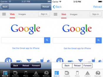
But for those pushing "for" flat design & minimalistic UI and/or pushing against comments/questions from me, Feyl, Thunderpalance, Beeplance, etc.: None of you have yet to effectively state any true objective benefit to the typical user by using an interface like that below to the right vs. that to the left, nor state any valid negatives to the user from that shown below to the left vs. that to the right.

button-bar.png

Maybe you'd state that for the screenview above to the right, the interface "disappears into the background so as to not distract the user" without going further about how exactly that's a functional benefit beyond any possible personal preferences, or how the interface on the left is actually detracting/distracting? Are you overlooking that the user still has to use that "background" area (the controls) ... and that there's potential for distraction when the user steps away from the middle/content to top or bottom borders that (too) often (for me) blend into the white middle area and have to take micro-pauses to process what's separate from what and then start next steps, or even worse in the case of safari, have to click an extra time to re-access the hidden menu commands (which should hardly be needed in today's age of large iPhones but that's another story).

Sure, design is subjective, particularly general appearance, but design for function/interaction would have certain universal common UI basics that (to me) should never include visually blending an app's "main feature/functional area" in with the "actionable controls" that are then easily confused with any "information only areas" into what looks like one overall flat presentation. The critique I keep reading here against interfaces like that above on the left are the repeated "users don't need that anymore" statements from people sounding emotionally insulted that a UI attempts to prompt them along in any way.

Readers here disagreeing with me know that I feel users need certain prompts that have been whited away, but I'd ask: Aside from any personal stylistic preferences, why do you think users shouldn't benefit from certain cues?

A particularly astongingly bad example is the "updated" Instagram UI, where the controls for responding to a photo completely blend in with controls for the app itself. Plus, is the word "instagram" up top a button or info only?

image1 (5).PNG

How is the interface above better than the interface below, in any way? Yes, I'll acknowledge certain features of the below interface look dated and could be updated, but wouldn't need to go completely white & flat & "buttonless" to be updated.

The inability of Apple's current UI/iOS design team to self-recognize the above (if not also seek the voice of customers enough to hear at least some complaints) is astonishing to me.

instagram_ios.png

It's the inability to justify objective improvements for flat/iOS7-10 (and 11?) vs. pre-iOS7 other than statements of "users don't need" that I find amusing yet baffling.
[doublepost=1505403573][/doublepost]
I would also bet if any of us were handed an early iOS device the threads of complaint would go off the chain; slow, bad design, no apps, dark screens, ...

If handed now, or back when the iPhone debuted? In the late 2000's when first trying an iPhone I thought the iPhone's interface absolutely blew the doors of my Palm Treo's interface, who's wonky UI I had learned to work with and accept as being good because it was the best at one time. They did get a lot correct out the chute, then kept refining & improving until 2013.
 
Last edited:
I would also bet if any of us were handed an early iOS device the threads of complaint would go off the chain; slow, bad design, no apps, dark screens, ...
I have actually tested that theory with my iPhone 4S. I handed it to some people and told them to do some basic iOS tasks and they really liked it. They never stopped mentioning how cool 6 looked and how smooth it was.
 
  • Like
Reactions: Beeplance and Feyl
I have actually tested that theory with my iPhone 4S. I handed it to some people and told them to do some basic iOS tasks and they really liked it. They never stopped mentioning how cool 6 looked and how smooth it was.

Personally I liked the older, non-flat look but, at the time people were clamoring for a more modern look to iOS.

I just go with the flow, enjoy the connectivity between all my Apple devices and look forward to a more multitasking iOS 11.
 
Personally I liked the older, non-flat look but, at the time people were clamoring for a more modern look to iOS.

I just go with the flow, enjoy the connectivity between all my Apple devices and look forward to a more multitasking iOS 11.
At the time I wanted a more modern look too, but I was shocked when iOS 7 was introduced. What I wanted from Apple, was to "refresh" it's look and feel, not to destroy basic rules of usability and readability.
 
I like the way you phrased this sentence, using the word "need." It may help me to state something in a way that may finally inspire someone who disagrees with my statements/preferences to finally respond and provide a clearly objective (or at least intriguing) rebuttal against my (and others') claims and for theirs (and others').

As many rebuttals often incorrectly over-simplify and jump back towards "don't need no stinkin skeumorphism," let me state that yes, I agree everyone below the age of 80 (and some above) doesn't need a button on a screen to be represented like this:

View attachment 717649

Nor do we "need" leather stitching or even a beautifully-designed compass.

But why does the user no longer need clearly distinguishable differentiation between Actionable vs. Non-actionable items? Or, what's wrong with providing them other than stylistics? What's wrong with differentiating this zone vs. that zone, or with providing easy readability of text & gridlines & labels in a variety of light/environments? Why is it OK to remove efficient organization and instead require extra user taps/swipes/effort than before? It's often stated that the user doesn't need gloss & 3D-esque hints for pressable items, so then why did we need Parallax other than it wasa stylistic difference?

But for those pushing "for" flat design & minimalistic UI and/or pushing against comments/questions from me, Feyl, Thunderpalance, Beeplance, etc.: None of you have yet to effectively state any true objective benefit to the user by using an interface like that below to the right vs. that to the left, nor state any valid negatives to the user from that shown below to the left vs. that to the right.

View attachment 717650

Maybe you'd state that for the screenview above to the right, the interface "disappears into the background so as to not distract the user" without going further about how exactly that's a benefit, or how the interface on the left is actually detracting/distracting? Are you overlooking that the user still has to use that "background" area (the controls) ... and that there's potential for distraction when the user steps away from the middle/content to top or bottom borders that (too) often (for me) blend into the white middle area and have to take micro-pauses to process next steps, or even worse in the case of safari, have to click an extra time to re-access the hidden menu commands (which should hardly be needed in today's age of large iPhones but that's another story).

Sure, design is subjective, particularly general appearance, but design for function/interaction would have certain universal common UI basics that (to me) should never include visually blending an app's "main feature/functional area" in with the "actionable controls" that are then easily confused with any "information only areas" into what looks like one overall flat presentation. The only attempted detraction I've been able to discern from comments here, to date, for interfaces like that above on the left is the repeated statements of "users don't need anymore," from people sounding emotionally insulted that a UI attempts to prompt them along in any way.


A particularily astongingly bad example is Instagram, where the controls for responding to a photo completely blend in with controls for the app itself. Plus, is the word "instagram" up top a button or info only?

View attachment 717654

How is the interface above better than the interface below, in any way? Yes, I'll acknowledge certain features of the below interface look dated and could be updated, but wouldn't need to go completely white & flat & "buttonless" to be updated.

The inability of Apple's current UI/iOS design team to self-recognize the above (if not also seek the voice of customers enough to hear at least some complaints) is astonishing to me.

View attachment 717656

It's the inability to justify objective improvements for flat/iOS7-10 (and 11?) vs. pre-iOS7 other than statements of "users don't need" that I find amusing yet baffling.
[doublepost=1505403573][/doublepost]

If handed now, or back when the iPhone debuted? In the late 2000's when first trying an iPhone I thought the iPhone's interface absolutely blew the doors of my Palm Treo's interface, who's wonky UI I had learned to work with and accept as being good because it was the best at one time. They did get a lot correct out the chute, then kept refining & improving until 2013.
Settings - General - Accessibility - Button Shapes

First thing I enable when I set up new iOS devices.
 
I’ll throw you guys a bone. For all that I’ve given crap to the aesthetics of the pre 7 iOS in places I will say this about Scott. The guy kept the trains running on time. If the actually design were taken out his hands a bit and he kept running the show, iOS would be better for it I suspect. To be specific, the input blocking, the delays, the little things that stop everything feeling solid; would likely have either not happened or happened much less frequently under Scott.
 
  • Like
Reactions: Beeplance and Feyl
Settings - General - Accessibility - Button Shapes

First thing I enable when I set up new iOS devices.

Really? Did you read my entire post? :) And, that's hardly is a solution from Apple for differentiating actionable items. I too have acquiesced since day 1 to enabling all of Apple's "accessibility" options for those of us abnormal users needing special accommodations, such as bold font, reduce whitepoint, and the amazing "enable button shapes" which is a joke because it very inconsistently provides a flat button shape only occasionally, and one that looks like it took as much care to create as it does to raise a middle finger to the user, wink, then move on with life. Pigeon holing these items under "accessibility" do also underscore the complete lack of understanding of the user and UI by today's key decision makers at Apple after 2013. I could re-write UI requirements and do a much better job than the final sign-off guru, and probably at a fraction of his salary too.
 
Last edited:
iOS 11 also comes with more questionable User Interface changes for the iPhone X. For example, the points about the notch area in this article:
Everything You Need to Know About the iPhone X's Controversial Notch

With the iPhone X, I'm sure you guys know they have also changed the way Control Center is accessed: now swiping down from the top instead of swiping up from the bottom, because swiping up is now used to return to the home screen. This creates a inconsistency that contrasts with the operation of other i-devices.

Quinn Nelson (@SnazzyQ) suggested that returning to home screen should have been done via 3D touching the bottom region of the screen, which would have allowed for Control Center to be accessed normally. I think this is a good alternative, though the downside is that Apple have to find some way to make it obvious to the average user.

From a design standpoint, how do you think they should've done it, both for the notch region as well as other parts of the UI?
 
  • Like
Reactions: yep-sure
iOS 11 also comes with more questionable User Interface changes for the iPhone X.

Whether it's ios7-11, macbook function keys, or now the iPhone, Apple sure seems to be waging war on buttons, huh? I've been realizing that too often, today's version of a manufacturer giving the consumer something new involves giving less. New cars often are smoothed-over versions of the prior model, TV's are removing physical buttons and providing just a remote, and Apple's constant stripping down of UI. Really it seems Apple is the king of removing more to provide less and then charging more...magsafe, headphone jacks, battery life for the sake of thinness, USB ports...now the home button. As I've said before, how long will it be before Apple realizes the quandary they've put themselves in where they're defining themselves by constantly removing so much, which may make a lot of sense in Marketing & Engineering meeting rooms but maybe not as much outside of the office? And, what universal law ever proclaimed that a physical button was bad, one that you can find and activate often without looking or in the dark? I for one will never ever again buy a car where the volume control isn't a turnable button, and I'll never buy a car where HVAC, radio, and nav controls are touch-screen like a microwave. I can only imagine the amount of neurons that have been and are exercised at Apple trying to figure out a way to remove physical volume & on/off buttons, you know they're next eventually...then what will Apple remove for sake of design?
 
Last edited:
  • Like
Reactions: yep-sure and Feyl
This is such an interesting thread to me. It really illustrates how different peoples' perceptions can be. I think iOS 1-6 looked good 10 years ago, mostly because it was radical and new...but when I see it now it looks hideous. I'm someone that's very passionate about design. Be it architecture, cars, or software...I prefer a clean, modern aesthetic. Superfluous detailing makes me ill. The original iOS and Mac OS X broke a lot of the rules of good design. Design should be unobtrusive, and the original iOS was VERY visually obtrusive. Like I said, it was novel at first, but aged incredibly quickly. 2-3 years in I was aching for a UI overhaul. iOS 7-11 is very unobtrusive. It's minimal and takes on the look of the content rather than being content itself. Of course it's going to look ugly when you have a stark white wallpaper on your home screen, as posted in this thread....but with a beautiful photo wallpaper, iOS 7-11 are far less visually distracting than the older versions. The apps have a lot of white space because white is clean and modern. It always has been and always will be. It's not a trend. It's been 4 years since iOS 7 launched and I still don't feel any desire for a massive change. It's aged incredibly well, and I appreciate the refinements to icons and animations to keep it fresh.

When the iPhone launched, the software WAS the design. There was no customization, no third party anything, not even wallpapers...we were stuck with a black background. There was also far less contact to interact with. The UI was 90% of what we saw while using the phone and at the time, the visually heavy iOS 1-6 made sense. As tech evolves, we're interacting far more directly with the content itself and the UI is becoming less and less of a focal point. Modern iOS reflects this.

I also don't understand all the discussion about needing prominent buttons in software. There has not been a single instance where I've been using my phone and was unsure of where to push for a specific action. It's exceedingly clear and I don't need unnecessary visual representation. Maybe some brains are wired differently...i don't know.
 
Fascinating... but great post. Would you mind elaborating on a few things below? I'm asking only to better understand user preferences such as yours which to date I can't help but feel are based solely on personal subjective taste for appearances and less so for function -- it's one thing to like the look of iOS7-11 much more than ios6 & prior, but I'm honestly very curious to see whether you might recognize certain functional limitations in either ios1-6 vs. ios7-11.

Superfluous detailing makes me ill. The original iOS and Mac OS X broke a lot of the rules of good design. Design should be unobtrusive, and the original iOS was VERY visually obtrusive. Like I said, it was novel at first, but aged incredibly quickly. 2-3 years in I was aching for a UI overhaul.

For the above, could you give an example other than items like leather stitching, address book pages, iBookstore wooden shelves, fancy wooden/glass compass?

iOS 7-11 is very unobtrusive. It's minimal and takes on the look of the content rather than being content itself.

...

The UI was 90% of what we saw while using the phone and at the time, the visually heavy iOS 1-6 made sense. As tech evolves, we're interacting far more directly with the content itself and the UI is becoming less and less of a focal point. Modern iOS reflects this.

For the above: would you mind looking further above to my post #408 for the comparison of the Google screens, where one has clear borders & tools defined and where the other shows something that definitely blends in altogether. Is that an example of what you mean, where one is much more preferable to you?

Is the darker one from earlier iOS's unusable if not worse to use than the one on the right? I find the one on the right much more frustrating personally for reasons I'll mention below.

Similarly in that #408 post, for the Instagram screen - I personally often feel frustration when aspects of the screen/app (like the tools for responding to a photo) blend "seamlessly" into the app controls, and this is a great example. The bottom border has very similar function icons, even in appearance, except they do different things in that they control your photos/account. Granted, I positioned the photo so that the tools touch, but that happens very often when using Instagram. I'm one who would prefer a slight separation of the content vs. tools, just like a kitchen stove. I wouldn't want the controls to be on the same surface as the burners, and to look virtually alike. If that sounds silly for a real-world item, why is that silly for a 10" iPad?

Is the example I showed highly preferable to you over having, say, a darker border for the bottom tools?

I also don't understand all the discussion about needing prominent buttons in software. There has not been a single instance where I've been using my phone and was unsure of where to push for a specific action. It's exceedingly clear and I don't need unnecessary visual representation. Maybe some brains are wired differently...i don't know.

Brains...if you mean taste & preferences, then yes you are correct. But there is a physical aspect where the current interface often doesn't provide ample feedback to where the experience is very much diminished for me. A large part of my frustration in this buttonless interface is how a small bit of text sans buttons is often horribly difficult to use on a non-physical interface where I can't feel the button pressed. Way too often the iPhone dialer on my 5s is frustrating because my fingers cover the small round button to the point that I can't tell if I pressed it, and I don't think the user should be required to glance up 10 times to see whether a number was pressed. Similarly for the voicemail screen - the small words for speaker, call back, and delete are way, way too small. I very, very often have to press "delete" two if not three times because the command area sans button is just too small. Also now the use across the board of a small wispy line for things like safari page load status (blue line at bottom of the address box) and podcast length/status (small line at the bottom of the oversize podcast art)...I have a hard time where the use/function is so diminished that I can't understand the benefit of how it "disappears into the content"...the blue line takes actual attention to look up and see vs. the prior method of filling in the entire address window and sweeping to the right. The wispy small podcast length status vertical hash mark often takes two if not three touches to activate and slide. How much better would it be if a larger round shape was used that once you rested your finger on it you knew it was activated. To me these functional depredations in the name of cleaner look across all apps is just torture for the sake of the designer's ego.

It's never been as much about not seeing a button and not knowing how to make things work. It's more the extra work it takes way too often to work without a button and having reasonable clickable/selectable area.

I'd love a thoughtful reply to my questions & comments & an honest comment as to whether or not you've experienced any similar instances where functions sometimes take you an extra move or attempt. It could be very well that you like the appearance so much that you don't even notice when it might happen. For me no appearance is worth it if it didn't work as good as before.

And -- it would be great if you walked through my post #408 above and responded to my questions. Not trying to put you personally on the spot as much as I'm trying to learn of any valid rationale for iOS 7+ UI other than personal preference. If it just boils down to personal preference, I could never call you or or anyone's preferences as being wrong. If Apple presented two options, something more like iOS 6, and something more like iOS 7 and later, that would be the best of both worlds.
 
Last edited:

Nice wallpaper.

This ios11 screen isn't real is it? The icons still look way too amateurish. I couldn't imagine icon/app designers at Apple being fulfilled creating something a child could create. The too-thin font in the red notification for Reminders seems hard to read as usual (then again I'll fix Apple's mistake usimg Bold Fonts since I'm impaired and need Accommodation features). And if you look and really, really think about it, why is the grey dock even needed since it's obvious what so many icons there means. So much obtrusive superfluous user aid, ick!! :)

I see a potential dropping of the app names down at the dock, which feels quite shortsighted and contradictory to the apps above. Considering my post #416 above, is this more of apple's war on helpful content and quest to keep removing things as part of some demented minimalization design project?
 
Last edited:
  • Like
Reactions: Feyl
I still have my iPhone 5 running iOS 6.1.4 that I clung onto for dear life and flat out refused to update because when iOS 7 was unveiled, I was devastated and had this “Oh no… what the heck have they done?” sinking, depressed feeling. It felt surreal, especially as others were praising it while I just couldn’t understand how anyone could possibly think that looked better. That’s when I realised that this isn’t the Apple I fell in love with anymore, and things will become much worse (design wise) from here on out.

I eventually upgraded to an iPhone 6 Plus (was pretty much forced to with my most used apps no longer supporting iOS 6) while still keeping my iPhone 5. Apart from the UI looking worse, I immediately noticed how much bogged down the performance was coming straight from my 5. I was expecting to be blown away by its performance, but instead was left completely let down and even startled at how much worse it was with its UI lag and jitters littered around the OS. So not only did it look worse, it performed worse. It was honestly the worst “upgrade” I’ve ever had and made me realise even more that Apple has lost its magic. No more Steve (who I miss dearly the more years that pass) to keep everyone in check.

I’ve come to like the design of iOS since, mainly due to having gotten used to it and forcing myself to like it, but only in some areas. The majority still feels cheap to me and not premium like how it used to look and operate. The performance is still piss poor in terms of UI lag, I honestly get infuriated when people say how smooth it is. Nope. I made a video below showing how snappy iOS 6 really was. This is what smooth is supposed to be like and what actual good design used to look like in action:


Bare in mind that this is an almost 5 year old OS running on 5 year old hardware. Every time I pull it out, I get amazed at how fluid it is compared to my 2017 A10 iPhone 7. Yes, the latest iPhone currently available with the fastest chip Apple has feels slower than a 5 year old iPhone mainly due to its OS alone. Despite recording in 60fps, the video doesn’t do it justice how snappy and pleasant to use it really is. Just solid, consistent, "boom, boom, boom" performance. I also marvel at its beauty, with every app having its own identity and not overbearing, bland, blinding white space thrown in my face. The attention to detail in the books app specifically, after pulling it down and showing the Apple logo above is such a nice touch. Details like that are sorely missed.
 
The performance is still piss poor in terms of UI lag, I honestly get infuriated when people say how smooth it is. Nope. I made a video below showing how snappy iOS 6 really was. This is what smooth is supposed to be like and what actual good design used to look like in action:

Yup. Hear hear. I've always noticed that too. My current 5s with iOS10 is very jittery at times, even with ample free RAM. Amazing how an "advanced and improved" UI like ios7 rendered my then only-3-year old iPhone 4s completely unusable, and I mean completely. It's a crime that Apple was allowed to handcuff 4s users like that, I'm surprised to have not heard of any class action against Apple.

One seemingly unneeded solution to a problem that didn't exist and that perplexed me was changing the icons to be vector-based instead of (I believe) image-based, perhaps as a way to skew things towards the simplistic flat geometric shape-designed icons. I often see the grey vector grids appear during occasional jittery/slow loading of the Settings page, and -- really -- why would "advancing" the icons a vector-based system be needed in Apple's brave new world of babyfied icons that look like 3rd grade paper cut-outs (think: early South Park cartoons)?

Just more unnecessary change for the unnecessary sake of change?
 
Register on MacRumors! This sidebar will go away, and you'll see fewer ads.