Become a MacRumors Supporter for $50/year with no ads, ability to filter front page stories, and private forums.
One could only dream...
(I refuse to mock up the X because of it's poor design of display, but will try if asked.)

iph8.png
 
Oh come on now. What's really wrong with an unfinished/draft-looking low contrast on white interface?

IMG_3643.JPG
 
As for iOS apps, I've fooled around and learned some stuff, but certainly don't have anything in the app store. I am getting ready to start my own project to replace a 32-bit app I don't want to loose (st@sh). But I've been lazy all summer and keep putting it off. I started something back in June, then got distracted with other projects. Now that iOS 11 is out, I plan to jump back in. But I probably won't go so far as to put it in the app store. If it was a money maker, the original developer wouldn't have killed it. But it's useful to me, so I'm going to create my own version.

Let me know if you are reviving the st@sh app. Can't seem to find a suitable replacement...
 
Doesn't seem like anything new beyond what's already been discussed about it many times over.

Yup. Just repeating my utter disbelief of how such a low quality cheap-looking UI is allowed to linger since 2013. Like I've openly admitted here or elsewhere, it's therapy and makes me feel better to point at and make fun of the funny-looking man on the corner who never smiles or makes warm eye contact, instead maintaining the same cold, clinical thousand-yard gaze for every mood or situation. He says he's wearing absolutely nothing that's unnecessary in today's world but he looks utterly ridiculous in his white loafers and transparent silver and faint light blue suit and no necktie, no collar, no belt, no buttons. Not even any pockets because he says everything he needs is buried underneath his clothes, requiring extra steps to access what he used to wear on his wrist or keep in his front shirt pocket. Noone forced him to those decisions other than himself so for once, this man deserves every bit of being made fun of. He clearly once understood that life is good with color and warmth, and with a few appurtenances that didn't need such over-scrutinization, but he's just too up in his head and ways for now to realize and admit the errors of his ways.
 
Last edited:
Let me know if you are reviving the st@sh app. Can't seem to find a suitable replacement...

Will do. I started a project a few months back, then got busy with other stuff. But now that I have a real need for it, I might just give it another go soon. If I get something working, I'll let you know. I've not written iOS apps before (beyond training type things). But I've been a developer for over 30 years, so I certainly have the skills to do so. So it's just a matter of me getting off my butt and doing it.
 
IMG_4238.jpg

IMG_4237.jpg

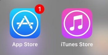
I don't know what's more amazing. I didn't think it was possible for iOS 11 to get even dumber than iOS 10, with all this talk about improvements in the UI for people like me who detest the operating system UI after ios6 but they did it, which I find amazing. Did they really need to do this to the icons? Itunes store as a star? App Store as three popsicle sticks? Perhaps what I find more amazing is that they actually made an aspect of iOS 10 seem detailed and interesting looking.

I dare one member here to tell us why the new App Store icon change was necessary and better than before. I dare you. I know noone will come up with a valid reason, but I dare you to try. Well, I know none of you also will be able to explain why they got rid of the program titles for apps in the dock area.

Someone please get this design "leadership" team the hell out of Apple. Seriously kids, Microsoft were the ones who unnecessarily reinvented each time. Seeing this on my girlfriend's iPhone scares the hell out of me to try iOS 11.

Does anybody know whether Apple is pulling the same insecure crap they did with iOS 7, where you could not revert back to iOS 6 after a few days of trying the trainwreck iOS 7?
 
Last edited:
  • Like
Reactions: sammy2066 and Aydy
View attachment 722792

View attachment 722791

I don't know what's more amazing. I didn't think it was possible for iOS 11 to get even dumber than iOS 10, with all this talk about improvements in the UI for people like me who detest the operating system UI after ios6 but they did it, which I find amazing. Did they really need to do this to the icons? Itunes store as a star? App Store as three popsicle sticks? Perhaps what I find more amazing is that they actually made an aspect of iOS 10 seem detailed and interesting looking.

I dare one member here to tell us why the new App Store icon change was necessary and better than before. I dare you. I know noone will come up with a valid reason, but I dare you to try. Well, I know none of you also will be able to explain why they got rid of the program titles for apps in the dock area.

Someone please get this design "leadership" team the hell out of Apple. Seriously kids, Microsoft were the ones who unnecessarily reinvented each time. Seeing this on my girlfriend's iPhone scares the hell out of me to try iOS 11.

Does anybody know whether Apple is pulling the same insecure crap they did with iOS 7, where you could not revert back to iOS 6 after a few days of trying the trainwreck iOS 7?
The new App Store icon evokes a feeling of playfulness.....since most apps downloaded are games. And the “Star” of the iTunes Store is actually spotlights made into a Star to indicate TV/movies. Which is where the app is headed anyway. It doesn’t make sense for it to be a music note anymore because it creates confusion with the music app and more people are streaming now anyway than buying music.

So I’m confused on why you’re confused.
 
View attachment 722792

View attachment 722791

I don't know what's more amazing. I didn't think it was possible for iOS 11 to get even dumber than iOS 10, with all this talk about improvements in the UI for people like me who detest the operating system UI after ios6 but they did it, which I find amazing. Did they really need to do this to the icons? Itunes store as a star? App Store as three popsicle sticks? Perhaps what I find more amazing is that they actually made an aspect of iOS 10 seem detailed and interesting looking.

I dare one member here to tell us why the new App Store icon change was necessary and better than before. I dare you. I know noone will come up with a valid reason, but I dare you to try. Well, I know none of you also will be able to explain why they got rid of the program titles for apps in the dock area.

Someone please get this design "leadership" team the hell out of Apple. Seriously kids, Microsoft were the ones who unnecessarily reinvented each time. Seeing this on my girlfriend's iPhone scares the hell out of me to try iOS 11.

Does anybody know whether Apple is pulling the same insecure crap they did with iOS 7, where you could not revert back to iOS 6 after a few days of trying the trainwreck iOS 7?

I know you’ll end up just completely dismissing this, but one or two possible reasons as to why the iTunes Store icon changed.

1: A star often represents actors and with iTunes now potentially making more movie sales than music sales recently with most of their music services shifting towards streaming and Apple Music. It makes sense that the icon for iTunes change being geared for movies/TV instead of the music note icon. (Most plosable explanation I can think of)

2: Somewhat tying into #1. Having two music note icons is weird. And due to reason in #1 and music for Apple is less reliant on iTunes and more in Apple Music. Change the icon to something else that relates to what iTunes has to offer for sale.

I tried. But based on your attitude towards anything past iOS 6 you’ll as I’ve said just say “nope! That’s stupid!” and completely dismiss 100% valid “explanations”
 
  • Like
Reactions: Compote and warden
I know you’ll end up just completely dismissing this, but one or two possible reasons as to why the iTunes Store icon changed.

1: A star often represents actors and with iTunes now potentially making more movie sales than music sales recently with most of their music services shifting towards streaming and Apple Music. It makes sense that the icon for iTunes change being geared for movies/TV instead of the music note icon. (Most plosable explanation I can think of)

2: Somewhat tying into #1. Having two music note icons is weird. And due to reason in #1 and music for Apple is less reliant on iTunes and more in Apple Music. Change the icon to something else that relates to what iTunes has to offer for sale.

I tried. But based on your attitude towards anything past iOS 6 you’ll as I’ve said just say “nope! That’s stupid!” and completely dismiss 100% valid “explanations”
The thing is, if they are going to change the icon to something that doesn't really make sense (most people I talk to say they don't understand the icon), they should change the name too. iTunes doesn't need to be called iTunes with what you just said in mind. iTunes is still iTunes and the logo is and as far as I can tell always will be 2 eighth notes regardless of what they do on iOS.
[doublepost=1506963369][/doublepost]
The new App Store icon evokes a feeling of playfulness.....since most apps downloaded are games. And the “Star” of the iTunes Store is actually spotlights made into a Star to indicate TV/movies. Which is where the app is headed anyway. It doesn’t make sense for it to be a music note anymore because it creates confusion with the music app and more people are streaming now anyway than buying music.

So I’m confused on why you’re confused.
That explanation doesn't explain the new App Store icon very well. The old one was a pencil, ruler, and paint brush. It represented that this is the place to go to add on to your device and make it yours. The new one is nothing but abstract.
 
  • Like
Reactions: yep-sure and Feyl
My only gripe (and same as "mobile-first" website designs these days) is it feels like it was made for people with bad eyesight. All the fonts are larger, bolder, and have more whitespace than previous versions. What point is a 5.5" screen if I can only see a few lines of text at a time?
 
Well all my downgrades to iOS 10 fail, so yes?

If I can't revert back if I dont like it then i think there's no way I'll "upgrade" for a while until I look things over online and hear feedback. I sure miss the days before 2013 when I could automatically upgrade anything Apple-related with zero hesitation or required added research, knowing that 99% of new decisions at the time were going to be bulletproof and based on solid fundamentals as evidenced by everything else they delivered since I became a user in 2005.

I know you’ll end up just completely dismissing this, but one or two possible reasons as to why the iTunes Store icon changed.

1: A star often represents actors and with iTunes now potentially making more movie sales than music sales recently with most of their music services shifting towards streaming and Apple Music. It makes sense that the icon for iTunes change being geared for movies/TV instead of the music note icon. (Most plosable explanation I can think of)

2: Somewhat tying into #1. Having two music note icons is weird. And due to reason in #1 and music for Apple is less reliant on iTunes and more in Apple Music. Change the icon to something else that relates to what iTunes has to offer for sale.

I tried. But based on your attitude towards anything past iOS 6 you’ll as I’ve said just say “nope! That’s stupid!” and completely dismiss 100% valid “explanations”

No I won't completely disagree. Though I would have rather you took a stab at the Apps icon, that was my major critique -- the constant dumbing down/over-simplifying and constant minimization to where it doesn't even look like anyone's trying anymore at Apple. Apple used to be the BEST, VERY BEST with UI's, and were heads & shoulders above any nearest competitors. Now they're me-too's in a land of translucent low-contrast dumbed-down UI's coming in from all directions, all saddled with some marketing driven title (Material Design...Responsive Design...). Apple went from being the hip jock/scholar that students looked up to and whom anyone could approach to just another slacker stoner me-too'er hanging out under the bleachers, all dressed in faded denim and surrounded by a grey haze.

Someone claimed above that the apps store was mostly for games, so the popsicle sticks evoked a sense of fun & playfulness... That I can quickly disagree and dismiss as 90% of the apps on my phone are for things like banking, productivity, home surveillance/security, home automation, and daily-life-business items. Not games. Like I've said often, Apple's new mantra of giving you something more/new by taking, taking, taking away as much as possible is getting out of hand and painting themselves into a corner. Keep it up Apple - what will you do when the 3 popsicle sticks turn into a simple 'A.' At that point why even have icons, let's go back to list-based interfaces.

As for iTunes, sure that's a reasonable try, but again as pointed above by @ThunderMasterMind, it's still called iTunes. FWIW I would have been more impressed if they left the eighth notes and added the icons they use in the store itself: analog film roll and TV screen. Nobody should argue again using a (gasp) analog film roll depiction since they still use a 1980's telephone handset for the phone icon. But realize please I'm judging less what they changed it to as much as: stop changing things up in ways that are just different, and instead stick to changing in ways that actually improve. The app is still called iTunes, so what did they gain by changing away from something that's worked for over a decade now, and that's just different.

And like I said: already iOS11 is making certain aspects of iOS10 seem more detailed & more interesting/intuitive, as they continue to over-think. Crazy!
[doublepost=1506971672][/doublepost]

PS for the example above (dumbing down the apps icon and unnecessarily changing the iTunes icon): Neither is enough to stop me from considering changing to iOS11 but it's yet another warning that Apple may have changed more for the worse that I'm not aware of. So why take the risk before I invest time researching what they changed. Like OSX's BLUE folders and dumbed-down stoplight buttons that are just too eye-painful for me to use.
 
Last edited:
There have been indeed some questionable design decision from Apple lately, but I think we forget how HUGE the iOS user base is. Any design change will draw incredible response from the average user, much more so than any Android change. I think Apple is aware of that, but I also think we're at a tipping point in iOS design. I am encouraged to see the HUGE changes that came to iPad with iOS 11, and I fully expect more along these lines for iPhone in iOS 12, especially now that the home button is going away. I like the gestures coming to iPhone X, and can't wait to see more of those. I think iOS 11 is a stepping stone, a command ground between home button iPhones and non home button iPhones. I expect heavy gesture based design changes in iOS 12 and I think it will be another big leap ahead of Android next year.
 
If I can't revert back if I dont like it then i think there's no way I'll "upgrade" for a while until I look things over online and hear feedback. I sure miss the days before 2013 when I could automatically upgrade anything Apple-related with zero hesitation or required added research, knowing that 99% of new decisions at the time were going to be bulletproof and based on solid fundamentals as evidenced by everything else they delivered since I became a user in 2005.


No I won't completely disagree. Though I would have rather you took a stab at the Apps icon, that was my major critique -- the constant dumbing down/over-simplifying and constant minimization to where it doesn't even look like anyone's trying anymore at Apple. Apple used to be the BEST, VERY BEST with UI's, and were heads & shoulders above any nearest competitors. Now they're me-too's in a land of translucent low-contrast dumbed-down UI's coming in from all directions, all saddled with some marketing driven title (Material Design...Responsive Design...). Apple went from being the hip jock/scholar that students looked up to and whom anyone could approach to just another slacker stoner me-too'er hanging out under the bleachers, all dressed in faded denim and surrounded by a grey haze.

Someone claimed above that the apps store was mostly for games, so the popsicle sticks evoked a sense of fun & playfulness... That I can quickly disagree and dismiss as 90% of the apps on my phone are for things like banking, productivity, home surveillance/security, home automation, and daily-life-business items. Not games. Like I've said often, Apple's new mantra of giving you something more/new by taking, taking, taking away as much as possible is getting out of hand and painting themselves into a corner. Keep it up Apple - what will you do when the 3 popsicle sticks turn into a simple 'A.' At that point why even have icons, let's go back to list-based interfaces.

As for iTunes, sure that's a reasonable try, but again as pointed above by @ThunderMasterMind, it's still called iTunes. FWIW I would have been more impressed if they left the eighth notes and added the icons they use in the store itself: analog film roll and TV screen. Nobody should argue again using a (gasp) analog film roll depiction since they still use a 1980's telephone handset for the phone icon. But realize please I'm judging less what they changed it to as much as: stop changing things up in ways that are just different, and instead stock to changing in ways that actually improve. The app is still called iTunes, so what did they gain by changing away from something that's worked for over a decade now, and that's just different.

And like I said: already iOS11 is making certain aspects of iOS10 seem more detailed & more interesting/intuitive, as they continue to over-think. Crazy!
[doublepost=1506971672][/doublepost]

PS for the example above (dumbing down the apps icon and unnecessarily changing the iTunes icon): Each is not enough to stop me from changing to iOS11 but are more a constant reminder that Apple may have also unnecessarily changed something just to change things in a direction that's too distractingly painful. So why take the risk before I invest time researching what they changed. Like OSX's BLUE folders and dumbed-down stoplight buttons that are just too eye-painful for me to use.

At the end of the day it’s literally just icons. I don’t know why you need to spend so much effort into hating on totally irrelevant things.

You are acting as if the changes to iOS drastically alter your personal life. While yes it’s a device used daily, a changed icon has ZERO impact on that (or at least should have zero impact) but for whatever reason you’re taking everything about iOS and make it as if it’s a personal attack on you. I think you need to relax and reevaluate what’s important in life. They’re just pixels dude. You tap on them and things happen just the same. Same goes for UI elements. As far as aesthetics, not really a lot has changed. Overall layout and all. Settings is literally the same settings it’s always been, and so on.

It’s embarrassing how much time and effort you spend trying to convince others you’re right and iOS 7-11 is wrong.

Oh please, it's not just two icons at issue here. Look around/read around a bit before you post.

I have increased sensitivity and decreased tolerance towards unbalanced design than others, I have admitted often.

Sorry you're embarrassed, move on if you like! :)
 
  • Like
Reactions: Aydy
Why do so many people care what an ICON looks like - I care what the application does and not what its icon looks like.
 
  • Like
Reactions: MEJHarrison
Why do so many people care what an ICON looks like - I care what the application does and not what its icon looks like.

Um, please read my post above yours. My and others' critiques are very much mostly about applications and how they work.

Why do so many people not comprehend. :)
 
At the end of the day it’s literally just icons. I don’t know why you need to spend so much effort into hating on totally irrelevant things.

You are acting as if the changes to iOS drastically alter your personal life. While yes it’s a device used daily, a changed icon has ZERO impact on that (or at least should have zero impact) but for whatever reason you’re taking everything about iOS and make it as if it’s a personal attack on you. I think you need to relax and reevaluate what’s important in life. They’re just pixels dude. You tap on them and things happen just the same. Same goes for UI elements. As far as aesthetics, not really a lot has changed. Overall layout and all. Settings is literally the same settings it’s always been, and so on.

It’s embarrassing how much time and effort you spend trying to convince others you’re right and iOS 7-11 is wrong.

It is true that this thread is discussing about the small technicalities of iOS - icons, button shapes, fonts, misc UI elements, colour, lines etc.

But part of what makes iOS so great in the first place (iPhone OS 1 - iOS 6) is that the software design team (under Scott Forstall) paid OBSESSIVE attention to these small details. Every nook and cranny of iOS was originally designed with an intent and had a certain shade of colour for a reason. Then iOS 7 onwards swept that all away with a giant white canvas and revamped most buttons with greatly reduced clarity and context.

No offense, but 'They're just pixels dude' and 'it's literally just icons' are the kind of dismissive comments that comes from those who are not passionate about software design. Great designers dedicate their time and energy towards perfecting every minuscule part of the User Interface, because they understand that each and every part - no matter how small - is consequential to the whole experience. Design shouldn't be recklessly changed unless an objectively better design can be properly justified.

This may apply to other companies in the world, but Apple has made it clear for many years now that it prides itself on both industrial and software design. I doubt Tozovac and ThunderMasterMind would be here wasting their time and effort pointing out the flaws of the current software design if this forum isn't about Apple. The moment Apple starts devoting less effort and obsession to sorting out their design elements will be the moment that will truly mark their slow descent into mediocrity.

How does one advance and support the argument that the newly changed App Store and iTunes logo are indeed necessary? Replacing it with a 'star' to reflect the trajectory towards less music sales and more towards movies and TV shows are just assumptions, and Ive/Craig never publicly stated it. Even if that was the actual reason, why did the iTunes icon for High Sierra not change to a star too? Where's the consistency? These are just change for the sake of change in my eyes.

When a person/company stops caring about perfecting the small details, then they will be no different from the average software developer on the street. The aspect that differentiates mediocre software and great software starts at the development of the most cardinal level - Design. This is Apple we are talking about.
 
But part of what makes iOS so great in the first place (iPhone OS 1 - iOS 6) is that the software design team (under Scott Forstall) paid OBSESSIVE attention to these small details. Every nook and cranny of iOS was originally designed with an intent and had a certain shade of colour for a reason. Then iOS 7 onwards swept that all away with a giant white canvas and revamped most buttons with greatly reduced clarity and context.

No offense, but 'They're just pixels dude' and 'it's literally just icons' are the kind of dismissive comments that comes from those who are not passionate about software design. Great designers dedicate their time and energy towards perfecting every minuscule part of the User Interface, because they understand that each and every part - no matter how small - is consequential to the whole experience. Design shouldn't be recklessly changed unless an objectively better design can be properly justified.

I agree with everything you're saying. To be clear to those incapable of seeing "our" side, the absolute basis of all our critiques is that iOS (and now OSX and websites, which also noticeably changed towards the minimalist side compared to 3 to 4 years ago) doesn't work nearly as good as it used to for me/us, noticeably so, and any option to work well has been arbitrarily stripped away with no option to access it. I hate it currently not first because of how it looks but because of how it functions which is based upon how it looks. Things are much less intuitive, much less easy to discern, way too often require more effort to access something because the commands are not as easy to find or hidden beneath menuscolor palette that is nearly impossible (and often absolutely impossible) to read outdoors, and unarguably look like something that almost anybody could create.

I play in a small time band, and one thing I've definitely learned is that only 5% of the people are capable of really getting and appreciating well-played music, while the same other 95% will always complement you just for showing up and no matter how you played, and especially on a night that you know the band was well under their best and played pretty sub-average. Same applies here I think. There is a small percentage of users who are very sensitive to and capable of recognizing greatness while having a very low tolerance for anything less than great. The majority of Apple user are, luckily for them, pretty happy taking whatever they are given and working within it, incapable of realizing they're presented with something that could work heckuva lot better.
 
Last edited:
  • Like
Reactions: Feyl and Beeplance
Why do so many people care what an ICON looks like - I care what the application does and not what its icon looks like.
To be honest, I judge an application by its icon.
Take a look at Pixelmator Pro for example (I know, Mac app, but still) or Procreate, then tell me you don't want to "lick" them and use the app.

img-new_icon.png


iu
 
  • Like
Reactions: Feyl
Register on MacRumors! This sidebar will go away, and you'll see fewer ads.