Become a MacRumors Supporter for $50/year with no ads, ability to filter front page stories, and private forums.
I really hate the new messages layout at the bottom. Just look at that crap, you got App store icon, health icon, music icon, airbnb icon... WTF is all that crap?

Apple has really fallen when it comes to iOS design in the last two years. It's getting uglier and unpractical with every new release.
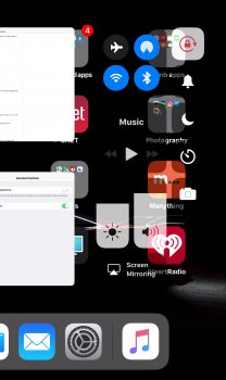
reminds me of something...
199528-iphone-multitasking_original.jpg
 
Apple has really fallen when it comes to iOS design in the last two years. It's getting uglier and unpractical with every new release.

Amazing, huh? I do get frustrated with today's Apple's removing the "super nice-to-haves" like MagSafe and convenient non-proprietary headphone jacks while cramming more and more functions and expectations into a small phone while keeping the user interface so less intuitive (and less interesting looking) than years ago.

Obviously every user always wants to be able to instantly include dancing dolphin gifs in every text message while it's completely OK to have frequently-used podcast playing controls and safari navigation controls be buried beneath layers of menus or require extra taps to access each time.

Focusing too much on the fluff instead of the substance are at the heart of my whining about ios11 and today's iOS UI. Less obvious, less convenient, less easy to use, less interesting looking.

[doublepost=1507209471][/doublepost]
reminds me of something...
199528-iphone-multitasking_original.jpg
Oh please. For your example, the user has to do an action to access that. Completely different.
[doublepost=1507210248][/doublepost]
Tap in the gray App Store icon to hide that drawer.

Because requiring an action to hide a drawer the user is likely to only occasionally use makes as much sense as requiring a tap to access safari navigation and podcast/music controls a user is likely to frequently use. Yup! :)
 
Last edited:
  • Like
Reactions: yep-sure and Feyl
Oh please. For your example, the user has to do an action to access that. Completely different.
Same on iMessages? I don't see the bottom banner until I tap the App store icon to the left of the text field. Then I can tap it again to hide the banner.

Not sure why you're posting with a light grey font btw - seems like a bad design decision ;)
[doublepost=1507210903][/doublepost]
Because requiring an action to hide a drawer the user is likely to only occasionally use makes as much sense as requiring a tap to access safari navigation and podcast/music controls a user is likely to frequently use. Yup! :)

I haven't seen or used the drawer since I first tried the iOS 11 beta in July. Not sure why you're making a big deal of it?

Besides, the poster was saying the look of it - having app icons along the bottom - was crap. It does genuinely remind me of the old multitasking. Accessing it is a separate matter.
 
Last edited:
  • Like
Reactions: Sharkoneau
Same on iMessages? I don't see the bottom banner until I tap the App store icon to the left of the text field. Then I can tap it again to hide the banner.

Not sure why you're posting with a light grey font btw - seems like a bad design decision ;)
[doublepost=1507210903][/doublepost]

I haven't seen or used the drawer since I first tried the iOS 11 beta in July. Not sure why you're making a big deal of it?

Ha, OK. I have not "upgraded" to ios11 yet until I vett it out, to first see what improvements made things worse. All I've read suggests that the lower menu always appears when you start a new conversation.

https://www.cnet.com/how-to/hide-the-annoying-app-dock-in-ios-11s-messages-app/

I'm using the light grey font since Apple deems it a better UI method.
 
  • Like
Reactions: GreyOS
Ha, OK. I have not "upgraded" to ios11 yet until I vett it out, to first see what improvements made things worse. All I've read suggests that the lower menu always appears when you start a new conversation.

https://www.cnet.com/how-to/hide-the-annoying-app-dock-in-ios-11s-messages-app/

I'm using the light grey font since Apple deems it a better UI method.
ah tbf I only use iMessages for a couple of contacts. I'm on 11.1 now and just tried opening other older existing and completely new conversations and it doesn't default to open so perhaps it's fixed
 
  • Like
Reactions: Tozovac
Why not? iPhone 8 is the 10th anniversary iPhone. If the rumors are true, and they are going to the iPhone 4's design, they should match iOS with it. If it's an anniversary, then they should really go all out and match everything to the time period, especially if this turns into a big tribute to Steve Jobs, which it probably will. I've said it once, I'll say it again. I hate iOS 7-10's UI and UX... It absolutely sucks! iOS 7+ just isn't fit for the iPhone 4's premium glass and metallic properties, it just doesn't work. This over-simplification period is getting a little out of hand.
Sometimes too simple is too far. I'm a person that still thinks this is a killer user experience even though this stuff is old:

View attachment 671822

It's been almost a year since you posted this. I'm curious, do you think the new iPhones, with their aluminum frame and glass fronts and backs, look bad with iOS 11?
 
It's been almost a year since you posted this. I'm curious, do you think the new iPhones, with their aluminum frame and glass fronts and backs, look bad with iOS 11?
Yes.

Just look at this, it looks so inviting!

iph8.png

[doublepost=1507241027][/doublepost]And more! (I need to get Plus size going, I haven't had time to make the remaining icons for it)

thing.jpg
 
Yes.

Just look at this, it looks so inviting!

View attachment 723819
[doublepost=1507241027][/doublepost]And more! (I need to get Plus size going, I haven't had time to make the remaining icons for it)

View attachment 723826

You know, I’m not opposed to that. It really doesn’t look that bad.

I still really like the redesign of iOS 7 a lot, and the UI changes in iOS 11 make it look the best it ever has, imo, but I wouldn’t object at all to what you’ve made. Good job.
 
You know, I’m not opposed to that. It really doesn’t look that bad.

I still really like the redesign of iOS 7 a lot, and the UI changes in iOS 11 make it look the best it ever has, imo, but I wouldn’t object at all to what you’ve made. Good job.

What you think?

upload_2017-10-6_16-28-50.png
 
These bold headers just don't fit in well. The blank space is really unnecessary(and legacyUI makes it look even worse). I don't really know why Apple had to make all devices suffer from a dumb display design on 1 product.

upload_2017-10-7_4-50-33.png
 
  • Like
Reactions: sammy2066 and Feyl
These bold headers just don't fit in well. The blank space is really unnecessary(and legacyUI makes it look even worse). I don't really know why Apple had to make all devices suffer from a dumb display design on 1 product.

View attachment 724096

Giant titles in iOS 11 is a hideous cancer which is spreading to 3rd party apps rapidly.

Here's an entire thread on Twitter explaining why these enormous titles are such a giant waste of space and flawed in design, which I fully agree with.

https://twitter.com/eli_schiff/status/915716507979612160
 
Last edited:
Giant titles in iOS 11 is a hideous cancer which is spreading to 3rd party apps rapidly.

Here's an entire thread on Twitter explaining why these enormous titles are such a giant waste of space and flawed in design, which I fully agree with.

https://twitter.com/eli_schiff/status/915716507979612160

Glad someone with a louder voice and wider audience than some of us who "get it" keeps banging the drum.

Today's iOS/OS UI is a bunch of band-aids and spaghetti-on-the-wall attempts to make seaworthy a leaky boat that was once pretty damn rock-solid.
 
  • Like
Reactions: Beeplance
the chunky/fat/bold fonts in ios 10/11 are awful and un-apple like

7 was so clean with all the minimalist fonts, now what we have is so...microsoftish.

the music app is the worst offender. please bring back ios 7 skinny fonts.
 
  • Like
Reactions: Vanilla35
So I’ve had a chance to play with iOS 11 for a day. I’m disgusted at some of the unnecessary changes, both new things they’ve added and things they’ve taken away. Just to keep dabbling around unnecessarily. Swipe the home screen to the right and now you only have one column where they used to be two, where two was much more efficient. Does anybody know if this is customizable back to what it used to be like? I’m too turned off to go look right now. The gray optional characters on the keyboard are just clutter now and completely unnecessary. It worked just fine before. But they’re different, which is to be expected with today’s Apple. The bold guidance text at top left for most apps is just horrific now, everything looks so plain. The Music App still doesn’t offer song time/position control without having to click to get it, am I the only one who feels those controls should always be available and at the top? Like it used to be?
[doublepost=1507434925][/doublepost]
7 was so clean with all the minimalist fonts, now what we have is so...microsoftish.

the music app is the worst offender. please bring back ios 7 skinny fonts.

Ha ha. Nooooooooo! Please nothing closer to ios7! Go back just one more iteration. :)
[doublepost=1507435328][/doublepost]

Still do not understand apple’s fascination with no borders. Take a look at the control center options relative to my black wallpaper. Far from instantly easy to discern what’s going on. Why is it so freaking hard is it, Apple, to just provide a little bit of border/context for controls rather than keep it so simple and often puzzling? I’m not even trying to complain here, I’m just getting hit left and right with all these dumb changes, many for the worse.

0D5E43DC-6AE4-46E7-BC64-1CE19515E250.jpeg
[doublepost=1507437383][/doublepost]Thank you Apple, for ruining one of my most used apps, the podcast app. Thanks for requiring me to click more now to see things that took fewer clicks before. Your iOS 10 app wasn't that great to begin with, but congratulations on finding a way to make me actually appreciate the iOS 10 podcast app. Thank you for this wonderful “upgrade.”
 
Last edited:
  • Like
Reactions: Feyl
So I’ve had a chance to play with iOS 11 for a day. I’m disgusted at some of the unnecessary changes, both new things they’ve added and things they’ve taken away. Just to keep dabbling around unnecessarily. Swipe the home screen to the right and now you only have one column where they used to be two, where two was much more efficient. Does anybody know if this is customizable back to what it used to be like? I’m too turned off to go look right now. The gray optional characters on the keyboard are just clutter now and completely unnecessary. It worked just fine before. But they’re different, which is to be expected with today’s Apple. The bold guidance text at top left for most apps is just horrific now, everything looks so plain. The Music App still doesn’t offer song time/position control without having to click to get it, am I the only one who feels those controls should always be available and at the top? Like it used to be?
[doublepost=1507434925][/doublepost]

Ha ha. Nooooooooo! Please nothing closer to ios7! Go back just one more iteration. :)
[doublepost=1507435328][/doublepost]

Still do not understand apple’s fascination with no borders. Take a look at the control center options relative to my black wallpaper. Far from instantly easy to discern what’s going on. Why is it so freaking hard is it, Apple, to just provide a little bit of border/context for controls rather than keep it so simple and often puzzling? I’m not even trying to complain here, I’m just getting hit left and right with all these dumb changes, many for the worse.

View attachment 724289
[doublepost=1507437383][/doublepost]Thank you Apple, for ruining one of my most used apps, the podcast app. Thanks for requiring me to click more now to see things that took fewer clicks before. Your iOS 10 app wasn't that great to begin with, but congratulations on finding a way to make me actually appreciate the iOS 10 podcast app. Thank you for this wonderful “upgrade.”
That screenshot has a bug as the background is meant to blur. It’s not a design decision.

Funny how most people use physical keyboard with two chars or more chars all the time, but on a software keyboard with one greyed (and adding great functionality) it’s now clutter and unusable

There’s a total lack of humility among some criticisms. Why not wait and see how you feel about it after a few weeks of getting used to it. Do you really think you’ll be upset by the keyboard clutter in a few weeks?!
 
Last edited:
  • Like
Reactions: johaen8
That screenshot has a bug as the background is meant to blur. It’s not a design decision.

Funny how most people use physical keyboard with two chars or more chars all the time, but on a software keyboard with one greyed (and adding great functionality) it’s now clutter and unusable

There’s a total lack of humility among some criticisms. Why not wait and see how you feel about it after a few weeks of getting used to it. Do you really think you’ll be upset by the keyboard clutter in a few weeks?!

Like most everything ios since 2013, I’ll get used to the keyboard change like i did for other changes which are just changes for change and not any significant fix of a bust or even an improvement. Just a change to be different. That is the issue. Many of these changes for the sake of change are frustrating, especially when they result in crap like the podcast app which did not need to be fussed with so much and should have remained the same from years ago. Who worked on this current podcast crApp, the team that came up with iTunes 12? As for the clutter grayed out characters on the keyboard - yes that’ll be easy to get used to but it’s just funny that Apple tries to be accommodative and helpful here while continuing to miss the boat with much of the rest of its unintuitive UI. Boy, seeing greyed out numbers above QWERTY... is such an improvement, here I thought I was the only one who could never ever seem to remember that numbers appear in the top row of the alternate keyboard.

If the control center background blur thing is just a bug, ok so be it, but yes I still take issue with no borders often everywhere, since other all-black representations often blend in too much to the background confusingly (like the copy/cut/paste functions appear when you’re working in a black background area). Or monkeying with the notifications or whatever it’s called search window area used to get by swiping to the right on the home screen. Now it’s one column and much less efficient than before. But, it’s different and a change!!!!

Time to unavoidably spend four dollars for a workable podcast app to make up for some gross deficiencies at Apple.
 
  • Like
Reactions: Feyl
Like most everything ios since 2013, I’ll get used to the keyboard change like i did for other changes which are just changes for change and not any significant fix of a bust or even an improvement. Just a change to be different. That is the issue. Many of these changes for the sake of change are frustrating, especially when they result in crap like the podcast app which did not need to be fussed with so much and should have remained the same from years ago. Who worked on this current podcast crApp, the team that came up with iTunes 12? As for the clutter grayed out characters on the keyboard - yes that’ll be easy to get used to but it’s just funny that Apple tries to be accommodative and helpful here while continuing to miss the boat with much of the rest of its unintuitive UI. Boy, seeing greyed out numbers above QWERTY... is such an improvement, here I thought I was the only one who could never ever seem to remember that numbers appear in the top row of the alternate keyboard.

If the control center background blur thing is just a bug, ok so be it, but yes I still take issue with no borders often everywhere, since other all-black representations often blend in too much to the background confusingly (like the copy/cut/paste functions appear when you’re working in a black background area). Or monkeying with the notifications or whatever it’s called search window area used to get by swiping to the right on the home screen. Now it’s one column and much less efficient than before. But, it’s different and a change!!!!

Time to unavoidably spend four dollars for a workable podcast app to make up for some gross deficiencies at Apple.
You’re right. But Apple is still the winner here. They don’t want you to use their free stuff. They’re actually genius. They brake something, make it ugly, so that you’ll go and pay $ for 3rd party solution and voila, they make profit. Kudos to genius salesmanship!
 
Like most everything ios since 2013, I’ll get used to the keyboard change like i did for other changes which are just changes for change and not any significant fix of a bust or even an improvement. Just a change to be different. That is the issue. Many of these changes for the sake of change are frustrating, especially when they result in crap like the podcast app which did not need to be fussed with so much and should have remained the same from years ago. Who worked on this current podcast crApp, the team that came up with iTunes 12? As for the clutter grayed out characters on the keyboard - yes that’ll be easy to get used to but it’s just funny that Apple tries to be accommodative and helpful here while continuing to miss the boat with much of the rest of its unintuitive UI. Boy, seeing greyed out numbers above QWERTY... is such an improvement, here I thought I was the only one who could never ever seem to remember that numbers appear in the top row of the alternate keyboard.

If the control center background blur thing is just a bug, ok so be it, but yes I still take issue with no borders often everywhere, since other all-black representations often blend in too much to the background confusingly (like the copy/cut/paste functions appear when you’re working in a black background area). Or monkeying with the notifications or whatever it’s called search window area used to get by swiping to the right on the home screen. Now it’s one column and much less efficient than before. But, it’s different and a change!!!!

Time to unavoidably spend four dollars for a workable podcast app to make up for some gross deficiencies at Apple.
Yeah, one of the big things that is really depressing to see go, is Apple's ease of use. Their old UIs and apps were so much easier to navigate and understand without having to play around and take wild guesses.

image.jpg


image.jpg
 
Yes.

Just look at this, it looks so inviting!

View attachment 723819
[doublepost=1507241027][/doublepost]And more! (I need to get Plus size going, I haven't had time to make the remaining icons for it)

View attachment 723826

Oh baby, don't drop that design on me like that, I'm in a public place.
[doublepost=1507494926][/doublepost]
Giant titles in iOS 11 is a hideous cancer which is spreading to 3rd party apps rapidly.

Here's an entire thread on Twitter explaining why these enormous titles are such a giant waste of space and flawed in design, which I fully agree with.

https://twitter.com/eli_schiff/status/915716507979612160

Yeah talk about not knowing what they are doing. iOS 7 was at least respectable for going all out on thin, clean, modern. iOS 11 just looks like they're forcing an updated look, to prevent it from going stale. iOS 1-6 did just fine with minor refinements. Yet with iOS 7-11 they try to change it up every year, and it only gets worse and worse.
 
Giant titles in iOS 11 is a hideous cancer which is spreading to 3rd party apps rapidly.

Here's an entire thread on Twitter explaining why these enormous titles are such a giant waste of space and flawed in design, which I fully agree with.

https://twitter.com/eli_schiff/status/915716507979612160

I gave my iPhone 7 Plus to my Dad after installing iOS 11 beta 1. I couldn't handle the UI and design transgressions littered throughout the OS. Sorry.
 
Yeah, one of the big things that is really depressing to see go, is Apple's ease of use. Their old UIs and apps were so much easier to navigate and understand without having to play around and take wild guesses.

I've had a weekend of playing with iOS 11 and am no closer to understanding how to efficiently navigate the podcasts app today than I was when I first opened it 3 days ago. Have yet had time this weekend to purchase workable podcasts app to fix Apple's poor decisions but that's coming.

Much to my amazement, they made reaching certain functions even more cumbersome than before. Once I've finally pulled up a podcast I'm listening to, I have to click on the lower right corner area to activate a view screen and then I have to scroll down just to even see/view the Sleep/timer function as it doesn't appear instantly on my 5S's screen. In fact I couldn't find it for a while since it wasn't obvious that I had to scroll down to access more features - lots of wasted space that they could have used better for fitting more functions on one screen for various sized devices. (Note - this is an iPad I'm talking about too. Plenty of real estate).

Can anyone point to any external blogs or articles criticizing Apple for specific misses like iTunes 12 and the current Music app which were ruined several iOS/OS iterations ago, and the current iOS11 podcast app that is just a complete UI disaster? The Apple I knew before ~2013 stuck with and just refined once they were onto something that worked well...all these annual reinventions that stunningly often resulting in vast degradations in usability are something new since ~2012. I really hate seeing Apple veer towards Microsoft's calling card of complete reinventions, which when you really think about it, are admissions of prior failure.

Really, what does anyone think is going on here? How can Jony or Craig or Tim not recognize crap output? What will be the next completely redesigned app or feature that will "just doesn't work?"
 
Last edited:
Register on MacRumors! This sidebar will go away, and you'll see fewer ads.