Keep in mind that Apple still doesn't design their UI.
I will absolutely call out someone any time they point out a poor UI from a third party and places the blame at Apple's feet. I've done so a couple times already in this thread.
You can continue to call me out but you're still not correct. You're somewhat correct in that yes, 3rd party developers
should be able to create a "good" app, but it's obvious from looking at & using Apple's very own UI and their very own base apps that Apple laid out certain expectations or basic tools that can't help but steer many or most developers (if not sometime completely constrain them to certain minimalist ios7-11 type of UI tools) to follow Apple's "rules."
Consider the 3rd party app I complained about ("Burner") that I know bummed you out because you thought I was being out of line. How come then did I not see a single ridiculously-minimalistic too-monochromatic & flat 3rd party app until after ios7? Could it possibly be that Apple's over-simplified new UI/programming could allow "non-qualified" programmers to assemble something nearly as professional/similar-looking to Apple's stripped down apps, opening the door for some really horrible crap apps like Burner?
If anyone's used the Tapatalk app, they might also recognize how before ios7 the app was pretty wonderful to use for accessing forums while after ios7 the UI went downhill largely due to a new type of menu-driven interface that was unintuitive, unnecessarily complex, and too monochromatic to be fun to use anymore. Many I know removed it from their device.
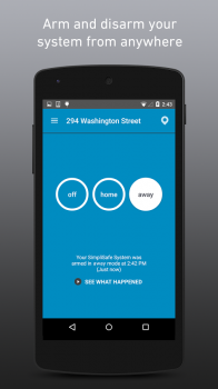
Why else would so many (not all but virtually all) 3rd party apps after ios6 have reverted to a monochromatic (but with lots of white) space-wasting large-flat-circles interface? Take the Simpliafe app before ios7 which utilized borders, colors, and screen space very effectively:

Compared to the app after ios7 where basic info is given on many different screens, and there are no multi-color borders to help provide context:


Give me a break. Sure Simplisafe chose to the minimalist space-wasting route but it's very inline with the iOS7-11 expectations and UI rules that Apple laid out.
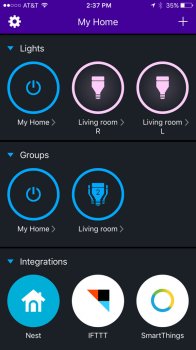
Or the LIFX app for wifi-controlled ceiling lights - rather than provide the user with an app that allows them to organize lights contextually and/or fit a dozen lights on one screen, they follow Apple's new "circular large button" interface guidelines or requirements or expectations, requiring frequent scrolling/swiping just to get to all your lights, even on an iPad for God's sake.

They could have fit so much more on 1 screen if not for the blind adherence to Apple's "circular" theme that's so unnecessarily pervasive in so many 3rd party apps.

I could go on but it's obvious you're incapable of "seeing it," while others instantly see it.
Do you blame Betty Crocker if your cake turns out like crap because you suck at following directions?
Whoah sorry, no. Your comparison would be more apt if Betty Crocker changed her initial "natural" direction and suddenly redid her cookbooks in difficult-to-read-easily light grey thin font and limited cooks to using mostly circular white eggs and light grey meat. It's the entire flat/monochromatic/big-circular-buttons/space-wasting/hidden-sub-menus theme of Apple's UI that ruined the iOS experience in their base apps and 3rd party apps. How is that so hard to see?
Betty Crocker was more like iOS6. Few unnecessary constraints and mostly organic controls that were "natural as they should be" and the result of what was "obviously the easiest and most convenient." iOS11 continues to be full of unnecessary constraints and arbitrarily-chosen minimalist/flat/monochromatic elements that are very hard to defend as being anything other than a purposeful choice to be different from what was before. Different than the initial, first, "obvious" direction before iOS7 because Jony didn't approve of what that design team with Scott created.
Just because Apple created the path and suggest that people follow it does not imply they're to blame when people don't follow that path or get lost along the way.
Again wrong - you're acting like Apple laid out a good path to follow while many of us find major fault with their own apps/UI. We'll just have to choose to disagree here.
If Apple were to blame, most apps would have poor UI issues.
And many do. Just that your tolerance level is different than mine and many others.
I have apps that still retain that old school, skeuomorphic look and feel (for example, on my iPad "DVD Profiler for iOS" can display my DVD collection as if it were sitting on shelves. I can even have wooden shelves, metal shelves, etc.). That app just recently got an iOS 11 update, so if Apple has issues with their UI, they let one slip through. My point is, there are no hard and fast requirements that apps adopt any particular look and feel regardless of what Apple suggests. In fact, if a developer truly wanted to, they can totally make buttons look like buttons again.
Would you mind finding or sharing some screen shots? I never heard of this, and just want to make sure I'm looking at the same UI you describe. I honestly have yet to find a truly good well-UI'd 3rd party app since ios7, while most all were pretty fine at iOS6 & prior.
You can make the argument that Apple has chosen a horrible UI. You can make the argument that most apps follow their guidelines and you don't care for where things are headed. But if you say Apple is to blame because MY app is confusing and hard to navigate, I'm going to have to disagree. That would only prove my own failure. If that's defending Apple, so be it.
Apple is to blame for much of hamstringing developers with dumb guidance like:
https://developer.apple.com/ios/human-interface-guidelines/controls/buttons/
Consider adding a border or a background only when necessary. By default, a system button has no border or background. In some content areas, however, a border or background is necessary to denote interactivity. In the Phone app, bordered number keys reinforce the traditional model of making a call, and the background of the Call button provides an eye-catching target that’s easy to hit.
"Consider using a border only when necessary"
"By default a system button has no border or background"
That's just masochism and completely unnecessary constraining.
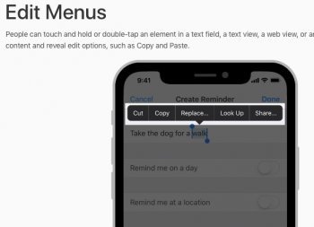
Or take the Edit Menus:
https://developer.apple.com/ios/human-interface-guidelines/controls/edit-menus/

Way, way too often, those black edit menus appear on a screen I'm using that is black already. The minimalist removal of borders often slows things down to figure out what's pressible or not. Again, this is coming directly from Apple's UI toolkit full of unnecessary minimalism. What's so awful about using borders? Did you remove frames from all the pictures on your home's walls and just post up the picture? If frames/borders are frequently deemed necessary in real life, why is it so anti-christ to see them in software? Answer that and you'll have my ear finally...
Well enough. Unsure any of this will be of interest or hold any water to you like it does for many others. Apple created an unnecessarily minimalist & different UI than "before," and not all of it is better, yet that's good enough for today's Apple.


