Well... I just made a theme for iOS 6, and I am blown away from the results. It looks new even though the changes are subtle. I love it!!!

Got a tip for us?
Let us know
Become a MacRumors Supporter for $50/year with no ads, ability to filter front page stories, and private forums.
iOS 11 UI design.
- Thread starter Old geek 959
- Start date
- Sort by reaction score
You are using an out of date browser. It may not display this or other websites correctly.
You should upgrade or use an alternative browser.
You should upgrade or use an alternative browser.
the chunky/fat/bold fonts in ios 10/11 are awful and un-apple like
7 was so clean with all the minimalist fonts, now what we have is so...microsoftish.
the music app is the worst offender. please bring back ios 7 skinny fonts.
Anyone remember how beautiful the lock screen, music screen and notifications were in iOS 7 through iOS 9?
iOS-7-Music-Lock-screen-Controls.png
Anyone remember how beautiful the lock screen, music screen and notifications were in iOS 7 through iOS 9?
iOS-7-Music-Lock-screen-Controls.png
You know, if you think about it - maybe they were onto something before with two separate areas/presses/swipes required to unlock. One home button press then one swipe on the screen, as a protection against any accidental unlocking.
Shouldn't you fix the Maps icon to remove that illegal turn?Well... I just made a theme for iOS 6, and I am blown away from the results. It looks new even though the changes are subtle. I love it!!!
View attachment 724540
Being since it makes sense, because you can get onto 280 there, I don’t find it to be an issue.Shouldn't you fix the Maps icon to remove that illegal turn?
Anyone remember how beautiful the lock screen, music screen and notifications were in iOS 7 through iOS 9?
iOS-7-Music-Lock-screen-Controls.png
That's nice but one major shortcoming of Apple's home screen IMHO was how often certain background info displayed there (like music) overlooked how many users use our phones as a watch/planner/communications device and not just to stream music and text out poopie emojis. I feel that a truly good design would have ensured the lock screen always showed the day/date as well as other key background items like stopwatch/timer, as I use the timer every day once I enter my place of work as a sanity check/reminder for end of day.
Is very frustrating with iOS10 to see only the timer countdown and not day/date when I press the home button once, and/or see only music being played when I press the home button once and then not see the timer nor day/date.
Anyone know whether iOS11 improved the lock screen here? I have yet to "upgrade" my 5s for fear of bricking/slowing it to a crawl like iOS7 did to my 4.
Apple's not being aware of things like that enough to offer key personalization options like that continue to be disappointing, let alone their not offering more personalization options even if they recognized the potential user benefit.
I don’t like anything about iOS 1-6 better. I think it looks really outdated, and never really cared for how inconsistent the icons were. I much prefer simple, flat vector graphics. I also like the iOS 11 lock screen music controls better. It doesn’t get in the way of notifications.... bout the only thing in iOS 11 I hate is Notification Center.
I'm curious. What makes you think it looks outdated?I don’t like anything about iOS 1-6 better. I think it looks really outdated, and never really cared for how inconsistent the icons were. I much prefer simple, flat vector graphics. I also like the iOS 11 lock screen music controls better. It doesn’t get in the way of notifications.... bout the only thing in iOS 11 I hate is Notification Center.
Not sure why you're posting with a light grey font btw - seems like a bad design decision
He posting in light grey to be a passive aggressive turd
He posting in light grey to be a passive aggressive turd
Very interesting and telling response.
Not being passive aggressive one bit — I’ve directly stated earlier that I was doong it on purpose. If Apple seems to think that it’s ok to rewrite long standing UI rules and use light gray text for “active text” instead of saving it for non-active, unavailable text, then that should be instantly obvious anyone who didn’t hear me say that, and good enough here.
Why is it OK for Apple after 2013 but I’m being a turd. Very, very interesting.
[doublepost=1507605650][/doublepost]
I'm curious. What makes you think it looks outdated?
I’m curious what makes anyone think an interface/UI that works well could get outdated.
I’m not looking forward to seeing what Apple comes up with once users think what they have now looks outdated.
Chasing fashion instead of clinging to classic excellence will come back to haunt Apple. And haunt us with these annual merry-go-round spaghetti-on-the-wall reinvention explosions.
Last edited:
’m curious what makes anyone think an interface/UI that works well could get outdated.
I’m not looking forward to seeing what Apple comes up with once users think what they have now looks outdated.
Chasing fashion instead of clinging to classic excellence will come back to haunt Apple. And haunt us with these annual merry-go-round spaghetti-on-the-wall reinvention explosions.
You act as if all current UI aesthetics is exclusive to apple and Apple only. It’s everywhere, so maybe you should be hating on ALL current digital design. As that’s how it’s always gone and how design in general across all things, it changes as time goes. Trends happen and are often things that define decades. (IE the 50’s has a distinctive look in how everything was designed, just as the 60’s, 70’s, 80’s and so on)
And yes you are being passive aggressive with typing every post in light grey. As you said it’s on purpose, and likely to specifically annoy people. Not to mention no reasonable adult would even stoop to those levels. It’s childish. “Waaahhh! Apple uses grey text therefore I will type all my post posts complaining about UI in an even lighter grey text on a white background! Waaahhh!”
You do realize that this topic is about Apple right?You act as if all current UI aesthetics is exclusive to apple and Apple only. It’s everywhere, so maybe you should be hating on ALL current digital design. As that’s how it’s always gone and how design in general across all things, it changes as time goes. Trends happen and are often things that define decades. (IE the 50’s has a distinctive look in how everything was designed, just as the 60’s, 70’s, 80’s and so on)
You do realize that this topic is about Apple right?
Oh is it? I got confused and thought it was an Android forum. Judging by all the ludicrous, incessive whining that goes on around here.
Oh right, because it's illegal to voice opinions. My mistake.Oh is it? I got confused and thought it was an Android forum. Judging by all the ludicrous, incessive whining that goes on around here.
You act as if all current UI aesthetics is exclusive to apple and Apple only. It’s everywhere, so maybe you should be hating on ALL current digital design. As that’s how it’s always gone and how design in general across all things, it changes as time goes. Trends happen and are often things that define decades. (IE the 50’s has a distinctive look in how everything was designed, just as the 60’s, 70’s, 80’s and so on)
And yes you are being passive aggressive with typing every post in light grey. As you said it’s on purpose, and likely to specifically annoy people. Not to mention no reasonable adult would even stoop to those levels. It’s childish. “Waaahhh! Apple uses grey text therefore I will type all my post posts complaining about UI in an even lighter grey text on a white background! Waaahhh!”
I do hate on much current media. A lot of it is crap right now. Apple deserves a lot of the blame, but also do all the lemmings designers that too often blindly follow Apple’s lead. Seems that when Apple comes up with a certain UI element, whether it’s good or bad, soon everybody else uses it. Where do you think Android got their basic touchscreen phone UI inspiration from, buddy old boy?
Like I said also said many times before, I do hate much of current digital design with its white washed basic background and light gray low contrast text. I have compared to a rich trophy wife who had a pretty good thing going in her 20s and 30s, but then instead of aging gracefully, she gets a bunch of unnecessary plastic surgery to try to freshen things up but winding up much more unnatural and awkward in the process. Why was light colored font on white so OK for Apple earlier and too much of digital media now but pretty awful here when I do it. Could be it was never a good UI technique but too few are calling Apple and others out for it?
Seems like with iOS 11, apple’s quietly acknowledging this earlier mistake, because I’m not seeing light colored thin text as often as before.
Oh right, because it's illegal to voice opinions. My mistake.
It’s not voicing opinions when all you and your buddy do is state your opinions as undisputable facts and nothing anyone says as any counter argument is false.
Would you agree that many of Apple's design choices lately are poor and not very creative?It’s not voicing opinions when all you and your buddy do is state your opinions as undisputable facts and nothing anyone says as any counter argument is false.
Would you agree that Apple was much more creative back in 2012?
Would you agree that many of Apple's design choices lately are poor and not very creative?
Would you agree that Apple was much more creative back in 2012?
No I wouldn’t agree to that. I also haven’t spent every waking moment for the last 4 years being pissed off about a UI.
I get on with life and use my device as it was designed to.
It's hard to do that when the UI gets in the way eh?I get on with life and use my device as it was designed to.
It’s not voicing opinions when all you and your buddy do is state your opinions as undisputable facts and nothing anyone says as any counter argument is false.
I think we’re getting closer to agreeing at least one indisputable fact: that light gray text for an item meant to be actionable/usable/readable is a horrible UI, no?
It's hard to do that when the UI gets in the way eh?
No, not really. It’s quite easy actually. If you haven’t figured out iOS this many years in, then maybe it’s time you find a simpler solution for you.
If my mom can navigate iOS just fine, then I’m sure the majority of iOS users can as well.
[doublepost=1507608050][/doublepost]
I think we’re getting closer to agreeing at least one indisputable fact: that light gray text for an item meant to be actionable/usable/readable is a horrible UI, no?
Apple doesn’t write full on paragraphs in light grey over a white background, nor do they use a grey as light as you’re using here.
If my mom can navigate iOS just fine, then I’m sure the majority of iOS users can as well.
Sounds like what I can only guess what Jony Ive’s design team must have thought for justifying completely reinventing years of refined of iOS UI elements ingrained into our heads (and I’m not talking about fancy icons or digital leather/woodgrain that many consider outdated): they can understand it (regardless of the fact that they put the puzzle together behind closed doors) so everybody should have an effortlessly wonderful experience.
Funny. My Dad who's had an iPhone since 2012 still get's hopelessly confused in it's current state. His phone is on 10 and he still get's lost because he can barely differ what is what. He had to use my 4S on 6 for a day and he told me when he got home that he was surprised and wondered why in the hell Apple changed it. You should've seen him when his phone updated to 10 and he couldn't figure out how to unlock it. He has large text because his sight is starting to change even though he's middle aged, so all it said was "Press h..." Very very easy to read no?No, not really. It’s quite easy actually. If you haven’t figured out iOS this many years in, then maybe it’s time for a simpler solution.
If my mom can navigate iOS just fine, then I’m sure the majority of iOS users can as well.
I think you have forgotten just how much Apple has changed things and moved things around recently in iOS. If you compare the features of iOS 6 to the same features in 11, you'll be surprised to see that the ones in 6 function better and 6 also handles it a lot smoother than 11 probably ever dreams to.
Apple doesn’t write full on paragraphs in light grey over a white background, nor do they use a grey as light as you’re using here.
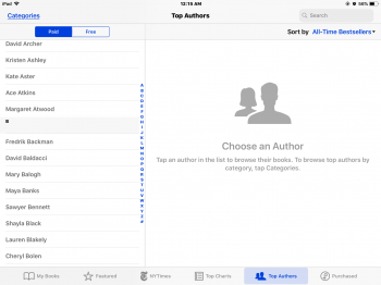
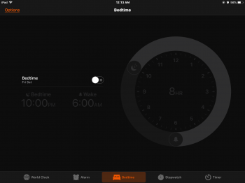
I’ll probably find more Apple app examples later, but it was pretty horrible several years ago and has been getting better as Apple may have slowly been realizing the error of their ways. They still often use horribly low contrast presentations that are absolutely impossible to read in the sun. Don't recall having that many problems with iOS 1 through 6, that I recall, when Apple designed for function and not fashion.


If the above example were used five years ago, I would have absolutely interpreted the bottom of the Contacts app to show unavailable greyed-out options, or informational-only because they aren’t separated by anything and/or they don’t look like pressable buttons or actionable items. But here’s the funny thing. Apple did use light gray years ago, but for where it counted that something was actionable, there were certain cues that existed for a reason. The options in this bottom older app are gray, but there were several treatments that let you know they were pressable. Today’s minimalist at all costs all-details-removed UIis much too often confusing and not as fun/easy to use as before.

I could very easily find some non-Apple apps or websites that are extremely unreadable because of low contrast text, as too often lemming designers follow Apple’s lead too blindly, often badly misinterpreting or misapplying their themes.
Attachments
Last edited:
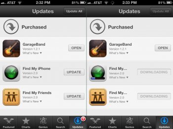
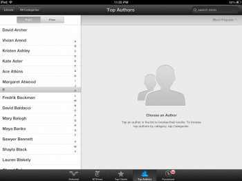
iOS 6:I’ll probably find more Apple app examples later, but it was pretty horrible several years ago and has been getting better as Apple may have slowly been realizing the error of their ways. They still often use horribly low contrast presentations that are absolutely impossible to read in the sun. Don't recall having that many problems with iOS 1 through 6, that I recall, when Apple designed for function and not fashion.
View attachment 724663
View attachment 724664
I could very easily find some non-Apple apps or websites that are extremely unreadable because of low contrast text, as too often lemming designers follow Apple’s lead too blindly, often badly misinterpreting or misapplying their themes.

(6 doesn't have bedtime, but hey who actually uses it anyways)

Register on MacRumors! This sidebar will go away, and you'll see fewer ads.


