Got a tip for us?
Let us know
Become a MacRumors Supporter for $50/year with no ads, ability to filter front page stories, and private forums.
iOS 17: All the little things
- Thread starter Ansath
- WikiPost WikiPost
- Start date
- Sort by reaction score
You are using an out of date browser. It may not display this or other websites correctly.
You should upgrade or use an alternative browser.
You should upgrade or use an alternative browser.
- Status
- The first post of this thread is a WikiPost and can be edited by anyone with the appropiate permissions. Your edits will be public.
Can anyone tell me if they have increased the background noises in iOS 17?
For those who don’t know what this are, click on the Spoiler:
It is a feature of the control center icon named “Hearing”, if you put it on the control center, it will look like this:
View attachment 2248283
If you press it, you will see this menu, with the option to enable background sounds and choose one of them:
View attachment 2248285
Then, after tapping on the sound (red arrow), you can see this menu where you can choose from, at least on iOS 15, 6 different sounds: pink noise, white noise, brown noise, ocean, rain and river (see screenshot below):
View attachment 2248284
My question is, have this sounds changed in iOS 17? Are there more than six to choose from? Thank you.
Here are the six types. I don’t think these have changed.

Why don’t Apple advertise these features
It’s not like they’re going to run a tv ad on these but they are mentioned in at least three places in Apple materials:

Thank you for confirming they haven’t changed them. Still, a great little feature that I use often to isolate myself.Here are the six types. I don’t think these have changed.

Apple did list the new feature here: https://www.apple.com/by/ios/ios-15/features/Why don’t Apple advertise these features
And here: https://support.apple.com/en-us/guide/ipod-touch/iphfed2c4091/ios
MacRumors also had an article about it: https://forums.macrumors.com/thread...nimize-distractions-and-stay-focused.2301069/
TheYayAreaLiving 🎗️
Suspended
Agreed too. Another small but stunning feature. It feels already to me like we have another major iOS release with 2-3 'big' features and tons of small and at some point even more useful ones. The same we had with iOS 16. Meanwhile, I wouldn't say that it was the same for older releases like iOS 15, 14 etc.
It is nice to have it, indeed. However, the problem I have with features like that, is that the time I fall asleep is not the same as the one I put on that timer. I mean, I can put 00:30h for bedtime, and go to sleep at that time, but maybe I won’t fall asleep until 02:00h, especially now with the high temperatures and humidity we have over here.
I would say iOS 16 Lock Screen redesig was a major feature, as well as the new option to blur wallpaper on the dashboard. I don’t remember other changes to be honest. But for me iOS 15 was another “little quality of life features” update. I’ve been looking at the webpage of iOS 15, and all the features are rather small or not very noticeable. The iOS 15 feature I used the most, is Safari tab groups, and I’m not sure how will I adapt to the new Safari Profiles feature.Agreed too. Another small but stunning feature. It feels already to me like we have another major iOS release with 2-3 'big' features and tons of small and at some point even more useful ones. The same we had with iOS 16. Meanwhile, I wouldn't say that it was the same for older releases like iOS 15, 14 etc.
I’d say iOS 13 had big features like dark mode, and iOS 14 was a release with more features that couldn’t get released on iOS 13 because COVID an schedule constraints. But iOS 15 in my opinion has a similar philosophy as iOS 17.
Last edited:
Agreed. Just a small remark. iOS 13 was released in 2019 (COVID spread actively in 2020), but releasing dark mode and widgets in one major release would have made it even more buggier than it was. So, probably, it was simply better to unveil them in the next major release.I would say iOS 16 Lock Screen redesig was a major feature, as well as the new option to blur wallpaper on the dashboard. I don’t remember other changes to be honest. But for me iOS 15 was another “little quality of life features” update. I’ve been looking at the webpage of iOS 15, and all the features are rather small or not very noticeable. The iOS 15 feature I used the most, is Safari tab groups, and I’m not sure how will I adapt to the new Safari Profiles feature.
I’d say iOS 13 had big features like dark mode, and iOS 14 was a release with more features that couldn’t get released on iOS 13 because COVID an schedule constraints. But iOS 15 in my opinion has a similar philosophy as iOS 17.
" data-source="post: 32396480"
class="bbCodeBlock bbCodeBlock--expandable bbCodeBlock--quote js-expandWatch">
Am I missing something? That sleep time setting feature has been around for at least 4 or 5 years.
Am I missing something? That sleep time setting feature has been around for at least 4 or 5 years.
That’s what I was thinking too, nothing new there, that I saw.Am I missing something? That sleep time setting feature has been around for at least 4 or 5 years.
TheYayAreaLiving 🎗️
Suspended
Am I missing something? That sleep time setting feature has been around for at least 4 or 5 years.
I thought there were new animations added to the sleep time setting feature compared to iOS 16.That’s what I was thinking too, nothing new there, that I saw.
I'm afraid, I may have overlooked it. Sorry about that. 🙏
How do you get to this screen? I didn’t know this exists. So I’m curious.Here are the six types. I don’t think these have changed.

See this article: https://forums.macrumors.com/thread...nimize-distractions-and-stay-focused.2301069/ (read to the end)How do you get to this screen? I didn’t know this exists. So I’m curious.
How do you get to this screen? I didn’t know this exists. So I’m curious.
From Control Center, pick the “Ear” icon (if you don’t have that you’ll have to add it in the control center settings in the Settings app). Once you select the Ear icon, the settings for background noise are right there.

Only in the UK, US, Canada and Australia says “Cellular” now….and they got rid of the word Data altogether.Mobile data is now called mobile service in settings.
never made sense it be called mobile data when it had all settings rated to mobile service in it lol
I just updated to iOS 17 Public Beta (and I understand that's from 5 and not 7 like the Developer Beta).
I know they tucked away all the app icons when you're texting someone. And I love it. But I wish they'd provide an option to still keep your most often-used app on the main screen always visible, because my most often-used app while texting is the Photos app (so that I can send someone a photo). That particular option now takes two taps instead of just one (plus sign, Photos). And yes, I realize this is a first-world problem.
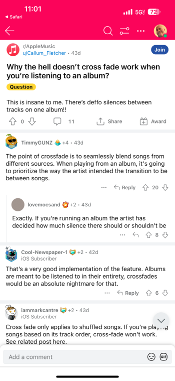
Also, cross-fade in Music is awesome. It would be nice if I could disable this on a per-album basis. Certain albums are meant to be listened to exactly as they are recorded (such as when he artist already provided the intended segue from one song to the next...
I'll stop right there. I just now did some Googling and learned that apparently, Apple already took care of this. I still would've preferred to decide for myself which albums shouldn't be cross-fade, but Apple decided already decided that NO albums should be cross-faded.
Lovemocsand makes a good point on Reddit, though (see screenshot).
Overall, I'm glad Apple set it up this way.

I’m not on iOS17, but have been following this forum. My understanding is that you can long press on the ‘+’ and that will bring your photos up (which was added a beta version or two ago). So, it can be done in just one slightly longer tap/press. Not quite as simple as a quick tap, but probably the best solution Apple could implement following the changes made of hiding the icons / de-cluttering the app.I just updated to iOS 17 Public Beta (and I understand that's from 5 and not 7 like the Developer Beta).
I know they tucked away all the app icons when you're texting someone. And I love it. But I wish they'd provide an option to still keep your most often-used app on the main screen always visible, because my most often-used app while texting is the Photos app (so that I can send someone a photo). That particular option now takes two taps instead of just one (plus sign, Photos). And yes, I realize this is a first-world problem.
This is correct. Long pressing + shows photos and you can scroll through, etc.I’m not on iOS17, but have been following this forum. My understanding is that you can long press on the ‘+’ and that will bring your photos up (which was added a beta version or two ago). So, it can be done in just one slightly longer tap/press. Not quite as simple as a quick tap, but probably the best solution Apple could implement following the changes made of hiding the icons / de-cluttering the app.
This should help @Rafagon
Petition to optionally NUKE the carrier name from being displayed on the lock screen.
My main thing I like from the public betas so far (besides interactive widgets) has been:
- automatically run (without a confirmation) an Automation as setup with Apple Shortcuts app for bluetooth connections such as my car or headphones. Works great with supported audio apps.
- automatically run (without a confirmation) an Automation as setup with Apple Shortcuts app for bluetooth connections such as my car or headphones. Works great with supported audio apps.
Register on MacRumors! This sidebar will go away, and you'll see fewer ads.


 said:
said:
