Well, in the past, beta 1 has been usable but then beta 2 and 3 start taking a nose dive with bugs galore and apps crashing, then beta 4 starts getting better and each beta after that gets a bit more stable until go-live. I learned to wait until beta 5 or so to jump in.Gotta say, in some ways this beta feels smoother than iOS 17 and iPadOS 17 on both my M4 iPad Pro and my iPhone 15 Pro Max. Battery has been stable, temperature is definitely cooler. Little things aside, quite impressed so far.
I presume another beta in ~15 days (week before July 4th), a DB3 ~July 10th with a PB1 of that DB3 ~July 15th. That’d be my guess for how this will go based on last year.
Got a tip for us?
Let us know
Become a MacRumors Supporter for $50/year with no ads, ability to filter front page stories, and private forums.
iOS 18 Beta 1 ― Bug Fixes, Changes, and Improvements
- Thread starter Banglazed
- WikiPost WikiPost
- Start date
- Sort by reaction score
You are using an out of date browser. It may not display this or other websites correctly.
You should upgrade or use an alternative browser.
You should upgrade or use an alternative browser.
- Status
- The first post of this thread is a WikiPost and can be edited by anyone with the appropiate permissions. Your edits will be public.
I gotta say, this is the least exciting iOS update ever for me.
And I can't get over how hideous the Home Screen icon tinting looks. I am surprised it got the green light. Did apple fire their design team? The tinting effect looks like a 10 yr old hackathon side project gone wrong. So basic and ugly. Hope they keep improving on every beta.
And I can't get over how hideous the Home Screen icon tinting looks. I am surprised it got the green light. Did apple fire their design team? The tinting effect looks like a 10 yr old hackathon side project gone wrong. So basic and ugly. Hope they keep improving on every beta.
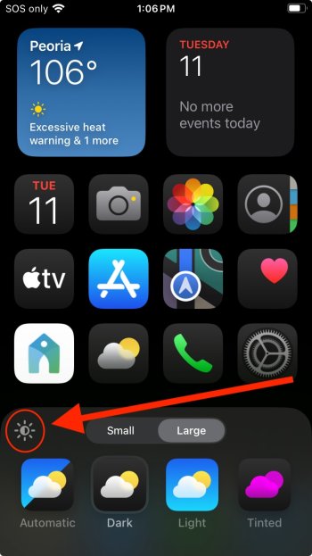
Has anyone noticed the effect of the light icon on the Homescreen customize control? If you have DARK or TINTED icons, a little light button appears on the upper left corner of the controls... but as far as I can tell, it doesn't change anything (yet)... it toggles between two states with no noticeable effect on the screen or icons.


Last edited:
I gotta say, this is the least exciting iOS update ever for me.
And I can't get over how hideous the Home Screen icon tinting looks. I am surprised it got the green light. Did apple fire their design team? The tinting effect looks like a 10 yr old hackathon side project gone wrong. So basic and ugly. Hope they keep improving on every beta.
That's typically how the beta process works.
The Photos app looks like it was done by another company and within the app itself the interface elements look like they were created by different teams who didn’t know what the other teams were doing. Those oval save and cancel buttons need to go and the choice of yellow on the save one is so random I don’t know what they were thinking.
It makes the wallpaper darker, at least it does on iPadOS.Has anyone noticed the effect of the light icon on the Homescreen customize control? If you DARK or TINTED icons, a little light button appears on the upper left corner of the controls... but as far as I can tell, it doesn't change anything (yet)... it toggles between two stated with no noticeable effect on the screen or icons.
View attachment 2387705
I was, like every beta for years, but I've had to roll back to 17.5.1.Whose running this as a daily driver?
I seem to be an outlier, but my main IMAP mail account didn't work.
I have other IMAP accounts which worked, and many people don't use IMAP any more anyway (iCloud, Outlook, Gmail etc.) but it was enough of an irritation to me that I went back.
I'll try again next beta. Rolling back is easy, apart from all my banking apps. They're a pain.
That's typically how the beta process works.
Actually we do usually see some “apparent” regression in the mid part of the cycle many years. But that’s likely due to adjustments being made elsewhere in the software.
If you have a light wallpaper, this button makes it darker or lighter.Has anyone noticed the effect of the light icon on the Homescreen customize control? If you DARK or TINTED icons, a little light button appears on the upper left corner of the controls... but as far as I can tell, it doesn't change anything (yet)... it toggles between two stated with no noticeable effect on the screen or icons.
View attachment 2387705
I probably will!Gooooo onnnnnnn!
Honestly, few little niggles here and there, but 90% happy using it for the first day.
Performance and battery is just like io17.5.1 on my IP14P.
And there is a nice smoothness to it that feels different to iOS 17.
Yes. I want that deep integration that'll finally make Siri worth something.But with AI, it would be worth the risk?!
I'm prolly going to install once back from vaca. I doubt I can wait.
I probably will!Just waiting till I get back from vaca this weekend. Less I can't stand it tomorrow and just go for it.

OTA baby! hahahahahahah
Take a backup.I probably will!Just waiting till I get back from vaca this weekend. Less I can't stand it tomorrow and just go for it.

If you only backup to iCloud, you'll have to disable backups before upgrading to ensure no iOS 18 backup over-writes it. If you backup to a laptop, click on it to archive it.
Once you IPSW-restore back to iOS 17.5.1 you won't be able to read iOS 18 backups. Of course, if you re-apply the beta then you can.
I think its an issue plaguing folks who use tapatalk to post here.
Passwords app | LOVE 😍
Long time coming, but this is great. Was always a bit of fumble going into settings and remembering where it was.
A lot clearer the way they've organised the different types.
Long time coming, but this is great. Was always a bit of fumble going into settings and remembering where it was.
A lot clearer the way they've organised the different types.
The bezel pops out when you press the volume and power buttons.
Just seen this. Looks awesome from the lock screen.
Lovely little touch. IP14Pro
Just seen this. Looks awesome from the lock screen.
Lovely little touch. IP14Pro
Very lovely touch. Maybe a sign that iPhone 16 Pro buttons are going solid state??!!The bezel pops out when you press the volume and power buttons.
Just seen this. Looks awesome from the lock screen.
Lovely little touch. IP14Pro
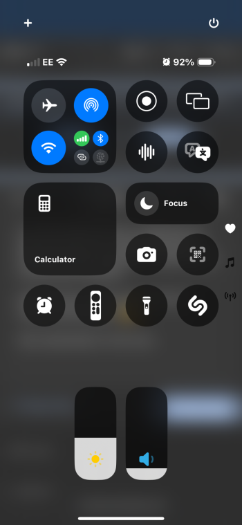
It took a little effort (and a couple of random re-springs along the way 😂) but here’s my current version. Very much liking this CC update.
I found Translate was a nightmare to place and move. It kept cloning itself and every time I selected another app it turned into translate.
Restarts then aloud me to edit the control panel again. 😵💫
Got somewhere in the end… it’s not my best work 😆
Attachments
Very lovely touch. Maybe a sign that iPhone 16 Pro buttons are going solid state??!!
Almost certainly
YES!!!!Very lovely touch. Maybe a sign that iPhone 16 Pro buttons are going solid state??!!
hadn't thought about that. would make perfect sense.
Register on MacRumors! This sidebar will go away, and you'll see fewer ads.


