Got a tip for us?
Let us know
Become a MacRumors Supporter for $50/year with no ads, ability to filter front page stories, and private forums.
iOS 26 Beta 1 ― Bug Fixes, Changes, and Improvements
- Thread starter Banglazed
- WikiPost WikiPost
- Start date
- Sort by reaction score
You are using an out of date browser. It may not display this or other websites correctly.
You should upgrade or use an alternative browser.
You should upgrade or use an alternative browser.
- Status
- The first post of this thread is a WikiPost and can be edited by anyone with the appropiate permissions. Your edits will be public.
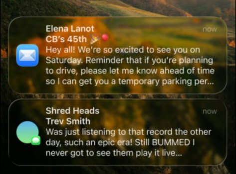
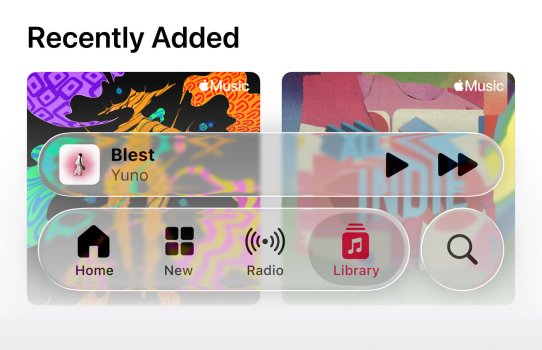
I remember iOS 7 beta and no, it was not as bad as this one is. Indeed, it was riddled with issues, but this version is taking a whole new approach to marking things as illegible as possible.Poor accessibility in a beta redesign is nothing new. iOS 7.0 was even worse than this, you couldn't even turn off motion or transparency effects until a few updates after final release.
I get it’s not a final product but this is from Apple’s website. How could anyone see this and think it looks good? I’m getting queasy just looking at it. How does this even make it into a first beta? The text is really hard to read. I guarantee you reactions would be different if the transparency was reduced in certain places. You can still retain the ‘glassy’ look but text is legible.Cause it’s early beta. This is not a final product.


And control center…my god, what is this abomination? How in the world did this make it into a beta?

Last edited:
After a night of sleeping on it: why are the app icons so big? It reminds me of a phone for elderly.
how could you do this? In my Volvo XC60 it only shows 1 stack of widgets in the middle of the screen and i can swipe through them. I would love to see them side by sideCarPlay Widget Screen
Please tell me how favorites work now (in the new mode, not classic) in the phone app. What does it look like if you have say a dozen favorites?
It’s likely to be dependant on the car itself size of the screenhow could you do this? In my Volvo XC60 it only shows 1 stack of widgets in the middle of the screen and i can swipe through them. I would love to see them side by side
could be. but there is so much space, you could fit like 2x2 widgets. hopefully they will adress that in future betasIt’s likely to be dependant on the car itself size of the screen
I think even in the previous 18 car play it needed more work on the multi view about being able to choose what each section showed and where it wascould be. but there is so much space, you could fit like 2x2 widgets. hopefully they will adress that in future betas
This feels like an alpha release, very far from beta state. In 15 years of beta testing every single major release, I’ve never seen a first dev beta so laggy, full of bugs (visual and non), messy and resource consuming. I was hoping that this would be the year of a stability and performance oriented release, given the truckload of bugs we’ve had since iOS 16, but they’ve gone in the exact opposite direction.
The new design is awful, hard to read, ugly and for the most part, unnecessary. Feels like a low tier Xiaomi or Oppo device, the professional and sleek look that iOS had since the beginning is gone. After 18 years of iPhone, this is the end for me. I hope future betas will at least improve some of the critical areas of this first design release, at least to keep the iPad usable.
The new design is awful, hard to read, ugly and for the most part, unnecessary. Feels like a low tier Xiaomi or Oppo device, the professional and sleek look that iOS had since the beginning is gone. After 18 years of iPhone, this is the end for me. I hope future betas will at least improve some of the critical areas of this first design release, at least to keep the iPad usable.
Can you not just hold and drag it back up? Works for me.
Doesn't work for me with the homescreen widgets.I believe you have to bring the clock size to its default size for widgets to go back up
I can't drag or drop them, I can' make the clock size any smaller.
The widgets are below the clock when I'm editing then, but then go down to the bottom after finishing editing them.
It displays the first 7 then the rest are in a menu that opens.Please tell me how favorites work now (in the new mode, not classic) in the phone app. What does it look like if you have say a dozen favorites?
It took more than 4 hours to install the beta on my watch series 10, super strange, I connected it to the charger with around 47% when it was almost finishing to prepare the update, the it iníciate automatically as always but remained on the apple logo loop for hours, the battery dropped to 42% and was charging slow on the fast charger from apple, when it get to 45 the apple logo rebooted with the first more shiny screen and the the opaque one, but never finished the install. I hard rebooted the watch 2 times because i thought it was stuck. Also the app on the iPhone if you were on the update page it would show as installing, if you leave to another app and return it will show as installed and when you go back and search again the update it would show again as installing (As a comment I made a few pages ago here). I finally left the watch loop for hours and went to sleep as I’m in Europe. Counting since I left the watch to install (10:45pm) when i left it be at 2 something in the morning, it took more than 4 hrs, at 7:15 am it was at the hello screen with 85% battery charged.
First time that this happened after years and years of betas on all my Apple Watches.
First time that this happened after years and years of betas on all my Apple Watches.
Because it's not there. It's in the menu where you could previously set your icons to dark or tinted.
That doesn't work either. I can't get it back like I had it in 18. Now my wallpapers look bad.
Installed on my m1 ipad pro 11.
Most things work, though I have had 3 re-springs (ie UI crash/restart) just in 10s minutes of usage. Seems to happen when scrolling right on the desktop and the app library is shown (which is a little jerky). This includes after the high cpu has settled overnight.
iPad is less critical/easier to reinstall so held off on 16 PM *for now*
Last edited:
If you have iPhone 15 Pro and newer, iOS 26 is for you.
If you have iPhone 15 and older, best to stay on iOS 18.x or whatever version you are using.
If you have iPhone 15 and older, best to stay on iOS 18.x or whatever version you are using.
anyone else having problems seeing cameras in the Home App?
I can see all Eufy Cams but all Circle View's are not responding ...
I can see all Eufy Cams but all Circle View's are not responding ...
You can turn off transparency effects, which kills them systemwide. I‘d be fine if they introduced a reduce liquid glass effects toggle, so only the liquid class UX is toned down.Umm accessibility features still exist and you can turn off the glass effect.
Liquid glass either gave me the sudden realization that my eyesight is drastically dropping or it‘s simply ineligible design. I surely can‘t be the only one scratching my head at how this was greenlit this way.
Im wondering how iPadOS 26 will perform on the M1 Air. My 13 mini is probably staying on 18.5 until at least after new year, since the first couple of public versions will be buggy anyway.If you have iPhone 15 Pro and newer, iOS 26 is for you.
If you have iPhone 15 and older, best to stay on iOS 18.x or whatever version you are using.
I'd like to know this as well. Is the Home app completely untouched again and we have to put up with another year of buggy home automation and cameras? Have they still not fixed the HomeKit Secure Video playback UI?Are there any changes to the Home app? The presentation gave no love to HomeKit or HomePod.
Register on MacRumors! This sidebar will go away, and you'll see fewer ads.


