Become a MacRumors Supporter for $50/year with no ads, ability to filter front page stories, and private forums.

Performance has improved over 9.1..


  • Total voters
    347
Status
Not open for further replies.

XTheLancerX

macrumors 68000
Aug 20, 2014
1,911
782
NY, USA
Just tried it and yep, I'm noticing that. Tap on the further most left app (the one that's blurred at the left edge of the screen) and it does this odd glitch where 3/4 of the home screen wallpaper shows before it flickers and then reloads the app in question. I'll file a report now.
Yeah I reported that with beta 1. It's a shame that this still happens.

You know how on iOS 9.0-9.1 all the apps in the app switcher would blur as the enter/exit animation happened which caused awful lag? They removed that in 9.2, which is why we don't see as much lag. They really should just make the enter/exit animation the opposite of how it was in 9.0-9.1, no blurred apps at all when entering or exiting the switcher. That means the leftmost app would still be blurred when you are just in the switcher normally, but it would instantly go back to normal when you go into any app/homescreen, that would make the switcher even smoother, and fix the bug where the whole app is blurred if you go into the leftmost app. It wouldn't look jarring with the leftmost app un-blurring when the animation occurs because the animation is so quick you would hardly notice any difference. Just like how most people probably didn't even notice the blurring of adjacent app previews when exiting/entering the switcher, yet they saw awful lag as a result of the subtle effect I mentioned.

Hard to explain, but I am sure you get the jist. I will file a suggestion concerning the removal of all blurring of app previews when entering/exiting the switcher when I get a chance. Should fix two issues right off the bat.
 
  • Like
Reactions: RebornProphet

C DM

macrumors Sandy Bridge
Oct 17, 2011
51,392
19,461
But visually nothing is changed. From your screenshot you can't tell anything different between any version of iOS 9 and the new beta from today. You can only see the change when it's moving.
As far as I can tell, it seems to work the same way in iOS 9.1 right now with the only real difference is that the application icons and names at the top don't slide over with the app card (as they do in 9.1) and simply just stay in place and change as cards slide.
 

RebornProphet

Suspended
Nov 3, 2013
989
494
As far as I can tell, it seems to work the same way in iOS 9.1 right now with the only real difference is that the application icons and names at the top don't slide over with the app card (as they do in 9.1) and simply just stay in place and change as cards slide.

Yeah, they don't scroll with RM on, they slide across. It's actually a pretty nice effect.
 

Cakefish

macrumors 6502a
Oct 14, 2015
512
308
Here is screenshot of the bug I mentioned;

6c2b0050c01f4f2b109c120c2d238026.jpg
 
  • Like
Reactions: dadiduekappa

GreyOS

macrumors 68040
Apr 12, 2012
3,358
1,694
On beta 2 now with iPad Air 2 (thanks for the delete beta profile tip folks).

There's a major bug that has been carried over from beta 1. When you have multiple apps open and select the leftmost app in the app switcher, it appears cut off and blurry for a second or two before the app UI reloads. Anyone else seeing this?
Nice find, tell me ''major" was sarcasm though :D
 

C DM

macrumors Sandy Bridge
Oct 17, 2011
51,392
19,461
Yeah, they don't scroll with RM on, they slide across. It's actually a pretty nice effect.
Well, I think that's the difference with 9.2 is that with Reduce Motion on the app icons/titles do not slide across or really move at all and simply change (fade in/out) as the cards slide.
 

planetf1

macrumors 6502a
Aug 8, 2014
565
209
Hampshire, UK
Remove your public beta profile, reboot your device, and beta 2 will show in Software Update. Once installed, go back to the Public Beta site and reinstall the profile to get the Feedback app back.

Somewhat uninituitive... I'd have expected having the profile to allow updates to come through

However the instructions worked properly... Is this usual for betas. If I'd done nothing would I have had the update tomorrow? If I didn't reinstall the profile would each beta update until 9.2 release?
 

RebornProphet

Suspended
Nov 3, 2013
989
494
Well, I think that's the difference with 9.2 is that with Reduce Motion on the app icons/titles do not slide across or really move at all and simply change (fade in/out) as the cards slide.

On 9.2 with RM on they slide across almost on top of one another. I don't see any fade in/out. I see sliding instead of scrolling.
 
  • Like
Reactions: scjr

RebornProphet

Suspended
Nov 3, 2013
989
494
Somewhat uninituitive... I'd have expected having the profile to allow updates to come through

However the instructions worked properly... Is this usual for betas. If I'd done nothing would I have had the update tomorrow? If I didn't reinstall the profile would each beta update until 9.2 release?

Well you can wait for public beta 2 in the next couple of days. I was only trying to help you get the developer beta 2 (which will be the same build as public beta 2) a little early.
 

RebornProphet

Suspended
Nov 3, 2013
989
494
And it was much appreciated. Just intriguing...

No problem at all. Had you just left the profile installed you'd have gotten a prompt for beta 2 via OTA and updated normally when the public build went live.

The deleting of the profile is a little workaround to get access to the developer build a little earlier. A little fidgety but it works.
 

scjr

macrumors 68020
Jan 28, 2013
2,196
1,340
On 9.2 with RM on they slide across almost on top of one another. I don't see any fade in/out. I see sliding instead of scrolling.
This is exactly what I'm seeing as well. Almost like a deck of cards.

The icon at the top changes as you slide across.
 
  • Like
Reactions: RebornProphet

Nox82

macrumors newbie
Jul 9, 2013
23
17
In iOS 9.1 iPhone 6s Plus whenever you activate Private in safari and press home button there is UI bug on the lower left corner. Wonder if this already fixed?

Step to reproduce:
Open safari - click on private on lower left corner - without doing anything click the home button.
 

RebornProphet

Suspended
Nov 3, 2013
989
494
This is exactly what I'm seeing as well. Almost like a deck of cards.

The icon at the top changes as you slide across.

Deck of cards is a good way to describe it. Rather than swiping and seeing a scroll occur, you see a slide ... like a card being slid under another. There's no scrolling, you need to keep swiping to make the cards move. With RM off you can swipe and the cards will scroll and gradually slow to a halt.
 
  • Like
Reactions: scjr

hugomingoia

macrumors member
Sep 14, 2015
30
20
New York
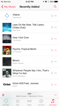
I noticed a small change from beta 1 in the Music app. The offline icon is not located on the left of the options icon, which is much cleaner.
 

Attachments

  • IMG_1037.PNG
    IMG_1037.PNG
    260.6 KB · Views: 145

Cakefish

macrumors 6502a
Oct 14, 2015
512
308
I saw frame drops using app switcher with iPad Air 2 (awww).

- open App Store.
- open wish list tab.
- switch back to homescreen via the app switcher.
- it drops frames in the resulting animation.

Hopefully beta 3 finally rids us of these frame drops. Or at least the final 9.2 build!
 

scjr

macrumors 68020
Jan 28, 2013
2,196
1,340
Deck of cards is a good way to describe it. Rather than swiping and seeing a scroll occur, you see a slide ... like a card being slid under another. There's no scrolling, you need to keep swiping to make the cards move. With RM off you can swipe and the cards will scroll and gradually slow to a halt.
That describes it perfectly!
 
  • Like
Reactions: RebornProphet

scjr

macrumors 68020
Jan 28, 2013
2,196
1,340
I saw frame drops using app switcher with iPad Air 2 (awww).

- open App Store.
- open wish list tab.
- switch back to homescreen via the app switcher.
- it drops frames in the resulting animation.

Hopefully beta 3 finally rids us of these frame drops. Or at least the final 9.2 build!
I just tried this and smooth when going back to home screen, though clicking the wish list tab isn't so smooth.
 

imagineadam

macrumors 68000
Jan 19, 2011
1,704
876
This is exactly what I'm seeing as well. Almost like a deck of cards.

The icon at the top changes as you slide across.
I like this! You can actually see more of the app card this way with RM on. I just put beta 2 on my iPad 4 and they sure have been tweaking things! Safari is truly faster than 9.1 on my iPad 4. A few stutters here and there still but man safari feels better and almost back to 7.1.2 speed!

Remember when opening the bookmarks on 8.4.1 it would stutter and lag?? Smooth as butter now! :)
 
  • Like
Reactions: scjr

scjr

macrumors 68020
Jan 28, 2013
2,196
1,340
I like this! You can actually see more of the app card this way with RM on. I just put beta 2 on my iPad 4 and they sure have been tweaking things! Safari is truly faster than 9.1 on my iPad 4. A few stutters here and there still but man safari feels better and almost back to 7.1.2 speed!
That is great to hear my man!

My wife has an iPad 4 and it does need some work.
 

XTheLancerX

macrumors 68000
Aug 20, 2014
1,911
782
NY, USA
Deck of cards is a good way to describe it. Rather than swiping and seeing a scroll occur, you see a slide ... like a card being slid under another. There's no scrolling, you need to keep swiping to make the cards move. With RM off you can swipe and the cards will scroll and gradually slow to a halt.
Yeah I like the new RM switcher. However I think it should be easier to slide multiple "cards" away, the way it is now, it's hard to move quickly throughout the switcher, it tries to go one at a time which is kind of annoying.
 
Status
Not open for further replies.
Register on MacRumors! This sidebar will go away, and you'll see fewer ads.