Become a MacRumors Supporter for $50/year with no ads, ability to filter front page stories, and private forums.
You mean the presence of the 'Radio' 'sub tab' in the music section in iTunes is really such an unbearable thing? Because that is the only difference to the previous version of iTunes prior to the introduction of Apple Music if you disable Apple Music, Connect and iCloud Music Library.

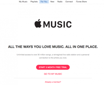
I'm not signed up to Apple Music but my iTunes now has extra For You, New, Radio and Connect tabs, which are all features of Apple Music and not necessary if you are not signed up.

Screen Shot 2015-07-25 at 16.58.45.png

There are also non-functioning Apple Music Station options shown when you select a track as well as those hearts which are all over My Music.

Screen Shot 2015-07-25 at 17.00.50.png

By no means is it unbearable but it's still slightly irritating and it would be nice to make them all go away.
 
I'm not signed up to Apple Music but my iTunes now has extra For You, New, Radio and Connect tabs, which are all features of Apple Music and not necessary if you are not signed up.

View attachment 571162

There are also non-functioning Apple Music Station options shown when you select a track as well as those hearts which are all over My Music.

View attachment 571163

By no means is it unbearable but it's still slightly irritating and it would be nice to make them all go away.
Have you thought about going into iTunes preferences and disabling Apple Music? Disabling Connect is a bit more hidden (under Parental > Disable > Apple Music Connect).
 
But would things really be automatically so much better if the different 'tabs' in iTunes (the icons at the top left) were individual apps, if they were icons in the Dock instead? It might simplify the UI a bit but there are downsides: For example, you would have Home Sharing settings in your Music app, in your TV Shows app, in your Movies app, in your Podcasts app, in your Audiobook app etc..

No, it doesn’t make it ‘automatically’ better, but it is one approach and an approach they already use on iOS. Homesharing could be done via System Preferences, just like Apple does on iOS. There already is a dedicated section for the App Store, for example. The app is just too complicated at the moment and they need to address that first.

We all think we know the magic bullet that would solve all problems and we think that Apple is really stupid not to use this magic bullet. That is not to say that your suggestions might not improve the situation, but acidly trashing Apple for not applying your magic bullet shows an at least equal arrogance of believing in your own intellectual superiority.

Have I said anything of the sort? I just said that Apple needs to do something about iTunes soon. Whether that is splitting the app – something appeals to me – or at least making sure that it is easier to use and doesn’t use as many confusing views and components.
 
No, it doesn’t make it ‘automatically’ better, but it is one approach and an approach they already use on iOS.
It's a valid approach but without further evidence, I cannot fault Apple too much for not splitting up iTunes. If something only 'might' be better, you cannot declare people to be idiots for not doing it.

The app is just too complicated at the moment and they need to address that first.
Are you sure you are not confusing 'feature-rich' with 'complicated'? What functionality precisely is too complicated?
 
It's slow as all hell, and I'm a pretty sharp guy and I can't even figure out how to navigate it half the time. The thing isn't intuitive. It's confusing.

Adding Apple Music just adds to the slowness and adds to the confusion. Really disappointed with Apple on this one.

BJ

Completely agree. It also pisses me off that iTunes does something different depending on whether you right-click on something or use the three-dotted button next to a song. The worst thing about it is that it doesn’t work consistently at all, depending on where you are and what you want to do. When I’m browsing the New or For You section, for instance, right-clicking doesn’t work. I’m so used to invoking the context menu elsewhere on the Mac that it really annoys me that I am forced to use the three-dotted button instead, which is also hidden unless you put the pointer on the song or album first. And then this: when I’m browsing an artist in My Music and expand to show Apple Music songs and albums, I can’t add an Apple Music album or song from there. Only when I click on an album/song and iTunes switches to the New tab can I click on the three-dotted menu. Same thing on the For You tab. But then for some actions they require you to use the regular context menu, for instance: get info, removing downloads, etc.

Honestly, this is a mess beyond comparison and I’m sure not even Microsoft could pull this off anymore. Whether Apple splits the app or streamlines it, I don’t care. But they have to do something about it.
 
What functionality precisely is too complicated?

See my post above. I can give you ample examples.

Take this: Go to My Music and select the Artists view. Then select an artist and switch to the All tab, to see all Apple Music has on that artist. Suppose you want to add a few albums to your music library, because you know or like the artist. The problems start already there: you can’t add an album right from that view (although you can add a song). You need to click on an album and then iTunes switches to the New tab. From there you can add that album to My Music. Suppose now you want to add another one. Your first instinct would be to use the arrow button in the top left, but that is doing something else: it will just browse to your previous result while you were in the New tab. You actually have to click on My Music first and it will bring you back to the artist you viewed. But what happened: it will default to the My Music tab, instead of the All tab you were previously in, which means that you again have to browse to your view. Consider also this variant: when you are browsing in the All tab in My Music and you want to see a list of all albums of that artist, you have to scroll down and click on the Albums header. This time it will not open the New tab, but instead show you the albums right within the My Music section. From there you can add albums directly to My Music for some reason, but why not on the main view? And then: suppose you want to see a list of their songs now, you can’t navigate back. You need to click on the My Music tab again and then on All tab once more to get back to the Artist page of Apple Music.

Take also the iTunes Store: it is completely separated from Apple Music. I have an extensive wish list and I wanted to add these songs to My music. You can’t. You have to manually search for these songs and then add them. It takes forever to do this, because you need to type, then press enter then look for the song and add it. Siri, for instance, adds songs it recognised to the wish list, but you can’t access it from Apple Music at all.

All of this is confusing that is what I mean with complicated. No one can convince me that this is a good experience.
 
Last edited:
  • Like
Reactions: Fuchal
Completely agree. It also pisses me off that iTunes does something different depending on whether you right-click on something or use the three-dotted button next to a song.
iTunes also does something different depending on whether you open the 'View' or 'Control' menu in the menu bar. A concept that has existed in almost all GUI applications since the beginning.

Sometimes there are no good options left. At some point the contextual menu gets too long as you keep adding features. So you create a slightly more accessible menu that has only the most used functions. Not adding the three-dot menu means making the functionality currently in it more difficult to access because it buried deeper. Adding the three-dot menu means people might need to open both menus to find the feature they want. Damned if you do, damned if you don't.

You might also notice that most of the features that are only in the contextual menu are things that only apply to 'owned' music and not to 'rented' music (ie, music obtained via Apple Music). This is why the contextual menu doesn't appear in the 'Apple Music sections'.
 
iTunes also does something different depending on whether you open the 'View' or 'Control' menu in the menu bar. A concept that has existed in almost all GUI applications since the beginning.
And which I am not at all talking about.

Sometimes there are no good options left. At some point the contextual menu gets too long as you keep adding features. So you create a slightly more accessible menu that has only the most used functions. Not adding the three-dot menu means making the functionality currently in it more difficult to access because it buried deeper. Adding the three-dot menu means people might need to open both menus to find the feature they want. Damned if you do, damned if you don’t.
There are only very few things in the three-dotted menu that are not duplicated in the context menu. The only notable option that is missing in the context menu is the “Add to My Music” option (which is, as I write, not always present in the three-dotted menu either). If there are too many things in the context menu then some need to be moved out of it or Apple needs to think about something different. This is the classic difference between Windows and OS X: Apple never needed to fill up menus to the brim, but they do so in iTunes. Also, the three-dotted menu has a different arrangement and it behaves differently, for instance, when you hover over the ‘Add to’ or ‘Share’ options, you actually need to click on them instead of hovering the pointer like you would do in context menus.

You might also notice that most of the features that are only in the contextual menu are things that only apply to 'owned' music and not to 'rented' music (ie, music obtained via Apple Music). This is why the contextual menu doesn't appear in the 'Apple Music sections'.

Which is, first, still no reason to discard the classic context menu entirely in the New and For You tabs and, secondly, no reason to duplicate the functions and use both. You can give justifications for it as much as you want, but the crucial point of it is that iTunes becomes less intuitive and more difficult to use. Sometimes you can use the context menu like anywhere else, sometimes you can’t use the context menu at all, sometimes you must use the context menu. It is confusing whatever the reason and Apple has lost track of it.
 
  • Like
Reactions: Narcaz
See my post above. I can give you ample examples.
The three-dot menu gives you access to the most used functions. If you don't like that, you can largely ignore it. It is not as it is constantly cluttering up the UI since it, as you said, only shows if you mouse over a song.

Take this: Go to My Music and select the Artists view. Then select an artist and switch to the All tab, to see all Apple Music has on that artist. Suppose you want to add a few albums to your music library, because you know or like the artist. The problems start already there: you can’t add an album right from that view (although you can add a song). You need to click on an album and then iTunes switches to the New tab.
I don't know, I always start in the 'New' or 'For You' sections when I want add new music. I don't know why I would start in the My Music section.

From there you can add that album to My Music. Suppose now you want to add another one. Your first instinct would be to use the arrow button in the top left, but that is doing something else: it will just browse to your previous result while you were in the New tab. You actually have to click on My Music first and it will bring you back to the artist you viewed. But what happened: it will default to the My Music tab, instead of the All tab you were previously in, which means that you again have to browse to your view. Consider also this variant: when you are browsing in the All tab in My Music and you want to see a list of all albums of that artist, you have to scroll down and click on the Albums header.
This is like always starting in the 'My Music' tab in the pre-Apple-Music days when you wanted to browse the iTunes Store and buy music from it. And constantly switching back to 'My Music' after having purchased a song or an album. If you keep switching away from the 'Apple Music' (ie, 'For You', New, Connect) to your music library, you complain about having to switch back to it?

This time it will not open the New tab, but instead show you the albums right within the My Music section. From there you can add albums directly to My Music for some reason, but why not on the main view? And then: suppose you want to see a list of their songs now, you can’t navigate back. You need to click on the My Music tab again and then on All tab once more to get back to the Artist page of Apple Music.
I don't see any of this because I keep the column browser visible. But I'd generally say that the 'All' tab in My Music is a distraction that one best ignores. The main section is called 'My Music' why I would want to show all music available in Apple Music under the header of 'My Music' is a mystery to me.

Take also the iTunes Store: it is completely separated from Apple Music. I have an extensive wish list and I wanted to add these songs to My music. You can’t. You have to manually search for these songs and then add them. It takes forever to do this, because you need to type, then press enter then look for the song and add it. Siri, for instance, adds songs it recognised to the wish list, but you can’t access it from Apple Music at all.
That is hardly a core feature of iTunes. The wish list is one of many smaller features of the iTunes Store. Yes, it would be nice if it where integrated with Apple Music but this is a missing feature of the iTunes Store not something that says anything about how complicated the application iTunes is.
 
Last edited:
The three-dot menu gives you access to the most used functions. If you don't like that, you can largely ignore it. It is not as it is constantly cluttering up the UI since it, as you said, only shows if you mouse over a song.

You can’t ignore it, because, as I said, you can’t use anything else in the For You and New tab and even in the My Music section you will have to use it if you want to add a song to your library. Moreover, the most-used functions can be easily moved to the top of the context menu as well. For some reason Apple kept the playlist functions at the bottom and made the context menus less user friendly.

I am not convinced of Apple Music and at this point iTunes has no workflow I am comfortable using and it takes too long to get up to speed if you’re moving from another streaming provider. In Spotify and Deezer, you search, you get instant results as you type, you can right-click and add entire albums, artists and songs to your favourites right from there and go on. Compare that with iTunes: you need to search, press enter, wait for the results, then depending on whether it’s an album or song you can press the three-dotted menu (but not the context menu) or in case of an album you need to click on the album first and then click on the three-dotted menu there. No contest.
 
Last edited:
  • Like
Reactions: Narcaz
There are only very few things in the three-dotted menu that are not duplicated in the context menu. The only notable option that is missing in the context menu is the “Add to My Music” option (which is, as I write, not always present in the three-dotted menu either). If there are too many things in the context menu then some need to be moved out of it or Apple needs to think about something different.
Which is exactly what Apple did. They created an easier to access menu (the three dots) into which it put the most used options and hid the less used features into the secondary menu (the right-click menu).


This is the classic difference between Windows and OS X: Apple never needed to fill up menus to the brim, but they do so in iTunes.
iTunes is also a Windows application, I think there is something to be said that this rubs off a little bit. And as I said before, if Apple removes some features, it gets flak (see iWorks for example) and if it retains them, it gets also flak.


Which is, first, still no reason to discard the classic context menu entirely in the New and For You tabs and, secondly, no reason to duplicate the functions and use both. You can give justifications for it as much as you want, but the crucial point of it is that iTunes becomes less intuitive and more difficult to use.
iTunes is adding features. It is hard to become to do that without becoming feature-rich. There is no way you can add streaming without adding a number of new features.

Sometimes you can use the context menu like anywhere else, sometimes you can’t use the context menu at all, sometimes you must use the context menu. It is confusing whatever the reason and Apple has lost track of it.
The three-dots menu is mostly a shortcut. Apparently you would have preferred if Apple hadn't add this shortcut (but then ignoring it is very easy but you seem to prefer to get agitated about it instead of just ignoring it).

And you also have to consider that there is no right-click on iOS. The three-dots menu is also there to provide UI consistency between iOS and iTunes.
 
You can’t ignore it, because, as I said, you can’t use anything else in the For You and New tab
Because the For You and New tabs are not about your library, they are about the streaming service, of having access to the whole Apple Music catalogue. You interact with the features of the streaming service (ie, browsing and searching for music to stream or add to your library) in the streaming section of iTunes. And you interact with your library in the library section of iTunes. You find the features related to the streaming service under the three-dot menu and you find all library related features under the right-click menu. I really don't understand what is so difficult about this.

even in the My Music section you will have to use it if you want to add a song to your library.
As I said, I don't see any reason to add music to my library while browsing my library. That doesn't make sense.


In Spotify and Deezer, you search, you get instant results as you type, you can right-click and add entire albums, artists and songs to your favourites right from there and go on.
The Spotify UI doesn't have to deal with 'owned' music, it only deals with 'rented' music. That removes quite a lot features it doesn't have to offer. It also doesn't have to offer with features that iTunes had before Apple Music, removing of which would get a lot of iTunes users up in arms.
 
  • Like
Reactions: Jstuts5797
I'm okay with iTunes on the Mac. When I'm sitting in front of a computer, I have the time to focus on a complex UI.

Not so with Music on the phone. It's a complex nightmare when out and about. For example, if a pop-up menu pretty-much covers your entire screen with a wall of misaligned, unintelligble text and "..." submenus, then the app designer has failed miserably, IMHO.

set-apple-music-songs-as-alarm-sounds-your-iphone.w654.jpg
 
Because the For You and New tabs are not about your library, they are about the streaming service, of having access to the whole Apple Music catalogue. You interact with the features of the streaming service (ie, browsing and searching for music to stream or add to your library) in the streaming section of iTunes. And you interact with your library in the library section of iTunes. You find the features related to the streaming service under the three-dot menu and you find all library related features under the right-click menu. I really don't understand what is so difficult about this.

This is my last post about this. First, if Apple would indeed separate the library from the streaming catalogue, which, and I stress this, they do not, then yes, I could accept that they use different workflows. But they do not. My Music contains your own songs, your purchased songs and the Apple Music songs you added to your library. While you are viewing your My Music section, you have access to Apple Music right from there. I explicitly showed this with my example above: just click on an artist and you have access to Apple Music from there (where else are you going to view your favourite artists or albums anyway? Are you going to search for them all the time?). Let’s say you are viewing an album in My Music, even there Apple Music is integrated. You can click on “Show Complete Album” and iTunes will show you available songs in Apple Music.

Secondly, if I would accept your point, that the dotted menu is just for the streaming service part, how come you can “love” tracks from the context menu (Apple Music feature), how come you can add a new radio station from there (also Apple Music), how come you can remove a cached download from there (also Apple Music). Also in reverse: how come you can add Apple Music songs (which are not necessarily stored on your device) to your local playlists? (Also, Apple is using two types of playlists now, pre-made Apple Music playlists and your own local playlists, yet another confusing aspect of Apple Music.) The dotted menu is adding additional complexity to what the context menu is doing elsewhere on OS X and they screw this up in particular in My Music, but they also don’t use it well while you browse For You or New (like I explained above).

Thirdly, I argue that there is no reason to use this additional dotted menu. Even if it is just for Apple Music features, why not use the familiar context menu? The name gives it away: it is a context-specific menu. They could just use that menu in the For You tab as well, but they don’t. The reality is that they use both, don’t separate them clearly (like you think they do) and in many parts insist on it.

As I said, I don't see any reason to add music to my library while browsing my library. That doesn't make sense.
Doesn’t matter, it’s there and you can use it. I have lots of artists in my library and I am interested in adding more songs to my previous artists. Regardless, if you are using the search, For You or New sections, the dotted menu is not consistent there either.

The Spotify UI doesn't have to deal with 'owned' music, it only deals with 'rented' music. That removes quite a lot features it doesn't have to offer. It also doesn't have to offer with features that iTunes had before Apple Music, removing of which would get a lot of iTunes users up in arms.

As a matter of fact, Spotify does allow you to see your iTunes music as well. The difference is that it will put the streaming on top of it, so you never actually notice it. But crucially, the streaming service itself is a lot easier to use. Apple Music has no equivalent of an artist or favourites view at all, because it ties Apple Music to your music library. When you are in For You, you only get suggestions for songs you can listen to or add to My Music, when you are in New, you get top lists and other playlists which you listen to or add to My Music, when you search, you get Apple Music search results (you get the gist). Everything you want to ‘keep’ you will find in My Music and it’s there where iTunes is messy.

Overall, this entire discussion underpins that iTunes has a complexity to it that makes it difficult to explain what is wrong specifically. Apple didn’t bother pissing people off when they revamped iWork and the critics have gone mostly silent about it after major features returned. I would be in favour of revamping iTunes, even if it means sacrificing a few things. As long as the crucial functions remain, I see no reason why it should not. Besides, using iWork as an argument why Apple should not revamp iTunes is not convincing, they screwed up iWork in that they actually removed features and broke compatibility, not just reorganised the interface (like they should do for iTunes). The biggest problems iTunes has right now are the failed attempt at merging My Music with Apple Music seamlessly, the conflicting and confusing use of context menus, the lack of a quick Spotlight-like search like anywhere else on the system and a simple workflow for getting to your music and adding things to your library.

That’s all I have to say about this.

Edit: this review is touching upon the very issues I mentioned in my posts.
 
Last edited:
  • Like
Reactions: Narcaz and Planey28
Have you thought about going into iTunes preferences and disabling Apple Music? Disabling Connect is a bit more hidden (under Parental > Disable > Apple Music Connect).

Thanks, that got rid of some of it though I'm still stuck with the Radio tab and the non-functioning Station options.

I still think my crap removal option would be better. :D
 
Completely agree.

Honestly, this is a mess beyond comparison and I’m sure not even Microsoft could pull this off anymore. Whether Apple splits the app or streamlines it, I don’t care. But they have to do something about it.

Thing is, Apple Music isn't some great leap forward that makes all this nonsense worth it.

Apple Music Radio = iTunes Radio (Standard Stations)
Apple Music Playlists = iTunes Radio (Artist Stations)
Apple Music "For You" = iTunes Radio (Custom Stations)
Apple Music "New" = iTunes Radio (New)
Apple Music Offline = iTunes Music Store
Connect = Twitter

There is no difference between Apple Music and iTunes Radio + iTunes Music Store except the price. One makes you pay $120 a year, the other $1 per song. The rest is just marketing and hype. Apple is better than this. Usually.

BJ
 
Really? You have the 'tabs' at the top left for the different categories [that you want as separate apps]. Why is using those tabs instead of Dock icons [if they were separate apps] such a challenging task that it keeps confusing you?
You mean the presence of the 'Radio' 'sub tab' in the music section in iTunes is really such an unbearable thing? Because that is the only difference to the previous version of iTunes prior to the introduction of Apple Music if you disable Apple Music, Connect and iCloud Music Library.

May I ask you a question? Why is it so unbelievable to you that iTunes is not intuitive for many users? You seem to be frustrated by all the comments.
 
May I ask you a question? Why is it so unbelievable to you that iTunes is not intuitive for many users? You seem to be frustrated by all the comments.
Because iTunes being overladen, unintuitive, or bloated has become a meme that is being repeated without necessarily reflecting the actual experience. The meme is given an explanation as to why iTunes is bloated and unintuitive: because it does so many things. Thus iTunes becomes bloated and unintuitive almost by definition (because it does so many things) and personal experience is superseded by this meme.
 
Last edited:
Because iTunes being overladen, unintuitive, or bloated has become a meme that is being repeated without necessarily reflecting the actual experience.

Thank you for answering my question.
What concerns iTunes. I started using it years ago. My first impression has not changed. My experience is similar to some of the members' here, so I will borrow their words:

...it's a mess in the real world. It's slow as all hell... The thing isn't intuitive. It's confusing...

...itunes tries to do too many things and makes a lot of things overly complicated (even before Apple Music). The media hub functionality should be cut off...

I'd like to see iTunes manage tunes. Period...

iTunes problem is its name and icon. iTunes is not media-hub only, but it is also content (files in fact) manager for iOS devices (for in-apps documents). Apple's biggest mistake is "things" philosophy (and not "folders and files"). And yes: i

...The worst thing about it is that it doesn’t work consistently at all, depending on where you are and what you want to do... this is a mess beyond comparison...

etc.


Thank you for answering my question.
What concerns iTunes. I started using it years ago. My first impression has not changed. My experience is similar to some of the members' here, so I will borrow their words:
Can you give me an example where the ability to manage 'tunes' was impeded by the other features of iTunes?
 
Can you give me an example where the ability to manage 'tunes' was impeded by the other features of iTunes?

manu chao, the UI, the complicated pattern of use, the performance, the unnecessary complexity, the instability etc. all these added to my negative experience. I did not have and I don't have an intention to dispute others' positive experience. I respect it. I am sure there are many users who enjoy it. And this is the way how it works. Some like it, some not. I belong to the latter.
 
Can you give me an example where the ability to manage 'tunes' was impeded by the other features of iTunes?

I don't know why it should annoy you so much that people do not like iTunes, the fact is people don't for whatever reason (I disagree that it is purely a meme) and so it needs to be fixed. End of
 
I don't know why it should annoy you so much that people do not like iTunes, the fact is people don't for whatever reason (I disagree that it is purely a meme) and so it needs to be fixed. End of
What annoys me is when people think there is an easy solution to a complex problem.
 
manu chao, the UI, the complicated pattern of use, the performance, the unnecessary complexity, the instability etc. all these added to my negative experience. I did not have and I don't have an intention to dispute others' positive experience. I respect it. I am sure there are many users who enjoy it. And this is the way how it works. Some like it, some not. I belong to the latter.
I am still convinced that most people would find any music library application with a similar feature set similarly complex and complicated, that the problem is not iTunes but peoples' expectations.
 
Register on MacRumors! This sidebar will go away, and you'll see fewer ads.