Become a MacRumors Supporter for $50/year with no ads, ability to filter front page stories, and private forums.
EVERYONE hates iTunes. It's a bloated piece of software that is trying to do EVERYTHING with your media. Its got nothing but bad press and complaints from loads of users. Anyone defending it hasn't got a clue. You are the 1%

There are indeed many bad reviews out there, especially on influential websites. I hope that Apple will feel the heat this time. It’s not like you need to use iTunes anymore for syncing your iPod or purchasing your songs on the iTunes Store. You can use Spotify, Deezer or Google Play Music with mostly slick interfaces and cross-platform availability.

But I prefer them breaking it out into separate apps called video, podcasts, music, iTunes Store.......wait....where have we seen this before????? I swear I've seen these applications broken out before , hehe.

iTunes really is this one big anomaly on the Mac where everything else is starting to converge. Apple broke up the iPod app years ago but didn’t even touch iTunes in that regard. iBooks is actually a very nice app on the Mac. It’s snappy, it looks fresh, has a very comfortable UI. I just don’t understand why they don’t bother.
 
Well, the way this works internally is that Apple admit the tool is a cluster and assign a UX/design team to re-design it. Given that if they have anyone competent in their UX/Design team, it *would* be better, then they would move forward with building it out.
So you are saying that if they had competent designers, then any new application (or set of applications) would be better than the existing app. But if they had competent designers, than the current app wouldn't be so bad. I don't quite understand why they would find competent designers for the apps that would replace iTunes if the current iTunes designers are incompetent.
 
iTunes really is this one big anomaly on the Mac where everything else is starting to converge. Apple broke up the iPod app years ago but didn’t even touch iTunes in that regard. iBooks is actually a very nice app on the Mac. It’s snappy, it looks fresh, has a very comfortable UI. I just don’t understand why they don’t bother.

I think it is the fact Windows gets thrown into the mix with iTunes, whatever they do on OS X they'll have to do for Windows also. Although given the size of Apple and their competition with Apple Music it is something they really have no excuse for anymore and should be working on. They aren't going to be able to compete well with Spotify and other alternatives that have better desktop apps in the long run if their solution is to bolt it onto an obese mess of an app.
 
Windows users just have to warm to drag and drop. Then, instead of dragging music files into the My Music folder, they just drag things into the iTunes window (as that adds them to the iTunes library). I don't see the point of using more than one application to manage music files. If that is what is implied with your statement, then it is the user that is creating complexity.

Actually no, the music isn't dragged into the My Music folder, it automatically goes there. Then it has to be dragged into the iTunes window. If Apple wasn't so insistent that all iTunes users *should* be buying all their music from iTunes, they'd build logic that anything that appears in My Music would also show in iTunes (most music applications built for Windows already do this). It's Apple that's creating the complexity.

As for using more than one application to manage music files, most Windows users would very much like to do that, or already do exactly that. iTunes is used solely for putting things on the iPhone, not for managing music, and it's used reluctantly at that.
 
So you are saying that if they had competent designers, then any new application (or set of applications) would be better than the existing app. But if they had competent designers, than the current app wouldn't be so bad. I don't quite understand why they would find competent designers for the apps that would replace iTunes if the current iTunes designers are incompetent.

That's not what I'm saying at all. An app redesign is a completely different task than adding functionality to an app. Their current designers/UX people are asked to do the latter, not the former. If you asked them to do the former, you would likely get an entirely different result. And that's making a big assumption - that they're even using a design team on the releases. It's possible that they're just running it past someone for approval (or maybe not even that). Not all software development uses designers or even UX people.
 
That's not what I'm saying at all. An app redesign is a completely different task than adding functionality to an app. Their current designers/UX people are asked to do the latter, not the former. If you asked them to do the former, you would likely get an entirely different result. And that's making a big assumption - that they're even using a design team on the releases. It's possible that they're just running it past someone for approval (or maybe not even that). Not all software development uses designers or even UX people.
According to Rene Ritchie iTunes has its own software team so I would imagine that includes UI designers. But if Jony Ive really does own all design then I think his user interface team under Alan Dye needs to take control. This new app has all the hallmarks of marketing calling the shots and the UI designers having to cram in all the features marketing wants.
 
Actually no, the music isn't dragged into the My Music folder, it automatically goes there. Then it has to be dragged into the iTunes window. If Apple wasn't so insistent that all iTunes users *should* be buying all their music from iTunes, they'd build logic that anything that appears in My Music would also show in iTunes (most music applications built for Windows already do this). It's Apple that's creating the complexity.
There are two sources for getting music besides the iTunes Store: 1) Ripping CDs, 2) Downloading music files (from wherever, eg, from Amazon). Ripped CDs end up in iTunes on their own, music files are downloaded to wherever the user specifies it. If downloading the music files to, eg, the Desktop and then dragging them from there into iTunes counts as horrible complexity, you must have a very low bar for what is complexity.

On the Mac, if the above is too much to ask for, you can easily create a watched folder, whereby any file placed into that folder is then automatically imported into iTunes. I don't know enough about Windows to say for sure whether that is possible there as well but I would be highly surprised if there would not be a way to achieve this.

As for using more than one application to manage music files, most Windows users would very much like to do that, or already do exactly that. iTunes is used solely for putting things on the iPhone, not for managing music, and it's used reluctantly at that.
That is their loss and their choice of introducing complexity for the sake of gaining extra or different features. And this at a time when iTunes is being criticised for having too many features (even if only looking at the music side).
 
And that's making a big assumption - that they're even using a design team on the releases. It's possible that they're just running it past someone for approval (or maybe not even that). Not all software development uses designers or even UX people.
If you really believe this, you must be living in an alternate universe. Or you are engaging in polemics, ie, intentionally lying to portray something you don't like as much worse than you actually know it is. I have to say it is difficult for me to guess which is the case here but there probably is a continuum between the two.
 
According to Rene Ritchie iTunes has its own software team so I would imagine that includes UI designers. But if Jony Ive really does own all design then I think his user interface team under Alan Dye needs to take control. This new app has all the hallmarks of marketing calling the shots and the UI designers having to cram in all the features marketing wants.

Well, the Music app is starting to show the same symptoms that iTunes has. Irregular workflows, inconsistent menus, design affordances. I noticed that I have trouble reading the status bar when I’m looking at the Now Playing screen (I don’t even know why they though it was a good idea to put the album cover without any sort of shadow of transparency below it so that readability is not impaired; the same nonsense is there on the iOS home screen since iOS 7 had removed the shadows underneath the app names, I still can’t freely choose a wallpaper because of this) and this new mini player at the bottom of the screen is really annoying when you quickly need to access the player due to its small size on the iPhone 6 and 6 Plus. This stuff just isn’t tested properly and it tells me that nobody seems to care about the human aspect of it anymore when they design these apps. iTunes and Music are just two of Apple’s worst apps and are so frequently criticised everywhere. All I want is that Apple respects a baseline of usability again, a design that has a consistent and logical UI so that you can navigate through it with minimal effort and waste of working memory.
 
Last edited:
If you really believe this, you must be living in an alternate universe. Or you are engaging in polemics, ie, intentionally lying to portray something you don't like as much worse than you actually know it is. I have to say it is difficult for me to guess which is the case here but there probably is a continuum between the two.

Um...yes, I believe that there is software development that doesn't use UX/design people. I *work* professionally in software development and have never worked with a professional designer in my 10+ years in the business. We on the project team do the design and UX planning ourselves, and that's been the case at every company I've worked for. So, yeah, it's totally possible they're not engaging designers.

What Rogifan is saying about Design needing to take control is correct, IMO.
 
Last edited:
Really quick concept of what a standalone Music app could look like... spent about half an hour on this and IMO the UI looks much more focused when all other media is stripped out and the interface focuses solely on Music.

Music OS X.jpg
 
I don't think it's entirely fair to blame the UI designers. Marco Arment said it best:
You're right. Product Management is just as guilty.

I wouldn't be surprised if there's a turf war going on between the legacy-iTunes folks and the incoming Beats people. It's almost as if there are multiple product managers all trying to get their needs promoted at the expense of the others. If so, then higher management is responsible for constructing or permitting such a dysfunctional org.

Because the iTunes/Music app is clearly a battlefield.
 
Last edited:
  • Like
Reactions: KALLT
in regards to being am all in one app, ya,, they get separate apps...

But then people will argue about that too..

Either u have one big bloated app with everything u can do with it, adding features overtime slows it down, coupled with service integration more and more, plus more harder to find bugs..

or

separate apps, even to pinpoint stuff. The only negative nelly would be the end users who say "I wish i didn't have multiple apps"

When something gets so complex and more options than a pocket knife, what u gonna do ?
 
Really quick concept of what a standalone Music app could look like... spent about half an hour on this and IMO the UI looks much more focused when all other media is stripped out and the interface focuses solely on Music.

View attachment 571561
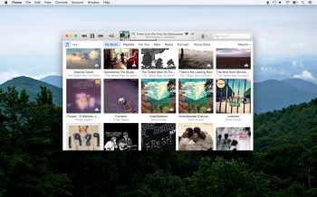
With all due respect for your mockup work, but, if anything, the current UI might even be less visually complex, e.g. you don't have to reference UI elements both on the top as well as the bottom of the window. Also, how do you change the current view from albums to another sorting in your screenshot? As a reminder, this is what iTunes currently looks like.

itunes.jpg

I really don't think a lack of focus is the issue. At least not due to other media categories stealing the focus from music. On the other hand, frankly I don't see why 'My Music' and 'Playlists' need to be under different headings. Apple could easily implement a method for showing/hiding the sidebar and thus eliminate the 'Playlists' view. There's even precedence for this in Mail.app:

mail.png


Also, unite all the Apple Music stuff and possibly the iTunes store under a single heading so there's basically only two categories: (1) My Music Library (2) Stuff that I can 'acquire', i.e. Anything That's Not In My Music Library (yet)

Although I realize Apple would probably like to blur the boundaries between the two.
 
You're right. Product Management is just as guilty.

I wouldn't be surprised if there's a turf war going on between the legacy-iTunes folks and the incoming Beats people. It's almost as if there are multiple product managers all trying to get their needs promoted at the expense of the others. If so, then higher management is responsible for constructing or permitting such a dysfunctional org.

Because the iTunes/Music app is clearly a battlefield.
The buck stops with Eddy Cue. He owns Apple Music. He was the one on stage at WWDC doing a demo of the app.
 
The thing that annoys me most about iTunes is how 'jumpy' the UI has gotten. There's no calm stability to its interface anymore. You can neither rely on being returned to the same view (not to mention the scrolling position) when you return to a certain part of the interface nor can you even rely on the scrolling position staying intact whenever iTunes is doing something in the background, for example downloading files. It's like a small child that keeps jumping around while you try to button her jacket.
 
The thing that annoys me most about iTunes is how 'jumpy' the UI has gotten. There's no calm stability to its interface anymore. You can neither rely on being returned to the same view (not to mention the scrolling position) when you return to a certain part of the interface nor can you even rely on the scrolling position staying intact whenever iTunes is doing something in the background, for example downloading files. It's like a small child that keeps jumping around while you try to button her jacket.

This is what made me furious the other day. I also noticed a significant frame-rate drop whenever iTunes was processing something in the background. I tried to explain that in one of my posts above, iTunes has this tendency of jumping between tabs automatically and then not giving you a straightforward way to go back, presumably because it mixes hard-coded interfaces with web views (when you go to the New tab, you have a back button that only works within the New tab). Perhaps that is the main reason why I don’t like it, that it feels more like a wrapped browser with lots of dynamically loaded content and performance issues related to that, but the lack of separate windows of tabs that help you to not lose your way. It reminds me of Facebook, a website so heavily loaded with JavaScript that it never works nicely, but you accept it because it’s a website, not a Cocoa app. Remember when the Facebook app on iOS sucked even more than it does now? It was because they used web views for everything, instead of hardcoding it.

With all due respect for your mockup work, but, if anything, the current UI might even be less visually complex, e.g. you don't have to reference UI elements both on the top as well as the bottom of the window. Also, how do you change the current view from albums to another sorting in your screenshot? As a reminder, this is what iTunes currently looks like.

View attachment 571669

I really don't think a lack of focus is the issue. At least not due to other media categories stealing the focus from music. On the other hand, frankly I don't see why 'My Music' and 'Playlists' need to be under different headings. Apple could easily implement a method for showing/hiding the sidebar and thus eliminate the 'Playlists' view. There's even precedence for this in Mail.app:

View attachment 571670


Also, unite all the Apple Music stuff and possibly the iTunes store under a single heading so there's basically only two categories: (1) My Music Library (2) Stuff that I can 'acquire', i.e. Anything That's Not In My Music Library (yet)

Although I realize Apple would probably like to blur the boundaries between the two.

iTunes’ main UI is indeed fine. The problem just starts when you need to interact with multiple media types, because not every tab has the same flow. I personally miss the sidebar as the main component, it only shows up in your playlist view, but nowhere else. In addition, Apple draws a line between store content and Apple Music content but mixes them inconspicuously in your music library. I had to click on the Get Info button so often because I couldn’t see where the music came from, so that I can benefit from the higher quality of Apple Music.
 
Last edited:
  • Like
Reactions: LizKat and tkermit
Um...yes, I believe that there is software development that doesn't use UX/design people. I *work* professionally in software development and have never worked with a professional designer in my 10+ years in the business. We on the project team do the design and UX planning ourselves, and that's been the case at every company I've worked for. So, yeah, it's totally possible they're not engaging designers.
But this is Apple, you were talking about. I have no problems believing you in general on this, but believing that Apple doesn't have a design team for one of its very important pieces of software is wholly unrealistic.
 
I don't have an issue with it to be honest. It's all in one place.

How would you guys split it?

I wouldn't split it, so I agree with you. But... they've subtracted too many features in recent releases, for my money:

That pop-down thing instead of separate downloads window was a TERRIBLE idea.

Being able to edit multiple playlist windows at once, why take that away?!​

Visual redisplay of play order when you shuffle a playlist, why is it gone?

Per-playlist or album shuffle, not global. Who wants to shuffle an opera?

Why is option-shuffle on a playlist gone? You could option-shuffle until it
looked like a nice order, then do copy to play order, pop it onto your mobile
and let it play through straight, pre-shuffled to perfection.​

I mean it's a long list. All seems towards stuffing desktop iTunes into iOS iTunes, which idea I loathe. Sometimes I want my stuff sprawled out on a flippin' DESK because it's a complex project and I need some elbow room to manage it. The old iTunes let you do that. You could have an iPod attached and have your iTunes window showing you what's on that device in the way of music, and you could also have several playlists open from your laptop's iTunes. VERY HANDY. It just worked...

Aside from feature elimination, I've always liked iTunes, even if I sometimes have to create a new library somewhere and mess around until I understand what's going to happen when I get some brainstorm about reorganizing some media in my library. The ways of doing metadata fixes on purchased video (TV seasons for example) have sometimes been a little less than intuitive when you're not seeing what you want to see. A minor complaint in my book, since I'm not averse to an experiment on a separate library now and then.

Bottom line I like the app but they need to stop killing the desktop app and start fixing some of the stuff they messed up in it during the last six or eight releases. Start with the weird not exactly toggles any more of mini player to main window. Sure I can learn the new commands or where to put the cursor if I want to flip. And I have done so. But what was wrong with what just worked before. There are some pretty obvious "wasn't broken shouldn't have been fixed" things they could repair sometime.
 
  • Like
Reactions: Jessica Lares
I think a LOT of you in the "separate iTunes into different apps) are completely forgetting about windows users. Believe it or not a LOT of them rely on iTunes for syncing of their media. iTunes needs to stay as an integrated entertainment hub. To many things rely on each other to work well in iTunes to just go stripping it away. Also part of the beauty and the reason iTunes has been so successful for windows users is because it's an all in one solution for all things iOS related. Lots of people would be lost and confused in a maze of software . Opening and searching for things in one app without being sure the feature they need is even in that app and not another. With it all together like it is now, at least everyone can have the comfort of knowing that they AT LEAST have the right app open. I think what Apple could maybe do is release a Stand alone music player for those who only need that functionality. But also leave it baked into iTunes as it is now. Honestly the solution isn't breaking iTunes up, the solution is fixing iTunes so it runs well on the majority of machines (both windows and OSX) in use today. It CAN be fixed without breaking it up. The issue is that Apple seems to like to just throw new stuff in before actually repairing what they already have first. Maybe Apple Music will be the last new thing they add to iTunes for awhile, leaving them time and resources to actually fix issues.
 
Last edited:
  • Like
Reactions: LizKat
I think a LOT of you in the "separate iTunes into different apps) are completely forgetting about windows users. Believe it or not a LOT of them rely on iTunes for syncing of their media. iTunes needs to stay as an integrated entertainment hub. To many things rely on each other to work well in iTunes to just go stripping it away. Also part of the beauty and the reason iTunes has been so successful for windows users is because it's an all in one solution for all things iOS related. Lots of people would be lost and confused in a maze of software . Opening and searching for things in one app without being sure the feature they need is even in that app and not another. With it all together like it is now, at least everyone can have the comfort of knowing that they AT LEAST have the right app open. I think what Apple could maybe do is release a Stand alone music player for those who only need that functionality. But also leave it baked into iTunes as it is now. Honestly the solution isn't breaking iTunes up, the solution is fixing iTunes so it runs well on the majority of machines (both windows and OSX) in use today. It CAN be fixed without breaking it up. The issue is that Apple seems to like to just throw new stuff in before actually repairing what they already have first. Maybe Apple Music will be the last new thing they add to iTunes for awhile, leaving them time and resources to actually fix issues.

I think if you ask most Windows users what made iTunes "successful" for them is the fact they are forced to use it to sync to their iDevices, they have no choice. It's got a more of a reputation for being a bloated resource hog on Windows than on OS X.
 
  • Like
Reactions: KALLT and Narcaz
I think a LOT of you in the "separate iTunes into different apps) are completely forgetting about windows users. Believe it or not a LOT of them rely on iTunes for syncing of their media. iTunes needs to stay as an integrated entertainment hub. To many things rely on each other to work well in iTunes to just go stripping it away. Also part of the beauty and the reason iTunes has been so successful for windows users is because it's an all in one solution for all things iOS related. Lots of people would be lost and confused in a maze of software . Opening and searching for things in one app without being sure the feature they need is even in that app and not another. With it all together like it is now, at least everyone can have the comfort of knowing that they AT LEAST have the right app open. I think what Apple could maybe do is release a Stand alone music player for those who only need that functionality. But also leave it baked into iTunes as it is now. Honestly the solution isn't breaking iTunes up, the solution is fixing iTunes so it runs well on the majority of machines (both windows and OSX) in use today. It CAN be fixed without breaking it up. The issue is that Apple seems to like to just throw new stuff in before actually repairing what they already have first. Maybe Apple Music will be the last new thing they add to iTunes for awhile, leaving them time and resources to actually fix issues.

There is certainly some kind of path dependency (especially for old iPods), which doesn't allow an easy way out. Breaking up itunes without opening iOS to finder/explorer drag and drop system or creating a new unified library, content management system won't solve the problem. My problem with the windows argument in the various itunes threads is that some premises are twisted or just wrong. Neither is itunes the solution for everything iOS related nor is the syncing process identical between mac and windows. And i also doubt that iTunes would have been a success without the sync requirement for the highly popular iPod, iPhone and iPad. Itunes already ignores a lot of software guidelines on both systems without barely any noticeable benefit. Why should they keep following the current concept? I expect things to get worse when they built in more features to make Apple Music ready for Android.
 
Last edited:
Well.. I'm starting to like the integrated iTunes app idea better and better. Somehow while I was fooling with Apple Music last night (and into the wee hours this morning!) I became ever fonder of the fact that I can flip from one venue to another inside one app while trying to track something down or just do errands like "did I ever put that on my wishlist" while I happen to be in the store.

To be able to skip around from my library to the Store to Apple Music and back again without ever hitting command-tab to switch apps is pretty nice. I don't think it's confusing about which place I'm in either, although maybe that's subjective. To me the venues look pretty different from each other, which is good.

In addition while rummaging around looking at what's what with Apple music stuff I elected to put into my experimental library, I noticed some improvements that had escaped my attention, for instance they've made the get-info panels a little nicer to work with.

At first I had not liked the newer way of showing options for browser columns in a drop-down under the Songs view, and still find that awkward sometimes, especially when you're first setting up your usually preferred set of columns: it's a pain because there can be so many to add and you have to re-fetch the columns sub-menu every time you pick another one. But at least you can still pick what you want to see, andi it's no big deal to pop over to tweak the setting for one or two more or fewer columns.

I still don't get why we can't blow up the artwork the way we used to in early iTunes. You go to the trouble of getting something really nice and then there it is, maxed at the size of a fat nano sitting on your laptop display. There must be a reason. Probably i don't want to hear it. If I have missed some right-click option to make it bigger, please tell me!

Still all in all, I like that I can explore new stuff, check out what I already have, buy or wish-list things in the Store and listen to the radio without leaving the one app. Maybe it's my imagination but the most recent update of iTunes seems to be a lot better about taking me back to where I was when I back-arrow.

So some under-the-hood work appears to be showing up here and there in the UI, which I do find encouraging. I am reluctantly starting to believe that more RAM and an SSD are part of the answer to some of the stalling. I say reluctantly because my workhorse is still a 2012 MBP with a hard drive. I don't know if it's just the OS or now also iTunes (and maybe other apps) are much happier with a solid state drive. For my experimental library, however, I was using a MacBook of 2010 vintage, one that I'd upgraded to have an SSD and 8GB RAM, and was pleasantly surprised not to get hung up halfway down a scroll though the tracklist of a long classical album. I cast my vote for more of this behind-scenes doctoring rather than a breakup.
 
  • Like
Reactions: Jstuts5797
I still don't get why we can't blow up the artwork the way we used to in early iTunes. You go to the trouble of getting something really nice and then there it is, maxed at the size of a fat nano sitting on your laptop display. There must be a reason. Probably i don't want to hear it. If I have missed some right-click option to make it bigger, please tell me!


Instead of using the mini player, in the main window lcd screen where it shows the tiny artwork, command click on it and you'd get artwork that you can resize however you like. I've high res artwork on most my albums and I love this thing as opposed to the mini player.
 
  • Like
Reactions: LizKat
^^ Works great... man I never even thought of command-click but of course it makes sense, like opening a new tab or window in a browser... a single click just gave me the blown up size of the mini player, and control-click gave a contextual menu.

Thank you so much!!
 
Register on MacRumors! This sidebar will go away, and you'll see fewer ads.