Become a MacRumors Supporter for $50/year with no ads, ability to filter front page stories, and private forums.
Well, over at apple UK, they still have the old leopard videos. In the iChat demo video they show screen sharing. I think that if this feature had been removed, then they would've removed it from apple UK too.

That makes since, and another good sign is that in the new Leopard images, what appears to be the button to start a screen share is still there. I just can't figure out why they wouldn't have anything about it on the website.
 
What I would mostly like to see in Finder is a useable Cmd+X shortcut. I switched from Windows/Linux about 6 months ago and I find OS X to be simply a joy to work with. Except for file management in Finder.

I really really miss the cut/paste workflow I was used to in Explorer. It's core functionality imho, and I can't see why Steve has taken it from me.

In OSX, Try dragging a file (or several files) from folder A to folder B by pressing the command key and voila.
no need for Cmd+X
 
In OSX, Try dragging a file (or several files) from folder A to folder B by pressing the command key and voila.
no need for Cmd+X

That's what I'm stuck with currently, and it simply doesn't work as smoothly as having one window and jumping back and forth rapidly between folders. Ironically I can move between folders much quicker than I was used to in Windows, but it's a moot point if I have to move my hand from the keyboard to the mouse just to move a file.

What irks me even more is that it's there under the edit menu, it's just always grayed out. *sigh*
 
All this info is awesome, but what I really want to hear about is iChat. Can someone with the Leopard Beta tell me if the screen sharing feature is still in iChat?

:confused:
look at the apple screenshot for the new ichat (on apple's website) and look on the bottom of the buddy list. u notice theres a 4th button next to the the "text/audio/video" buttons . i believe thats screensharing. but i am happy to hear theyve integrated that into the finder. i wonder if it will work w/ windows lol (prob not but still).


:apple: is the ueberpwnzer!
 
look at the apple screenshot for the new ichat and look at the buddy list on the bottom. u notice theres a 4th button next to the the "text/audio/video" buttons . i believe thats screensharing. but i am happy to hear theyve integrated that into the finder. i wonder if it will work w/ windows lol (prob not but still).


:apple: is the ueberpwnzer!

Yeah, that is what I was hoping, but it would still be good for it to be confirmed by someone who has the beta.
 
That's what I'm stuck with currently, and it simply doesn't work as smoothly as having one window and jumping back and forth rapidly between folders. Ironically I can move between folders much quicker than I was used to in Windows, but it's a moot point if I have to move my hand from the keyboard to the mouse just to move a file.

What irks me even more is that it's there under the edit menu, it's just always grayed out. *sigh*

Now, that I read your post, Yer... I agree apple should do something about it, and hope they've fixed it in Leopard.
I think you'll just have to live with it until October :(
 
That's what I'm stuck with currently, and it simply doesn't work as smoothly as having one window and jumping back and forth rapidly between folders. Ironically I can move between folders much quicker than I was used to in Windows, but it's a moot point if I have to move my hand from the keyboard to the mouse just to move a file.

What irks me even more is that it's there under the edit menu, it's just always grayed out. *sigh*
in windows its basically required to use that, b/c theres no sidebar or column view. but in the finder i really dont care about that feature b/c u have that column view and the sidebar which is really useful.
 
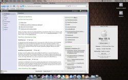
Here's another I found floating around. Nothing revealing, but interesting to see how the desktop looks with a different background.
 

Attachments

  • 541788551_6e31f21d45_o_d.jpg
    541788551_6e31f21d45_o_d.jpg
    218.5 KB · Views: 1,310
Here's another I found floating around. Nothing revealing, but interesting to see how the desktop looks with a different background.

I don't really like the top bar's grey color (of every app) with the very light grey for the rest of the window. I just think the colors dont go well together.
 
So the dock has a depth feel and the top bar is translucent, but the appearance changes are so minor - which is fine, don't mess with success I suppose. I think that a casual Mac user might not notice the appearance change. I'll be surprised if my wife notices the difference when we upgrade - perhaps a sense that it's not quite the same but couldn't tell you what's changed.
 
I don't really like the top bar's grey color (of every app) with the very light grey for the rest of the window. I just think the colors dont go well together.

Actually, the dark/light gray combo doesn't bother me. It provides more contrast and I believe it looks better than than the inconsistent white unified and brushed metal GUI's we have in Tiger. By the way, all our opinions are based on what we've seen. Let's hold our final judgements for October, shall we? ;)
 
So the dock has a depth feel and the top bar is translucent, but the appearance changes are so minor - which is fine, don't mess with success I suppose. I think that a casual Mac user might not notice the appearance change. I'll be surprised if my wife notices the difference when we upgrade - perhaps a sense that it's not quite the same but couldn't tell you what's changed.
i think they changed the finder significantly and they got rid of brushed metal (yes!!!). i would certainly notice a major change if someone updated my computer w/out me even knowing
 
I hope magnification is still available for the Dock. I like to keep the Dock tiny with magnification turned up all the way.

The Leopard grass desktop background is simply gross and out of character for Apple. I much prefer their abstract blue backgrounds of the previous releases. I was looking forward to seeing what they would come up with for Leopard, but the grass is a huge disappointment. No big deal since it can be switched out effortlessly, but still an uncreative and unoriginal choice. It belongs in the Nature folder and not as the default desktop.

o ya theres magnification for the dock, watch one of apples vids, i believe they show it off there.

as for the background, i really dont care (as u said it can be changed effortlessly), but i have to admit i do love the blue backgrounds. maybe apple will include a new one just not the default
 
The text of the menu bar isn't hard to read with black/dark background, rest assured.

I'll only rest assured when I know for certain that I can disable the transparency. :)

Its to bad that it doesn't have cool features like this.

Why? A good portion of Beryl doesn't do anything but show off superfluous effects. There are a few features in there that help productivity (like the Expose style window manager) and window-level transparencies, but on the whole Beryl doesn't add a lot to the productivity factor.

Actually we do. We have the spinning cube with in FUS, and we have the little squishy-genie effect for minimizing windows.

Beryl is a different beast all together than just those few effects. But you're right, Quartz & CoreGraphics have this ability; Apple's never really put it into place. With the advent of Core Animation it could become a possibility in the future, I'm sure.
 
look at the apple screenshot for the new ichat (on apple's website) and look on the bottom of the buddy list. u notice theres a 4th button next to the the "text/audio/video" buttons . i believe thats screensharing. but i am happy to hear theyve integrated that into the finder. i wonder if it will work w/ windows lol (prob not but still).

If they use VNC for 'screen sharing,' it will be able to be used with Windows, Linux, Mac, etc...
 
Its to bad that it doesn't have cool features like this.

http://www.youtube.com/watch?v=m5aoomR7yW8&mode=related&search=

So...can you do any work on that computer, or do you just spin around the cube thing like a fricken' spaz all day long?

Spinning around the cube to the other desktops got old after the first 10 seconds

Beryl...as most other "cool" 3d desktops don't actually show anything but useless eyecandy. A lot more judicious use of such effects would go a long way away from making that lame and into something thats cool, and useful.

Could you imagine accidentally catching a corner on Photoshop or FCP or Xcode and having it flub around like a damn rubber band? ugh.
 
The rounded corners on the menu bar have been around since the original Macintosh in 1984... Sad to see that iconic UI element go.

I agree! Those little things actually contribute a lot to the "nice" feeling of the desktop. Can't believe that they removed those. They didn't have to go just because of the transparency.
 
Its to bad that it doesn't have cool features like this.

http://www.youtube.com/watch?v=m5aoomR7yW8&mode=related&search=

Yay, useless 3d effects to eat up time and processor cycles.

Beryl is all good and fun, I use it on my Ubuntu partition. But stuff like that needs to be left to the 3rd party apps and not incorporated into the main OS; it isn't for everyone.

The rounded corners on the menu bar have been around since the original Macintosh in 1984... Sad to see that iconic UI element go.

Well, the menus themselves (context menus, etc) all have rounded corners so I guess they just moved them there? I dunno, not really a big sticking point for me.
 
Register on MacRumors! This sidebar will go away, and you'll see fewer ads.