Become a MacRumors Supporter for $50/year with no ads, ability to filter front page stories, and private forums.
Status
The first post of this thread is a WikiPost and can be edited by anyone with the appropiate permissions. Your edits will be public.
Is there only one dynamic desktop? Did Apple provide any sort of tool for making them?

Yes. and No, at least not yet
[doublepost=1528664175][/doublepost]After nearly a week, the dark mode is wearing on me... many of the apps, including Apple's own stuff gets really confusing with all of the dark ... no clear delineation of dialog boxes and other screen components... I'm just "not seeing" a lot of stuff because everything sort of blends together... would like to see some refinement in the dark skins - perhaps just lighten up the 'darkness' a bit...
 
Such an "Apple" detail: When you use the new screenshot tool, you're able to drag the floating tool bar around the screen and put it wherever you want. This setting will of course be remembered. But, in case you're wondering how to get it back to exactly where it was, perfectly centered, at the bottom of the screen: The closer you get to the correct location, the more visible another faded image of the bar becomes. Once you're right next to it it, the bar will snap into position.

Well done, Apple!

bar.png
 
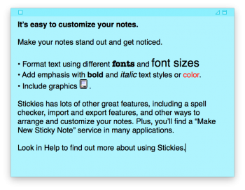
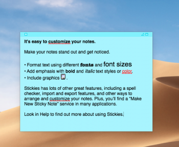
Does opening the Stickies application on a brand new installation of Mojave still have the stickie note showing the old classic Mac? If so, screenshot?

Edit: This is what I have, on 10.13.
Screen Shot 2018-06-10 at 9.12.22 PM.png
 
Last edited:
  • Like
Reactions: martyjmclean
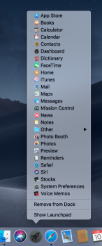
Pretty sure this is new; right-clicking the Launchpad icon in the dock now provides a Start menu-esque method of launching applications.

New indeed (just tried under 10.13 and only get the normal "Remove from Dock" and "Show Launchpad" options). This is going to be really useful to me as I find Launchpad tedious to use.
 
  • Like
Reactions: Slix
Thank you for sharing; the translucency seems like a bit of a bummer to be honest. I like how much translucency there is to these window bars in High Sierra; from your comparison it looks like it will barely be noticeable.

There already is the option to completely turn translucency off for those who don't like it, so I see no reason why they would reduce it to the point where it's almost not there anymore.
I agree. Making the light mode less translucent while making dark mode more translucent makes zero sense. If anything light mode needs it more because it's more bland looking. Stupid. It was perfect before.
 
  • Like
Reactions: afir93
I agree. Making the light mode less translucent while making dark mode more translucent makes zero sense. If anything light mode needs it more because it's more bland looking. Stupid. It was perfect before.
Yeah actually i do like the look of darkmode, but on the other side i hate the new light mode look. I seriously hope this isn't on Purpose or customizable in any way

and to be honest Dark mode with Transparency turned of can look great. Light mode without transparency looks ugly in my opinion.
 
Pretty sure this is new; right-clicking the Launchpad icon in the dock now provides a Start menu-esque method of launching applications.
This is wonderful. I am starting to love 10.14 more and more.

Reminds me of the Tiger and Leopard, where you had so many of such little features introduced, that so many people found useful, and are still finding useful, even today.
[doublepost=1528714369][/doublepost]
Does opening the Stickies application on a brand new installation of Mojave still have the stickie note showing the old classic Mac? If so, screenshot?

Edit: This is what I have, on 10.13.
View attachment 765739
I also hope that Stickies haven't been removed in 10.14, because I like them and use them, and my daily use of Mac would be really affected negatively. And I believe there are many people who find Stickies useful.

BTW, how do you invoke that screen again? I tried closing and opening again, and that blue sticky won't show up.
[doublepost=1528716030][/doublepost]
Such an "Apple" detail: When you use the new screenshot tool, you're able to drag the floating tool bar around the screen and put it wherever you want. This setting will of course be remembered. But, in case you're wondering how to get it back to exactly where it was, perfectly centered, at the bottom of the screen: The closer you get to the correct location, the more visible another faded image of the bar becomes. Once you're right next to it it, the bar will snap into position.

Well done, Apple!

View attachment 765710
That's the Apple we all know and love.
 
Last edited:
I also hope that Stickies haven't been removed in 10.14, because I like them and use them, and my daily use of Mac would be really affected negatively. And I believe there are many people who find Stickies useful.

I always thought I was in a minority in using Stickies for quick notes, but when I went to university, at least 75% of the people using a Mac had Stickies plastered over their Desktop. I think they are pretty widely used, even if they haven’t really been updated in aeons.
 
  • Like
Reactions: tkermit
Such an "Apple" detail: When you use the new screenshot tool, you're able to drag the floating tool bar around the screen and put it wherever you want. This setting will of course be remembered. But, in case you're wondering how to get it back to exactly where it was, perfectly centered, at the bottom of the screen: The closer you get to the correct location, the more visible another faded image of the bar becomes. Once you're right next to it it, the bar will snap into position.

Well done, Apple!

View attachment 765710

Now if they would do this for spotlight search as well...
 
I always thought I was in a minority in using Stickies for quick notes, but when I went to university, at least 75% of the people using a Mac had Stickies plastered over their Desktop. I think they are pretty widely used, even if they haven’t really been updated in aeons.
Actually I prefer Dashboard for this. Looks cleaner without having to mess up the Desktop
 
Actually I prefer Dashboard for this. Looks cleaner without having to mess up the Desktop
I use Dashboard a lot too, but breaks down when I need to have more than a few lines of information.

Personally, I use Dashboard for very quick things I need to reference, like a measurement or voucher code; Stickies for longer things which I need quick reference to for a short time period; Notes for things I want on my iPad/iPhone or things I don't need immediate access to. I think they all have their place.
 
  • Like
Reactions: colourfastt
Does the dark theme work with Google Chrome??
Unlike Apple apps, third party apps aren't affected by default, including Google Chrome. They continue to use the light mode in the app.

Each third-party app will have to be updated to work with the system dark mode.
 
Could someone please post a screenshot of the notification center in dark mode? Thank you so much
 
I went through and did the colors I left out in the original (except blue and graphite) for light and all expect default blue for dark :).

This makes me think of the first ever iBooks and iMacs!

C’mon Apple, release a new range of iBooks & iMacs , each with plastic colour highlights that match the system highlights as shown above.

Mind you, with all the talk of heading to ARM, something like this really could happen (although probably with some sort of optional silicone case that matches the system highlights).
You would seriously like that? The latest attempt doing something similar was the 5c and failed as hard as it could fail
 
  • Like
Reactions: martyjmclean
Register on MacRumors! This sidebar will go away, and you'll see fewer ads.