Got a tip for us?
Let us know
Become a MacRumors Supporter for $50/year with no ads, ability to filter front page stories, and private forums.
macOS 10.14 Mojave: All The Little Things
- Thread starter Galaxas0
- WikiPost WikiPost
- Start date
- Sort by reaction score
You are using an out of date browser. It may not display this or other websites correctly.
You should upgrade or use an alternative browser.
You should upgrade or use an alternative browser.
- Status
- The first post of this thread is a WikiPost and can be edited by anyone with the appropiate permissions. Your edits will be public.
The text cursor now has higher contrast. Most likely in preparation for dark mode.
High Sierra:

Mojave:

High Sierra:
Mojave:
installed PB2 on my late 2012 mac mini yesterday, all went fine... apart from i cant open Finder (keep getting an error that Finder cannot be opened), also the "Macintosh HD" icon is not showing on the desktop
any ideas as to a fix?
Thanks
any ideas as to a fix?
Thanks
installed PB2 on my late 2012 mac mini yesterday, all went fine... apart from i cant open Finder (keep getting an error that Finder cannot be opened), also the "Macintosh HD" icon is not showing on the desktop
any ideas as to a fix?
Thanks
With those serious problems, I would restore to a backup.
Beta 4 changes found:
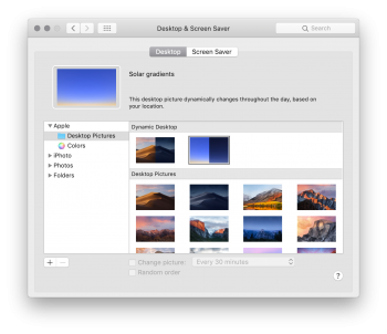
- new Dynamic wallpaper called "Solar gradients" (not a photo, just a gradient of two colors)
- iTunes seems to have smoother window resizing (on m3 MacBook 2015) EDIT: when scrolled all the way up
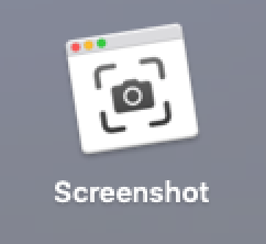
- new Screen Print (idk what the english word is) app (or icon?) in Launch Pad (in the "Other" map)
Still to check:
- blurriness of text in scanned PDF documents on non-retina screens
Not fixed:
- poor performance of Twitch in Safari
- white screen while loading a new website, even though Dark Mode is on
Last edited:
Darker menu selection colors (Mojave beta 4 on the left, High Sierra on the right):


New Solar gradients dynamic wallpaper. The preview on the left now slowly fades from one image to another.

Dynamic Desktop now behaves the same with either the light or dark UI, and the separate options to force either the light or dark versions of the background are now functional. Much better.

New Solar gradients dynamic wallpaper. The preview on the left now slowly fades from one image to another.

Dynamic Desktop now behaves the same with either the light or dark UI, and the separate options to force either the light or dark versions of the background are now functional. Much better.
DP4 looks like you got what you predicted. In Dark Mode, now selecting Dynamic gives you the daytime images (during the day of course). Dark (Still) and Light (Still) are now available, and do as you might expect.The options are grayed-out right now regardless of the UI theme, but it looks like this means we'll eventually be able to use the full dynamic wallpaper with the UI dark mode enabled, and not just the dark / night version. Also, the preview on the left cycles through the different images now.
View attachment 769010
[doublepost=1531780248][/doublepost]
Darker menu selection colors (Mojave beta 4 on the left, High Sierra on the right):
View attachment 770957 View attachment 770958
New Solar gradients dynamic wallpaper. The preview on the left now slowly fades from one image to another.
View attachment 770959
Dynamic Desktop now behaves the same with either the light or dark UI, and the separate options to force either the light or dark versions of the background are now functional. Much better.
View attachment 770960
Of course, personal opinion comes into it... but I think Light (Still) is quite dark really ;-) Plus I think it looks nicer used in Dark Mode!!
[doublepost=1531780350][/doublepost]DP4 fixes the issue I was seeing with System Preferences --> General --> [x] Use font smoothing when available... which was kind of 'bolding' the text in Mail and Notes.

There're no dividers in Safari using the light appearance.
What's more, after quitting a full-screen video, Safari looks as it is in an inactive state..
The dividers are still there, but very faint when the window is active, and still look as expected in the dark mode. Could be a bug.
There're no dividers in Safari using the light appearance.
This is a bug I experienced in beta 3 as well.What's more, after quitting a full-screen video, Safari looks as it is in an inactive state..
Yes. The bug is there since beta 3. When it comes to the dividers, I think they were more visible in the previous beta versions.The dividers are still there, but very faint when the window is active, and still look as expected in the dark mode. Could be a bug.
This is a bug I experienced in beta 3 as well.
Have the toolbar icons always wiggled when you go into Customize Toolbar? I just noticed this on Mojave Public Beta...
Nice find, this is new.
Does anyone have pics of this Screen Print app?Beta 4 changes found:
- new Dynamic wallpaper called "Solar gradients" (not a photo, just a gradient of two colors)
- iTunes seems to have smoother window resizing (on m3 MacBook 2015) EDIT: when scrolled all the way up
- new Screen Print (idk what the english word is) app (or icon?) in Launch Pad (in the "Other" map)
Still to check:
- blurriness of text in scanned PDF documents on non-retina screens
Not fixed:
- poor performance of Twitch in Safari
- white screen while loading a new website, even though Dark Mode is on
It's exactly the same as pressing Cmd-Shift-5 which brings up the new Mojave screenshot interface. It doesn't do anything apart from providing a UI-based shortcut for that.Does anyone have pics of this Screen Print app?
Another thing which I've noticed - when I split screen two Preview windows, the left one is slightly larger than the right one. I don't remember having such issue with High Sierra. Is it like this on purpose or it's a bug?
And I think they've removed the translation animation between light and dark which was present in beta 3.
And I think they've removed the translation animation between light and dark which was present in beta 3.
Safari

I didn't see anyone point out yet, but radio buttons, checkboxes, and dropdown menus no longer animate in Mojave. I really hope it's just a bug, otherwise I'll miss it. :/
- The privacy icon is blue (was grey in High Sierra).
- The "move to" button changed in beta 4. Now it takes up way too much space.
- There's a new button to view emails on a light background in dark mode. The button doesn't have an icon yet, though, and html emails aren't affected.
- You can now drag the window from the navigation bar (where the back/forward buttons, Library, Store, etc. are).
- The split view grabber is no longer blinding white. Now it's a muted grey that gets brighter when the cursor hovers over.
- Dark mode has darker shadows.
- No more "mess up" option on desktop. :'C
I didn't see anyone point out yet, but radio buttons, checkboxes, and dropdown menus no longer animate in Mojave. I really hope it's just a bug, otherwise I'll miss it. :/
- The "move to" button changed in beta 4. Now it takes up way too much space.
On Sierra, the button is that larger size on the Touchbar. I've always wondered why. If you try to add buttons it doesn't shrink itself.
What are radio buttons?Safari
- The privacy icon is blue (was grey in High Sierra).
View attachment 770991
- The "move to" button changed in beta 4. Now it takes up way too much space.
iTunes
- There's a new button to view emails on a light background in dark mode. The button doesn't have an icon yet, though, and html emails aren't affected.
Other
- You can now drag the window from the navigation bar (where the back/forward buttons, Library, Store, etc. are).
- The split view grabber is no longer blinding white. Now it's a muted grey that gets brighter when the cursor hovers over.
- Dark mode has darker shadows.
- No more "mess up" option on desktop. :'C
I didn't see anyone point out yet, but radio buttons, checkboxes, and dropdown menus no longer animate in Mojave. I really hope it's just a bug, otherwise I'll miss it. :/
Register on MacRumors! This sidebar will go away, and you'll see fewer ads.


