Got a tip for us?
Let us know
Become a MacRumors Supporter for $50/year with no ads, ability to filter front page stories, and private forums.
macOS 11: All the little things!
- Thread starter Galaxas0
- WikiPost WikiPost
- Start date
- Sort by reaction score
You are using an out of date browser. It may not display this or other websites correctly.
You should upgrade or use an alternative browser.
You should upgrade or use an alternative browser.
- Status
- The first post of this thread is a WikiPost and can be edited by anyone with the appropiate permissions. Your edits will be public.
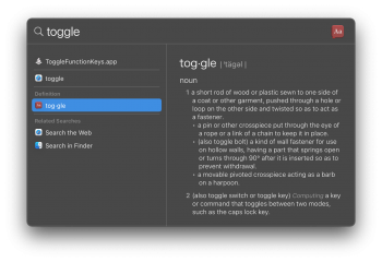
I think the benefit of this design is, if you scroll through the results with the down arrow it no longer has to load the preview. Try searching a couple characters and hold the down arrow. It lags a lot especially with Excel previews on my system.
New Spotlight look, which is now a simple list. A column appears after you select an entry and press Enter. Not sure how I like this yet, The catalina Spotlight was much easier to use, not to mention order of magnitudes faster to display entries.
View attachment 954743
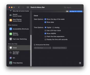
View attachment 954742
Yes, the new Spotlight has been very glitchy for me.
They've renamed the new sosumi sound, now it's sonumi!

Also, I SWEAR the Messages app icon is less "3D"! If anyone has a comparison pic please reply?

Also, I SWEAR the Messages app icon is less "3D"! If anyone has a comparison pic please reply?
Last edited:
Also, I SWEAR the Messages app icon is less "3D"! If anyone has a comparison pic please reply?
View attachment 954904
They've definitely pulled back on the shadows, thankfully.
You knew they would...
Did anyone else spend like 5 minutes trying to figure out why their wifi signal was only 3 bars, only to find out they changed the max from 4 to 3?
Good to know !
They really need to get the tabs situation sorted out. It's hard to know which is active because the shade of the active tab is not much darker than the inactive ones.
Here's a little tidbit. When I created a new backup on a NAS, it came out as an APFS sparsebundle. When I migrated an old Time Capsule HFS+ backup bundle, it remained as HFS+, no conversion. And I plan to keep it that way. APFS backups have been slow for me on networked spinning disks, especially the phase where it looks for changes and prepares for action. If there was a way to keep using HFS+ on new backups, I'd do that, for now.
Haven't seen this posted; Keychain Access has a new icon.
Old

New

Garage door got a lick of paint!
Old
New
Garage door got a lick of paint!
Noticed something strange, have seen other people's installs of Big Sur with slightly tweaked Safari/FaceTime icons (less shadows on the FT icon, thicker lines on Safari). Weirdly my messages icon has less shadows too though...
I've attached my icons (pink background) and someone else's. Which icons do you guys have?


I've attached my icons (pink background) and someone else's. Which icons do you guys have?
Noticed something strange, have seen other people's installs of Big Sur with slightly tweaked Safari/FaceTime icons (less shadows on the FT icon, thicker lines on Safari). Weirdly my messages icon has less shadows too though...
I've attached my icons (pink background) and someone else's. Which icons do you guys have?
View attachment 957773View attachment 957774
I believe the one on the right is from a legacy (read: non retina/ HiDPI) display.
My icons look like yours on the left on my internal MPB display & external 4K display.
Not sure if I like the new Safari icon. By making all the points equal, it looks a lot less like an actual compass.
Yay! Love this much more than the hideous previous "plaid" icon.
This was mentioned 3 posts earlier...
Some fine graphic design going on right there: “Let’s just smack an existing 3D-style icon onto a black iOS-ish square.” - Is this amateur hour at DeviantArt or something? The entire macOS Big Sur icon set feels like an incoherent rush job.
Last edited:
Emoji & Symbols now has a toggle between the emoji palette and the standard character viewer:


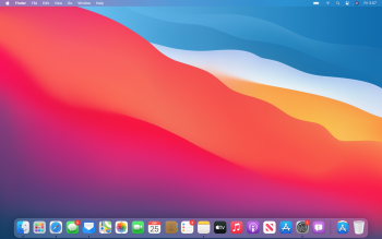
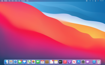
I can confirm they've adjusted the tints of the menu bar/dock, as well as tweaked the Messages/FaceTime icons. In light mode the dock is lighter and the menu bar is darker (for the contrast against the white text, definitely welcome).
MacOS has been due for a redesign for a while and I was really excited about Big Sur, but each update I'm liking it less. This late in the game I'm really worried how much of it still feels so utterly and horribly disjointed. It's yikes.
MacOS has been due for a redesign for a while and I was really excited about Big Sur, but each update I'm liking it less. This late in the game I'm really worried how much of it still feels so utterly and horribly disjointed. It's yikes.
Attachments
Last edited:
IMO, PB beta for the menu bar looks a lot better and its now actually readable. I am so glad they sorted out the Messages/Facetime icons, they were a bit much in the earlier betas.I can confirm they've adjusted the tints of the menu bar/dock, as well as tweaked the Messages/FaceTime icons. In light mode the dock is lighter and the menu bar is darker (for the contrast against the white text).
MacOS has been due for a redesign for a while and I was really excited about Big Sur, but each update I'm liking it less. This late in the game I'm really worried how much of it still feels so utterly and horribly disjointed. It's yikes.
Its slowly getting better for me..
Odd choice to make the dock lighter. Seems the dock of the first image would go perfect with the menu bar of the second image. More legibility is welcome though.I can confirm they've adjusted the tints of the menu bar/dock, as well as tweaked the Messages/FaceTime icons. In light mode the dock is lighter and the menu bar is darker (for the contrast against the white text, definitely welcome).
MacOS has been due for a redesign for a while and I was really excited about Big Sur, but each update I'm liking it less. This late in the game I'm really worried how much of it still feels so utterly and horribly disjointed. It's yikes.
Register on MacRumors! This sidebar will go away, and you'll see fewer ads.


