Become a MacRumors Supporter for $50/year with no ads, ability to filter front page stories, and private forums.
Status
The first post of this thread is a WikiPost and can be edited by anyone with the appropiate permissions. Your edits will be public.
Can you provide a video example of what you mean?
Thanks

It might be unnecessary work to provide a video example, but I will try to elaborate. Suppose I am typing this content in Safari, and I launch an app from the Dock or anywhere, between Lion and Big Sur, the app would steal focus at launch and I would end up with missed content. Not anymore in Monterey, it keeps focus on what I am typing. You can try this:
- Microsoft apps take the longest to open, or you can even try Affinity or Adobe apps. Launch them and return to MR reply section and start typing something. The app would launch in the background, it will not steal focus and present itself in the foreground anymore.

It was something really subtle but noticeable when I was coming from Windows to Mac OS X Tiger. I loved it. Now it is back.

In case this did not help, let me know, I will try and cook a video for it.
 
Did Monterey improve on the look and feel of the GUI or is it exactly the same as BS?
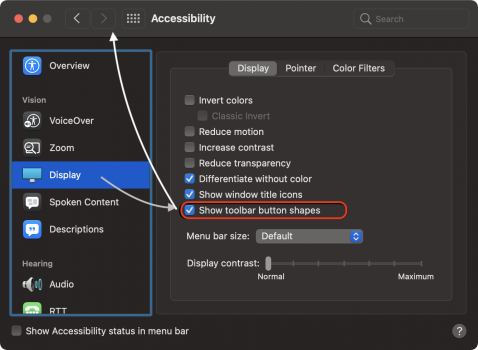
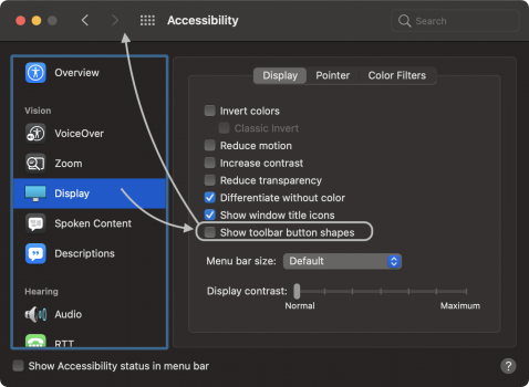
There's an improvement in the visibility area of macOS Monterey, in Accessibility there's now (not, 'not' as it stated before) an option to have Finder buttons appear with a small outline rather than nothing. It's system-wide this setting.

On macOS Big Sur the only known way to have an outline like this is to turn on the High Contrast mode.

I also remember it going beyond just Finder buttons - i forget where I also noticed changed, I remember that I wasn't appreciating it everywhere throughout macOS Monterey.

Edited post, because my keyboard insists of typing 'not' when it should say 'now'
 
Last edited:
It might be unnecessary work to provide a video example, but I will try to elaborate. Suppose I am typing this content in Safari, and I launch an app from the Dock or anywhere, between Lion and Big Sur, the app would steal focus at launch and I would end up with missed content. Not anymore in Monterey, it keeps focus on what I am typing. You can try this:
- Microsoft apps take the longest to open, or you can even try Affinity or Adobe apps. Launch them and return to MR reply section and start typing something. The app would launch in the background, it will not steal focus and present itself in the foreground anymore.

It was something really subtle but noticeable when I was coming from Windows to Mac OS X Tiger. I loved it. Now it is back.

In case this did not help, let me know, I will try and cook a video for it.
Seems like that this doesn't work anymore in Beta 5 :( I write in TextEdit. Now I start the OneNote application (with Spotlight), focus TextEdit again: As soon as OneNote application started and show its window, the focus is in OneNote.

Can you check by yourself and give feedback?

/edit: Okay, check this with Safari again. This seems to work?

I typed this in Safari while opening Outlook in the background. Outlook was unable to steal focus. Let me try with Notes and Outlook.

Okay, my experience is that after clicking on Outlook icon and coming back to Notes, the Notes app takes a long time to come back into focus and by that time it becomes difficult to reliably gauge if the focus was after app opening or what. So, conclusion is that Safari does this better than Notes, and likely TextEdit would be suffering from the same.
 
I wonder if AirPlay to Mac works with Zoom from your iPad. So if you are in a Zoom call and you want to use your Apple Pencil to draw something on your iPad and share your Mac screen if people will see your iPad using AirPlay.
 
There's an improvement in the visibility area of macOS Monterey, in Accessibility there's now (not, 'not' as it stated before) an option to have Finder buttons appear with a small outline rather than nothing. It's system-wide this setting.

On macOS Big Sur the only known way to have an outline like this is to turn on the High Contrast mode.

I also remember it going beyond just Finder buttons - i forget where I also noticed changed, I remember that I wasn't appreciating it everywhere throughout macOS Monterey.

Edited post, because my keyboard insists of typing 'not' when it should say 'now'
Could you post some screenshots if you get a chance please? :)
 
  • Like
Reactions: RandomDSdevel
Could you post some screenshots if you get a chance please? :)
Now here's a few.. notice the arrows pointing to the difference in appearance in relation to checkboxes

These files are separate and can be themed too - perhaps adding a slight gradient on the mask within the bounds of the outline. Fun experiment of course.
 

Attachments

  • Screen Shot 2021-08-26 at 16.40.41.png
    Screen Shot 2021-08-26 at 16.40.41.png
    167 KB · Views: 374
  • Screen Shot 2021-08-26 at 16.42.11.png
    Screen Shot 2021-08-26 at 16.42.11.png
    164.2 KB · Views: 310
  • Screen Shot 2021-08-26 at 16.39.49.png
    Screen Shot 2021-08-26 at 16.39.49.png
    19.4 KB · Views: 314
Now here's a few.. notice the arrows pointing to the difference in appearance in relation to checkboxes

These files are separate and can be themed too - perhaps adding a slight gradient on the mask within the bounds of the outline. Fun experiment of course.
Thank you! That’s exactly what I’ve been wanting, just to add a bit more precision.
 
Last edited:
Now here's a few.. notice the arrows pointing to the difference in appearance in relation to checkboxes

These files are separate and can be themed too - perhaps adding a slight gradient on the mask within the bounds of the outline. Fun experiment of course.

The 'toolbar button shapes' look really nice and make it much easier to find somewhere to drag the window rather than buttons appearing out of nowhere, should be default IMO.
 
The 'toolbar button shapes' look really nice and make it much easier to find somewhere to drag the window rather than buttons appearing out of nowhere, should be default IMO.
Yes. I agree.. There's not much to differentiate between buttons on Big Sur.. it's not impossible to tell what does what of course - I think it's a huge blunder on Apple's part to not make it less melted together in the toolbar..

I also hope for this setting to be put into General settings rather that Accessibility. Perhaps we could use an "Appearance" PreferencePane instead of the mish-mash there is now where somethings are in Dock and Menubar and some other appearance settings are in General and then finally this setting for button outlines are in Accessibility. I believe it would be more pleasing for new or old macOS users to have such settings more in an Appearance PreferencePane. Or even an "Appearance & Style" PreferencePane - wouldn't hurt one bit

No?
Completely agree. But my guess here is that in a soft form of damage control - or rather not admitting to mistakes - Apple buries these settings in Accessibility as a way convincing the user that said feature is only for those with specific requirements.

Case in point: Like in iOS, one setting that I believe is buried far too deep in System Preferences is Reduce motion. I activated this a few years ago after iOS had its overall (and proceeded to make me dizzy), and it's now the first thing I click on when I get a new device. The fade transitions that now appear between simple actions such as Spaces, Mission Control, are so composed and calming that I literally can't believe it isn't default on macOS or iOS.
Interesting! You're definitely entitled to your own opinion, but to me, the reduce motion actually makes me feel more dizzy, as opposed to the default behavior. Seeing the fade makes my eyes hurt a bit, while seeing windows and spaces move in place actively is actually more calming to my eyes.

It's a matter of personal preference, I'd think, and I'm glad macOS offers the ability to pick your preference.
 
Setting up throwaway Emails should in the Mail app not hidden in iCloud, or am I missing it?
Anyone know the difference between Protect Mail Activity and Hide IP in Mail?
 
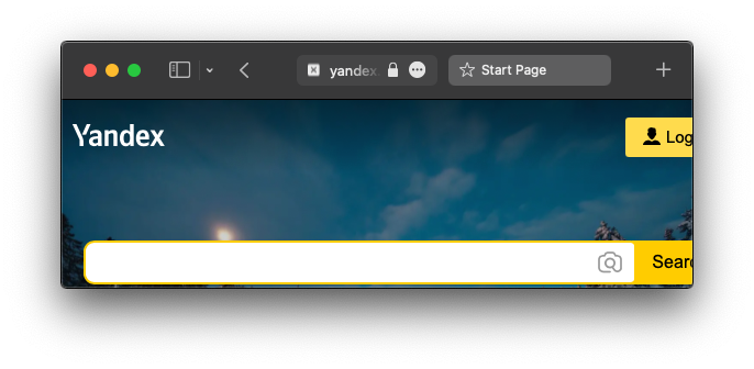
That x is rendered pretty dang badly though
 

Attachments

  • Screen Shot 2021-09-03 at 02.33.22.png
    Screen Shot 2021-09-03 at 02.33.22.png
    154.4 KB · Views: 250
Not really, at least not before sf symbols came into play
 

Attachments

  • Screen Shot 2021-09-03 at 02.40.16.png
    Screen Shot 2021-09-03 at 02.40.16.png
    8.6 KB · Views: 147
-----(Frowns.) Well, that's a bit of a kludge to work around bad UI/UX design in that it's now hard to tell which tab's active and which isn't. (There should be enough room on a desktop or laptop computer's screen to display both the identifying site icon, for those who want it, and the 'close tab' control. Guess I'll be leaving icons off like in older versions of Safari, then; ah, well, I'm used to it that way, anyway.) This wouldn't've been a problem if Apple hadn't needlessly changed the interface.
 
  • Like
Reactions: gilby101
Register on MacRumors! This sidebar will go away, and you'll see fewer ads.