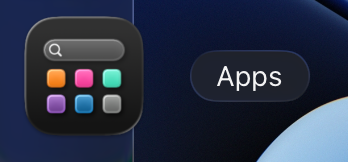
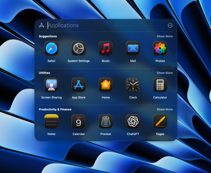
This looks horrible. Since this is beta, I really hope they rethink this, like they rethought that hideous battery icon few years back
I really wonder how they designed this.. tested it.. and was like yeah.. this is the right direction for Mac OS.....
Just to put it in perspective where we came from.


