Looks like something is very wrong in current beta with those huge shadows in toolbar buttons and it will be fixed, that's how finder is supposed to look as shows in wwdc videos for devs, still questionable, but much much better.
Got a tip for us?
Let us know
Become a MacRumors Supporter for $50/year with no ads, ability to filter front page stories, and private forums.
macOS Tahoe 26.0 Beta 1 - Bug fixes, changes, and more
- Thread starter WilliApple
- WikiPost WikiPost
- Start date
- Sort by reaction score
You are using an out of date browser. It may not display this or other websites correctly.
You should upgrade or use an alternative browser.
You should upgrade or use an alternative browser.
- Status
- The first post of this thread is a WikiPost and can be edited by anyone with the appropiate permissions. Your edits will be public.

Good catch, it does look way better like thisLooks like something is very wrong in current beta with those huge shadows in toolbar buttons and it will be fixed, that's how finder is supposed to look as shows in wwdc videos for devs, still questionable, but much much better.
That looks like a mock up, not an actual app build they have hidden away.Looks like something is very wrong in current beta with those huge shadows in toolbar buttons and it will be fixed, that's how finder is supposed to look as shows in wwdc videos for devs, still questionable, but much much better.
Looks much better except for list view, that thing has too much padding. List view is used when you want to see as much stuff as possible, adding more padding to it is counterintuitive.Looks like something is very wrong in current beta with those huge shadows in toolbar buttons and it will be fixed, that's how finder is supposed to look as shows in wwdc videos for devs, still questionable, but much much better.
Of course that's a mock up, but at least now we know what they are targeting, they showed extremely little of macOS in keynote and promo website, zero screenshots of finder.That looks like a mock up, not an actual app build they have hidden away.
Padding is terrible for a desktop app, especially double padding for the new sidebar design, simply put it looks like a simplified iPad app designed for touch.Looks much better except for list view, that thing has too much padding. List view is used when you want to see as much stuff as possible, adding more padding to it is counterintuitive.
Then they're actually committing to phone ui on desktop os, not a good look for a long time mac fan.Of course that's a mock up, but at least now we know what they are targeting, they showed extremely little of macOS in keynote and promo website, zero screenshots of finder.
This is more acceptable.
Looks like something is very wrong in current beta with those huge shadows in toolbar buttons and it will be fixed, that's how finder is supposed to look as shows in wwdc videos for devs, still questionable, but much much better.
This looks good at least
That's good. I hope it can actually play videos now.
This looks good at least
If you're talking about iPhone mirroring, a French journalist asked during the post WWDC chat and Apple said it still won't be available for users in the EU.Can anyone located in the EU check if the Phone app is working for them (is the phone app even visible in the EU region)? Thanks!
Did you report as a bug? If not I might, it's really bad...It gets worse - a roundRect running into a rect.
Here is a deactivated Finder window with Show Status Bar enabled.
View attachment 2518004
Is that some sort of ugly or what?
No, it’s not even available. I switched the Media & Purchases account to the US, and it appeared, but it’s not working.Can anyone located in the EU check if the Phone app is working for them (is the phone app even visible in the EU region)? Thanks!
This definitely feels like a step backwards..
Long time Apple purist.. Are going to want to turn off the "glass" if possible.. No doubt about it...They are going to hate it
That's true. Long time Apple users have never used a shiny, lickable interface before.
you mean this?That's already a known issue in the macOS 26 release notes.
>Users who enable path bar or status bar in Finder and use list view might be unable to access the last item in the list. > (151917092)
> Workaround: Disable path bar or status bar temporarily.
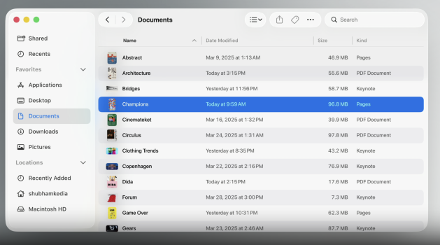
What's going on with padding in list view? Why in some screenshots it looks like this:

Yet there are screenshots where list view looks compact like before? Is this a setting that can be changed somewhere?
-------------------------------------------------------------------------------------
EDIT: It appears to be this setting:

Sorry for confusion.
Yet there are screenshots where list view looks compact like before? Is this a setting that can be changed somewhere?
-------------------------------------------------------------------------------------
EDIT: It appears to be this setting:
Sorry for confusion.
Too much information on the background…View attachment 2517976
View attachment 2517979
This is all looking much worse in reality or if you see the whole screen.
Not iPhone Mirroring, it's a new app.If you're talking about iPhone mirroring, a French journalist asked during the post WWDC chat and Apple said it still won't be available for users in the EU.
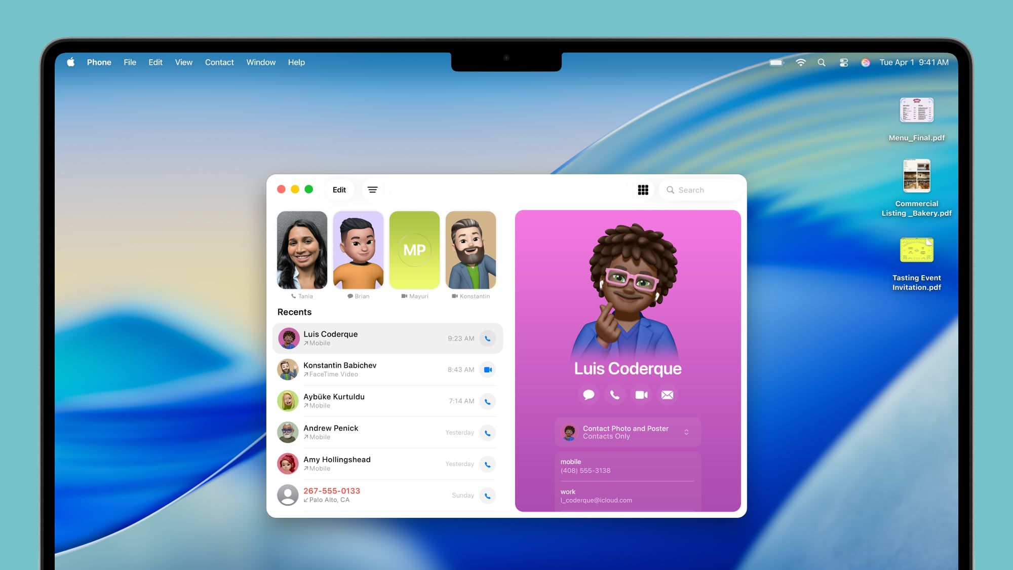
iPadOS 26 and macOS Tahoe Include Phone App With Call Screening, Hold Assist and More
With iPadOS 26 and macOS Tahoe, Apple is expanding the Phone app to the Mac and the iPad for the first time. It might not make a lot of sense for...
 www.macrumors.com
It doesn’t work without the workaround in EUIf you're talking about iPhone mirroring, a French journalist asked during the post WWDC chat and Apple said it still won't be available for users in the EU.
I jumped into it again by changing language and region to EN (US) and logging in with a US AppleID into AppStore.
Oh ok. That works … but is nothing more than a FaceTime in new clothesNot iPhone Mirroring, it's a new app.
iPadOS 26 and macOS Tahoe Include Phone App With Call Screening, Hold Assist and More
With iPadOS 26 and macOS Tahoe, Apple is expanding the Phone app to the Mac and the iPad for the first time. It might not make a lot of sense for...
Register on MacRumors! This sidebar will go away, and you'll see fewer ads.