Become a MacRumors Supporter for $50/year with no ads, ability to filter front page stories, and private forums.
This is worse usability. Not sure how you think it’s good. Making something that was a clear grid of icons into a long scrollable list you have to dig through is a huge step back

I have a feeling people won’t even bother and most will just use the search bar. So why have the icons at all?

Whoever has been in charge of the Mac UI for the past few years should be fired. Every single change has been hiding information; making things harder to find and use


Now THAT is a good idea. Can Apple hire you? It’s a smart solution that would actually improve usability beyond what the System Preferences app has always had.

That’s the thing I’ve been missing in Apple’s UI design lately. It’s just making things worse for the sake of making it look more like iOS rather than adding real improvement that makes using a Mac fun
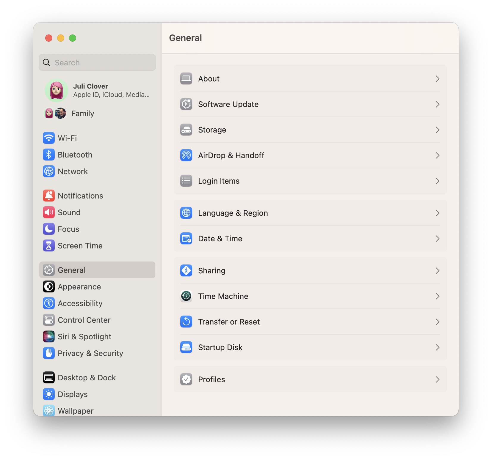
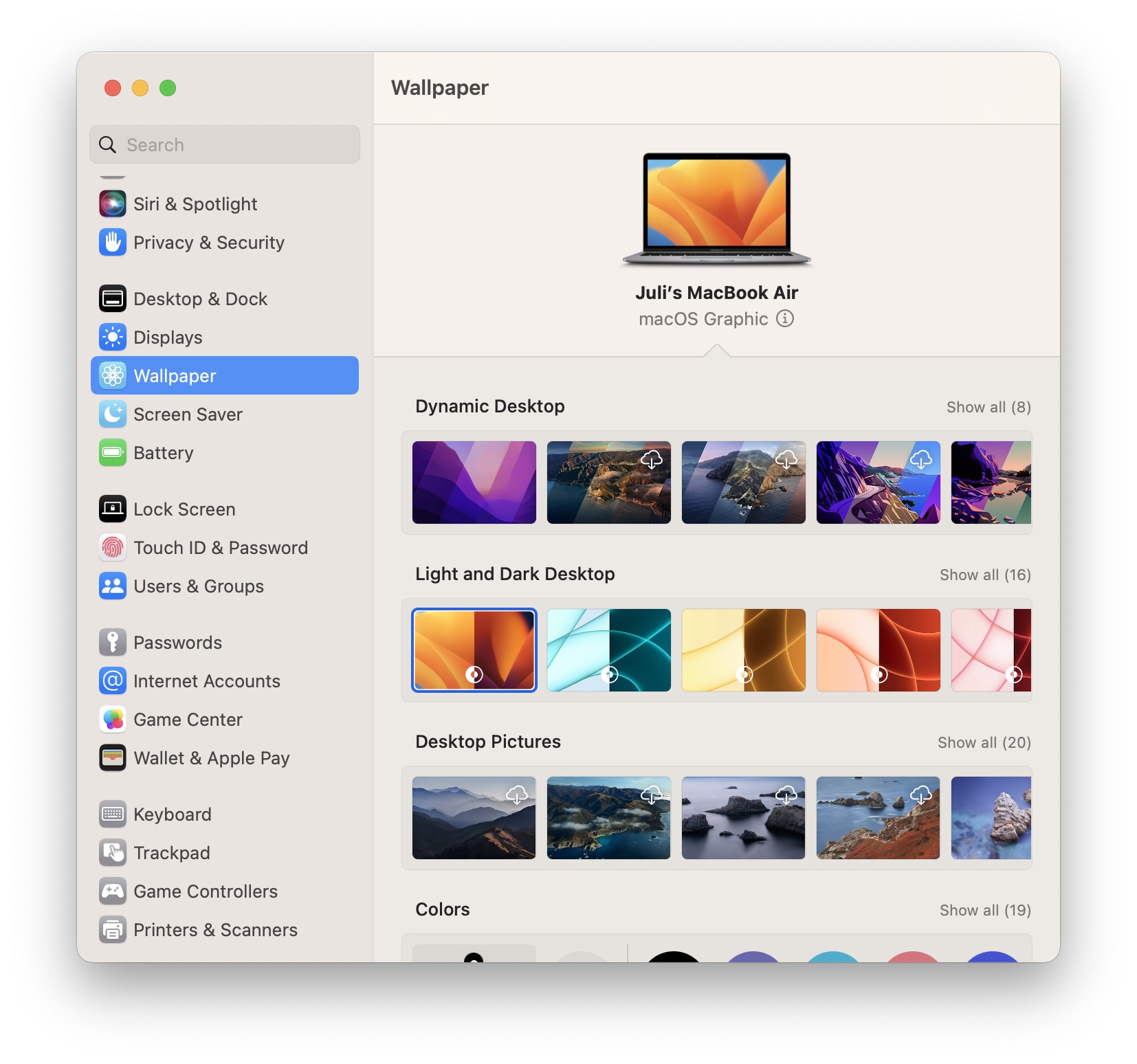
my man! this is the exact reason I don't like macOS Big Sur, and its derivatives. I have macOS Las Venturas on my M1 Air, cause I wanted to see the changes for myself, but my main hackintosh still runs Catalina for this reason.

Everything released after Big Sur feels too crammed on a 1080p screen. That simply wasn't the case before. And now I need even more screen real estate just to see all the settings. the things we do for the sake of consistency.
 
  • Like
Reactions: Wonder Warthog


Apple today previewed macOS Ventura, its latest operating system for the Mac, and one of the new features is a redesigned and renamed System Settings app that replaces System Preferences on macOS Monterey and previous versions.

macos-ventura-system-settings-1.jpg

The new System Settings app looks more similar to the Settings app on the iPhone and iPad, with settings placed in a sidebar for easy access.

macos-ventura-system-settings-2.jpg

System Preferences had been the app's name for over 20 years, but System Settings is the new name going forward. The redesigned app is limited to macOS Ventura, which will be publicly released in the fall. The first beta of macOS Ventura was seeded to developers today for testing, and Apple said the first public beta will be released in July.

Article Link: macOS Ventura Features Redesigned 'System Settings' App
Oh it looks like Apple must have hired a bunch of Linux UI designers lately. 😩😫😖
 
I'm pretty sure I don't like this, but I'd have to try it first. The system preferences were one of the things I liked the most when I first started using Macs from Windows. And the fact it's been consistent, outside of a little rearranging, was a relief compared to Windows getting a new system every OS release.

I guess the idea is to have a longer list of specific sections instead of the broad categories. I got used to the categories pretty quickly. Hard to tell how confusing it is to a new user.

I don't like this because I always end up scrolling forever looking for a specific setting in iOS. I guess the current way I end up clicking through to different categories if I can't find something... but who wants to scroll when you can have single screen pages of settings?
 
Last edited:
  • Like
Reactions: FCX and Canubis
Instead of making macOS look more like the mess in iOS and iPadOS, I wish they would make iOS and iPadOS function more like macOS. I don’t want my Mac to turn into an iPad with a built in keyboard.

TBH, none of the OS updates seem to be anything I can get excited about. If they want to impress me, leave the darn interfaces alone and fix the dang bugs!
I'm with you, this bastardisation of macOS really grates me but it's the way Apple has been going for years. It's clear they don't want power users like they've had for decades. They're slowly dumbing down the OS, locking customisation down and turning it into a device for dummies. It really bums me out, especially when the UX suffers so much along the way.
 
And is it just me, or are they fazing out the dynamic desktop wallpapers in favor of simple dark/light options?

(edit)
They didn’t add a new dynamic this year it seems.
It's not just you: there was none in Monterey either. I was a fan of the dynamic desktop landscape shops and don't know why they seem to have abandoned those. There a couple of sites offering third party dynamic wallpaper for download but most aren't particularly well done or very interesting. The best third party option I've found so far is actually an app - 24 Hour Wallpaper. Pretty good - high quality landscape photography which changes over the course of the day, from dawn to stars. It even, ironically, features several Monterey scenes: perhaps they'll add some Ventura ones later in the year!
 
A rigid grid of icons isn’t automatically great usability. Not if you arrange them to just “fit the grid” as Apple does. If you can group things by content/functionality, it’s good practice to do so and giving the user visual cues for that.

Maybe you have one line of the grid with only three icons/panes and another with five or six. But looking at my Mac and Apple’s support pages, Apple doesn’t really do that today.
Actually in the past System Preferences were grouped by category, even with some clear header, giving some really good overview.
They changed the grouping and layout over the years, at some point removing the clear headers. Overall, by seeing this old screenshot now, I actually feel it already got worse in terms of usability over the last years.
prefssecrets-8.jpg
 
Actually in the past System Preferences were grouped by category, even with some clear header, giving some really good overview.
They changed the grouping and layout over the years, at some point removing the clear headers. Overall, by seeing this old screenshot now, I actually feel it already got worse in terms of usability over the last years.
View attachment 2016044
As someone with adult ADHD, seeing BIG ICONS that represent what they are is super helpful. All my drives, main folders, and projects are color coded or have custom icons so I can better remember where things are located.
The iOS inspired are really hard for me to quickly decipher, as did removing the custom icons from the sidebar years ago.
 
  • Like
Reactions: Canubis
What I don’t like is that they’ve taken away the ability to find things spatially. Now we have to read through an entire list of non-labeled categories to find something. This isn’t an improvement. This is letting the growing complexity defeat and drive the “design”.
 
  • Like
Reactions: FCX and Canubis
What I don’t like is that they’ve taken away the ability to find things spatially. Now we have to read through an entire list of non-labeled categories to find something. This isn’t an improvement. This is letting the growing complexity defeat and drive the “design”.
I suppose it depends on how a certain person sees certain things. You say that, however I find a scrollable list and a search bar infinitely more usable than a square palette of sections seemingly placed at random, with the contents of each also seemingly fairly random.
I'm hoping this new app clears that up.
 
Actually in the past System Preferences were grouped by category, even with some clear header, giving some really good overview.
They changed the grouping and layout over the years, at some point removing the clear headers. Overall, by seeing this old screenshot now, I actually feel it already got worse in terms of usability over the last years.
View attachment 2016044
You are right, they did this is Yosemite 10.10. Before that it was much more usable, because you had the name of the categories etc.

After 10.10 it was like this:
u2Fuonc.jpg


And some version later they removed the lines even more (no visaul categories anymore):
2deuT3C.jpg

And finally this in Monterey (same as above, but the icons are even less recognizable):
6uBuk5A.jpg


But I tried to use the following tricks over the years for fast(er) navigation inside this cluttered mess:
 
Last edited:
I suppose it depends on how a certain person sees certain things. You say that, however I find a scrollable list and a search bar infinitely more usable than a square palette of sections seemingly placed at random, with the contents of each also seemingly fairly random.
I'm hoping this new app clears that up.
The spatial version wasn’t random. It was in categories. They often rearranged them, which was a problem, but it was easy to find things again where you once found them before.

The search function is the only thing that saves us anymore. I use it a lot now. It’s more effective and more efficient, but most users don’t use that, from what I see when I watch people use computing devices. My girlfriend never issues spotlight on her Mac, for example.

The search tool is a tech person workaround for a bad end-user design.
 
  • Like
Reactions: Mr. Rod and Canubis
The spatial version wasn’t random. It was in categories. They often rearranged them, which was a problem, but it was easy to find things again where you once found them before.

The search function is the only thing that saves us anymore. I use it a lot now. It’s more effective and more efficient, but most users don’t use that, from what I see when I watch people use computing devices. My girlfriend never issues spotlight on her Mac, for example.

The search tool is a tech person workaround for a bad end-user design.
Each to their own, as I was trying to put across, as I’m sure you know not everyone is the same. One persons potato is another persons goldmine.

However I completely disagree with your thoughts on the search tool. Done properly it renders any single other method of UI almost useless. It’s close to a perfect way of finding anything within a system.
 
You are right, they did this is Yosemite 10.10. Before that it was much more usable, because you had the name of the categories etc.

After 10.10 it was like this:
u2Fuonc.jpg
just a nitpick, but I used OS X Mavericks (10.9) on my 2013 MBP until 08/2021, and I'm 100% sure that the category names were not there
 
You are right, they did this is Yosemite 10.10. Before that it was much more usable, because you had the name of the categories etc.

After 10.10 it was like this:
u2Fuonc.jpg


And some version later they removed the lines even more (no visaul categories anymore):
2deuT3C.jpg

And finally this in Monterey (same as above, but the icons are even less recognizable):
6uBuk5A.jpg


But I tried to use the following tricks over the years for fast(er) navigation inside this cluttered mess:
It would actually be bad UX to give all settings equal importance, i.e., reinforcing a strict category-based layout in System Preferences and forcing users to dig through categories & subcategories to find what they're looking for. What Apple was trying to do with each iteration of macOS in System Preferences is strike a balance between UI that's strictly category-based and one that's use-frequency-based, e.g., Touch ID & Passwords aren't buried under Security & Privacy.

Another thing to keep in mind, most Apple converts are coming to macOS from iOS. They're used to the way things are arranged in System Settings on their phones. It's less jarring for them not having to get used to another UI/UX or do the switch in their brain every time they put down their phones and turn to their desktop.

Microsoft attempted a unified UI with Metro on Windows Phone, Windows 8, and Xbox. Apple adopted a more gradualist approach, but the eventual goal is the same, i.e., a unified UI across different devices. And it's the right approach, especially considering macOS is now playing a supporting role to iOS in the Apple ecosystem.
 
Last edited:
This is almost making me miss Mac OS 9 control panels... Just a Finder window that can sort/layout however you want. I always felt like a mini-app that was displayable inline in column view would be awesome.
 
This is a serious step backwards. The settings app in iOS is a complete mess with no logic behind where to find a particular setting. It's consistent the the long lists make things only more confusing. As a result almost everyone I know uses the search function to find anything. I always find the system settings app in Mac OS refreshing in contrast.

I really which Apple's design group would maybe sometime read their own human design principal guidelines.

Mac OS has always had an industrial and simplistic look. The OS and UI got out of the way and let you focus on your work. This is progressively changing to a in your face aesthetic almost as bad as Windows XP.
 
Design wise this is a step back. For a landscape display the current control panel displays all the icons to the sub windows. This new layout is more appropriate for a portrait display like an iPad or iPhone. In a landscape display you will have to scroll to see the entire menu. It is like in finder selecting to display icons vs the detail list.

Agreed. The screenshots above are an inconsistent mess of colour and pseudo groupings that are more confusing than make sense. You just need to look at the System Preferences from macOS Catalina and macOS Ventura side by side and it becomes crazy obvious how much of a step backwards this is.
 
This is a serious step backwards. The settings app in iOS is a complete mess with no logic behind where to find a particular setting.
Quite the contrary.

1st entry: Apple ID and associated devices and Apple services
2nd group: wireless (and network) connectivity
3rd group: notification and usage: how much and when am I using my device and how it‘ll bother/notify me when I use and and when I don‘t
4th group: customisation of device user experience (yes, „General“ is as nondescript as it is on the Mac)
5th group: App Store and Wallet (admittedly, this seems a bit superfluous, when you have the Apple ID-associated services above)
6th group: settings for stock „utility“ apps
7th group: settings for stock audiovisual media and gaming apps
8th group: settings for third-party apps

Perfect? Arguably not.
But reasonably making sense.
You just need to look at the System Preferences from macOS Catalina and macOS Ventura side by side and it becomes crazy obvious how much of a step backwards this is.
I can look at it on current macOS, and it‘s not less a mess. Bunch of icons in a grid.


👉 „Users and Groups, Accessibility, Screen Time, Extensions.“ In that order. Sorry, no, there’s no logic behind that.
👉 Why is „Desktop“ lumped in with „Screen saver“? Did somebody run out of preference panes to display? A desktop is something I see when use my computer. A screensaver when I don‘t.
👉 Why is Touch ID in a separate from passwords or users and groups? I mean, it literally is a substitute for entering a user password, isn’t it?
 
URGH!!!! That's one description. It will be endless scrolling up down and popping into this setting that setting. Googling where you can find what you need. It's already like this on iOS and CF thinks this is vast improvement. That says it all really. Leave what works alone, and fix what doesn't.
 
  • Like
Reactions: sorgo †
Register on MacRumors! This sidebar will go away, and you'll see fewer ads.