Become a MacRumors Supporter for $50/year with no ads, ability to filter front page stories, and private forums.

Lloydbm41

Suspended
Original poster
Oct 17, 2013
4,019
1,456
Central California
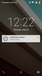
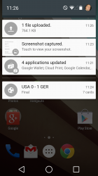
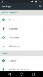
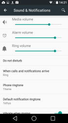
Let me know if you have questions. Seriously, there are a ton of changes in this. Animations galore, that feel really smooth. Colors aren't to bright and seem to fit where they should. Everything seems to be moving to the Google Now/card based set up and colors. Pull down notification is now a 2 step affair, with the first pull giving you notifications and then slide it down a bit further to get phone adjustments.

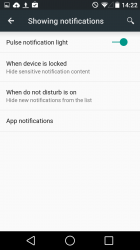
Security options have been added. See pics.

If you want to download the preview yourself, go here: http://developer.android.com/preview/setup-sdk.html#top

Please note: This can only be loaded onto a Nexus 5 or Nexus 7 2013 version. There aren't any other images available.

The boot screen is now a firefly effect with four Google colored balls flying around one another.

Video I made (may take a few minutes before it pops up as live in Youtube):
 

Attachments

  • Screenshot_2014-06-26-11-26-22.png
    Screenshot_2014-06-26-11-26-22.png
    938.6 KB · Views: 306
  • Screenshot_2014-06-26-14-13-44.png
    Screenshot_2014-06-26-14-13-44.png
    2 MB · Views: 267
  • Screenshot_2014-06-26-14-20-03.png
    Screenshot_2014-06-26-14-20-03.png
    764.1 KB · Views: 261
  • Screenshot_2014-06-26-14-21-15.png
    Screenshot_2014-06-26-14-21-15.png
    95 KB · Views: 239
  • Screenshot_2014-06-26-14-21-43.png
    Screenshot_2014-06-26-14-21-43.png
    119 KB · Views: 216
Last edited:
More pics and full days use of battery stats

I downloaded "L" with a full battery and kept my screens brightness at 65% the entire day. Loaded approx 60 apps, including games like Asphault 8 and updated my threads all day here on MacRumors (plus the usual email, youtube, texts).

Not bad for a first battery cycle and using the crap out of the phone!

And link to the Benchmark post: https://forums.macrumors.com/posts/19286875/
 

Attachments

  • Screenshot_2014-06-26-14-23-13.png
    Screenshot_2014-06-26-14-23-13.png
    137.1 KB · Views: 204
  • Screenshot_2014-06-26-14-22-33.png
    Screenshot_2014-06-26-14-22-33.png
    103.3 KB · Views: 209
  • Screenshot_2014-06-26-16-11-56.png
    Screenshot_2014-06-26-16-11-56.png
    189.7 KB · Views: 148
  • Screenshot_2014-06-26-16-12-11.png
    Screenshot_2014-06-26-16-12-11.png
    106.1 KB · Views: 161
Last edited:
Is it just me or does that multitasking interface seem inconvenient (particularly when compared to the previous version)?
 
Is it just me or does that multitasking interface seem inconvenient (particularly when compared to the previous version)?

I agree. It looks harder to use. Like I would have to scroll more to see other apps.
 
How's the nifty new keyboard layout??
The keyboard layout is still the same as before, they just added a new option under advanced settings of the Google keyboard. They now have a 'material' option, which is what comes stock now. And I like it more.

----------

I agree. It looks harder to use. Like I would have to scroll more to see other apps.
Not sure I follow. It remains unchanged in that you swipe left to get rid of the task and you swipe up and down to see the various cards in 'carousel' style. Almost identical to WebOS.

----------

lockscreen widgets is gone.
Phone and camera quick links remain, but the lockscreen is now very clean and modern. Take a look.
 

Attachments

  • Screenshot_2014-06-26-12-22-48.png
    Screenshot_2014-06-26-12-22-48.png
    1.6 MB · Views: 180
Any notable changes to google now, other than aesthetics?
Particularly interested in any changes to customisation options.
 
My concern with Recents is you see less immediately.

android-42-app-switcher-phone.jpg


Whereas in the new one, it looks like I can only see two at a glance before needing to scroll to see more.

In the old one, you can see four-ish at a glance.
 
Thanks for the write up, was looking for a real persons hands on review.

I have an HTC One M8 GPE, I hope we will get this developer preview soon ?

What do you notice to be the biggest change / improvements ? The animations really cool ? How's the new Notification system ?

Can this be used as a daily driver, or no way ?
 
My concern with Recents is you see less immediately.

Image

Whereas in the new one, it looks like I can only see two at a glance before needing to scroll to see more.

In the old one, you can see four-ish at a glance.

Agreed.

Kit Kat's multitasking was not that great, but this even worse! And those Chrome tabs... what if you have 20 open? Are they all going to show?

IMO, Nokia N9's multitasking was the best, with cards.
 
Agreed.

Kit Kat's multitasking was not that great, but this even worse! And those Chrome tabs... what if you have 20 open? Are they all going to show?

IMO, Nokia N9's multitasking was the best, with cards.

I didn't think this was a big deal until looked at the tabs I had open. 18 of them. That might be a problem, however not all 18 are recent.
 
Can exceptions be made for "Do not disturb" in any way? Either by person, or even more fidelity to text or phone calls by person?
 
Thanks for the write up, was looking for a real persons hands on review.

I have an HTC One M8 GPE, I hope we will get this developer preview soon ?

What do you notice to be the biggest change / improvements ? The animations really cool ? How's the new Notification system ?

Can this be used as a daily driver, or no way ?
Animations are settle, but noticable when you are looking for them. To the average user, it is not something they will likely notice, but it will improve upon the experience. Google has really taken a page out of Apple's UI asthetic book.

For the notification center, you can see the pics above. The nice thing is having the user option to hide the data, so all you see is that there is a new notification, or allow it to display all the info as it comes in.

And yes, it has been rock steady since I loaded it a couple of hours ago. No force closures or reboots thus far. It is a pretty good Beta build.
 
Register on MacRumors! This sidebar will go away, and you'll see fewer ads.