Become a MacRumors Supporter for $50/year with no ads, ability to filter front page stories, and private forums.
Status
The first post of this thread is a WikiPost and can be edited by anyone with the appropiate permissions. Your edits will be public.
Seeing all these screens and little things
 

Attachments

  • 300-rainbow-puke.jpg
    300-rainbow-puke.jpg
    78.1 KB · Views: 168
I installed this on a MBA yesterday. Today I installed it on a 2013 MBP Retina 15.
Yowza, it looks soooo much better on the Retina.
 
Bugs and Improvements

Here are the bugs that I have found:

Typing on Facebook Chat moves the screen
Graphical Glitches on some system pref settings ( i.e. Network)
The phone calls from your mac are hit or miss.
First time mail may stick at upgrading. (Can force quit and restart app to resolve issue)
Instant Hotspot doesn't show up
Dark Mode isn't there
iApps are not compatible (prob means they are releasing a newer version)
Graphical glitches with Microsoft Office 2011
Applications Menu from dock glitches
Clicking the extensions link in system pref, brings you to a broken appstore link.
iCloud prefs backs out at times.


As far as improvements:

My battery now charges to 100% really quick!
 
I'm not gonna lie, i had a feeling i would like this windows 7 look on the desktop, and i do. For some reason i hate it on ios 7. I love how the lock screen/login shows your wallpaper. no need to do the hackies there anymore. i like the dock even more than the old one the 2d dock looks great as well. love the indicators, although they are rather small. the see through translucency on different elements of the GUI means you don't get bored and adds depth, i really want that dark theme though for dark/black wallpapers.

I poopooed the widgets when i saw it but i think i might actually use it. third party api's perhaps next year? along with siri.

the icons, well, they are all right, i already got used to them. the font is much more crisp and feels easier on the eyes.

all i really want at this point is speed and lots of it. and glitch/bug/crap free.

oh yeah here is spotlight navigation:

fyjuvr.png
 
Last edited:
hopefully someone post screenshots of what iTunes looks like in OS X Yosemite. my guess is not much since it was not mentioned in the keynote. just a different icon and flatter windows?

Umm it hasn't been updated... Looks really **** actually
 
Ugliest OS i've ever seen. What a disaster, looks like some of the crappy X11 or Java ported apps out there. Uggh, that System font is horrendously hideous.

More than ever this OS needs to be opened up to theming and font swapping, Apple have no style or taste these days. What's with the 1950's style typography??? UGLY!!!

Reminds me that Blue/White Apple CRT Studio display that Jony Ive designed, which looked like a vehicle rear vision mirror from the 1950's, atrocious.

Image

As much as I agree that Helvetica was a poor choice for a new font... I've always really liked that old CRT!

----------

Sys Prefs > General > Allow Handoff... near the bottom


Also, DP1 and the apple site have two different Finder icons:

Image

bottom is DP1.

I would guess that the apple site is more uptodate

Thank goodness. The upper one is SOOOOOOOOO much better. I really hope that they go with that, rather than the one that shipped in the DP.
 
Curious, is TextEdit still around? Would love a screenshot of it, also the open/save dialog boxes (did I miss that from earlier in the thread?). Thanks.
 
iApps are not compatible (prob means they are releasing a newer version)

I know, but is it too much to expect that Apples own apps at least work, even in the preview? I mean how hard can that be? I don't really get that. :confused: I start thinking it's a miracle any apps will then work at this stage.
 
In safari, the view area has rounded corners, and it makes a really annoying effect where the tab bar meets. I'm hoping that goes away.
 
Is there no way to have Safari open a New Window with Top Sites anymore?

edit: yes, there's a lithe button in the top right.
 
Umm it hasn't been updated... Looks really **** actually

yikes hopefully they release a iTunes 12 beta soon then with updated icon and look. im guessing they will based on the screenshot from apples website. updated icon at least. didn't the UI just get a major redesign with 11? another one expected for 12 then? :) 
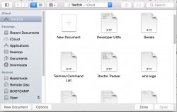
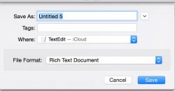
im all for it the app needs some major work still.
 
Curious, is TextEdit still around? Would love a screenshot of it, also the open/save dialog boxes (did I miss that from earlier in the thread?). Thanks.

Yes, has a new icon (No more "here's to the crazy ones" :().

open/save look the same.

More info on the built in apps:

App Store - Looks the same

Automator - no changes, same version number

Calculator - icon looks like iOS 7 calc, but actual app is same as 10.9. Guess this will get a make over before the GM?

Calendar - Preferences are the same except Advanced is now on the far right. Also has option for overlay Calendar: Chinese, Hebrew or Islam.

Chess - no change

Contacts - same, expect new icon

Dashboard, Dictionary, DVD Player, Font Book - same

Game Center - has a white look, iOS icon

Mail - Other than new look and new features demoed at the Keynote, no difference expect option to display short names/nicknames

Maps - same slightly changed icon

Notes - v3.Paper side is lighter, new note and share buttons are at the top.

Preview - v8. New icon. Signatures has it’s own Prefs pane, can do down with the track pad also.

Photo Booth - not here. Dead?

Quicktime Player - v10.4, looks the same

Reminders -
14335991512_34e3758f9f_o.jpg

Reminders is actually useful now, as you can do the last monday of each monday, 5 days before the end of the month etc.

Stickies - same

TextEdit - same version, new icon.
 
Last edited:
I just had two questions I was hoping someone could help me with:

1. Have they returned the three finger navigation gesture for Finder or do you still need to use cmd [ or ]?

2. Could someone type uname -a into terminal to see what kernel version Yosemite is using?

Thanks

1) Doesn't seem like it, no :(

2) Darwin Kernel Version 14.0.0
 
Then they should have waited a while.

Except, developers need it now to begin making their apps compatible and updated with the new UI so they are ready for the fall.

It's not meant to be used as a day-to-day OS.
 
Curious, is TextEdit still around? Would love a screenshot of it, also the open/save dialog boxes (did I miss that from earlier in the thread?). Thanks.

Here you go (icon, open, save)
 

Attachments

  • Screen Shot 2014-06-03 at 10.19.29 AM.jpg
    Screen Shot 2014-06-03 at 10.19.29 AM.jpg
    73.7 KB · Views: 243
  • Screen Shot 2014-06-03 at 10.20.08 AM.jpg
    Screen Shot 2014-06-03 at 10.20.08 AM.jpg
    153.4 KB · Views: 254
  • Screen Shot 2014-06-03 at 10.20.49 AM.jpg
    Screen Shot 2014-06-03 at 10.20.49 AM.jpg
    58 KB · Views: 209
Register on MacRumors! This sidebar will go away, and you'll see fewer ads.