I don't remember this in mavericks, but now double click in title bar acts like the old green button (zoom button), resizing the the window to fit the content (maximize in some apps)
Got a tip for us?
Let us know
Become a MacRumors Supporter for $50/year with no ads, ability to filter front page stories, and private forums.
OS X 10.10 Yosemite: All The Little Things
- Thread starter WhackyNinja
- WikiPost WikiPost
- Start date
- Sort by reaction score
You are using an out of date browser. It may not display this or other websites correctly.
You should upgrade or use an alternative browser.
You should upgrade or use an alternative browser.
- Status
- The first post of this thread is a WikiPost and can be edited by anyone with the appropiate permissions. Your edits will be public.
I don't remember this in mavericks, but now double click in title bar acts like the old green button (zoom button), resizing the the window to fit the content (maximize in some apps)
This is new in Yosemite.
This is new in Yosemite.
this is very nice, beacause it's easier to double click the title bar than opt click the green button and also makes easier to people from windows switch to mac
this is very nice, beacause it's easier to double click the title bar than opt click the green button and also makes easier to people from windows switch to mac
Yes, but now you can't minimize the window with the double click on the bar because of this change.
Yes, but now you can't minimize the window with the double click on the bar because of this change.
Well you can, you just can't have both. If you turn on double click to minimize it disables the other one.
Well you can, you just can't have both. If you turn on double click to minimize it disables the other one.
That's good to know I heavily rely on double click to minimize.
Looks like they finally decided to tweak Automatic Termination in Yosemite. Now the apps close ~5 minutes after the last document is closed. Still intrusive when it's being closed, but at least I can drag a file from Finder to the app in the Dock to open it.
EDIT: Seems only limited to TextEdit and iCal. Maps still quits when switched to another app if the last window is closed.
EDIT: Seems only limited to TextEdit and iCal. Maps still quits when switched to another app if the last window is closed.
Last edited:
That's good to know I heavily rely on double click to minimize.
Me too. It drives me mad that some of Apple's own apps don't work with it. Like itunes for some reason.

Me too. It drives me mad that some of Apple's own apps don't work with it. Like itunes for some reason.
Because iTunes is still written in the antiquated Carbon framework with code that dates back to the Mac OS 9 days.
To somebody who is feeling brave – could you please report on the effects of the following Terminal commands in Yosemite? Screenshots are more than welcome.
These commands are supposed to only affect the look of the system, and I've tried the first one in Mavericks, with interesting, and completely harmless, results.Code:defaults write -g NSUseLeopardWindowValues NO; defaults write -g AppleUseCoreUI -bool NO; killall Finder
How would i un do that? Replace NO with YES? It's cool on Mavericks because it makes old applications look like they did in tiger (i had some universal old versions)
Updated finder icon
The Finder icon has just been updated on Apple's website : it looks a lot like the icon featured in Yosemite Developer Previews, but the nose has been lengthened a bit.
I like it (I liked the prior version too) and this should end the "short nose" complaints.
I guess this new icon will be included in DP3.
Last edited:
Yeah, the page on Apple.com has been updated and has some UI changes that aren't yet in DP2. I've spotted a few differences, most of which bring it on par with how DP2 looks, although there are some new bits as well.
One obvious change I see is that Apple is moving to a darker blue selector color. A common complaint had been that, until now, only the Spotlight button used this particular shade of blue, giving UI inconsistency. It looks like they took a few steps forward and a few back, though, since the actual Spotlight popup uses an even *lighter* shade of blue than it did originally. It seems Apple can't make its mind up over this.
Before:

After:

- Messages: Sidebar text field is more translucent and less pronounced
- Selector color is a darker blue
- WiFi icon is thinner (as in DP1)
- New Finder icon (newer than what's in DP2)
- New System Preferences icon (as in DP2)
Before:
After:

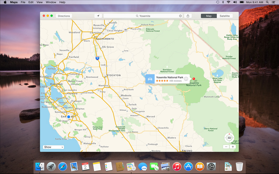
- Maps: Text field is now left-aligned.
Before:

After:

- Reminders: Sidebar text field is more translucent and less pronounced
Before:
After:

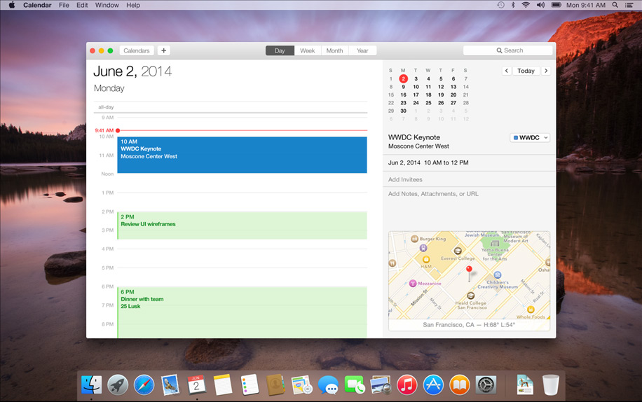
Calendar: Event titles are now bolder, event text has a very different format in general. Integrated map now shows current temperature, rather than the daily high and low.
Before:

After:
[URL="https://www.apple.com/osx/preview/design/images/apps-gallery/osx_design_view_finder.jpg"] [/URL]
- Finder: "Documents" icon on the sidebar is changed, item spacing on sidebar items has changed, sidebar selector color is a darker blue
Before:

After:

- Notification Center: Selector pill buttons are more pronounced (as in DP1)
Before:

After:

- Spotlight: Selection color is now a lighter gradient instead of solid (which is totally inconsistent with the rest of the UI changes, which generally moved to a darker blue selector...)
One obvious change I see is that Apple is moving to a darker blue selector color. A common complaint had been that, until now, only the Spotlight button used this particular shade of blue, giving UI inconsistency. It looks like they took a few steps forward and a few back, though, since the actual Spotlight popup uses an even *lighter* shade of blue than it did originally. It seems Apple can't make its mind up over this.
Before:
After:
- Messages: Sidebar text field is more translucent and less pronounced
- Selector color is a darker blue
- WiFi icon is thinner (as in DP1)
- New Finder icon (newer than what's in DP2)
- New System Preferences icon (as in DP2)
Before:

After:

- Maps: Text field is now left-aligned.
Before:

After:

- Reminders: Sidebar text field is more translucent and less pronounced
Before:

After:

Calendar: Event titles are now bolder, event text has a very different format in general. Integrated map now shows current temperature, rather than the daily high and low.
Before:

After:
[URL="https://www.apple.com/osx/preview/design/images/apps-gallery/osx_design_view_finder.jpg"]
 [/URL]
- Finder: "Documents" icon on the sidebar is changed, item spacing on sidebar items has changed, sidebar selector color is a darker blue
Before:
After:

- Notification Center: Selector pill buttons are more pronounced (as in DP1)
Before:

After:

- Spotlight: Selection color is now a lighter gradient instead of solid (which is totally inconsistent with the rest of the UI changes, which generally moved to a darker blue selector...)
Last edited:
Great post Takuro !
I spotted more differences in Maps :
- "Title" bar is thinner
- "Directions" button is wider
- "Map" and "Satellite" buttons are closer to the right border of the window
- The selected "Map" button has a lighter shade of gray (same with "Day" button in Calendar and buttons in the Finder)
Dock :
- more translucent.
Finder :
- the empty search field is wider.
- more space between the top of the window and the trafic light buttons/iCloud label
- all app icons shown on the iCloud folders have new sizes
Spotlight :
- Magnifier symbol in the search field is closer to the left border of the window
- Window is brighter
- "More..." link vs "More" link
Great. I think we listed them all. We win a free copy of Yosemite. Oh wait...
Last edited:
Dock :
- more translucent.
I thought this too, but it's an optical illusion. I ran most of these images through a diff tool called Kaleidoscope. It turns out that in the newer promo images, the wallpaper depicting a lake is either shifted or cropped, making the dock look more transparent. I don't think the transparency is actually changed. Focus on the screenshots with the Yosemite wallpaper depicting El Captin (the rock formation) as your point of reference, and you'll see it's the same, before and after.
Last edited:
I thought this too, but it's an optical illusion. I ran most of these images through a diff tool called Kaleidoscope. It turns out that in the newer promo images, the wallpaper depicting a lake is either shifted or cropped, making the dock look more transparent. I don't think the transparency is actually changed. Focus on the screenshots with the Yosemite wallpaper as your point of reference, and you'll see it's the same, before and after.
I had spotted the shifted desktop backgrounds, too. However, looking at your two latest screenshots, with the Spotlight window, the desktop background position didn't change, but the Dock transparency did (look around the Notes, Reminders and Contact icons)
I had spotted the shifted desktop backgrounds, too. However, looking at your two latest screenshots, with the Spotlight window, the desktop background position didn't change, but the Dock transparency did (look around the Notes, Reminders and Contact icons)

Also bear in mind that they changed the size of the dock in the newer images (obviously, user configurable), so the sample area that the dock uses to compute its color matching is different, which can account for small variations in the tone. It's really hard to say, unless somebody wants to take a screenshot on DP2 where their dock is sized exactly as in these new images.
When DP3 comes out next week, we'll probably know.
Last edited:
[url=http://i.imgur.com/1qP6CjB.png]Image[/URL]
Also bear in mind that they changed the size of the dock in the newer images (obviously, user configurable), so the sample area that the dock uses to compute its color matching is different, which can account for small variations in the tone. It's really hard to say, unless somebody wants to take a screenshot on DP2 where their dock is sized exactly as in these new images.
Here's what I did : I just opened both pictures in two Safari tabs, and switched from one to the other. I see a difference in the left part, but it's true that the dock is slightly larger in the new screens, so, as you explained, the difference may be a consequence of the tweaked size and the dock computing its color match on a larger area.
I don't know who's right, but it doesn't really matter, I just enjoyed arguing with a detail-concerned user !
(Sorry if my sentences sometimes sound unnatural, I'm not a native speaker)
Guys, you can add "_2x.jpg", to see more changes
For example:
Old picture — http://images.apple.com/euro/osx/preview/a/generic/design/images/osx_design_translucent_2x.jpg
New picture — http://images.apple.com/osx/preview/design/images/osx_design_translucent_2x.jpg
For example:
Old picture — http://images.apple.com/euro/osx/preview/a/generic/design/images/osx_design_translucent_2x.jpg
New picture — http://images.apple.com/osx/preview/design/images/osx_design_translucent_2x.jpg
Guys, you can add "_2x.jpg", to see more changes
For example:
Old picture http://images.apple.com/euro/osx/preview/a/generic/design/images/osx_design_translucent_2x.jpg
New picture http://images.apple.com/osx/preview/design/images/osx_design_translucent_2x.jpg
You're right, more changes at the top of Messages' window...
Isn't it strange that the website is constantly updated with those subtle GUI tweaks, while they can still change in the forthcoming betas ? Wouldn't it be easier to update the website with the final version when Yosemite ships ?
I think I preferred the first selector blue colour. The new one reminds me a little too much of un-styled HTML links and the default blue.
Me too
[url=http://i.imgur.com/1qP6CjB.png]Image[/URL]
Also bear in mind that they changed the size of the dock in the newer images (obviously, user configurable), so the sample area that the dock uses to compute its color matching is different, which can account for small variations in the tone. It's really hard to say, unless somebody wants to take a screenshot on DP2 where their dock is sized exactly as in these new images.
When DP3 comes out next week, we'll probably know.
Oh, the transparency and/or color is definitely different. I already posted this picture a couple of pages back, but it does show that using the same wallpaper, the dock's color changes. The size also changed, but it was only changed horizontally, and I doubt that would change the color in this case. The bottom of my wallpaper is basically a solid color.
Attachments
Register on MacRumors! This sidebar will go away, and you'll see fewer ads.