Become a MacRumors Supporter for $50/year with no ads, ability to filter front page stories, and private forums.
Status
The first post of this thread is a WikiPost and can be edited by anyone with the appropiate permissions. Your edits will be public.
Not sure if this is new with Yosemite DP2 but I just noticed it working for first time. In ibooks you can edit the metadata of your files, finally, if you select the list view.

Awesome! The editing is not very efficient since there's no Info window or anything though, you have to manually click each of the fields to edit it, but hey it's better than nothing.
 
Also were the edges always perfectly square in DP1?

I thought we'd see a squarification off the roundRecs in Yosemite. I'd prefer to see a uniform radius reduction across all windows instead of keeping the old radius for normal windows and making dialogs 90º.

In fact, use the new button radii and make it uniform across everything. You'd see a much nicer visual tranquility. Right now it's inconsistent and odd.

Anyone know if the copy file window was squared or not in Mavericks? I can't seem to remember...
 
File copy progress window in Mavericks is just a regular window with title bar and rounded corners.

Ugh. Inconsistencies like this bug me, don't know why they would introduce one now. I hope they continue to get rid of separate title bars though. I always hated how stark the line looked at the top of a window to separate it. Especially how it's a darker gradient color to the rest of the window.
 
I'm not sure if this is different from mavericks (or if this is even what you are thinking of), but if you click on the second tab, and then switch to RGB sliders, you can input hex values.

Finally! Now that might be the most awesome feature of Yosemite. They should have done this a long time ago! Go Apple, you made my (font-end )life a lot easier.:)

p.s. they also implemented <input type='color' /> into Safari.
 
I just noticed that on lighter websites the scrollbar will be dark but on dark websites it will be light. Pretty sure this is new, I remember having a barely visible scrollbar on a website that is pretty much the same color as the dark scrollbar.
 
I just noticed that on lighter websites the scrollbar will be dark but on dark websites it will be light. Pretty sure this is new, I remember having a barely visible scrollbar on a website that is pretty much the same color as the dark scrollbar.

I'm pretty sure that's been the case since Lion.
 
I just noticed that on lighter websites the scrollbar will be dark but on dark websites it will be light. Pretty sure this is new, I remember having a barely visible scrollbar on a website that is pretty much the same color as the dark scrollbar.
Not new. I have it right now in OS X Mavericks.
 
I posted this in another thread on the Continuity topic and thought it would be worth posting here. None of the devices had Bluetooth ON either in the demos at WWDC or on the Apple website. They simply are connected to the same WiFi.
And Craig at one point says even if your phone is across the house you don't have to worry about it. Bluetooth has a 30 foot range. We know it's still buggy in the current betas and some people with older Macs are reporting that some of these features have worked for them.
 
Not sure if this is new with Yosemite DP2 but I just noticed it working for first time. In ibooks you can edit the metadata of your files, finally, if you select the list view.

This is great but you can't (at least I couldn't) edit the series data. Hopefully iBooks 2 or whatever it will be called will be a more robust software for managing ebooks.
 
Haven't seen this mentioned here before, but there is a new option in my bootscreen. When selected it will open the DP1 installer, and it's not the usual recovery partition. Not sure if this works by finding the installer on my hard drives or as an invisible partition, but thats highly unlikely as I don't see it in terminal > diskutil list.

This comes in handy if one experiences boot failures (I've had the TRIM prob too). The reinstall will leave all previous data intact. Just had to run the DP2 update again.

Now it would be nice to find a way to also update this startup option, to install DP2 and further DP versions directly in future. Would save even more time. ;)
 

Attachments

  • Bootscreen & DP1 Installer.jpg
    Bootscreen & DP1 Installer.jpg
    304.8 KB · Views: 497
I don't like how they're making things thinner and bolder at the same time.
The in-between would be the best looking solution IMO.

I know this is iOS, but they're starting the same thing with OS X right now... Let's put it simply : ugly and inconsistent.
The iOS 8 example looks much better in this case.
 
This is great but you can't (at least I couldn't) edit the series data. Hopefully iBooks 2 or whatever it will be called will be a more robust software for managing ebooks.

Series? Do you mean the Collection? Yes, you can edit that.

You can edit the following information: Title, Author, Category, and Collection.
 
Series? Do you mean the Collection? Yes, you can edit that.

You can edit the following information: Title, Author, Category, and Collection.

No, I mean series. If you right click the bar that says Author, Title, etc. a menu pops up with different data options and you can check series. Series will then show up on the bar but you can't edit this data. I am pretty sure that this is what I books will use to group books together in the iBooks app on iOS.
 
I've gotta admit that dark interfaces aren't always easier on the eyes. Just try to use Pixelmator for more than 15 minutes and tell me about it. While on the other hand, Final Cut pro X, Logic Pro X and Aperture really nailed it.

----------


Good GOD ! This is a long awaited feature request by anybody who does Web Development. Finally...

This color pane is still ugly looking, but it is functional as hell. Sometimes I believe it should be nothing more than a popover.

Good point. I love the pixelmator toolset, but their version of a dark interface is completely awful. I can't see a thing.
 
I have a question... I have a MacBook Pro early 2011 so obviously I don't have Bluetooth LE. Does this mean only handoff won't work but also the SMS texting and phone call features as well?

As of right now, it appears that SMS texting/phone call WILL work on the non-BT LE Macs... but Handoff and AirDrop will not work.
 
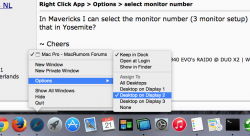
Right Click App > Options > select monitor number

In Mavericks I can select the monitor number (3 monitor setup) to which an application will be opened on. Can't do that in Yosemite?

~ Cheers
 
Every time I look at the old finder logo it looks so weird to me. I used to like the lines protruding on the top and bottom but now I think it looks much worse. Still not totally in love with the new one though, I think it would be perfect if the smile wasn't as curved and more like the last one.

The folder icons have totally grown on me though. I use the folder as my dock stack icons now.
 
The iOS 8 example looks much better in this case.

I hate it for a few reasons :

- The background of the icons is white on light gray. It's almost undistinguishable. They should add a border around it like in iOS 7, or make the light gray darker, or change the white background.
- Why make everything thinner when you actually make these icons bolder ? I am for bolder, iOS6 was bolder and its typography would make everything much more readable. What I am against is inconsistencies.
- Why is the Diaporama icon empty when all the other icons are filled ?

I was scared at the keynote, that they would have destroyed OS X like they have done with iOS. In the end, OS X turned out pretty good, globally I am very happy with it. But then when they ended up demo-ing OS X Yosemite, I had hope for major UI changes in iOS 8, which never happened. The GUI looks girly and cheap.
 
To somebody who is feeling brave – could you please report on the effects of the following Terminal commands in Yosemite? Screenshots are more than welcome.
Code:
defaults write -g NSUseLeopardWindowValues NO; defaults write -g AppleUseCoreUI -bool NO; killall Finder
These commands are supposed to only affect the look of the system, and I've tried the first one in Mavericks, with interesting, and completely harmless, results.

I just tried it, and everything looks exactly the same.
 
Register on MacRumors! This sidebar will go away, and you'll see fewer ads.