Nice new feature.
Sorry to burst your bubble, but that feature has been there since OS X 10.8 Mountain Lion. I don't think a lot of people knew/know about it though.
Nice new feature.
"OSX" is you spelling things wrong. OS X is the brand. OS X Yosemite the latest version's name. 10.10 the version number.OSX Yosemite is the brand. 10.10 is the product name.
So, now it seems that the screens posted on Apple's website depict the latest changes made to the GUI, even if the next DP is not yet out. And many of us noted that the menu bar has never had a shadow on these screens, even after they were updated, whereas it has a shadow in the DPs. The menu bar may thus lose its shadow in the forthcoming DPs I presume.
Really ? Well maybe, but it's very difficult to see on the website with my 1440*900 screen. But I'm sure that the menu bar looks flatter than in the DPs.
Did a clean install of 10.10 and all of a sudden I'm able to see text messages in my Messages.app and able to start phone calls from my Mac (although I can't get them to go through). Handoff is still not working. This is on a 2011 MBP.
I only tested Mac to iOS (no other Mac) but id expect it to work.
Just noticed this (new?) itunes logo when subscribing to a podcast.
 I preferred the demo/pre-DP1 Finder icon (not the Mavericks one; the new Finder icon that had a longer span for the smile vs. the thinner smile now, if that makes sense)
I think Yosemite has an outdated version of iTunes by default. Did you ever upgrade to the latest version, or are you using whatever it had preinstalled? I can't think of any reason why this icon should exist in the version hosted on Apple.com.
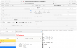
There still a lot of inconsistencies on title bar across the apps that Apple needs tô fix before final release here a screenshot, also WTF with Notes yellow selection? haha
Search bars color/tranparency/size
Title itens selection (ibooks is blue, Calendar is gray)
Notes selection/sidebar tranparency
window buttons close minimize and fullscreen alignment
Having or not having titlebar