Got a tip for us?
Let us know
Become a MacRumors Supporter for $50/year with no ads, ability to filter front page stories, and private forums.
OS X 10.10 Yosemite: All The Little Things
- Thread starter WhackyNinja
- WikiPost WikiPost
- Start date
- Sort by reaction score
You are using an out of date browser. It may not display this or other websites correctly.
You should upgrade or use an alternative browser.
You should upgrade or use an alternative browser.
- Status
- The first post of this thread is a WikiPost and can be edited by anyone with the appropiate permissions. Your edits will be public.
What the heck is up with the new Mail icon? The text 'California' is now harder to read and looks ugly when imposed on top of that heavy shadow.
Hoping this is just an error/experiment. But, yeah, alot of things about Yosemite seems to be in flux right now. (Finder icon, I'm looking at you.)
What the heck is up with the new Mail icon? The text 'California' is now harder to read and looks ugly when imposed on top of that heavy shadow.
Hoping this is just an error/experiment. But, yeah, alot of things about Yosemite seems to be in flux right now. (Finder icon, I'm looking at you.)
I disagree. The "hero" of the Mail icon is the stamp. The text is just a decoration. I doubt any mainstream user would notice the text on the icon, let alone reading it.
swingerofbirch
macrumors 68040
My guess is the Public Beta isn't going live until all features are in working order and the interface is a lot more polished. They're not going to expose the general public to OS X Yosemite until it's near-final. Apple would be nuts to do so.
The Public Beta page says, "Since the beta software is unfinished, some new features will not be available, such as phone calls, SMS, Handoff, Instant Hotspot, and iCloud Drive. Spotlight suggestions are U.S.-based only. Some applications and services may not work properly with the beta software. When creating or making changes to documents stored in iCloud, your documents will sync only with Macs running the OS X Yosemite Beta and with iOS devices running iOS 8."
https://appleseed.apple.com/sp/betaprogram/welcome
I am definitely waiting for this release more than anything else. Including any and all new hardware. ")
When removing an icon from the dock it now longer shows the puff of smoke. it now says remove
Yuck! Don't mess with something already good when you don't have a better alternative.
Most of those features require iOS 8 so obviously they're informing the user about those not being available. My point is, Apple is going to wait until OS X Yosemite is a lot more polished and stable before exposing more people to it. Otherwise they'll risk a lot of negative (mouth-to-mouth) publicity.The Public Beta page says, "Since the beta software is unfinished, some new features will not be available, such as phone calls, SMS, Handoff, Instant Hotspot, and iCloud Drive. Spotlight suggestions are U.S.-based only. Some applications and services may not work properly with the beta software. When creating or making changes to documents stored in iCloud, your documents will sync only with Macs running the OS X Yosemite Beta and with iOS devices running iOS 8."
https://appleseed.apple.com/sp/betaprogram/welcome
sorry if it has been asked but does the system preferences icon spin the cogwheel somehow as in the apple demo video?
Nope, at least not yet.

I think the ability to choose a custom highlight color is new.
View attachment 479620
I have that on Mavericks. Thanks though.
I have that on Mavericks. Thanks though.
You're right. I wonder when it was added?
You're right. I wonder when it was added?
A long time ago. I have a PowerBook G4 running Mac OS X v10.4 and the option is there too.
Good news, everyone! 10.10 DP3 is out! Let's see whats new and find those little things

Last edited:
A long time ago. I have a PowerBook G4 running Mac OS X v10.4 and the option is there too.
It's been there ever since the Mac has had color. So, Mac OS 7.
The menu bar icons has been updated for Dark mode!
You can now use dark mode as the default! There is now a system preference for Dark mode as well. The terminal command does nothing. As expected though, third party icons will have to be updated to support dark mode.
Screenshot:

Other changes:
* Activity Monitor's memory pressure bar has been fixed (it was broken in DP2)
* Feels much more stable, animations are still a little jaggy but smoother than they were in DP2.
You can now use dark mode as the default! There is now a system preference for Dark mode as well. The terminal command does nothing. As expected though, third party icons will have to be updated to support dark mode.
Screenshot:
Other changes:
* Activity Monitor's memory pressure bar has been fixed (it was broken in DP2)
* Feels much more stable, animations are still a little jaggy but smoother than they were in DP2.
Last edited:
New Font Book Icon, and new Quicktime icon! Font book has also been updated for Yosemite's look. Looks much nicer.


The menu bar icons has been updated for Dark mode!
You can now use dark mode as the default! There is now a system preference for Dark mode as well. The terminal command does nothing. As expected though, third party icons will have to be updated to support dark mode.
Screenshot:
Other changes:
* Activity Monitor's memory pressure bar has been fixed (it was broken in DP2)
* Feels much more stable, animations are still a little jaggy but smoother than they were in DP2.
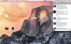
a link to your wallpaper please
Have they dropped X from the name?
The version number is still 10.4 so I highly doubt it
Register on MacRumors! This sidebar will go away, and you'll see fewer ads.