Here's the official thread for the MacRumors Front Page News for the DP4 release:
https://forums.macrumors.com/threads/1756452/
The initial reception to iTunes 12 seems mixed, but mainly negative so far. I really hope it's just an experimental design exercise and not the final product. Maybe something to get "out the door" until the fall unveiling when iPhone 6 launches?
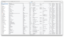
Changes in iTunes 12
I know this is an iTunes beta, but it's definitely not headed in the right direction. All they've essentially done is re-theme the existing iTunes 11 UI and tweak things ever-so-slightly to make it much harder to navigate through your content. They aren't even incorporating any of Yosemite's transparency effects — neither for the sidebar, nor for the titlebar when scrolling.So much missed opportunity.
https://forums.macrumors.com/threads/1756452/
The initial reception to iTunes 12 seems mixed, but mainly negative so far. I really hope it's just an experimental design exercise and not the final product. Maybe something to get "out the door" until the fall unveiling when iPhone 6 launches?
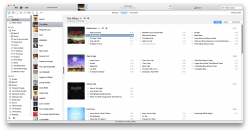
Changes in iTunes 12
- New "now playing" area, which spans the entire height of the titlebar. Album artwork is scaled to span this entire height as well.
- New button on the toolbar to access your iTunes account.
- The sidebar has been removed (WHY APPLE???) and can no longer be enabled from the "view" menu. However, the sidebar suddenly returns in "playlist" and "device" tabs as well as in a few other places, making for a weird UI inconsistency. (Personally, I don't get this. It's sort of like a half-assed way of admitting the sidebar was useful — so why disable it in the first place?)
- New buttons near the upper left area of the window replace the previous selector-style downtown for accessing "Music," "Movies," etc. The "…" button shows a list of content that you've hidden (e.g.: "iTunes U".)
- The iTunes Store no longer gets its own standalone section. Instead, you access the store from each respective content view ("Music," "Movies," etc.)
- The "view" button that toggles between album view, song view, etc has been replaced with a text drop-down menu. However, in playlist view, it's still shown as a "view" button. Again, another weird inconsistency.
I know this is an iTunes beta, but it's definitely not headed in the right direction. All they've essentially done is re-theme the existing iTunes 11 UI and tweak things ever-so-slightly to make it much harder to navigate through your content. They aren't even incorporating any of Yosemite's transparency effects — neither for the sidebar, nor for the titlebar when scrolling.So much missed opportunity.
Last edited: