Got a tip for us?
Let us know
Become a MacRumors Supporter for $50/year with no ads, ability to filter front page stories, and private forums.
OS X 10.10 Yosemite: All The Little Things
- Thread starter WhackyNinja
- WikiPost WikiPost
- Start date
- Sort by reaction score
You are using an out of date browser. It may not display this or other websites correctly.
You should upgrade or use an alternative browser.
You should upgrade or use an alternative browser.
- Status
- The first post of this thread is a WikiPost and can be edited by anyone with the appropiate permissions. Your edits will be public.
New time machine GUI
Is that your desktop background blurred behind it, or a new time machine specific background ? Is it animated ?
Last edited:
Because it is still written in Carbon. You'd think they'd actually spend some time creating a Cocoa iTunes to match a major OS redesign... But they didn't.
No, sorry but iTunes is definitely a Cocoa application. It imports Foundation and AppKit, it uses NSViews (including NSScrollView). It is definitely not Carbon.
It's 64-bit, too. OS X does not ship with a 64-bit version of Carbon, and iTunes doesn't include an embedded one.
I don't have a copy of iTunes on Windows to see what they're doing there, but in any case iTunes on OS X is Cocoa.
----------
New get info window for iTunes 12.
Image
Looks good, but it's still too difficult to add multiple artists. I wish they'd make it like mail - where you get those little token bubbles for each artist.
Is that your desktop background blurred behind it, or a new time machine specific background ? Is it animated ?
It's my desktop background. It is blurred just like time machine in DP3.
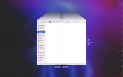
Drag to File Dialogs
It looks like the file dialog has two different drag points: 1) Drag to the file list and it is moved. 2) Drag to the Path Chooser at the top and it changes current folder/selected file to the path to the dragged file. It's great that they are accommodating both.
Persists through a restart. This better not be new intended behaviour. File all of the bug reports!!
It looks like the file dialog has two different drag points: 1) Drag to the file list and it is moved. 2) Drag to the Path Chooser at the top and it changes current folder/selected file to the path to the dragged file. It's great that they are accommodating both.
this looks like crap. they need to fix this
Beta for a reason, send in a bug report dude. If developers **** out perfect software, we'd lost 50% of the workforce.

Many icons/UI areas are still Aqua. I'm sure Apple is still working on unifying the UI and icons across the bar. If you're part of the beta program, give feedback. I plan to give feedback on whatever is still Aqua. Many apps prefs icons are still Aqua.
Noticed that there is no sound when changing the volume in Yosemite. Is this a bug I should report or did they remove it purposely? Also, I am unable to log into the Feedback Assistant. Tells me to try again later or contact AppleSeed if it continues.
Edit: Volume button sounds are back. Feedback Assistant still not working.
Edit 2: Feedback Assistant is now working.
Edit: Volume button sounds are back. Feedback Assistant still not working.
Edit 2: Feedback Assistant is now working.
Last edited:
Is it just me, or did Dark Mode menus used to be sort of translucent black? Now they are flat grey. The Reduce Transparency option under Accessibility doesn't affect it.
Looks like that could be an issue you should report to Apple. My menu bar in Dark Mode are translucent black and not a solid grey as you describe.
Looks like that could be an issue you should report to Apple. My menu bar in Dark Mode are translucent black and not a solid grey as you describe.
I've seen screenshots of both - but no matter what I do, I have the solid grey menus.
What happens when you activate reduce transparency?
----------
Okay, fixed my opaque dark mode menus!
You need to have menu bar translucency on. When you do, you get translucent menus. If you have this off, you get solid grey (in dark mode) and solid white in regular mode.
Mystery solved!
You solved it!
Dunno if I prefer it with translucency or without! I think I'll keep it with for the time being.
Dock Icons
Am I the only one who miss the thick black vertical bar on the finder icon, it sort of seems odd without it - it looks more like a smiley without it and too happy. Think the first Yosemite Finder-icon looked better.
And also the trash-can seems nice, but if I've got a light wallpaper - it's hard to notice the trash-can...
But overall - a good first impression with Yosemite (Public Beta)!
Last edited:
iTunes 12 Multiple Windows?
Does iTunes 12 bring back the ability to have more than one iTunes main window open at a time? IE main library and iTunes store in separate windows?
TIA
Does iTunes 12 bring back the ability to have more than one iTunes main window open at a time? IE main library and iTunes store in separate windows?
TIA
Does iTunes 12 bring back the ability to have more than one iTunes main window open at a time? IE main library and iTunes store in separate windows?
TIA
It doesn't seems to - just tried checking under both window and file tab and all searching in help tab for new window...
Before installing Yosemite, I had 48 gigs of remaining space on my computer. I now have 122 gigs of free space.
What?!?
Anyone else notice a similar change in their storage?
________
PS been lurking this thread/ "all the little things" for years now, can't say how much I've enjoyed them. Thanks to all.
PPS WhackyNinja I'm a big fan
What?!?
Anyone else notice a similar change in their storage?
________
PS been lurking this thread/ "all the little things" for years now, can't say how much I've enjoyed them. Thanks to all.
PPS WhackyNinja I'm a big fan
Last edited:
Youtube now defaults to HTML5 and you can't change it back to flash player. Unfortunately, the youtube HTML5 player (like the netflix HTML5 player) feels incomplete. I really hope apple at least gives us an option to switch players, and for netflix too.
Before installing Yosemite, I had 48 gigs of remaining space on my computer. I now have 122 gigs of free space.
What?!?
Anyone else notice a similar change in their storage?
Mine was about 166GB used, and now it's 159GB used - I suspect it's because the Yosemite installer deleted itself itself and some other things got cleaned up.
So for the first time I installed a beta OS on my machine, but I though, why not take advantage of the public beta. Anyway, a few things I have noted.
-It seems to definitely be made for retina screens, Looks more pixelated on my 09 macbook.
-Maybe related to the first point, but corners are awful (see attached pic)
-Runs very fast, performance is quite good compared to 10.9. (note, i'm am running an ssd)
-It seems to definitely be made for retina screens, Looks more pixelated on my 09 macbook.
-Maybe related to the first point, but corners are awful (see attached pic)
-Runs very fast, performance is quite good compared to 10.9. (note, i'm am running an ssd)
Attachments
So for the first time I installed a beta OS on my machine, but I though, why not take advantage of the public beta. Anyway, a few things I have noted.
-It seems to definitely be made for retina screens, Looks more pixelated on my 09 macbook.
-Maybe related to the first point, but corners are awful (see attached pic)
-Runs very fast, performance is quite good compared to 10.9. (note, i'm am running an ssd)
The performance is stellar for a Beta version. Also yes the graphics on a non-retina is so pixelated
It doesn't seems to - just tried checking under both window and file tab and all searching in help tab for new window...
Thanks SanFran.
@#$%^& I Really miss not being able to that anymore, useful when comparing different things or checking an Album in the iTunes Store against songs in ones Library etc etc....
Register on MacRumors! This sidebar will go away, and you'll see fewer ads.