Got a tip for us?
Let us know
Become a MacRumors Supporter for $50/year with no ads, ability to filter front page stories, and private forums.
OS X 10.10 Yosemite: All The Little Things
- Thread starter WhackyNinja
- WikiPost WikiPost
- Start date
- Sort by reaction score
You are using an out of date browser. It may not display this or other websites correctly.
You should upgrade or use an alternative browser.
You should upgrade or use an alternative browser.
- Status
- The first post of this thread is a WikiPost and can be edited by anyone with the appropiate permissions. Your edits will be public.
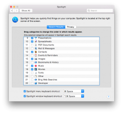
New bing web searches in spotlight.
This all new in DP4 or Public Beta?
I really love the dark theme.")
The Dark theme is good, how ever those black icons on the status bar that aren't white really bother me for some reason lol
Hopefully it'll be fixed by GM
The Dark theme is good, how ever those black icons on the status bar that aren't white really bother me for some reason lol
Hopefully it'll be fixed by GM
Yeah that is really unattractive. I am sure it will be.
Zip files have a new icon!
Also, Ive found that with Yosemite, Finder is much more often an App Using Significant Energy though my battery life was increased by about 25%. Heres to hoping iOS 8 shows the same battery improvement for iPhones..
Also, Ive found that with Yosemite, Finder is much more often an App Using Significant Energy though my battery life was increased by about 25%. Heres to hoping iOS 8 shows the same battery improvement for iPhones..
Attachments

Anyone have this running as their ONLY OS? (ie: not as a partition).
I wanna go all out, or not at all.
Yes, since the first Beta. There are glitches, but nothing major for me. If you ask me, go all out. But YRMV.
S_S
Last edited:
Has the Star Wars hologram effect in Photo booth already been there? In my memory it was demoed at one point but never made it into the final product.
Following installing the public beta, I've seen my hard drive space dramatically increase - I previously had about 15GB free and now it's sitting at 28GB. Thanks, Yosemite!
Is it just me or does the Apple logo in the menu bar just look really strange now? Like...I keep comparing it with the one on the back of my MacBook and they just seem different. The digital version in Yosemite looks as if the leaf is sitting too upright and the dimples aren't large enough...it's really getting to me for some reason. But then I'll look back at it later on and it'll look fine. Am I going mad?
Is it just me or does the Apple logo in the menu bar just look really strange now? Like...I keep comparing it with the one on the back of my MacBook and they just seem different. The digital version in Yosemite looks as if the leaf is sitting too upright and the dimples aren't large enough...it's really getting to me for some reason. But then I'll look back at it later on and it'll look fine. Am I going mad?
You're right! I think the leaf is a lot thinner than before...
I might be nitpicking, but with Yosemite bringing the crisp and precise look from iOS, I really think they should fix this. (Yosemite screenshot borrowed from another thread.)

I might be nitpicking, but with Yosemite bringing the crisp and precise look from iOS, I really think they should fix this. (Yosemite screenshot borrowed from another thread.)
Image
Are you talking about squares vs circles? I hadn't even noticed.
----------
I really love the dark theme.
Me too! 24/7 Dark Mode user here!
Are you talking about squares vs circles? I hadn't even noticed.
More likely it’s about the vertical placement of the colon.
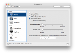
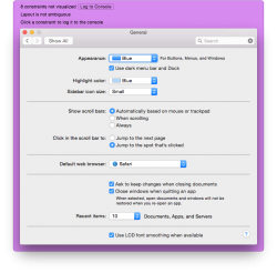
I don't know if this has been mentioned already, but akin to iOS 7 / 8 you can Increase the contrast (which automatically reduced transparency). In prior DPs of Yosemite you could only reduce transparency.
This results in a number of things. Just look at the screenshots I provided.
(Before, After, SysPrefs)
This results in a number of things. Just look at the screenshots I provided.
(Before, After, SysPrefs)
Attachments
Both, actually!More likely its about the vertical placement of the colon.
IIRC they even gave it a special mention in one of the iOS 7 WWDC sessions about typography. So why miss it this time? (It's so trivial, though, I think my bug report might never hear an answer back. Probably a shout out to Tim some other time ;p)
I don't know if this has been mentioned already, but akin to iOS 7 / 8 you can Increase the contrast (which automatically reduced transparency). In prior DPs of Yosemite you could only reduce transparency.
This results in a number of things. Just look at the screenshots I provided.
(Before, After, SysPrefs)
High constrast look gorgeous! i will use it!
In unrelated news: (I already posted this in another thread...)
I just installed the Yosemite beta on my main machine after having tested DP1-4 on a separate partition.
Everything seems to be as expected, however, I am getting this strange window frame every now and then. It first appeared in
System Preferences → Keyboard → Text
and after that is persistent to all System Preferences windows.
Anyone got any idea what exactly that is (yes for debugging the layout of some sort... but why do EYE see it?!). And more importantly how to get rid of it?!
Attachments
This all new in DP4 or Public Beta?
I never liked Bing. it seems to me too Ad oriented. Of course, Google is much more Ad oriented, but at least they know how to hide it.
Google is easier to read, and I usually get more relevant search results in Google.
I just wish the transition to Bing will be smooth for those users who prefer Google.
----------
Youtube now defaults to HTML5 and you can't change it back to flash player. Unfortunately, the youtube HTML5 player (like the netflix HTML5 player) feels incomplete. I really hope apple at least gives us an option to switch players, and for netflix too.
I want a world free of Flash!
----------
I'm not sure where that warning is coming from, it's perfectly sunny outside and we don't generally get tornadoes in Australia.
It's says Marcus Beach further down, in the forecast section.
I don't know if anyone's noticed this... but the new TextEdit icon doesn't have the "Here's to the crazy ones..." on it.
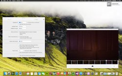
Don't know if this has been mentioned before, but the Get Info window in iTunes 12 has had a major redesign.

Very pretty!
Very pretty!
This all new in DP4 or Public Beta?
DP4. There's no way I would ever switch to public beta if that might mean less frequent updates.
Register on MacRumors! This sidebar will go away, and you'll see fewer ads.