Got a tip for us?
Let us know
Become a MacRumors Supporter for $50/year with no ads, ability to filter front page stories, and private forums.
OS X 10.10 Yosemite: All The Little Things
- Thread starter WhackyNinja
- WikiPost WikiPost
- Start date
- Sort by reaction score
You are using an out of date browser. It may not display this or other websites correctly.
You should upgrade or use an alternative browser.
You should upgrade or use an alternative browser.
- Status
- The first post of this thread is a WikiPost and can be edited by anyone with the appropiate permissions. Your edits will be public.

yeah that looks terrible on my computer
As a UX guy, I can assure you that whether the volume hud is transparent or blurred, it's not making a difference with your experience and you're making a big deal out of nothing. If a video is playing and a UI element pops over it, it's going to attract your eyes to it and it's going to take visual priority over anything else on the screen for the 1 second it appears.
Also, from a (opinionated) design standpoint, I think it's beautiful, along with the rest of Yosemite.
Also, from a (opinionated) design standpoint, I think it's beautiful, along with the rest of Yosemite.
Are you one of those people who try to watch entire movies through those overlays?I don't think you're correctly remembering how it actually looked.
Lose so much detail?!
OS X 10.10 Yosemite: All The Little Things
Erm... That's a bit of a strange and aggressive question. No. I doubt such people exist so your rhetoric is a bit pathetic. I'm just someone who occasionally changes the volume and brightness during video playback.
Are you one of those people who try to watch entire movies through those overlays?
Erm... That's a bit of a strange and aggressive question. No. I doubt such people exist so your rhetoric is a bit pathetic. I'm just someone who occasionally changes the volume and brightness during video playback.


Here's my problem

...And as you can see, by this post, I have internet connection, though this stupid software thinks I have not! Just one thing more: Impossible to check Internet Radio box...It's there but light gray...

...And as you can see, by this post, I have internet connection, though this stupid software thinks I have not! Just one thing more: Impossible to check Internet Radio box...It's there but light gray...
So they removed the puff of smoke effect from the Dock and all there's left is a very strange (non-)animation when you try to remove an item from the Dock.
What a joke. Either make a new animation or just restore the amusing effect.
What a joke. Either make a new animation or just restore the amusing effect.
Last edited:
Also, from a (opinionated) design standpoint, I think it's beautiful, along with the rest of Yosemite.
And I think it's hideous (again, subjective). I dislike many things about Yosemite, which is why I'm not upgrading if there aren't ways to fix it later down the line (like removing ALL blurs without making it look even worse, changing the system font - you can do this with TinkerTool, getting back Maverick's 3D dock, and changing the horrible turquoise folders back to the Mavericks ones).
My work machine is not my phone - I do not want or care for blurs where I can see the background shining through. The whole point is to NOT have the background showing, that's why it's for work.
Hideous? Holy overreaction, batman. They're just basic flat icons.
----------
What does it look like?
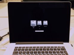
Beta 4 only broke this for me. I now get the flat HUD, but when I F5 or F6 to change the keyboard backighting, the HUD pops up with no notches, and pressing any amount of F5 or F6 or trying with Fn even, doesn't make any difference - so no backlit keyboard at all for me on beta 4. Makes it a game killer that the only difference they bought in broke something.
The screen brightness and sound work, just not keyboard back lighting. Works fine on my beta 3 partition of yosemite, just not on beta 4
My work machine is not my phone - I do not want or care for blurs where I can see the background shining through. The whole point is to NOT have the background showing, that's why it's for work.
Are you talking about the translucent sidebars? First thing I did was enable reduce transparency to get rid if it, though I wish it was more customizable (I like translucency in the menu bar.)
Agree about the folders, ugliest thing about Yosemite. 3D dock, though...that couldn't go away fast enough.
It was rhetoric, but meant more as a joke. I won't resort to saying it's "pathetic" you don't get that. However if you only change your volume occasionally, and you only see the overlay few seconds at best, I honestly have no idea why you're making such a fuss about it.Erm... That's a bit of a strange and aggressive question. No. I doubt such people exist so your rhetoric is a bit pathetic. I'm just someone who occasionally changes the volume and brightness during video playback.
OS X 10.10 Yosemite: All The Little Things
I see what you did there...I won't resort to saying it's "pathetic" you don't get that.
Where have I made a big fuss about this?I honestly have no idea why you're making such a fuss about it.
So they removed the puff of smoke effect from the Dock and all there's left is a very strange (non-)animation when you try to remove an item from a Dock.
What a joke. Either make a new animation or just restore the amusing effect.
At least the functionality is still there.
I am really suprised that after one day of use of the PB4, the battery life is impressive on my mid 2012 13' MacBook Pro. And the performance is also much more faster and fluid. I'm glad. But also sad that the fonts stayed pixelated on non retina displays.
I've filed a bug report with Apple. I really can't imagine I'm the first to do it, but we'll see what the outcome is.
Update: My bug got marked as a duplicate of "17524889" which is still in an "open" status. Unfortunately, there's no way to view other people's bugs.
Last edited:
Last one looks better imo
----------
I'm a big fan of the 3D dock, it brings depth and that's a nice visual effect. 2D messes it up, although I have to admit it looks better with the 2D. In my case, I'll change most of the stock icons as I prefer detail over flat icons (however, much better job by Apple with these icons than on iOS).
----------
Are you talking about the translucent sidebars? First thing I did was enable reduce transparency to get rid if it, though I wish it was more customizable (I like translucency in the menu bar.)
Agree about the folders, ugliest thing about Yosemite. 3D dock, though...that couldn't go away fast enough.
I'm a big fan of the 3D dock, it brings depth and that's a nice visual effect. 2D messes it up, although I have to admit it looks better with the 2D. In my case, I'll change most of the stock icons as I prefer detail over flat icons (however, much better job by Apple with these icons than on iOS).
Last one looks better imo
----------
I'm a big fan of the 3D dock, it brings depth and that's a nice visual effect. 2D messes it up, although I have to admit it looks better with the 2D. In my case, I'll change most of the stock icons as I prefer detail over flat icons (however, much better job by Apple with these icons than on iOS).
Yosemite icons are flat ?
There is a difference between "non-glossy" and "flat".
I'm really not sure if this was in any of the other recent DPs or betas, but here is what I found. Way back in DP3 or something like that, someone discovered that the selected option in the sidebar was transparent, but only in some apps and only when the sidebar wasn't the focus I.E in mail if you click inbox, then click on an email.
Now the behavior has changed slightly, so that finder has this now, and for some reason, the selection stays transparent even when you select a file or anything that takes the focus away from the sidebar. I would've hoped that this would be system wide by now, but it is GM candidate 1 and I don't think there will be any more UI changes.
Now the behavior has changed slightly, so that finder has this now, and for some reason, the selection stays transparent even when you select a file or anything that takes the focus away from the sidebar. I would've hoped that this would be system wide by now, but it is GM candidate 1 and I don't think there will be any more UI changes.
Attachments
It is GM candidate 1 and I don't think there will be any more UI changes.
I'm not so sure about that. I think now that it's a GM candidate, there's a feature freeze, but they are still free to tweak the UI slightly. There's almost definitely going to be a second GM candidate before the release late this month.
Register on MacRumors! This sidebar will go away, and you'll see fewer ads.