In prefer the thin one to be honest. Looks more modern.
Got a tip for us?
Let us know
Become a MacRumors Supporter for $50/year with no ads, ability to filter front page stories, and private forums.
OS X 10.10 Yosemite: All The Little Things
- Thread starter WhackyNinja
- WikiPost WikiPost
- Start date
- Sort by reaction score
You are using an out of date browser. It may not display this or other websites correctly.
You should upgrade or use an alternative browser.
You should upgrade or use an alternative browser.
- Status
- The first post of this thread is a WikiPost and can be edited by anyone with the appropiate permissions. Your edits will be public.
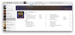
Haven'y seen this reported anywhere else, but in the newest iTunes beta, the Artist View shows a banner image, reminiscent of the Album View.
cool.. glad to see it. liked this view
Haven'y seen this reported anywhere else, but in the newest iTunes beta, the Artist View shows a banner image, reminiscent of the Album View.
Is it really an image or just a composite of colors taken from the album art work?
EDIT: Answered my own question. It's just a composite of colors. Apparently, it only uses the first album art in the list. Not sure if this makes sense.
Last edited:
Does anyone have a problem updating to iTunes 12 (the latest build) on Yosemite PB4?
Software Update tells me it cannot contact swscan.apple.com.
I've tried at home and at work (same MacBook Pro) and does not work.
It's a MacBook Pro 15" 2009, if it's useful to you.
Software Update tells me it cannot contact swscan.apple.com.
I've tried at home and at work (same MacBook Pro) and does not work.
It's a MacBook Pro 15" 2009, if it's useful to you.
Preview Won't Move PDF Pages After Update
Okay, so I update and update. Now every time I turn on my iMac, i see the update status bar. EVERY TIME NOW.
Then this morning. I casually shift PDF pages from one document into another seamlessly like I have since Mavericks. Possibly before I can't remember.
Today, after a reboot due to an update, and another update bar, I get no pdf page transport between documents. I save them to the desktop and reopen, no transfer of pages between PDFs.
I need counseling after everything apple has done to me in the middle of my work flow.
swingerofbirch
macrumors 68040
Speakable items orb?
Out of curiosity, what does the Speakable Items orb look like in Yosemite?
It already looks a little out of place in Mavericks. It has the design cues of the very first Apple DVD player controller going all the way back to OS 9.
This is what it looks like now:

For some reason the picture isn't showing up. If you right-click and select open in new window it shows up.
Out of curiosity, what does the Speakable Items orb look like in Yosemite?
It already looks a little out of place in Mavericks. It has the design cues of the very first Apple DVD player controller going all the way back to OS 9.
This is what it looks like now:
For some reason the picture isn't showing up. If you right-click and select open in new window it shows up.
Okay, so I update and update. Now every time I turn on my iMac, i see the update status bar. EVERY TIME NOW.
Then this morning. I casually shift PDF pages from one document into another seamlessly like I have since Mavericks. Possibly before I can't remember.
Today, after a reboot due to an update, and another update bar, I get no pdf page transport between documents. I save them to the desktop and reopen, no transfer of pages between PDFs.
I need counseling after everything apple has done to me in the middle of my work flow.
The "update" bar isn't an update bar...apple replaced the spinning wheel with a progress bar so you can see how close to booted the Mac is.
Indeed, it looks ancient. I would suggest sending Apple feedback.Out of curiosity, what does the Speakable Items orb look like in Yosemite?
It already looks a little out of place in Mavericks. It has the design cues of the very first Apple DVD player controller going all the way back to OS 9.
This is what it looks like now:
Image
For some reason the picture isn't showing up. If you right-click and select open in new window it shows up.
swingerofbirch
macrumors 68040
Indeed, it looks ancient. I would suggest sending Apple feedback.
I'm not a developer and I don't have the public beta, either. Just a Mac-nut. I wish they had a better feedback system. I send feedback occasionally through apple.com/feedback, but I never know how worthwhile it is. I'm still having AirPlay bugs in Mavericks that I had back in 10.7 that I've reported to them that way.
I'm guessing that they know the "Orb" exists, it might be a low priority. Its functionality (speakable items) is very low and inaccurate compared to Siri. Apple tends to neglect updating things until they scrap it and start over.
Does anyone know where the 'Replay Song' button is in iTunes 12? I can't seem to find it
Good question, it's really weird but I can't find it either, other than it being a menu item.
But you can enable it by going to Controls -> Repeat and then selecting All, One or Off.
I wish they had a better feedback system. I send feedback occasionally through apple.com/feedback, but I never know how worthwhile it is.
They do have a better feedback system, that you get a reply to: bugreport.apple.com
You'll at least get a reply back, unless your bug report is a feature request.
They do have a better feedback system, that you get a reply to: bugreport.apple.com …
That's for developers. swingerofbirch is not a developer.
For customers, the OS X Beta Program is more suitable.
… I don't have the public beta, either. …
Any reason why not?
The banner in itunes looks nice but i'm really annoyed they changed the inactive sidebar selection color to a bland gray. Before is was like blue with dark blue text and looked so much better.
I hate that they changed it from white in the earlier builds. Blue always clashed with the rest of the [mostly] white window. But now they've made the grey pretty subtle so even the sidebar grey is noticeably different. I just hope they reconsider and make that white when translucency is turned off.
As a UX guy, I can assure you that whether the volume hud is transparent or blurred, it's not making a difference with your experience and you're making a big deal out of nothing. If a video is playing and a UI element pops over it, it's going to attract your eyes to it and it's going to take visual priority over anything else on the screen for the 1 second it appears.
Also, from a (opinionated) design standpoint, I think it's beautiful, along with the rest of Yosemite.
As another UX guy, this point cannot be overstated: for the moment it is up, your attention will be focused on this UI element, and not what's behind it.
Where are the volume indicator popout files located at?
Thinking about swapping it with transparent version or at least using the dark mode one with light theme.
These blurred views are created programmatically. You can't just exchange images.
These blurred views are created programmatically. You can't just exchange images.
Hmm...launchpad also programmatically blurs the background...people found a way to adjust the blur, so maybe that can apply to the rest of the UI in Yosemite? Also, the dock actually has images for its background, and changing them will make the background a solid image (not blurred) so maybe deleting an image like that will make it completely transparent..
Wishlist for iTunes 12: Have my Apple ID profile picture next to my name. Kinda bothers me not seeing it there XD
haha. I've wondered this too.
Safari still has low-res PDF tool graphics.
iTunes still renders album artworks in low-res.
Input method HUD is still Leopard-style.
Chinese handwriting is still Lion-style AND is overlapped by Spotlight.
Dark-mode menubar still has no drop shadow.
Apple, are you reading my bug reports???
iTunes still renders album artworks in low-res.
Input method HUD is still Leopard-style.
Chinese handwriting is still Lion-style AND is overlapped by Spotlight.
Dark-mode menubar still has no drop shadow.
Apple, are you reading my bug reports???
Register on MacRumors! This sidebar will go away, and you'll see fewer ads.