Got a tip for us?
Let us know
Become a MacRumors Supporter for $50/year with no ads, ability to filter front page stories, and private forums.
OS X 10.10 Yosemite: All The Little Things
- Thread starter WhackyNinja
- WikiPost WikiPost
- Start date
- Sort by reaction score
You are using an out of date browser. It may not display this or other websites correctly.
You should upgrade or use an alternative browser.
You should upgrade or use an alternative browser.
- Status
- The first post of this thread is a WikiPost and can be edited by anyone with the appropiate permissions. Your edits will be public.
Try changing your background to something colorful, e.g. solid red and it becomes readily apparent.
See screenshot. This is with a Safari window underneath. No other translucent UI features do this. Only the menubar.
Doesn't happen here. In this screenshot you can clearly see the menu taking the appearance of the underlying window as it should.
EDIT: Actually it does BOTH. Huh. Turns out it mixes in the colour of the desktop as a tint WITH the translucency. Fascinating. Now your choice of desktop will truly personalise your computer even if you never see it. The second one is with a solid red colour desktop, same webpage.
Attachments
For me it's even worse with dock on the left side.
It only works properly if I FIRST press the command and then right click on it.
Attachments

EDIT: Actually it does BOTH. Huh. Turns out it mixes in the colour of the desktop as a tint WITH the translucency. Fascinating. Now your choice of desktop will truly personalise your computer even if you never see it. The second one is with a solid red colour desktop, same webpage.
It's just a bit weird. Why can't Apple decide whether they want it or not? I thought consistency was a keyword

It's just a bit weird. Why can't Apple decide whether they want it or not? I thought consistency was a keyword
I don't think it's weird and in fact I think it's actually consistent. This way, the menu bar color is the same as the menu color.
That's actually really really nice!Doesn't happen here. In this screenshot you can clearly see the menu taking the appearance of the underlying window as it should.
EDIT: Actually it does BOTH. Huh. Turns out it mixes in the colour of the desktop as a tint WITH the translucency. Fascinating. Now your choice of desktop will truly personalise your computer even if you never see it. The second one is with a solid red colour desktop, same webpage.
EDIT: Actually it does BOTH. Huh. Turns out it mixes in the colour of the desktop as a tint WITH the translucency. Fascinating. Now your choice of desktop will truly personalise your computer even if you never see it. The second one is with a solid red colour desktop, same webpage.
Ok, that makes sense. The menus pick their hue from the background. Didn't notice it earlier with my greyish background image.
It's another question whether it's a good thing. I might imagine wanting a red background, but that doesn't mean I want pink menus all over my system...
I think it's sooo ugly.Doesn't happen here. In this screenshot you can clearly see the menu taking the appearance of the underlying window as it should.
EDIT: Actually it does BOTH. Huh. Turns out it mixes in the colour of the desktop as a tint WITH the translucency. Fascinating. Now your choice of desktop will truly personalise your computer even if you never see it. The second one is with a solid red colour desktop, same webpage.
Please show me how this menu looks like with disabled transparency?
And all context menus look exactly the same?
I think it's sooo ugly.
Please show me how this menu looks like with disabled transparency?
And all context menus look exactly the same?
I agree, the transparency is overboard. It makes it look like there's mold growing behind the UI. They need to return it to Mavericks levels.
I have it turned off, this is what it looks like. Context menus are the same.
Attachments
Turns out it mixes in the colour of the desktop as a tint WITH the translucency. Fascinating.
I actually think this was a good call from a UI design standpoint. The menubar is strongly influenced by your desktop background. The dropdown menus are an extension of the menubar. Therefore, the dropdowns use the exact same translucency and color mixing. It gives your background a sense of presence.
I kind of agree, though, that if the menubar does it, the dock should too. There has to be better consistency, since both use basically the same color blending techniques.
The dock IS translucent. :S It will show whatever's below it, same as the drop down menus. The menu bar has minimal if any translucency. You won't really notice it.
The UI style in general is love it or hate it. I've been using it since Beta 2 and it's had time to grow on me. However, many people can't stand it. Apple/OSX/iOS etc has never really been about choice though. Linux offers much more choice but suffers in other areas because of it. I was originally appalled that they were going back to a 2d dock but even that has grown on me. I still prefer a 3d dock but I now don't mind the 2d one of Yosemite.
GM Candidate 3.0 is out!
Looks like apple is really working to fix bugs...I like that!
Last edited:
Only the newest Macs (2014, maybe a few 2013) have black boot screens - has nothing to do with the color of the bezel.
I have '12 rMBP and it shows a black booting screen.
Apple is matching the bezel of your Mac, it is the same thing they do on iOS devices. If you have a white/gold device, it shows white, if you have a black one, it shows black.
I have '12 rMBP and it shows a black booting screen.
Apple is matching the bezel of your Mac, it is the same thing they do on iOS devices. If you have a white/gold device, it shows white, if you have a black one, it shows black.
No...my cMBP also from 2012 has a white boot screen. It has a black bezel. I think that it is 2012+ rMBPs, 2013+ everything else.
Also, the white iPhone 4/4S and iPod touches don't have a white boot screen
I have '12 rMBP and it shows a black booting screen.
Apple is matching the bezel of your Mac, it is the same thing they do on iOS devices. If you have a white/gold device, it shows white, if you have a black one, it shows black.
I was off by one year (2012 models onward), but what I said is still true. Apple is not matching bezels like it does with iOS. Black boot screens are on these models only:
• MacBookPro10,1
• MacBookPro10,2
• MacBookAir6,1 (silver bezel)
• MacBookAir6,2 (silver bezel)
• iMac14,1
• iMac14,3
• iMac14,2
• MacBookPro11,1
• MacBookPro11,2
• MacBookPro11,3
• MacPro6,1 (no default screen)
Additionally, see this video of an Air with black boot screen: https://www.youtube.com/watch?v=3umkLL9cXxE
Black boot screen is on newer models only, and regardless of bezel color.
Anyone know whats new in GM 3?
The finder transitions/animations are still screwed...
Looks like I'll have to use TotalFinder to get rid of this annoying lag.
The finder transitions/animations are still screwed...
Looks like I'll have to use TotalFinder to get rid of this annoying lag.
What computer do you use? I have had no problems, the only problem is that the "plup" sound when raising or lowering the volumes isn't heard most of the time. Do you use a Retina display? I do.
What computer do you use? I have had no problems, the only problem is that the "plup" sound when raising or lowering the volumes isn't heard most of the time. Do you use a Retina display? I do.
When you click to go full screen in finder, first there is a slight delay, then the background transitions to black from right to left, and only then the finder begins to fill the space, marking the finishing of process with the flickering top of the window an bunch of black boxes lol.
Apple either have some incompetent people working for them, or they are trying to make yosemite run slower on purpose on older machines. TotalFinder and all the other apps, including video players, spotify, etc, transition to full screen without stuttering and without artifacts, so I'am sure it's not that hard to code that transition properly, at least for casual devs not working in Apple.
Last edited:
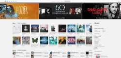
New ITunes Store update?
id say most likely when os x yosemite is released to the public with iTunes 12.
id say most likely when os x yosemite is released to the public with iTunes 12.
I was actually referring to the new features panel. My screenshot didn't seem to load though haha. But yeah, your probably right with the overall revamp.
Attachments
Register on MacRumors! This sidebar will go away, and you'll see fewer ads.