Just got the canon 50mm 1.8, beautiful lens for £99 ") Tate modern today... c&c welcome. (clickable) No PP on this either!
Tate modern today... c&c welcome. (clickable) No PP on this either!

wow
Tate modern today... c&c welcome. (clickable) No PP on this either!
wow
Tate modern today... c&c welcome. (clickable) No PP on this either!
These shots really help me grow outside of my box, thx so much for posting and sharing your artistic abilities.
I find myself looking differently at the world and aspiring to capture it in similar fashion.
I'm just learning on our new Canon T1i, so constructive criticism is welcome!


One more from the Red Tail Hawk series I shot last weekend.

C&C always welcome.

.....
I was curious to see how it would do as a black and white. Here's the result:
Personally I see it as an improvement. The original image really wasn't about color--it was about constrast and texture. B&W brings this out perfectly.
I'm not saying my version of this theme is better. You may hate it. But I wanted to show you in images what I visualized when I wrote out my earlier critique. And a huge thanks for the underlying idea. I probably wouldn't have thought of this on my own but I really like where it went.
Oh, and while I usually don't post EXIF data (who really cares what gear I use?) in this specific instance I want to.
f/11, 1/20 sec, ISO 1600 on a nikon D700 24-70/2.8. Handheld. I used f/11 because I wanted the wine glass stem to be in focus. I took a shot at f/2.8 but wasn't happy with the shallow depth of field. The reason I am even bothering with this is to let you know that images like this are possible even with the "kit" lens that comes with many DSLRs. Even with an entry level camera, it's possible to create something like this (though you might require a tripod to keep the ISO down, and thus the noise at a reasonable level). Oftentimes you will hear that to create images in low-light you have to have a "fast" (and often expensive) lens. While it is true for some images, it isn't true for all. I used a "slow" aperture of f/11 (even though my lens goes to f/2.8 and I have a prime that goes to f/1.4). The reason is that those apertures were "wrong" for what I hoped to achieve. Again, this image could have been created with an entry level DSLR and kit lens. Hell, it could have been created with a good point and shoot. It isn't always about the gear. It's about knowing how to translate what you see in your mind's eye into what will show up on your screen. Oftentimes you don't need "pro" gear to accomplish this.


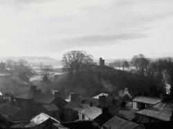
Taken at 09.30 this morning from my back garden and overlooking the very frosty village.
Due to the sun high to the left, bleaching out any colour I think it looks better in B&W!?!?!?!?
http://images.macrumors.com/vb/images/attach/jpg.gif
This is somewhat cheating. I posted a similar composition yesterday in a critique of another's image. The initial shot was a snapshot taken in diffuse light. Didn't do anything for me. I shot again at night where I had more control over the light. I felt it was better, but I wasn't totally happy (the backlighting brought out some text on the label that I found distracting). Today I had some nice strong sun shining onto my dining room table and I revisited the subject.
Wow! That last shot it perfect! I love the light reflection moving towards the right, honestly. In fact, it was one of the first thoughts that popped into my head when I saw the second set. Very cool, as are the rest of your shots on your gallery.
Also, many thanks for the thoughts. You're right, just graduating from a point and shoot, I find that I'm still somewhat in that mindset. In fact, that is the real reason behind the table/cork/wineglass; I was walking by, saw the bottle and cork and thought, "hey, that'd be a cool shot," and snapped the shutter. As another user stated, the more criticism you hear, the more your brain thinks about things like table color vs cork color, wine glass is in the frame (though that COULD have been due to the viewfinder not capturing 100% of the field... I dont remember whether I saw the glass in the frame or not, honestly), but you get the idea. And now, so do I
I'm having a blast with the camera, however, and that's the point. I'll post more as I take them, and thanks again so much for your thoughts.
ThanksThat's such a special quality of light...
Thanks^^^ Wonderful look and feel to this photo. Great use of color and good framing to boot. Love the way the red stands out against the blue of the water. The rocks at the very bottom seem to intrude on the subject to my eye. They could be cropped off to enhance the main element.
The kind of lighting and location we dream of! Well done! That would look glorious spanned across two screens... care to add a little watermark and let us download it?
That is a long lens you have there (420mm) by by little EXIF reader. It that one of the Canon 400s or a Sigma 500? Extender, maybe?
These birds make great subjects and your photo shows the power and majesty of the red tail. I like the compliment given by the green and blues in the background, but I feel that there is too much open space around the bird. Maybe crop in a bit from the top and bottom.
Dale