Got a tip for us?
Let us know
Become a MacRumors Supporter for $50/year with no ads, ability to filter front page stories, and private forums.
Photo of the day - July 2008
- Thread starter SpaceMagic
- Start date
- Sort by reaction score
You are using an out of date browser. It may not display this or other websites correctly.
You should upgrade or use an alternative browser.
You should upgrade or use an alternative browser.
First off, Valdore and Ghostguts, looking good  .
.
Anyways..
I agree with you composition wise and would probably have tried it differently if I were shooting B & W, but the fact is that when I took this photo the stark contrast between the bright yellow of the fisherman's overalls and the blue of the sky just jumped at me; that's what I tried to evoke by including such a huge piece of sky.
Also, since this photo is destined to be the cover piece for an article about Britany's artisanal fishery (my first ever actual job !!!!!!!!!!*100,000,000), the extra space on top gives a generous margin for titles, etc.
Thanks . Means alot to me!
I've only just started importing the hundreds of images I took, so later I'll post another in the 'fisherman' series.
Anyways..
Nice overall, but I personally think there is too much sky. I would have tried this shot as a landscape aspect rather than a portrait.
I agree with you composition wise and would probably have tried it differently if I were shooting B & W, but the fact is that when I took this photo the stark contrast between the bright yellow of the fisherman's overalls and the blue of the sky just jumped at me; that's what I tried to evoke by including such a huge piece of sky.
Also, since this photo is destined to be the cover piece for an article about Britany's artisanal fishery (my first ever actual job !!!!!!!!!!*100,000,000), the extra space on top gives a generous margin for titles, etc.
Have to say I think the sky is perfect in that shot and using portrait worked beautifully - love the photograph Everythingisnt, gorgeous
Thanks
I've only just started importing the hundreds of images I took, so later I'll post another in the 'fisherman' series.
Love the b/w processing of this one.
I agree, the B&W is great on this, her expression and shadows arond the eyes is terrific.
Another shot. Comments and criticisms?

IMO the guy blends in with the background to much.
Don
Ghostguts what lens are you using for those portraits? It looks very sharp.
Speaking of sharpness, this is with my 16-85mm VR, no PP whatsoever (to be fair I had in-camera sharpening set to +1). I have so many pics from the fishing shoot that I don't know where to start...

Fresh caught Langoustine basking in the sun before being sold..
Speaking of sharpness, this is with my 16-85mm VR, no PP whatsoever (to be fair I had in-camera sharpening set to +1). I have so many pics from the fishing shoot that I don't know where to start...

Fresh caught Langoustine basking in the sun before being sold..
Ghostguts what lens are you using for those portraits? It looks very sharp.
For the shot I just posted, I used a standard 40d kit lens: EF 28-135mm f/3.5-5.6 IS USM
For some of the portraits that I've posted throughout this threat, I typically use a Canon EF 50mm f1.4 USM Standard & Medium Telephoto lens
First shot I've posted to a PotD thread for a while.

Shot of a rose from a hanging basket in front of the house. Fill flash was used to isolate the rose and produce the catchlights in the water droplets. Only post-processing was a minor tweak of curves and levels.

Shot of a rose from a hanging basket in front of the house. Fill flash was used to isolate the rose and produce the catchlights in the water droplets. Only post-processing was a minor tweak of curves and levels.
Lunch
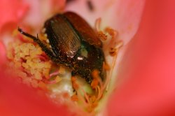
Saw some roses next to the house I'm renting, went to grab a shot of them and saw this little guy munching instead. (Not sure how to control size of picture I'm posting, hope it's not too big)
180mm Macro
1/250 s
f/4.5 (wishing I made it ~5.6)
ISO 250
Saw some roses next to the house I'm renting, went to grab a shot of them and saw this little guy munching instead. (Not sure how to control size of picture I'm posting, hope it's not too big)
180mm Macro
1/250 s
f/4.5 (wishing I made it ~5.6)
ISO 250
Attachments
My last one of the green city with the impressive clouds. And when it rains it really rains. We saw the streets turn into floods within minutes.


Just pulled off the road driving home to take this. Comments?

Why so much sky if it is rather dull?
I think it adds a nice sense of balance to it.
The photo itself is okay, to me at least. It is a bit bland, but the sky doesn't hurt it at all.
Similar to my first fishing set picture, but with a bit more emphasis on the touristic nature of the fish unloading..

Latitude: 47 47 32.6 N
Longitude: 4 14 6.2 W

Latitude: 47 47 32.6 N
Longitude: 4 14 6.2 W
Similar to my first fishing set picture, but with a bit more emphasis on the touristic nature of the fish unloading..

Latitude: 47 47 32.6 N
Longitude: 4 14 6.2 W
A bit off subject. "touristic"???? Is this one of those "new" words that have just been added to the dictionary??????
A bit off subject. "touristic"???? Is this one of those "new" words that have just been added to the dictionary??????I like

Err... Honest mistake
Register on MacRumors! This sidebar will go away, and you'll see fewer ads.


