Got a tip for us?
Let us know
Become a MacRumors Supporter for $50/year with no ads, ability to filter front page stories, and private forums.
Photo of the Day May 2015
- Thread starter oblomow
- Start date
- Sort by reaction score
You are using an out of date browser. It may not display this or other websites correctly.
You should upgrade or use an alternative browser.
You should upgrade or use an alternative browser.
What a great idea for a photo project! Involves a bit of background research as well as the obvious photography and post skills. Keep it coming.
I agree great idea for photo project
You spend to much time heading for the pub! Enjoy.
----------
Sunrise yesterday was awesome.
[url=https://farm8.staticflickr.com/7769/16754487883_a924e72101_k.jpg]Image[/url]
DJI00378 (1) 6.43.10 AM by CharlieFromJersey, on Flickr
It's nice when you get up and nature deliveres.
----------
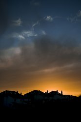
Dramatic skies last night. Gorgeous colours. Tried to keep them as I saw them. Nature is amazing
Or when you stay up/go out late!
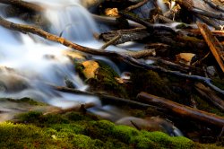
Had a bash at taking some macro shots today. Not too bad for my first attempt. I'd give it a C+ (could do better).
Image
Lovely soft colours. Is this with the new found application of the 2x teleconvertor on the Voigt?
Lovely soft colours. Is this with the new found application of the 2x teleconvertor on the Voigt?
It is Ken. Just a quick attempt.
It is Ken. Just a quick attempt.
I really really like that. Genuinely I think that it is a beautiful picture. I think the pinky red balanced nicely with the purple hints to the right, I love the beautiful soft yet sharp quality.
Now, what did you do for this one? anything in particular?
I really really like that. Genuinely I think that it is a beautiful picture. I think the pinky red balanced nicely with the purple hints to the right, I love the beautiful soft yet sharp quality.
Now, what did you do for this one? anything in particular?
Thanks
Shot wise I had a strobe set up to the right, shot it at about F11. In PP I added a touch of sharpening and a vignette.
No tigers, countryside pubs or castles here. But we do have some interesting modern architecture.
Spent a morning visiting and shooting Disney Concert Hall in downtown LA.

DSC00019-Edit-3.jpg by Puckman2012, on Flickr
Not entirely sure about the processing on this one. There's another more contrasty version on my Flickr page (for those who care to offer some feedback/critique).
Spent a morning visiting and shooting Disney Concert Hall in downtown LA.

DSC00019-Edit-3.jpg by Puckman2012, on Flickr
Not entirely sure about the processing on this one. There's another more contrasty version on my Flickr page (for those who care to offer some feedback/critique).
No tigers, countryside pubs or castles here. But we do have some interesting modern architecture.
Spent a morning visiting and shooting Disney Concert Hall in downtown LA.
[url=https://farm8.staticflickr.com/7687/17173803677_0cb5073a30_b.jpg]Image[/url]
DSC00019-Edit-3.jpg by Puckman2012, on Flickr
Not entirely sure about the processing on this one. There's another more contrasty version on my Flickr page (for those who care to offer some feedback/critique).
Of the three, I prefer the third one with the blue hue tbh. The more contrasty one second.
Of the three, I prefer the third one with the blue hue tbh. The more contrasty one second.
Same here I am afraid. Same order, blue, contrasty, then this one. What is weird though, is if you look at this one, switch to the blue one, then switch back to this one, it looks more contrasty. Nice capture with the FD 50 though!
I like the contrast with the snowy mountains in background.

Camera Canon EOS 6D
Lens Canon EF 24-105mm f/4L IS
Focal Length 105mm
Exposure 1/200
F Number f/11
ISO 100
Lovely scenery. But my focus is drawn to the big branch on the right side.

If you have any problems with my edit, please let me know and I'll remove it.
Lovely scenery. But my focus is drawn to the big branch on the right side.
Image
If you have any problems with my edit, please let me know and I'll remove it.
With this edit this photograph looks much better. That branch really draws eyes away from landscape...
I think another road trip is in order. I'm already missing taking these photos like I did last year!
As always, comments appreciated!

Flo & Katherine by acearchie, on Flickr
As always, comments appreciated!

Flo & Katherine by acearchie, on Flickr
With this edit this photograph looks much better. That branch really draws eyes away from landscape...
That's not an edit... that's decimation.
I rather like the gnarled, thirsty tree and the red earth... and how they tie the foreground and background together. I prefer the original pic...
Lovely scenery. But my focus is drawn to the big branch on the right side.
Image
If you have any problems with my edit, please let me know and I'll remove it.
Better without the branch IMHO but I would like to see more foreground too to enhance the depth of the picture.
----------
That's not an edit... that's decimation.
I rather like the gnarled, thirsty tree and the red earth... and how they tie the foreground and background together. I prefer the original pic...
Maybe if the original was taken slightly lower so some of the branch wasnt lost in the foreground detail?
* - I couldnt do any better to ignore me...
That's not an edit... that's decimation.
I rather like the gnarled, thirsty tree and the red earth... and how they tie the foreground and background together. I prefer the original pic...
True, it's not an edit. I wanted to show how distracting the right side of the original image is. (in my opinion)
Register on MacRumors! This sidebar will go away, and you'll see fewer ads.


